To commemorate the year that was, we invited artists, designers, and thinkers across disciplines — from multimedia artist Ralph Lemon and spoken word artist Dessa to designer Martine Syms and musician Greg Tate — to share their most noteworthy ideas, events, and objects of 2013.
Based in Amsterdam and founded in 1997 by Marieke Stolk, Erwin Brinkers, and Danny van den Dungen, Experimental Jetset has been consistently reinterpreting the implications of modernism, often from a countercultural perspective. The studio is perhaps best known to US audiences from their appearance in the documentary Helvetica (2007) and their dogmatic use of that typeface has become a defining aspect of their work and has influenced new generations of graphic designers. Experimental Jetset’s iconic print work explores ways in which we are both shaped by and help shape our material environment. Projects for cultural clients include most recently the new identity for the Whitney Museum of American Art, and collaborations with the Amsterdam Stedelijk Museum, Purple Institute, Centre Pompidou, Colette, Dutch Post Group, Réunion des Musées Nationaux, Le Cent Quatre, De Theatercompagnie, and 2K/Gingham, which released their iconic John&Paul&Ringo&George T-shirt design. The studio’s work has been exhibited in galleries across the world — including the Walker’s 2011 exhibition Graphic Design: Now in Production — and in 2007 New York’s Museum of Modern Art acquired a large selection of their projects for inclusion in its permanent collection. Since 2000, members of Experimental Jetset have been teaching at the Gerrit Rietveld Academy in Amsterdam.
![]()
The Deposition of Richard Prince
True, this paperback was published in 2012, but we only got around to reading it in 2013. Edited by Greg Allen, and designed by Lex Trueb, The Deposition of Richard Prince is basically a transcript of an oral testimony Prince was forced to give as part of a copyright infringement lawsuit against him, back in 2009. Part legal thriller, part artist monograph, The Deposition lays bare Prince’s education, artistic history, influences and methodology. We were already huge admirers of Prince, but after reading this book, we respect him even more. Even in the face of the harshest criticism (in this case, juridical criticism), Prince remains true to himself, and punk as fuck. (Illustration: The Deposition of Richard Prince (published by Bookhorse), as shown on the website of Motto Distribution.)
![]()
Guy Debord: Un Art de la Guerre
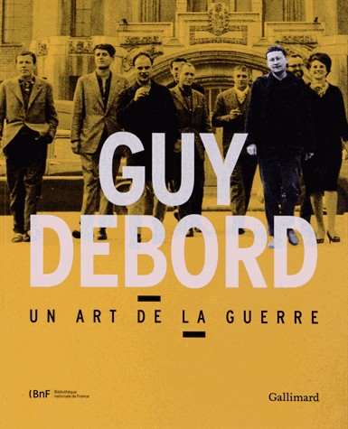
Taking place from March 27 to July 13, 2013, at the Bibliothèque Nationale de France, Guy Debord: Un Art de la Guerre was basically an exhibition built around the personal archive of Debord, as acquired in 2011 from his widow, Alice Becker-Ho. It showcased a wealth of material: from Lettrist and Situationist pamphlets to Constant’s New Babylonic scale models, from Asger Jorn’s Cobra-period paintings to the protest posters of May ’68. There was also a large selection of photographs by the Dutch photographer Ed van der Elsken (from his Love on the Left Bank series), drawings by Jacqueline de Jong, and even some Provo-related material. Needless to say, it was quite a powerful experience to come across such a large collection of artifacts related to the individuals and movements who have influenced our ways of working and thinking so profoundly. (The exhibition also came with a really good catalogue, published by Gallimard). (Illustration: front of the catalogue, designed by Martin Corbasson.)
![]()
Mulatu Astatke, live at the Bimhuis
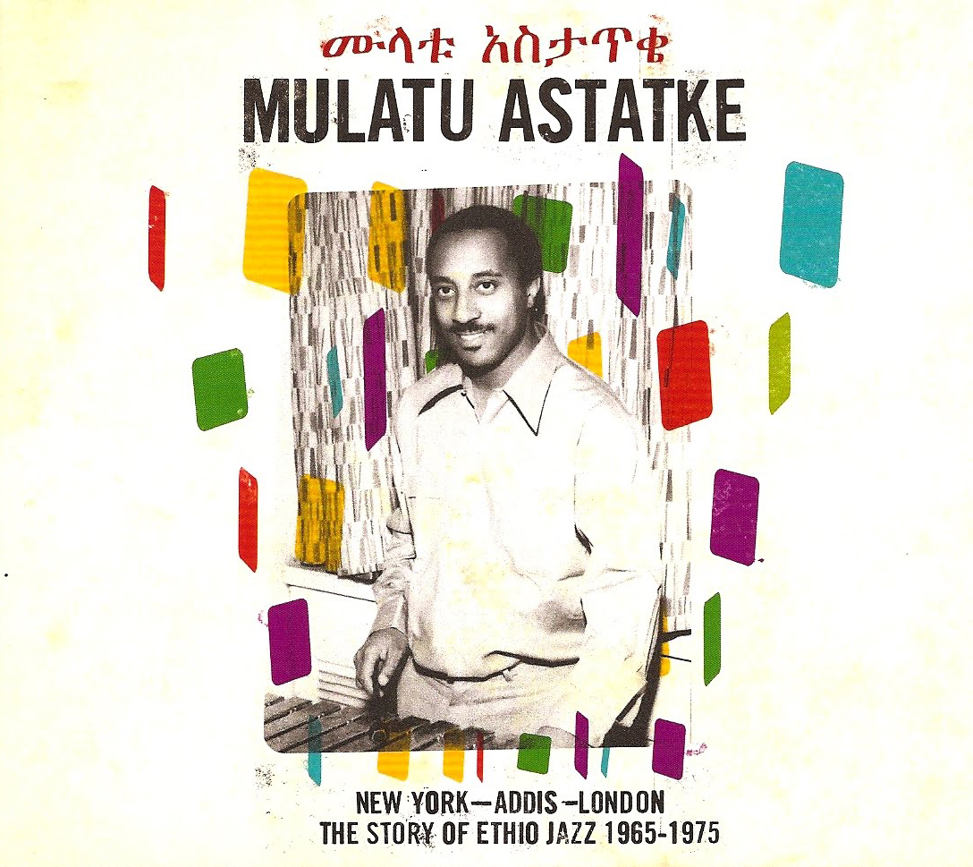
Malatu Astatke (whose work some readers might know through compilations such as Ethiopiques 4, or else through the soundtrack to Jim Jarmusch’s Broken Flowers) is probably most famous for his cool, vibraphonic Ethiopian jazz. However, when performing live, Astake and his band are not afraid to turn these iconic compositions inside-out, and transform them into complete free-jazz/improv freak-outs. The show we attended (November 28, 2013, at the Bimhuis in Amsterdam) also featured a post-gig DJ-set by Terry Ex (of The Ex), so yeah – it was pretty much a perfect night. (Illustration: sleeve art of Mulatu Astatke: New York, Addis, London, designed by Matt Thame.)
![]()
Lawrence Weiner lecture, Stedelijk Museum
The talk by Lawrence Weiner, that took place on September 21, 2013, at the Stedelijk Museum in Amsterdam, turned out to be quite an inspiring event. Introduced by curator Martijn van Nieuwenhuyzen, it featured Lawrence Weiner being interviewed by Ann Goldstein (of the Stedelijk) and Soledad Gutierrez (of MACBA), discussing a wide variety of subjects: marks and notations, drawing as a form of navigation, the relationship between people, objects and language, the surplus value of art in society, the egalitarian potential of the pixel, the gestural benefits of folded paper, just to mention a few. We walked away from that lecture truly electrified. (Photo: Written on the Wind, Lawrence Weiner at the Stedelijk Museum.)
Glasgow in general
Invited by LongLunch (a group of Scottish designers organizing lectures in Glasgow and Edinburgh), we did a talk at the Lighthouse in Glasgow, which took place on June 20, 2013. Although the lecture itself went okay-ish (we’re not really strong speakers), we really loved the city. So many good record stores, art spaces, bars, venues, and vegan restaurants (Mono, Stereo, The 78, Saramago, etc.). We bought zines at Good Press, rode the Clockwork Orange, did a tour through the GSA, visited the Glasgow Press, and attended a very interesting symposium at the CCA (featuring speakers like Simon Reynolds, Paul Morley, Olia Lialina, and James Bridle). The only thing we didn’t manage to do was paying a visit to Little Sparta, the garden of Ian Hamilton Finlay (situated just outside of Glasgow) – but we’ll do that next time. (Illustration: the poster we designed for our lecture in Glasgow, as photographed by LongLunch.)
Teaching
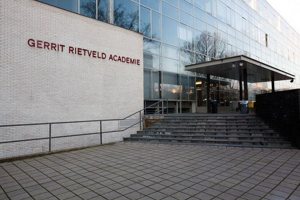
We used to teach at the Gerrit Rietveld Academie, between 2000 and 2010 – and then we decided to quit, for several reasons. In 2013, we were asked to teach again, at both the Rietveld Academie (Amsterdam) and the Werkplaats Typografie (Arnhem) – and, much to our own surprise, we said yes. We are glad we accepted these invitations to teach – it’s simultaneously rewarding and refreshing to be involved in the dynamics of teaching again. (Illustration: detail of the Gerrit Rietveld Academie building, as shown on the website of the academy.)
![]()
Whitney Halloween
Although the graphic identity we developed for the Whitney Museum was launched in 2013, we actually designed it in 2012 (in fact, we started even earlier, in 2011). So in that sense, we personally associate the Whitney more with the year 2012 than with 2013. However, 2013 is the year we first saw the graphic identity being applied by others, namely the Whitney in-house graphic design team (headed by the brilliant Hilary Greenbaum). And we have to admit, it was only then that we felt the whole thing really came alive. The Whitney designers excelled themselves – they really managed to make the graphic identity their own, coming up with results we never even dreamed of. A good example (of the way they seized the graphic identity) is the material that they produced on the occasion of Halloween 2013, including carved pumpkins, goodie bags and window stickers. (Illustration: bats and ghosts on the glass of the Whitney’s lower gallery, as photographed by Matthew Carasella.)
![]()
Vegan Paris
We’ve always loved Paris, but after we visited it in 2013, and noticed the recent increase of vegetarian and vegan restaurants, we love it even more. There seem to be dozens of (relatively) new places around – from vegetarian French cuisine (Gentle Gourmet Café, Soya, etc.) to herbivore fast food (e.g., East Side Burgers, M.O.B.). Certainly adds an interesting new dimension to Paris, at least in our view. (Illustration: photo of the “facade” of East Side Burgers, as shown on their website.)
![]()
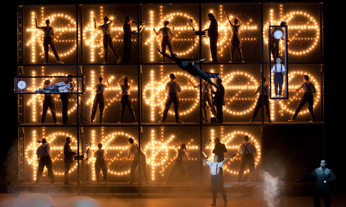
Einstein on the Beach
Seeing the 2012 production of Einstein on the Beach, as performed in January 2013 at Het Muziektheater in Amsterdam, was certainly a personal highlight. Directed by Robert Wilson, composed by Philip Glass and choreographed by Lucinda Childs, this reworked version of the classic 1976 opera managed to take our breath away, for five solid hours. We know, that’s physically impossible – but you get the idea. (Illustration: promotional photo for Einstein on the Beach, 2012.)
![]()
Punk 45: Kill the Hippies! Kill Yourself!
The full title being Punk 45: Kill the Hippies! Kill Yourself! The American Nation Destroys its Young – Underground Punk in the United States of America, Vol. 1, 1973–1980, this double album offers an unbeatable selection of US punk, post-punk and proto-punk singles – solidly compiled (and packaged) by Soul Jazz Records, as they always do. In fact, we are listening to the album right now, as we’re compiling this Top Ten list. (Soul Jazz Records have also released an accompanying 400-page book, ‘Punk 45: The Singles Cover Art of Punk, 1976-1980’, featuring full-size reproductions of sleeve designs, and an essay by Jon Savage – but we haven’t had the chance to take a look at it yet). (Illustration: cover of Punk 45: Kill the Hippies! Kill Yourself!, designed by Adrian Self.)
Moving our studio
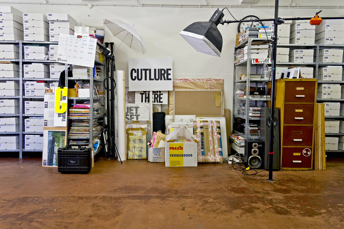
Last summer, we relocated our studio – which turned out to be quite an intense undertaking. After a four-year-period (1997–2001) at the Domselaerstraat (where we actually worked from Marieke’s living room), and twelve years at the Jan Hanzenstraat (2001–2013), we are currently located at the Vinkenstraat. So yeah, zip-code-wise, we traveled from 1093 to 1053 to 1013 (all safely within the borders of Amsterdam). The move took a lot of time and energy (and in fact, there are still stacks of boxes we have to unpack), but it sure was worth it. A new space, a new neighbourhood (“De Jordaan”), a new walking/biking route: guaranteed to keep things fresh and interesting. Or at least chaotic. (Illustration: Photo of our old studio [in the Jan Hanzenstraat], showing units ready to be moved.)
Karina Bisch’s Kiosk
 On June 29, 2013, we were in Lyon for the unveiling of Kiosk, a large public artwork created by the French artist Karina Bisch. Basically a huge open pavilion, the sculpture consists of reproduced fragments of iconic modernist architecture, pieced together in an almost Frankenstein-like way. As a disclaimer, we have to admit that we were somewhat involved in this project (for Kiosk, we designed a series of posters, a publication, and some lettering on the pavilion). But even if we wouldn’t have been involved, we would still count Kiosk as one of the highlights of 2013. Honestly. (Photo of Karina Bisch, standing inside her sculpture.)
REDO Conference, Prishtina
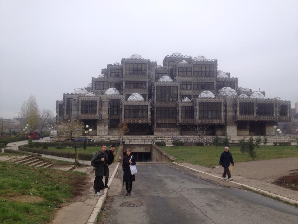 REDO was an international graphic design confererence that took place in Prishtina (or Pristina – apparently, both spellings are correct), between November 22 and 24, 2013. The event had a bit of a pro-situ/dérive/flaneur-like theme, the line-up included two of our favourite studios (Our Polite Society and Mevis & Van Deursen), and some of the lectures took place in a really interesting building – the National Library of Kosovo. The thing is: we weren’t there. We were actually invited to speak, but we were simply too busy to accept this invitation. So we just couldn’t make it to Prishtina, much to our own regret. But we are certain that if we could have made it, it would have been one of our highlights of 2013. (Photo: Matthias and Jens (of Our Polite Society) and Linda (of Mevis & Van Deursen), standing in front of the National Library. We should have been standing there as well. But, alas.)
Get Walker Reader in your inbox. Sign up to receive first word about our original videos, commissioned essays, curatorial perspectives, and artist interviews.







)
)
)
)
)
)
)
)
)
)
)
)