Andrea Büttner—The making of a visual identity
By Gabriela Baka
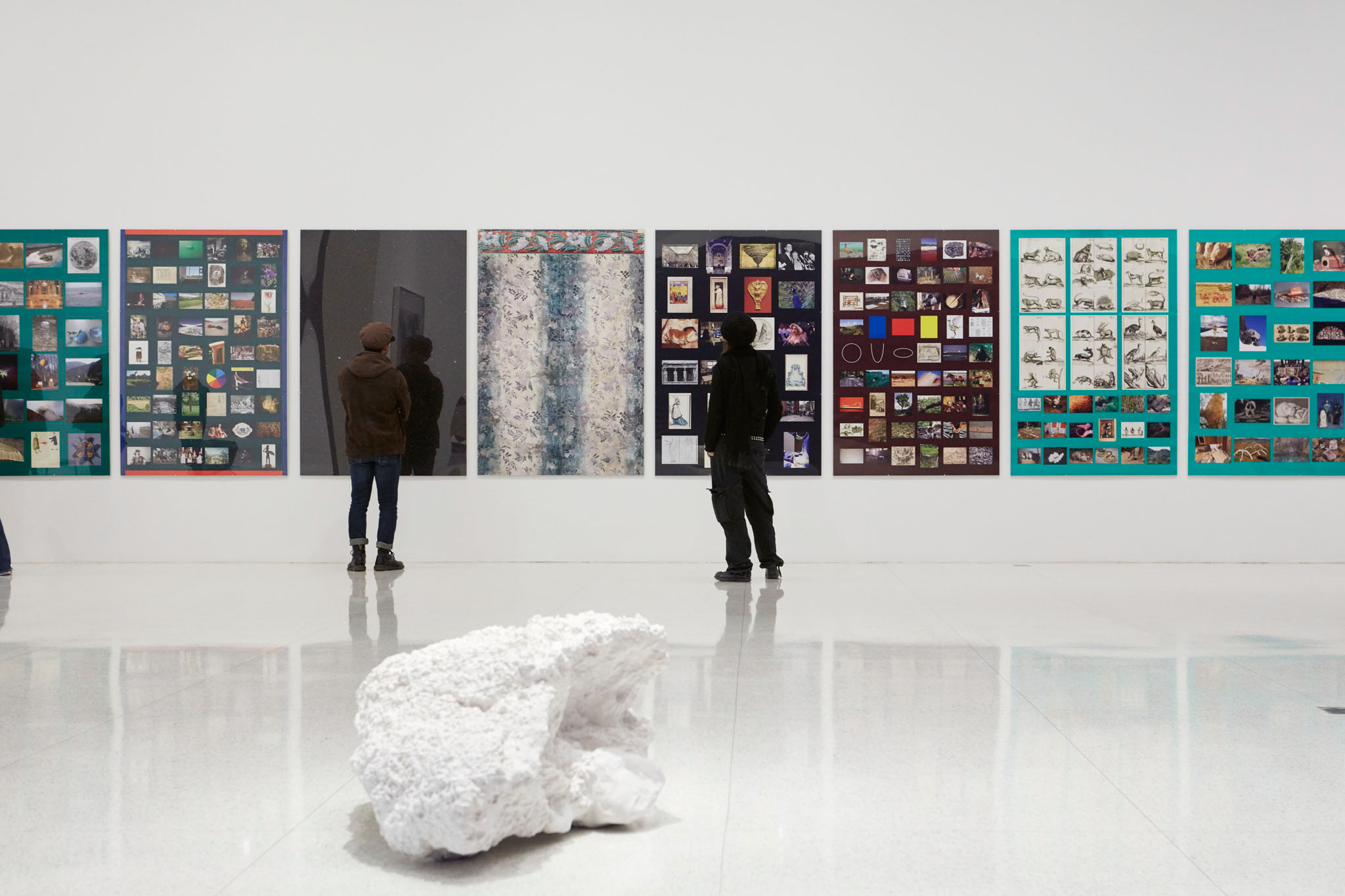
One of the latest exhibitions at Walker Art Center is the first U.S. solo exhibition of the work of German artist Andrea Büttner. Curated by Artistic Director Fionn Meade, the exhibition continues the Walker’s ongoing presentation of solo shows by emerging artists who have not yet had significant museum exposure in the United States.
Büttner’s practice intertwines art-historical concepts with social and political issues, often exploring unexpected connections between art and religion, deviance and ethics, or shame and visual expression.
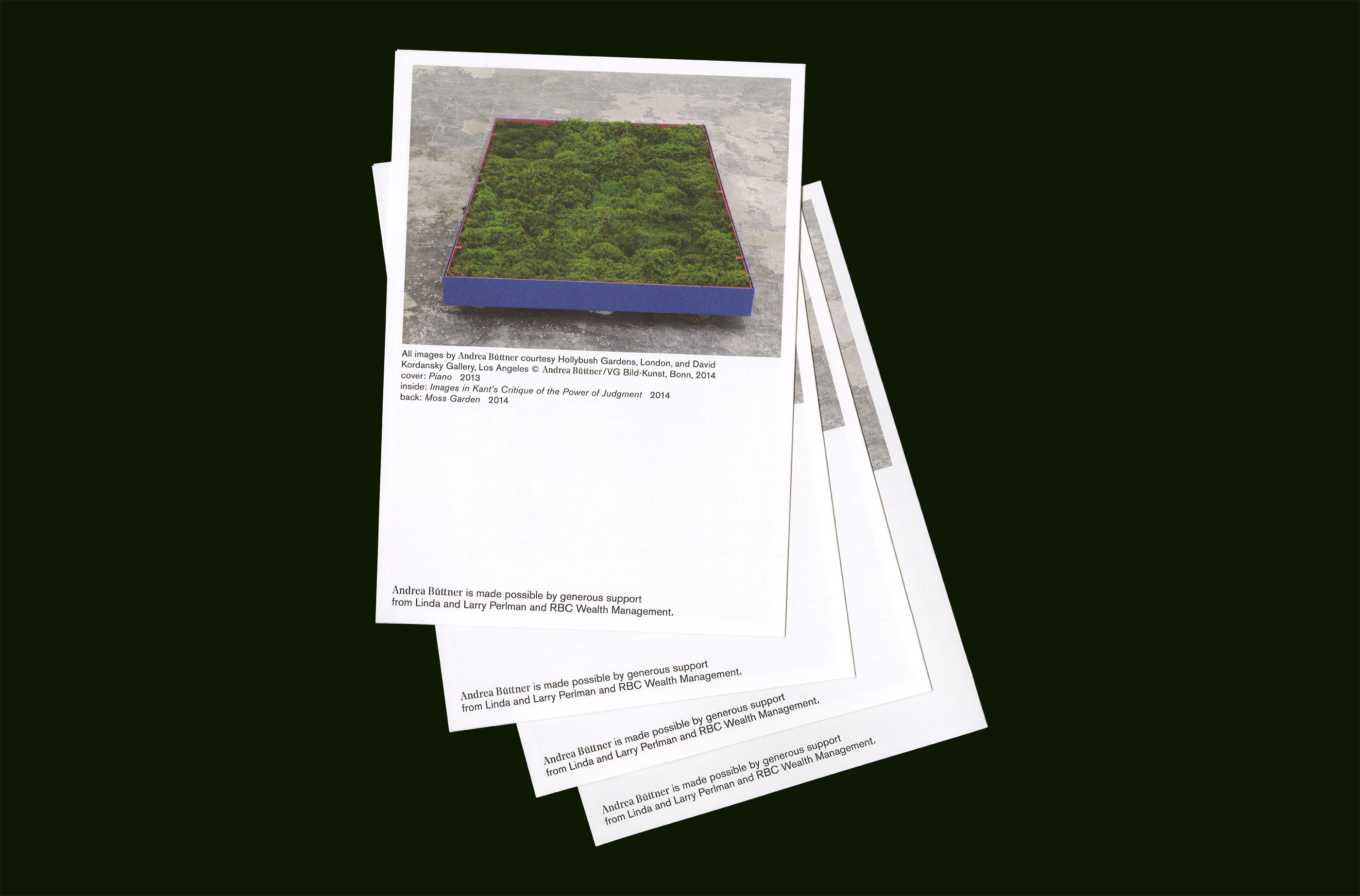
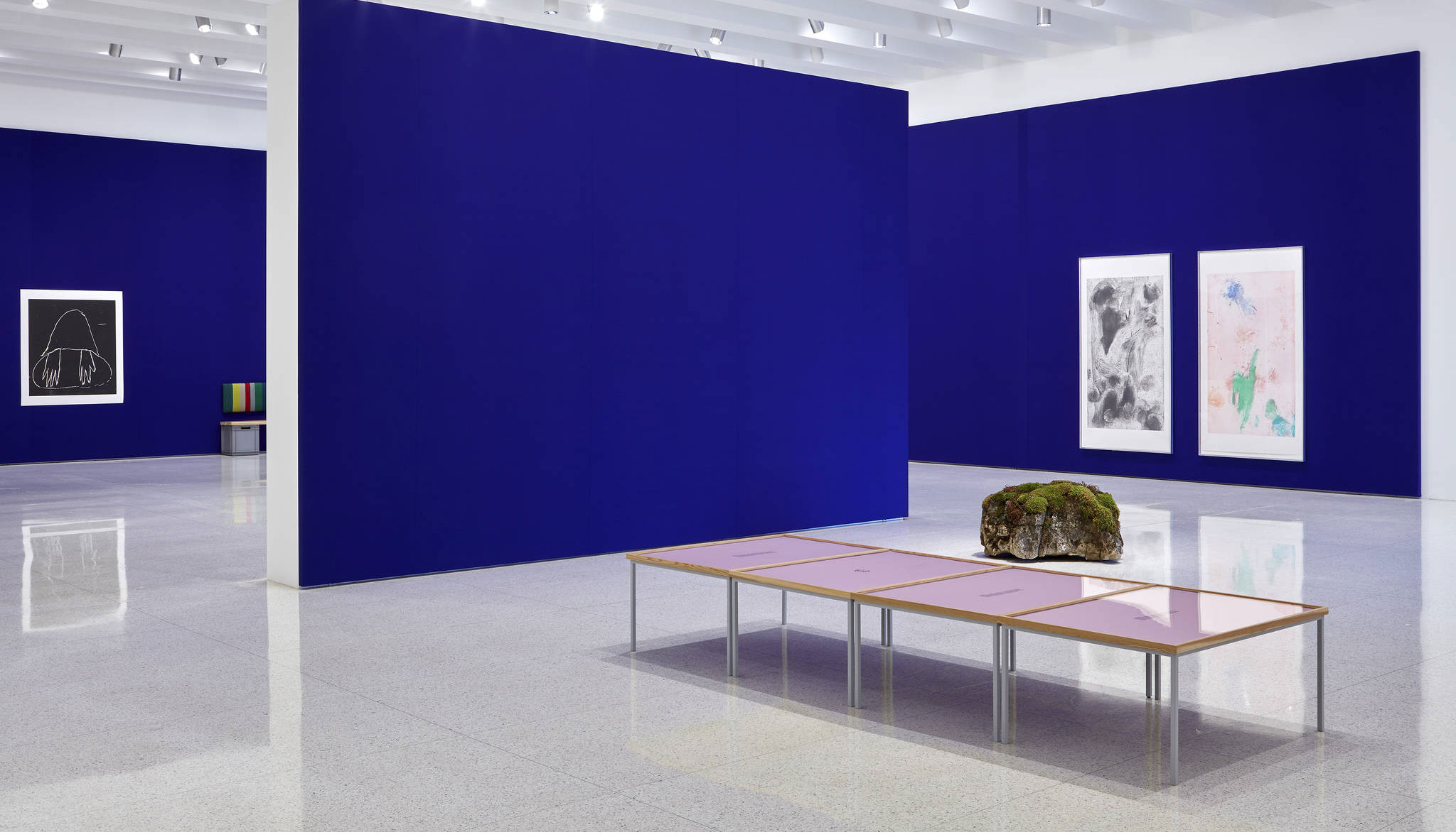
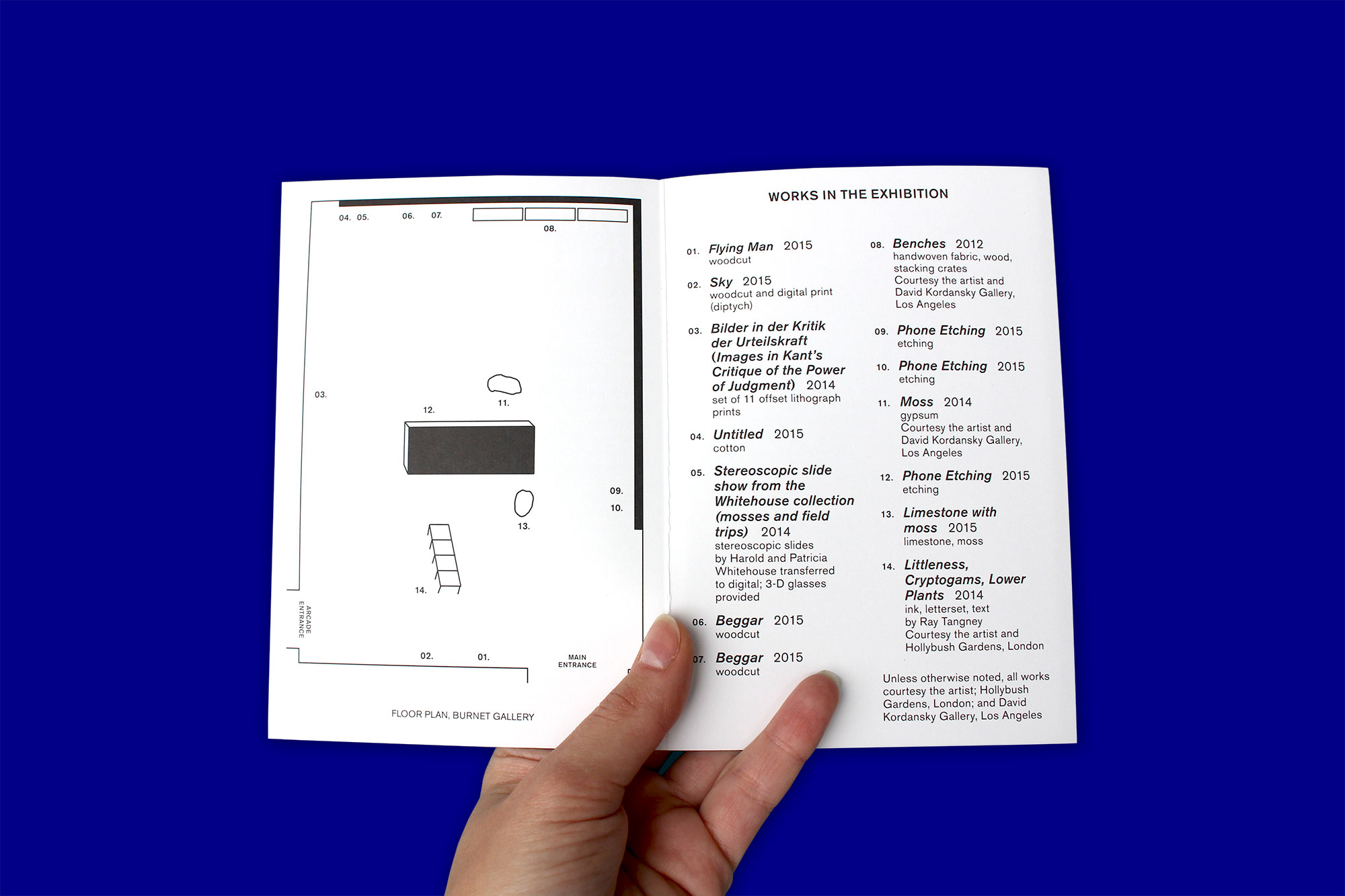
The newly commissioned installation features a range of new works, including a living moss sculpture, large-scale woodcuts, and etchings that capture and transpose the smear and blur of fingerprints left on cell phone screens. Through deploying a wide range of pre-modernist media, Büttner restores outmoded methods in order to provoke and challenge conventions of high and low. She constructs a profound space between ornate and humble, dissociation and humility, and the urge to judge or to remain objective.
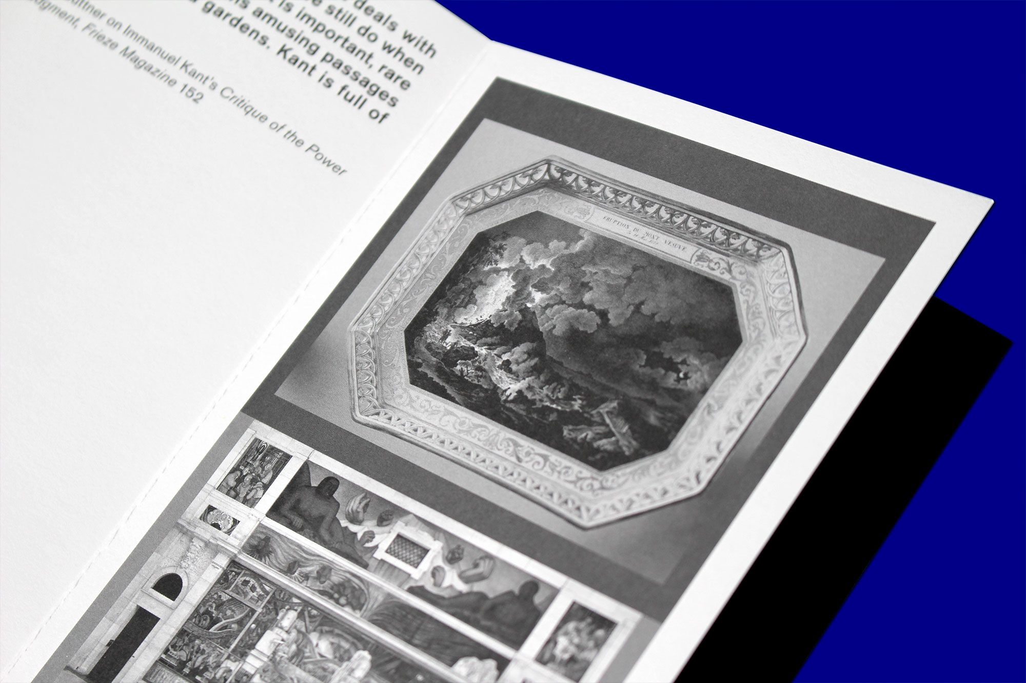
Personally, I was particularly captivated by the complex details in Büttner’s prints and woodcuts (many of which can be seen here). My initial design sketches for the visual identity explored the combination of typography and woodcut patterns and an attempt to use fragments of Büttner’s works and her carved forms/line-work. What I found interesting was the complex markings that were left-behind by the sharp edge of Büttner’s carving tools and which range from hairline markings to triangular, gouge-like markings.
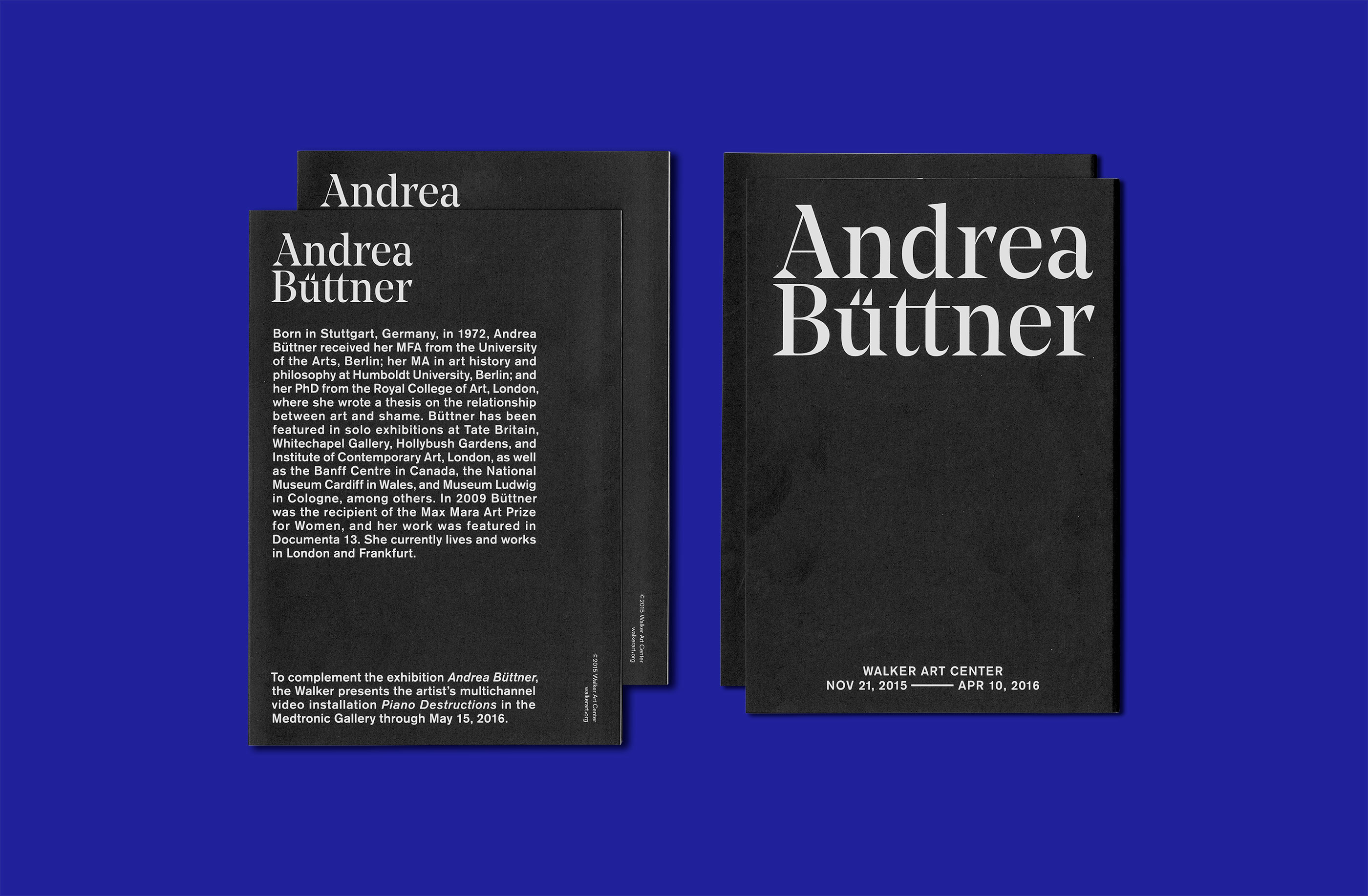
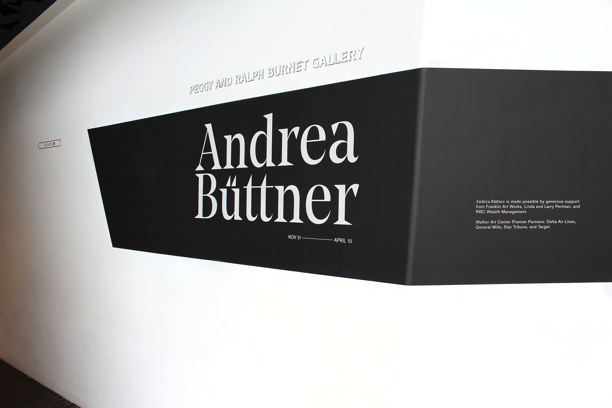
An important step in designing the visual identity was finding an appropriate typeface—ideally a classical, but not boring, serif typeface. The chosen typeface, Noe Display, responds to the pronounced and crafted feeling of Büttner’s work. Designed by the type foundry Schick Toikka, the typeface is a Transitional-style, high-contrast headline typeface. Noe Display’s sharp triangular serifs and terminals give it strong and distinctive characteristics, echoing the similar shapes which occur within Büttner’s etchings and woodcuts.
To emphasize a connection to Büttner’s sharp woodcuts within the typographic treatment, I slightly altered the height and appearance of the umlaut. Rather than keeping the two dots that typically appear within the umlaut, I instead swapped-in two triangle shapes that derived from the top, triangular part of the letter “t” in Noe Display. These triangles also replaced the dot above the letter “i”.
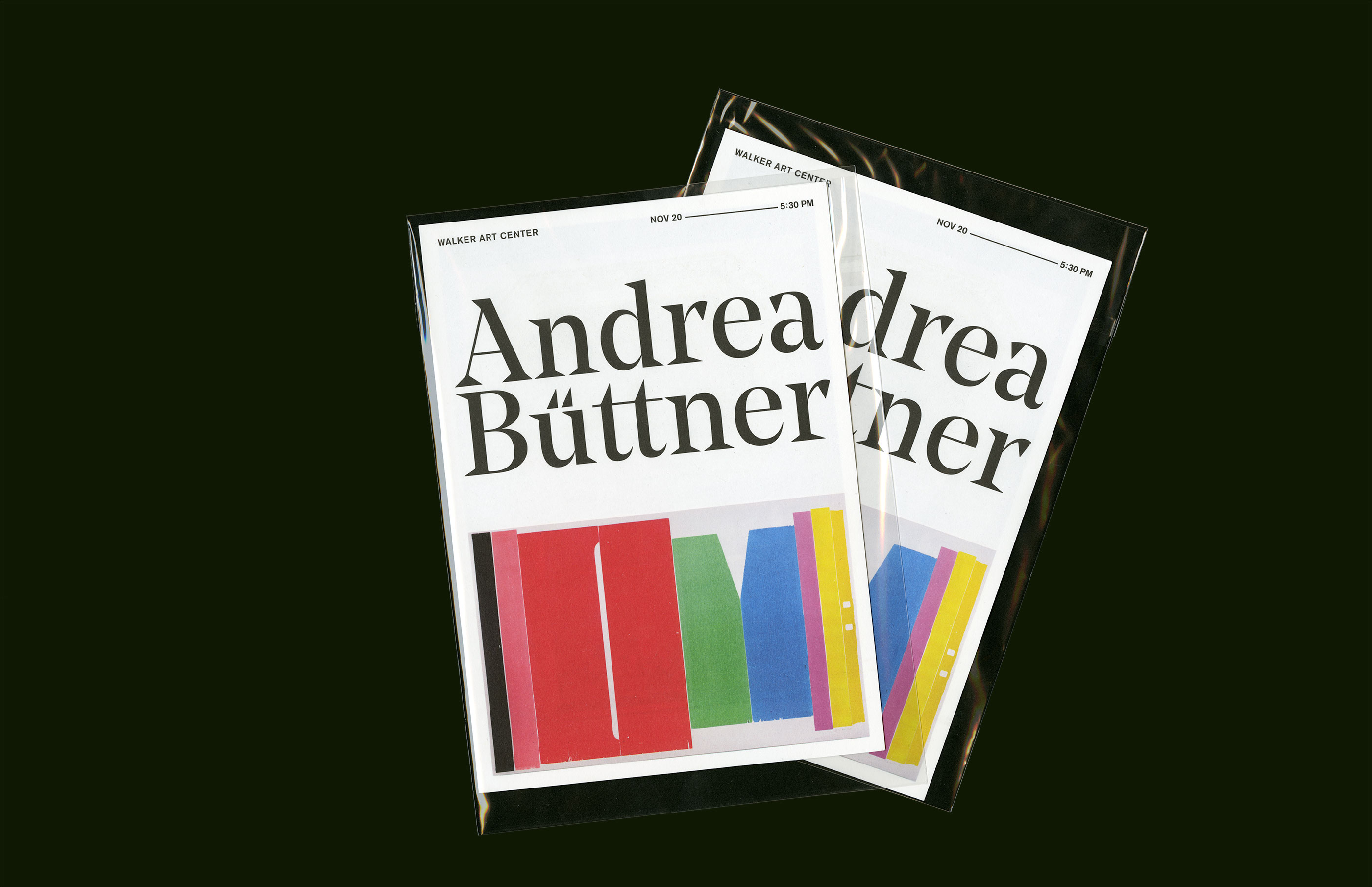
Intrigued by the small details in Büttner’s work, I then decided to respond by creating my own level of typographic detail through a series of customized punctuation marks that would subsequently be embedded within the texts associated with the exhibition. As a base for the punctuation, I used the same Noe Display-derived triangle shape to then create a comma, colon, period, and apostrophe. The resulting punctuation marks, which appear throughout the typeset materials connected to the exhibition, make a small intervention on the space, yet are elements that may go easily unnoticed upon first glance. This subtle intervention was made in order to focus more attention on the detailed and contemplative nature of Andrea Büttner’s work.
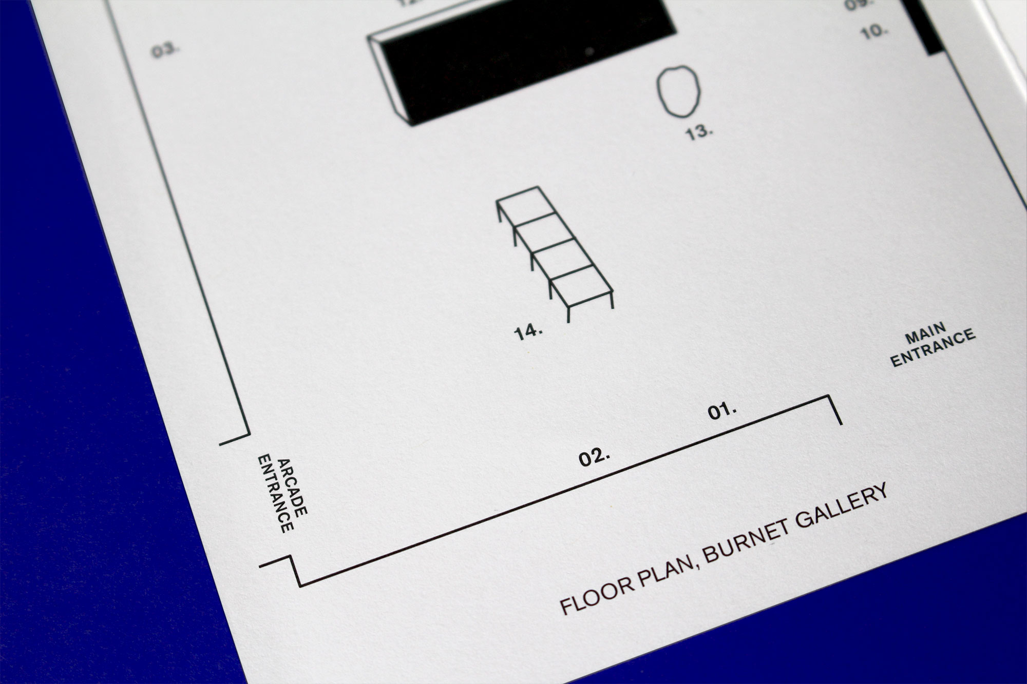
The developed visual identity was applied to various exhibition materials—from the invitation for the exhibition opening, to the gallery guide, to exhibition labels, title walls, and related texts.
Design and photos: Gabriela Baka