When Is an A not an A?: Shannon Ebner and Julia Born on A Public Character
By Ben Schwartz

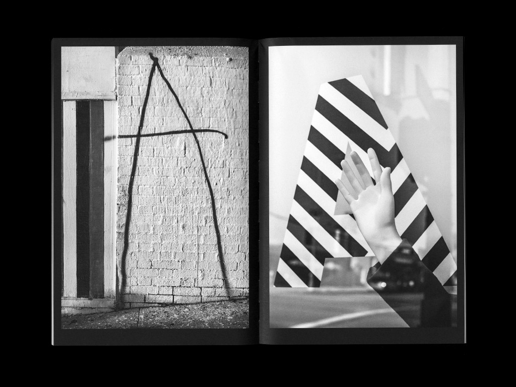
When is an A not an A? A Public Character is a new catalogue designed by Julia Born, documenting Shannon Ebner’s recent exhibition at ICA Miami. In this body of work Ebner extensively explores one of our most rudimentary graphic signifiers, the letter “A,” shifting between media and roles as a definite and indefinite article.
The creation of such a beautiful artifact is of course the result of a successful collaboration, one in which two individuals hold a mutual trust and respect allowing each to bring her respective expertise to the project. With the typographic nature of Shannon’s work, and Julia’s deep involvement with content and concept, I was interested in learning more about their working exchange. In the following interview we discuss the process and collaborative efforts that lead to the creation of A Public Character. A Public Character is available for purchase via Roma Publications.
Spread from A Public Character, 2016
Ben Schwartz (BS)
Julia and Shannon, what was your relationship to each other’s work prior to this collaboration?
Shannon Ebner (SE)
I had a copy of Moyra Davey’s SPEAKER RECEIVER book that Julia designed, and I was really attracted to how the book was handled design wise, specifically how it responded to or was a part of what drove Moyra’s content. But it was Mark Owens who introduced me to Julia’s work when we started working on Auto Body Collision together. I was looking for a recommendation for the ICA catalog and Mark raved about Julia’s work and so when I realized that Julia was in fact the designer for Moyra’s book I got really excited about the prospect of working together.

SPEAKER RECEIVER, 2010

Spread from SPEAKER RECEIVER, 2010

Spread from SPEAKER RECEIVER, 2010
Julia Born (JB)
Shannon’s book The Sun as Error, made in collaboration with Dexter Sinister, is one of my five all-time favorites. I’ve looked at it many times; the work, the editing, the design—all of it becoming one. For some reason it didn’t immediately ring a bell when Shannon first emailed me about a possible collaboration for A Public Character. It was only when I googled her name that I found out it was her, and of course I was thrilled! Both Shannon and I share an interest and fascination by the very elementary cornerstones of language. Her work fascinates many graphic designers because she manages to capture and magically bring together typography, poetry, philosophy, politics, language, and aspects of the vernacular– “Concrete Photography” as Laura Hoptman calls it.

The Sun As Error, 2009

Spread from The Sun As Error, 2009
BS
Before beginning work on the book, what were some early conversations like between the two you? Were there any upfront goals that you both had with this publication?
JB
I had the opportunity to spend two months in LA right at the beginning of our collaboration. This was a nice coincidence as these meetings and conversations at Shannon’s studio allowed for discourse about the book and created an understanding of shared interests. For an entire week I was reading texts she gave me. Through this exchange we got to know each other professionally and personally, which helped in the numerous late night/early morning Skype conversations.
I also insisted to look at all of her work in order to develop an idea of how A Public Character could define its own place in her already impressive “bibliography.” Shannon envisioned “a book with a proper title page and TOC.” She clearly wanted it to be different from her previous, more autonomous artist books, and in the end the extra material that was considered to be added was left out.
When I left LA I didn’t have a file or mockup (I never make one), but I did have a clear idea of the structure, along with ideas and notes, which eventually shaped the book.

Spread from A Public Character, 2016
SE
Yes, we were very lucky that these circumstances happened to line up and we were able to have this exchange for an intensive period of time. I also heard Julia present her work at a public lecture (at the HMCT at ArtCenter) around the same time which was extremely informative. I hadn’t quite understood the Rietveld Academy up until this point, and it was very intriguing hearing about this experience and seeing how it is reflected in Julia’s work as well as others like Stuart [Bailey]. Also having Experimental Jetset come through town at the same time for Printed Matter’s 2016 LA Art Book Fair—those guys gave the keynote last year and published their Statement Counter Statement book, and so the ethos around design (not to lump all of these people together because they are all individuals and quite different) and a way of thinking and making around books and publications can be seen in each. Last winter in Los Angeles I felt very immersed in these ideas.
BS
You mention an awareness to allow for the book to “define its own place” amongst Shannon’s previous books. I’m curious as to how this shaped particular decisions throughout the process.
JB
As mentioned earlier, Shannon felt a need for the book to communicate on a certain level, address the show as a whole, include all works that were in the show, and invite brilliant writers for essays. For every work we were looking for a suitable translation into book form. I don’t think that it differs so much on an aesthetic level from her previous books (I guess they all share a clear, reduced visual language), but it might be the more classical structure of an exhibition catalogue which makes it different from the earlier publications.

Spread from Auto Body Collision, 2015

Spread from Auto Body Collision, 2015
SE
For me it was important that the ICA book not in any way be an artist book, and I was excited for that just because I was coming off of Auto Body Collision and STRIKE and they were both very intense projects. Even though both of those books had essays in them, I approached each as an artist book, which for me means that they themselves are the project, the artwork. I only strictly adhered to that format for The Sun as Error, and in many ways I made a conscience decision with the subsequent two books that I would consider the act of publishing opportunities to commission writing. It felt important for me to do that even though the writing corrupts the purity.

Spread from STRIKE, 2014

Poster included in STRIKE, 2014
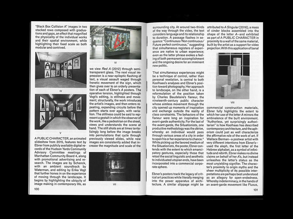
For A Public Character it was a little unclear to me in the beginning. I mean, I knew I wanted the book to be a catalogue proper, but at the same time here was this opportunity to work with Julia and make some discoveries. Also part of the project of the A’s is that they are discursive, they are promiscuous and not beholden to just this or just that. So if anything that was the larger conceptual conversation—do we stick with the “narrative” of the ICA exhibition or do we further complicate reception by also contaminating the book with external projects?—like when the A’s took part in Erika Vogt’s Artist Theater Program at EMPAC in Troy, or when I worked in collaboration with Erika for her Performa commission and incorporated Cornel Windlin’s A’s into the performance at Roulette Theater, or the first time I showed the work under the title A PHOTOGRAPHY. I felt very committed to an unsettling of the work but eventually I decided it made far more sense to let the book act as a catalogue and tell the story of the exhibition and showcase that experience and this other stuff can get funky somewhere else down the line.

Erika Vogt, Artist Theater Program, commissioned by Experimental Media and Performing Arts Center (EMPAC), 2014
BS
Shannon, it makes sense that you wouldn’t consider A Public Character an artist book. Yet it feels different from a straightforward catalogue, perhaps landing somewhere in between. I’m curious as to how the working process may have expanded the book to be more than a direct translation of the show?
SE
It could be that I am incapable of making a standard catalogue, whatever that means! It was my original goal to make a conventional catalogue, but the process of working with Julia was entirely unconventional, and so this changed the DNA of the project right away. Julia’s design decisions are content-driven, so ultimately it was the sum of our discussions that contributed to her ideas—things like the french folds for the A’s to give them some body and also what was important to me was this arc in the show from a public character to a private self and how to translate that from the work to the book. Same for the video, which was both the title of the video and the exhibition, how does that get translated? These questions around translation from idea to book became really central, and I think this is what gives the book a different kind of feeling. I still maintain that it is not an artist book, but it is also maybe a little less straightforward from a catalogue. For me the book is very Dutch; it had a job to do, which is to tell the story of the exhibition, but at the same time it has an engagement with material and the book-making process as an integral extension of the work itself that is totally Julia Born.

Spread from A Public Character, 2016
BS
Julia, I’m curious about Shannon’s description of the book as seeming “very Dutch.” I’d love for you to expand on this notion as to what that may mean to you?
JB
I appreciate Shannon’s reference to the books “Dutchness.” I like how she describes, compares, and distinguishes the multiple approaches in designer’s work, who have been more or less influenced and shaped by Dutch culture and education. Having lived there for 16 years myself, it is definitely a huge influence. Even though the work of the designers she refers to are quite different from one another, there is a certain mentality which we all share.
BS
Julia, I’d like to hear more about the working process. As you mentioned, in the beginning you were fortunate to be able to spend time together which really shaped the ideas for the book. However, moving forward you were working in two different countries in two very different time zones. What was the actual working exchange like with Shannon? How often were you in touch, and what was the feedback like?
JB
I usually take quite a lot of time to make a book, as I am involved with every step of the process. This book was made in close collaboration with Shannon, despite the location and time differentiations of both our practices. It was important that the decision making on an editorial level happen together, so we did a few late night Skype sessions along with many emails.
Not every artist is willing to be that involved in each step of the process; but it seemed to reflect Shannon’s thorough and committed way of dealing with things. She has a talent to tackle the right questions at stake. I involved her in questions that I typically wouldn’t involve anyone in because I knew I was going to get an interesting answer. Many things we would agree on, and other things we debated about. I am guessing this is why she wanted someone else to design her book.
BS
I’d assume there was quite a bit of dialogue around the way work was shown. I especially enjoy moments such as the close crops of A SINGULAR, the fragmented A SELF, and the decision to do a french fold for Black Box Collision A. Shannon, what sort of conversations lead to these decisions?
SE
It had to do with graphic interpretations. I think we both share a dislike for showcasing installation images, and as a result we really worked hard to find a way to represent the sculpture A SINGULAR and the A SELF silkscreen print. In both cases it was a bit of an experiment for me to see what happens when something (in the case of the sculpture) goes from an immaterial font to a three-dimensional, material object back to a flat graphic representation of a drawing reducing the elements to their most basic form, the unit. Same for the silkscreen print, how to let that read like a poem that closes out the exhibition and also as an exit for the book—but also that piece is tricky because it came out of the Auto Body Collision, and the print is very much a collaboration with Mark Owens, so to put it back into book form again is its own riddle. Maybe now would be a good time to say that the letter A can be both a definite and indefinite article which for me speaks to doubt, that an A can be an A and not an A or definite and indefinite depending on the task at hand—something about the space this opens up linguistically acts as a catalyst for how the book and representing the work was approached.

A SINGULAR as shown in A Public Character, 2016

A SELF as shown in A Public Character, 2016
BS
Julia, as so much of Shannon’s work is very typographic. I’d love to hear about the decision to use the typeface Mercator throughout the book. To my understanding it’s a typeface that isn’t available commercially, and it has been used quite sparingly.
JB
For quite some time I could not decide whether it should be a serif or sans serif typeface. I eventually realized it needed some pragmatism, something a bit down-to-earth, as every serif typeface I tested looked somewhat detached from the content. There was as well the fact that Shannon herself uses Helvetica in A Public Character in a beautifully brute, raw manner. If I were to use that typeface throughout the book, the borders between work and written content would have dissolved—which could have been an interesting path as well but didn’t seem appropriate in this context. I decided to “color” the typeface for all editorial content just a bit differently, if only subtly.
Mercator in use, A Public Character 2016
I encountered Mercator in my years in the Netherlands many times, mostly in letterpress form (the workshop at Rietveld Academie used to have an almost complete set). It was designed by Dick Dooijes who happened to be a former director of my school, and digitized by Laurenz Brunner 10 years ago, though not commercially distributed. Some Dutch children’s books teaching the alphabet use Mercator in a very pure and elementary way. This association with the basics of language seemed quite fitting within the context of Shannon’s work.

Dick Bruna, Mercis Publishing bv. License: All Rights Reserved.
BS
I’d like to talk about the book as an object. With the large silver foil stamp and the french fold, the book has a remarkably polished feel to it. The production details add a beautiful sense of contrast to the raw photography, concrete sculptures, and even the tone of some writing. Was this sense of contrast a conscious decision or more of a natural outgrowth of the working process?
JB
I think we both share a deep antipathy towards books that are overdone. It’s a thin line, and we had more than one discussion about whether or not we are pushing it too far. All the elements that we kept, in my opinion, justify their existence as they are linked to some conceptual considerations. The silver foil was an idea prompted by Shannon, as she was considering printing on mirror paper when preparing for the exhibition. At one point she was talking about using reflective material on the cover in which the reader could see him or herself, “from a public character to a private self…” an idea which I really liked. That plus the fact that Luis Zukovsky’s “A” somehow becomes immaterial because the reflection cancels out all material states.
BS
What was the production and printing process like for the book? Were there any difficulties you had to work through?
JB
The book might look more complicated in terms of production process than it actually was. The only unexpected challenge we experienced was the binding. For most of the black and white images we used a “skeleton black,” which is a technique often applied when printing on uncoated paper. The double hit of black adds extra depth and clarity to Shannon’s images, which I think solidifies their rawness and minimalism. For the foil stamping on the cover I referenced the effect that emerged when we re-photographed the video for the book (long-exposure). I liked how through repetition (an essential element in the video) of the same text, the middle part cancels itself out. This is also a nod to the definite/indefinite topic which is central to the work.

Spread from A Public Character, 2016
The only thing that gave us, but mostly the brilliant bookbinder at DZA, a headache was the binding because of the way the french fold pages closed on top. I insisted on printing the A’s each on their own sheet so they feel solid when flipping through the book because of the physical nature of how Shannon defines the “A.” The so called “otabind” binding which we intended at first could not be realized, so the binder suggested this really clever open back, hidden in the dust cover, so the book would still lay flat. This is just one of many examples where bookbinders and printers have contributed precious knowledge and ideas that have shaped the outcome of my books.
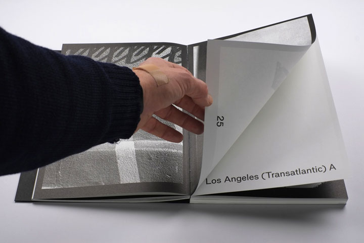
French folds in A Public Character, 2016. Image courtesy Roma Publications
BS
Shannon, you’ve collaborated with several incredible designers including Dexter Sinister, Mark Owens, and Lauren Mackler. The two of you working together immediately excited me, and the result is stunning. How was this collaboration similar or different than your past experiences?
SE
I have been very fortunate for the people I have worked with and each time I am very humbled by the process and learn a great deal from them. I would be hard pressed to try and parse out the experiences because each one is so very unique. But what I can say is that what I really came to understand through this process is that Julia is a bookmaker through and through and she is engaged in the material form of the book in a very deep way that I totally admire.

Spread from The Sun As Error, 2009
BS
To wrap things up, at the Walker we’re preparing for our upcoming Merce Cunningham show, Common Time, which deals significantly with his collaborations throughout his life. Thus, collaboration has been a big topic of conversation. What do each of you feel makes a successful collaboration?
JB
My entire job is all about collaboration and dialogue. Every assignment, every project I make is developed in conversation with other people, be it artists, institutions, curators, printers, binders, etc. Books perhaps illustrate this collaborative effort in an extreme way, as there are so many parties involved throughout the process. Within this process I see myself as the “guide,” bringing together and coordinating all this expertise. Now and then I need to make decisions, but mostly I am making sure that everything is on the right track.
Merce Cunningham is a truly inspiring example of interdisciplinary collaborations. He was expanding his own field by working together with figures like John Cage or Rei Kawakubo—looking for other visions to expand his own. Together they redefined the boundaries of their individual practices, which is the result of a truly fruitful and successful collaboration. The people that I have closely collaborated with all share a willingness and curiosity to do exactly that, which is why each of these collaborations are truly unique and not comparable.
Working with Shannon once again proved my theory that (at least some) artists are the best designers, but thankfully they still need us to do certain things…

On a coach from Paris to Hamburg for the shooting of Cunningham’s Ballet Variations V, Merce Cunningham, movie maker Klaus Wildenham, John Cage, 1966.

Rei Kawakubo, Merce Cunningham, and company members during costume fitting at Westbath studio, New York City, 1997
SE
For me it’s about a willingness to exchange ideas and be in dialogue about the process of making something together. It’s this togetherness but also belief, belief that the end result is not simply a product but is a result of shared time and so the collaboration becomes material evidence of this shared time and the immaterial conversations that were exchanged within this space get put into a form, in the case of many of my collaborations that form is the book. This question reminded me of something that Will Holder made when working on a project with Stuart and David [Reinfurt] called A Monument of Cooperation. It’s an actual crayon rubbing of a monument on the lower east side. I don’t know too much more about it but it does seem fitting to me that the basis of a good collaboration is like a monument to cooperation. ◼

Brass rubbing of a monument to cooperation found on the grounds of Seward Park Housing Corporation (corner of Montgomery and Grand Streets on the lower east side of Manhattan), Will Holder, 2007