On September 1, 2009 the new ArtsConnectEd became available at ArtsConnectEd.org. The new site provides access to more than 100,000 museum resources, including audio, video, images, and information about works of art, all of which can be saved and presented with the more powerful Art Collector.
This project was at least three years in the making, with the last two of those being the technical work of research, design, and development. In this series of posts I’d like to present some of the decisions we struggled with and the process we went through in developing the new site. I’ll start with the Art Finder, followed by a post on the Art Collector and presentations, and finish with a post about some of the more technical aspects including the data and harvesting technologies we’re using.
Art Finder
The Art Finder is the guts of the site, a portal into our thousands and thousands of objects, text records, and more. I don’t think it’s an exaggeration to say designing and building this component was the biggest challenge we faced in the entire process. We’ve redesigned the interface many times, often significantly, and are still not certain it’s right. We’ve changed the underlying technology from a SQL / Lucene hybrid to a straight-up Solr search engine. We’ve debated (endlessly) what fields to include, and what subset of our data to present in those fields. We’ve gone back and forth over tab titles, and even whether to use tabs. A rocky road, to say the least.
The big idea
What if we could start with everything and narrow it down from there? Offer the user the entire collection and let them whittle away at it until they found what they wanted?
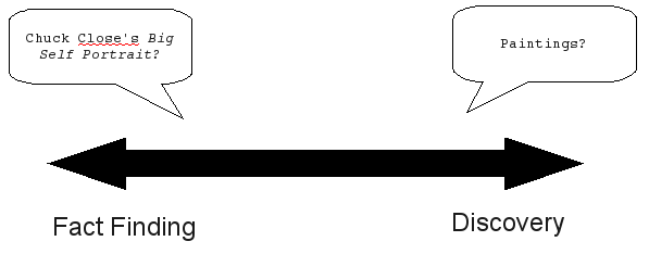
It’s all browse. Keyword is just another filter.
To me this is the big breakthrough of the ArtsConnectEd interface. We don’t hide the content behind a search box, or only show filters after you try a keyword. We don’t have a separate page for “Advanced Search”, but we offer the same power through filters. There is still a keyword field for those who know exactly what they’re looking for, but we get to use our metadata in a more powerful way than simple text. That is, since know the difference between the word “painting” appearing in the description and something that is a painting, we can present that to the user through filters.
How we Got here
 We wanted many ways for the user to explore the collection, with the idea we might hopefully mimic some of the serendipity of exploring a gallery. The tech committee felt early on that we’d need, in addition to a robust search, some way to freely browse. Our initial attempt was to split the Art Finder into a Browse interface (left) and a Search interface (right).
After forcing users to choose a content type to browse (Object, Text, etc), we exposed facets (fields) to allow filtering, e.g. by Medium or Style. These facets were hidden by default in the Search interface, where instead you started with a keyword and content type as tabs — but could then click to reveal the same browse filters! The more we played with these two ideas, the more we realized they were essentially the same thing, the only difference being a confusing first step and then having to learn two interfaces. The real power of the site was in combining them, committing fully to Browse, and adding the keyword search as a filter.
Lastly, as we harvested more of our collections we realized pushing filters to the front offered a better way to drill down when many of our records are not text-heavy and thus less findable via keyword search. In many ways browse leveled the playing field of our objects between those with healthy wall labels and those with more sparse metadata.
What works
(In my humble opinion!) A good browse has to do a few things:
- Be fast. Studies have shown that slow search (or browse) results derail a user’s chain of thought and makes it difficult to complete tasks. We went one step further and did away with the “Go” button for everything but keyword – making a change to a pulldown automatically updates your result set. (It’s not instant, but it’s fast enough the action feels connected to the results)
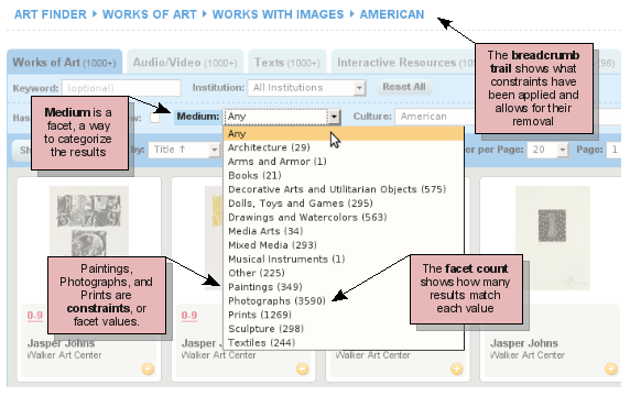
- Reduce complex fields to an intuitive subset. We have a huge range of unique strings for the Medium field, but we’ve broadly grouped them to present a reasonable-sized pulldown. Likewise for the Culture pulldown. (We manually reduce the terms for Medium, and have a automated Bayesian filter for the Culture field)
- Have good breadcrumbs. Users need to know what options are in effect and be able to backtrack easily.
- Avoid dead ends. With many interfaces it’s entirely too easy to browse yourself into an empty set. By showing numbers next to our filter choices, we can help users avoid these “dead ends”.
- Expose variety. Type “Jasper Johns” in the artist field, and check out the Medium pulldown: it shows the bulk of his work is in Prints, but we also have a few sculptures, some mixed media, etc. A nice way to see the variety of an artist’s work at-a-glance.
- Autocomplete complicated fields. If a search box is targeted to a field (like our Artist box), it needs to autocomplete. Leaving a field like this open to free text is asking for frustration as people get 0 results for “Claes Oldenberg“. (Auto-suggest “did you mean” should also work!)
- Have lots of sort options. One of my favorite features of the new Art Finder is the ability to sort by size. Super cool. (check out the Scale tab in the detail view for more fun!)
I’m biased after this project, but I’m fairly convinced combining faceted browsing with keyword search is absolutely the way to go for collection search. It gives the best of both worlds, powerful but still intuitive.
What could be better
… but is it really intuitive? People seem to still be looking for a big inviting search box to start with. The interface is crowded, and the number of options looks intimidating. We’ve ended up avoiding using the words “Search” and “Browse” because they were loaded and causing confusion. We’ve tried many versions of the tab bar to try to clarify what filters apply globally (e.g. Institution) and which only effect that tab (Works of Art have an Artist, for instance), but I don’t believe we’ve solved it.
I think the two components of the interface that give us the most trouble and confusion are actually the “Has Image” checkbox and the “Reset All” button. These are consistently missed by people in testing, and we have tried almost everything we can think of. Oh, and the back button. The back button is “broken” in dynamic search like this.
Also, while I really like the look of the tiles in the results panel, we’ve had to heavily overload the rollover data to show fields we can sort by since there’s no more room in the tiles. We also intended to create alternative result formats, such as text bars, etc, which could show highlights on matching keywords, but this item was pushed back for other features.
We’ve defaulted to sorting alphabetically by title when a user first reaches the page, and I’m no longer sure this is best. As we’ve populated the collections in ArtsConnectEd we’ve ended up with a bunch of works that have numbers for titles, make the alpha sort less obvious.
You tell me! Give the site a spin and post a comment – what works, and what could be better?
Resources:
- Designing for Faceted Search (http://www.uie.com/articles/faceted_search/)
- Faceted Search: Designing Your Content, Navigation, and User Interface (http://www.uie.com/events/virtual_seminars/facets/FacetedSearchVS35Handout.pdf)
- Faceted Search (http://en.wikipedia.org/wiki/Faceted_search)
- Best Practices for Designing Faceted Search Filters (http://www.uxmatters.com/mt/archives/2009/09/best-practices-for-designing-faceted-search-filters.php)
- V&A Collections (beta) (http://www.vam.ac.uk/cis-online/search/?q=blue&commit=Search&category%5B%5D=5&narrow=1&offset=0&slug=0)
- Their facets aren’t as up front as I’d like (you have to start with a keyword), but they’re done really well once they show up.
- You can also cheat and leave keyword blank to get a full browse and go right to the facets… Maybe start here?
- MOMA Collections (http://www.moma.org/collection/search.php)
- Nice presentation of facets, but I wish two things: show me a number next to all constraints, not just artists, and let me add a keyword. (I got a dead end looking for on-view film from the 20s or 2000s) I also like that it’s a true browse – leaving everything at “All” seems to give me the whole collection.
Get Walker Reader in your inbox. Sign up to receive first word about our original videos, commissioned essays, curatorial perspectives, and artist interviews.