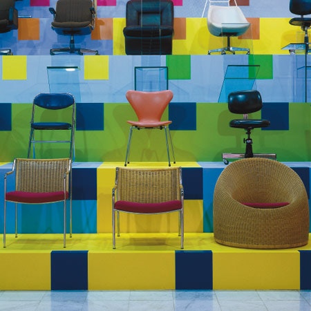
Chairs
What constitutes a "comfortable" seat, and for whom is seating designed? Designer and author David Gissen sits down with Natalie Kane, Curator of Digital Design at the V&A, and Michael K Chen, architect and principal at MKCA, to explore the pitfalls and possibilities of one of design's most classic objects.
The Problem of Seat Design
David Gissen
Natalie, can you please tell us why you wanted to talk about chairs and seating?
Natalie Kane
It has increasingly become the thing, both personally and professionally, that I look out for most in my environment and in public and private spaces. Chairs provide me with respite and the ability to regulate myself physically and mentally. I’m always bothering my partner and whoever I’m with by instantly critiquing chairs—their quality and the complete lack and absence of them. I’ve become personally invested in their presence. I guess that’s the best way I can describe it.
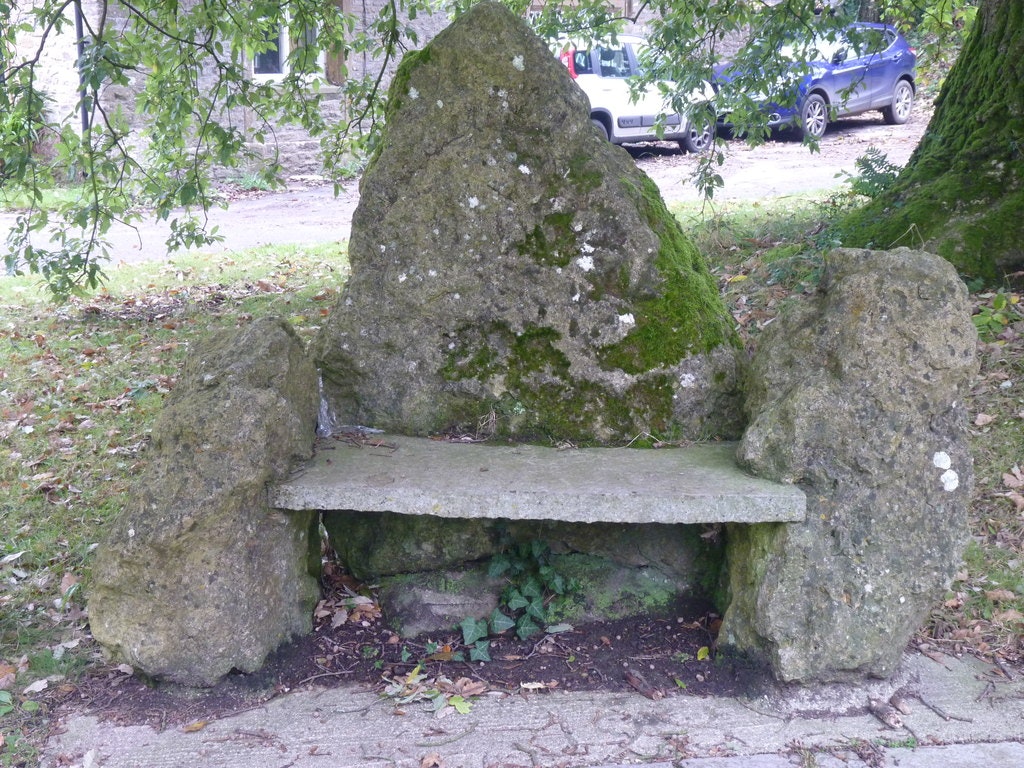
As someone who works in a museum, benches are such important public spaces. People don’t just come there for the art. They don’t come there just to see art or design, for that matter. People come to a museum to sit and relax. Museum seating is a big part of how I’ve come to understand museums generally. So when you come to design museum exhibitions, you suddenly become obsessed with how seating should be organized. If someone enters an exhibition and they can’t see any seating, or if they’ve been asked to stand for too long, you start to feel it viscerally, especially if you’re a disabled person. Even on the street, it’s important. I became obsessed recently when my street got a new bench—that’s the level at which I think about seating. That’s the long answer of why I was interested to talk to you about that today, and also because we talk about this a lot as friends and as peers.
DG
You mentioned that you’re often critical and have a lot of opinions about seating. What is the worst seating you’ve ever seen?
NK
Oh yeah. It sounds obvious to say this, but the worst seats are those that automatically exclude people or define the kind of person who’s supposed to sit on it, negatively. I’m sure many people have heard the term “hostile architecture” before. This is architecture or urban design which dictates a certain type of facility; for instance, benches that have armrests so you can’t lie down, you can’t sleep. There’s a particular type of bench that was once quite popular—the Camden bench—which was placed in London, which was a concrete bench where you could never lean or sit comfortably, you could [only] perch on it for a bit. It doesn’t really function well as a seat. It’s like a very overblown sculpture that was used for a time by Camden Council in the UK.
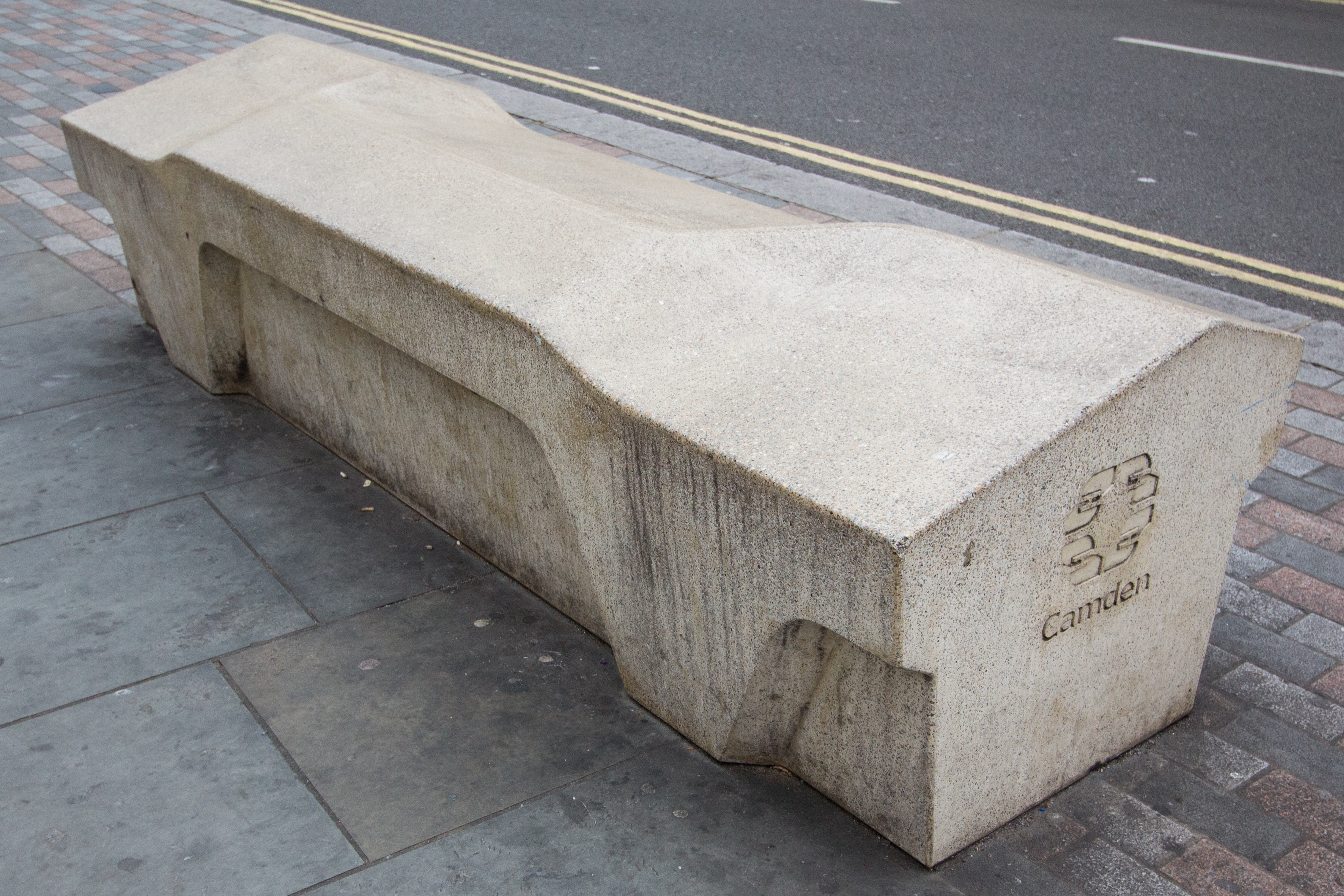
There were some really interesting design responses by students and activists to put a molded mattress over the front of it. Another problem are seats that have no backs, or don’t have an armrest, so you can’t transfer into and out of a wheelchair. I’ve become critical of things, both from my own perspective, and from people talking to me about their perspectives on seating: Why would someone design something like that?
DG
Michael, you actually designed an entire seating system, which is beautiful. And I was wondering if you could both talk about that, and as a counterpoint to what Natalie just mentioned, if you could also talk about some of the research that went into its design. I recall that, years ago, the design critic Mark Lamster once asked why architects still design seats. “Hasn’t the seat been solved?” he said.
Michael Chen
Not yet, right? It has been solved a million different ways, and yet chairs by architects are a little bit like regional pasta in Italy: if you travel five kilometers left or right, there’s another noodle with a twist in it. And you say, “Oh, I just had this noodle,” and the locals are like, “No, no, this is completely different.”
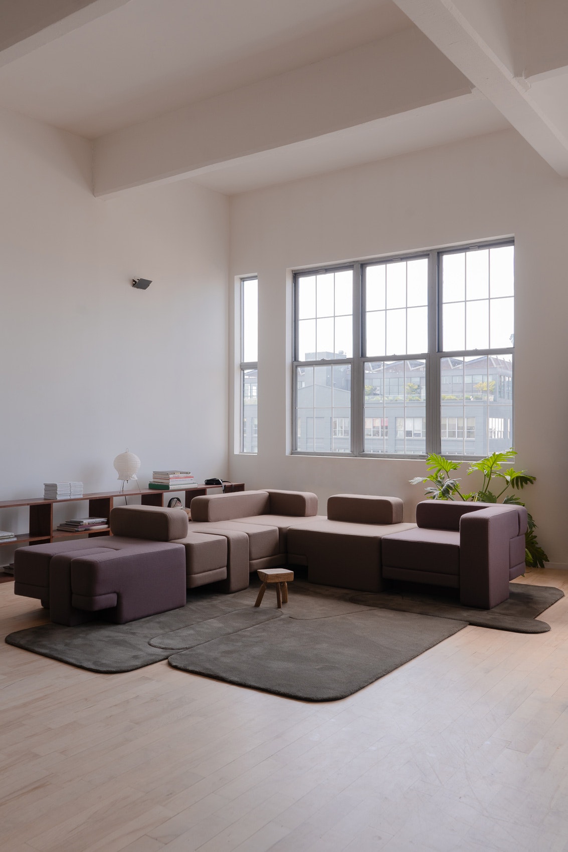
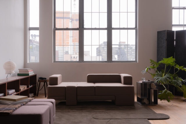
We are fascinated with furniture. I’m an architect. Everyone in the studio here—there are 10 of us—is trained as an architect, but we work somewhat fluidly across architecture, interiors, and product design. We were commissioned by TRNK to design an upholstered seating system; it’s a micro ecosystem of seats and carpets that go together. The name of the collection is Sarsen, which is an Old English term for limestone megaliths that become building blocks. So that tells you a little bit about the spirit of the collection.
The system is built around a daybed, rather than a sofa, because we wanted immense flexibility. The seats don’t themselves change, but they have backs, and then sections without backs, and they’re somewhat omnidirectional. It’s a seating system that was designed to occupy the edges of the room, like a conventional piece of furniture, as well as the middle of the room. You can face in, you can face out, and then they are calibrated at two distinct heights: a standard seating height—about 16 inches—and a low back and arm that’s continuous at 24 inches that you can perch on. The idea was that it accommodates many different body positions and lends itself to placement that is flexible spatially as well.
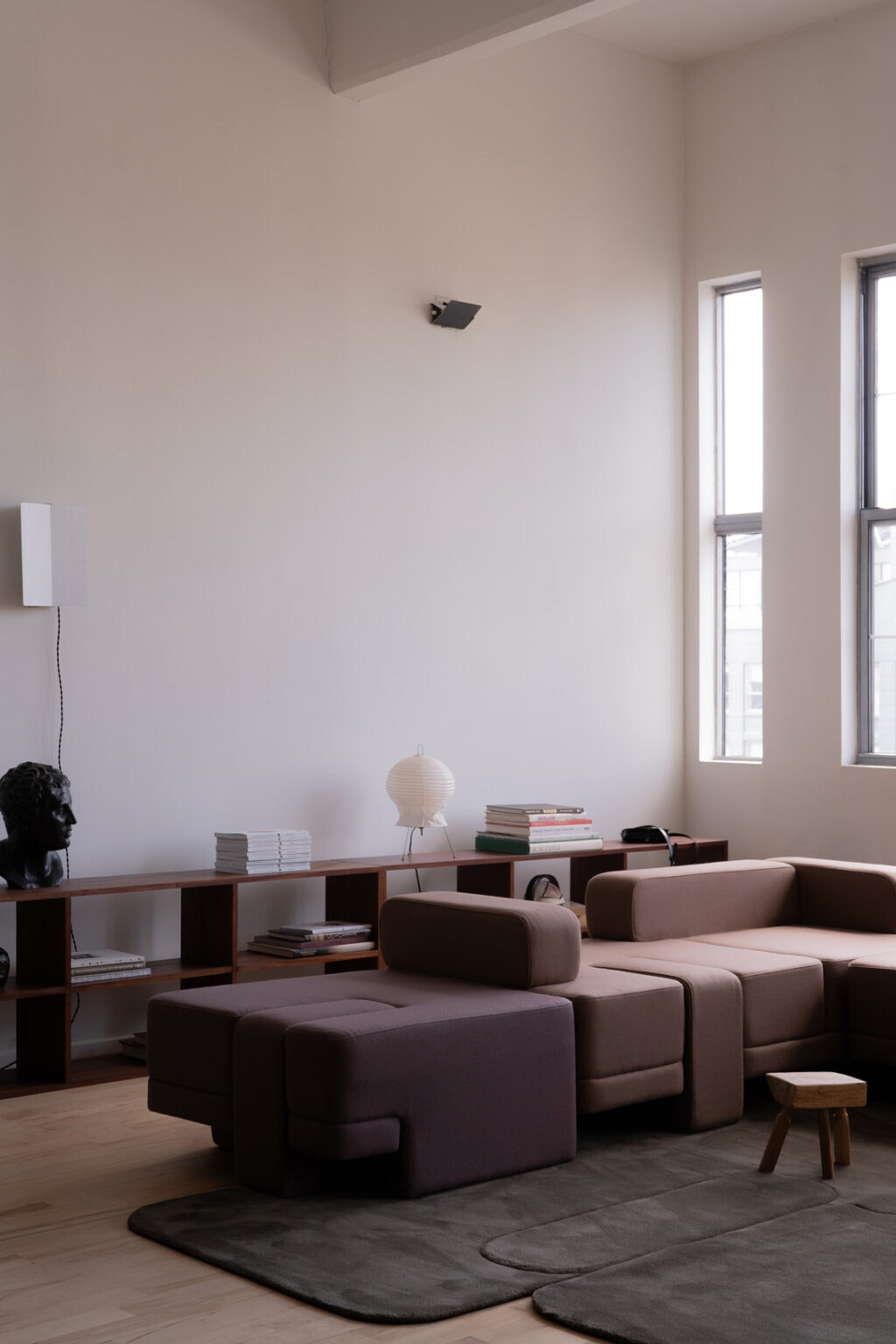
We think about furniture as objects. And because we are architects, we also think about furnishings in terms of their spatial and social potential. We’re very, very interested in the relationships between elements—maybe more so than the elements themselves, or at least in equal measure. The carpets are very similar in spirit. They have a similar geometry, with these notches and extensions. They were purposefully designed to not define a single space, but to fit in-between things.
DG
How did you and your team research the seating? Did you make mockups and try them out? Did you study positions of the body? Did you look at historic pieces of furniture that inspired you? I understand the process behind the design of a building or an interior for a client, but I don’t understand the process behind realizing a commercial piece of furniture that will be used more broadly.
MC
It’s all the above. There’s the question of ergonomics, and there are conventional rules of thumb that predominate in furniture design in terms of ergonomics. Our system is organized around an eight-inch module. We wanted the seat to be not so low that you fall back into it and struggle to get out of it, and not so high that it felt too upright; there is a sweet spot of about 16 inches in height. As mentioned, we wanted a social dimension for the pieces, and for them to accommodate somebody at rest momentarily, as well as someone seated for a long time. I really love the proportion of a daybed because it is not so deep that that you can’t sit down comfortably. But it also allows you to lie down and lean back. These set the dimensional and ergonomic parameters.
There is a precedent project, a sofa system designed by Vladimir Kagan called the Omnibus, that I personally love. Omnibus is much more radical than the collection we designed, because it’s tiered, so it has multiple heights. Ours is much more conventionally recognizable as a sofa. But I love that collection so much, and it plays very deliberately with mass and lightness, which is really appealing in the language of upholstery.
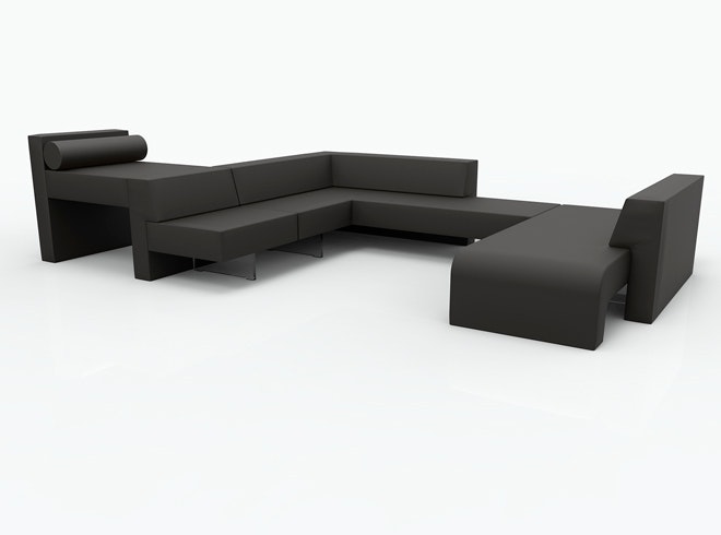
Our design has a very heavy, almost sort of elephantine foot. And there is another dimension to it, a through-tenon leg; the leg comes through the seat. It’s fully upholstered on all sides and becomes part of the cushion. The seat is not this long undifferentiated plane of textile. It’s carved up into zones that are intended to loosely demarcate where a person can sit, but it also allows the end of the sofa to be cantilevered, so it’s grounded and lifted at the same time. We intended to give the pieces no singular front or side or back in terms of how you perceive it, and with other modules this produces extensions and pinwheels and conversation pits and that sort of thing.
DG
Natalie, maybe we could end this section by describing a seat you admire?
NK
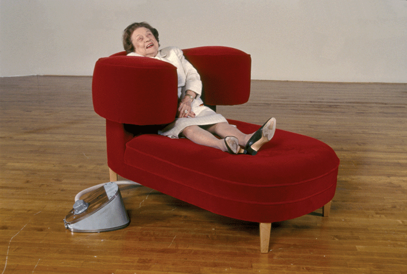
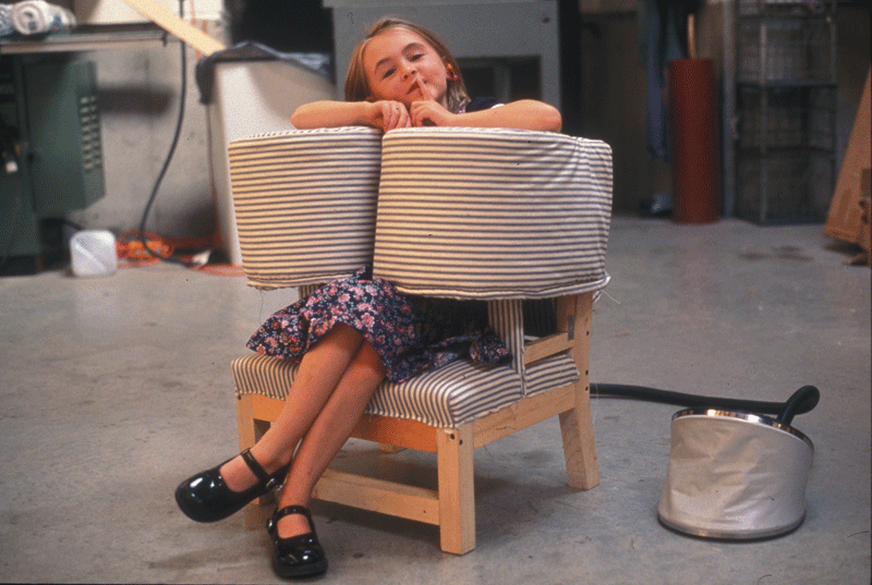
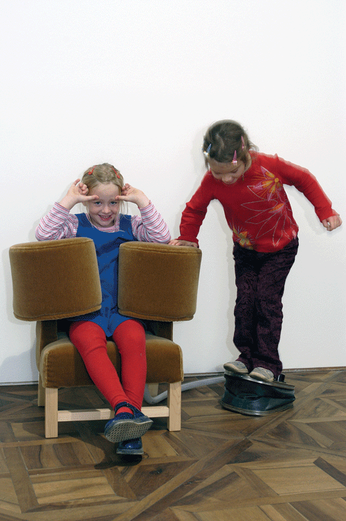
One of my favorite chairs is Wendy Jacob’s squeeze chaise longue, which she created in collaboration with Temple Grandin. It is a red mohair chaise lounge based on a Victorian design. It’s very luxurious, with a squeeze box that engages your body. It capitalizes on the idea that you can sit and relax and recline in this very pleasurable object, while also getting sensory reconfiguration and recalibration. It is a really gorgeous object that’s not meant to be in industrial production. The squeeze chair has the potential to be a medicalized object in certain therapeutic conditions because it is useful for autistic and neurodiverse people, but this example has not compromised on aesthetics and also engages ideas about disability.
-
Wendy Jacobs, Squeeze Chair, 2000. Image courtesy of the artist. -
Wendy Jacobs, Squeeze Chair, 2000. Image courtesy of the artist. -
Wendy Jacobs, Squeeze Chair, 2000. Image courtesy of the artist.
Seats in the Wake of Covid 19
DG
When I was researching this conversation, I revisited writings by the historians Margaret Campbell and Beatriz Colomina about the seating postures that were encouraged in early 20th-century European and U.S. lounge furniture. One of their arguments is that some of the postures of furniture that have become familiar to us are a response to respiratory diseases from the early 20th century, particularly tuberculosis. These seats and chairs were designed to put the sitter’s lungs at rest, to ease their breathing. So, I’m curious if our experiences with Covid have influenced how we think about the experience of seating and health? How is seating responding to a post-pandemic life?
NK
We sit with our laptops for much longer periods of time and in ways that we didn’t before. This is due to the condensation of space that happened during Covid. In Britain there was a lot of conversation that happened around posture and sitting correctly, and the conversations around ergonomics suddenly became really pushed to the front. Drawings were made of a speculative, future person that might exist if we all work from home and we all sit in bed and work.
I found it a difficult conversation and difficult model to see because it suggested that, if we continue to work from bed, we’re all going to have hunched backs and hunched necks. It’s obviously a very ableist conversation because the people creating this [prototype assert] that a person would not want to have a certain type of body. What we should be talking about are issues with the ways that people are working now, which might benefit people or different types of bodies in different ways. But the problem of improving home ergonomics for comfort became a specific [Covid-era] conversation, and I don’t think everyone has the budget to have a Herman Miller chair in their homes.
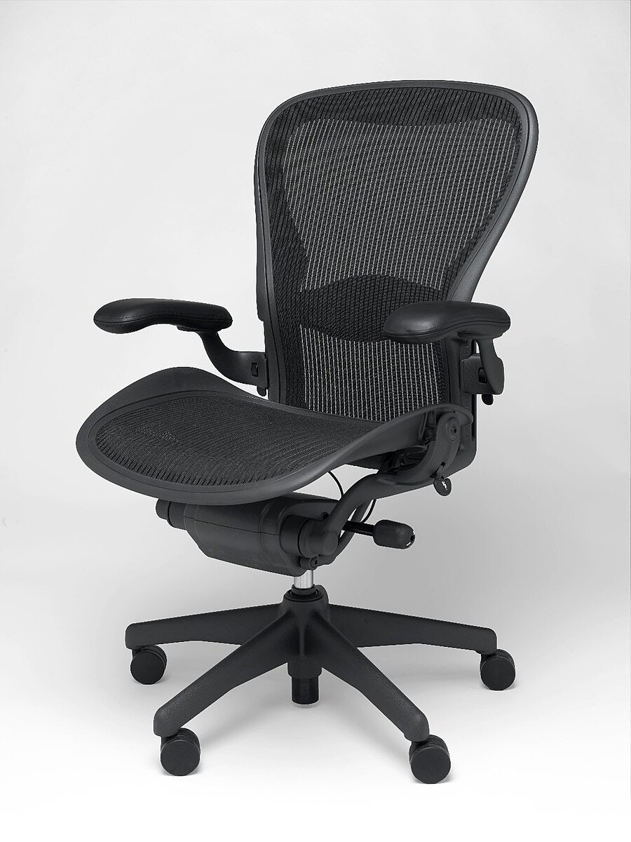
We have a particular chair in the V&A collection that I find interesting, a Herman Miller Aeron chair, which is fitted with an app that tells the sitter how long they’ve been sitting, how often they’ve been moving around. It’s connected to productivity, and there’s also no coincidence that it was developed in the last few years as a response to hot desking, which accelerated post-Covid. [Hot desking is a workplace organization idea where each space is available for any worker, rather than reserved for a specific worker, allowing different workers to use the same spot during the day or week.]
It also encourages a person to not sit as much because, for some, this means better health. It’s not so much about resting. It’s about returning to the idea of normality and to a “better life.” I don’t know if that makes any sense, but that’s what I’ve been interested in looking at. It’s not so much that we have chairs so we can rest better, and be more comfortable, but chairs that we can spend less time in and be more productive in.
MC
My father was an actuary for many years, and he was fascinated with HR metrics. He worked for a large company, and they installed software reminders for their employees to get up from their seats and walk around. It was all couched in the language of wellness. But it actually was developed to reduce employee injury claims, particularly workplace injury claims. It’s also very insurance driven. The return to normal is like a return to productivity, right? It’s not a return to rest.
Post-Covid we continue to see the integration of working at home, which is changing our domestic environments. But there’s also an interesting parallel development, which is that workplaces are becoming more and more comfortable because people were so accustomed to being at home. Offices feel more and more like domestic spaces; maybe because your workplace is nicer than your apartment is a reason why you would go there.
NK
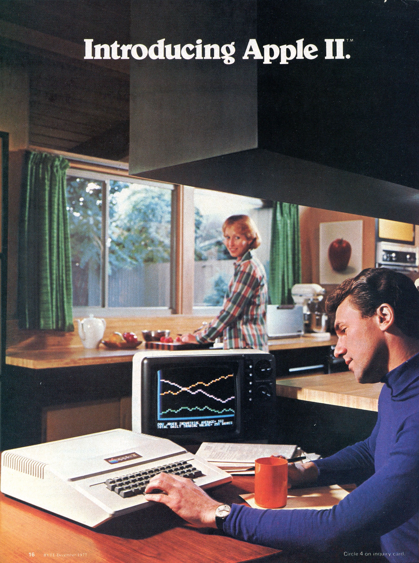
One of my favorite objects and one of my favorite ridiculous adverts ever is for the Apple II computer that was in a Scientific American from the 1970s. The Apple II was one of the first tabletop home computers. It’s an image of a man doing economic-looking graphs in his kitchen while his wife is cooking. For the first time, it shows how computing could be fully integrated into the domestic environment. And that was a significant turning point. There’s this whole story about Steve Jobs choosing the color for the Apple II. He was walking around Macy’s looking at the color of Cuisinarts. He wanted the Apple II to integrate into the home so that there was no work-life barrier.
There’s something really weird about Covid that we have to start integrating our work into home. And now work is bringing home to us. There’s something very odd about not being able to have that separation of space; not all of us can have a home office to close the door on work. I think there’s something eerie about having to accommodate our bodies and our schedules and our time around all those behaviors. We can compare this to a more delineated way of living, using a specific piece of furniture for a specific thing.
Seats at Work
DG
Both of you mentioned that the workplace is taking on the accoutrements of people’s homes. One of the trends I noticed in architecture offices that began before the pandemic is that everybody sits around one long table. It’s like some hybrid between the dining room table and the cubicle, but without partitions. Is this an example of what you’re talking about, or maybe you have another example?
MC
That is not what I was talking about, but guilty as charged. We once sat at one long table, but as my team has grown, now we sit at two long tables. But there’s a completely different rationale for this, which is about not being hierarchical and facilitating cross talk and collaboration.
DG
So to continue with the dining-room table metaphor: It’s not like a big Thanksgiving dinner, where you can have an “adult table” and then a “kid’s table”?
MC
No, we don’t do that, although that’s hilarious. Our arrangement is about the degrees of exchange that exist in the studio environment that are a little bit different. My husband is a lawyer, and he is fascinated by our office because there’s no way that a lawyer could work in an open space like ours. It’s not possible; he needs to be able to close the door, be alone, and not be overheard by other people. We have the long table so we can pass things back and forth.
One of the things that I want to mention about workplaces is that, if you look at a law firm designed in 2024, it does not look like a law firm designed in 2018. Some elements are the same, but they’ve been repurposed. The sleekness that one associates with a corporate environment is not so popular now. There’s also the language of coworking, which is more like the interior design of a museum lobby, or a very nice apartment, or even a high-end restaurant. This is becoming the design language of the workplace. It has swung pretty hard in the direction of comfortable spaces, soft spaces—lounging as a mode of working. So maybe soon you don’t have a “hot desk” that you share with other people; rather, you have some “hot” lounge-like furniture that you share in the workplace.
NK
I hate these futures. A lot about hot desking, in terms of an extreme flatness and reduction of community, is nightmarish for neurodiverse people. Hot desking is nightmarish because of the lack of regularity, the lack of being able to have a space that is familiar, or the ability to know what you’re doing and where you’re going. Hot desking for me is this movement toward everything being flat: everyone wants the same thing. Everyone likes this complete sheen of nothing. I really hate this universe of coworking, and I also hate working in an open-plan office. “Let’s do everything gray and plywood” and then forget about the other things that matter, like materiality and texture and warmth.
All of this reminds me of a trend called “beige parenting.” Beige parenting is a particular aesthetic where people choose very soft beige [hues and] neutral textures for their children’s clothes and environments, but they forget that children need color and texture to develop. This is the idea of fitting into a specific aesthetic, driven by a particular desire to be attractive and faultless and, basically, to look good on Instagram.
In an office, you know that your workspace is going to be consumed on social media and by people who don’t have to work there. But how do you provide modularity and flexibility, without sacrificing the ability for people to come as they are and to make choices and create community? Because sometimes that’s what’s lost from the idea of people trying to create spaces with a kind of universality and inclusivity.
On Museum Seating
DG
There’s an installation called Portrait of the Museum as a Chair by the artist Cristian Philipp Muller that was exhibited at the National Museum in Osaka, Japan. He asked if he could display each of the different types of chairs used throughout the museum. This included chairs used by visitors to the museum in lobby and exhibition areas, but also the chairs used by the staff in their offices and reception areas. It also included a selection of four chairs from the museum’s permanent collection. He displayed all the seating together as a snapshot of the museum.
Because this series of conversations is being sponsored by a museum, can you all describe some of your favorite museum seating experiences?
MC
I was in Mexico City at the MUAC [University Museum of Contemporary Art] and saw the recent Francis Alÿs exhibition, which consisted of short films and photos of children at play from all over the world. What I loved about this show, and others in Mexico City, is that there are always a variety of seating options. People are making themselves comfortable; they’re sitting on the floor, in a chair, in a lounge. This is something that I never experience in New York, but somehow, in Mexico City, it happens all the time.
In this particular exhibition, there were double-sided screens all over a darkened room, and little tripod wheelie stools that were littering the whole exhibition. And everyone was seated on one and scooting from one video to the next. No one got up to walk around. Kids were pushing them around. They just really got the memo about the subject of the installation, and I loved how it translated to the way people sat, but also to the way that the seating enabled a certain kind of slippage from piece to piece to piece that you just otherwise wouldn’t experience.
DG
It’s like the wheelchair user becomes the paradigm of viewership. Having been to Mexico City, I always thought that one of the reasons there’s such good seating everywhere is because, once you walk down a sidewalk in Mexico City, you need a break.
MC
You actually made it down the sidewalk?
DG
Yes, if you can believe it, but I have to use a cane when I walk there. Natalie, you mentioned some things about museum seating earlier. Because you’re a curator and you also have a disability, I imagine museum seating is an important element in your exhibitions.
NK
Yeah, I’m obsessed with it. I was at an exhibition in London that displayed an hour-long film, and there’s no seating whatsoever. It was also in a room that was pitch black, so it meant that if you were blind or partially sighted, you couldn’t navigate. One of the worst seating arrangements I’ve ever seen was at an exhibition that had a space with wiggly cushioned floor seating with videos. To watch them, you had to lie down, but if you were blind, partially sighted, or required some type of walking aid or wheelchair, you just couldn’t get into them, and you would miss out on the majority of the show. It was the worst seating I’ve ever seen in my life.
An exhibition can be like an endurance effort for people. In addition to the actual length of the exhibition, people who design and curate exhibitions need to account for the time it took people to get to the exhibition and all the time that is needed to prepare to leave as well. So you need to provide spaces within spaces for people to rest and recuperate, both mentally and physically. I know it sounds really obvious to us, but a lot of people don’t think about that. They just think about very basic standards: Well, there’s a film over five or 10 minutes, I have to provide a bench because that’s what my exhibition producer told me I have to do. And you have to think about what comfort and pleasure mean within the full holistic experience of your show.
I would like people to sit with objects—to sit and be able to talk to their friends about what they experience. I like the idea of designing from rest outward, of sitting or incorporating rest into the display of an object. All that kind of thing can be really interesting to think about.
And I think a lot about benches, especially because public and cultural spaces are so important to everyday life. So doing it within the show, but also in the wider museum space. People use museums for such important things, from breastfeeding to resting with their parents to just checking their phone. Providing respite in a public institution is one of the best things in the world. Why wouldn’t you give them a good bench?
DG
I see a new design commission for you, Michael. Thank you both for having this conversation.▪︎
Explore more conversations about everyday design objects and their relationship to accessibility in the full series Rethinking "Normal" Design here.
)
)