Counter Currents: Experimental Jetset on Provo
By Emmet Byrne
Presented in conjunction with the exhibition Hippie Modernism, the ongoing series Counter Currents invites a range of individuals and collectives—from writer Geoff Manaugh and artist-archivist Josh MacPhee to Are.na and LUST—to share how countercultural artists and designers of the 1960s and ’70s have influenced their work and thinking today. Here, Amsterdam-based graphic design studio Experimental Jetset focuses on Provo, a counterculture movement in the Netherlands from 1965 to 1967.
What we learned from Provo is the idea that the city is basically an environment that could (and should) be shaped through the printing press.
At the heart of Provo is the notion of the city as a graphic space. Magazines were sold in the streets, posters were pasted to the walls, performances (“happenings”) took place on public squares (and around specific statues and monuments), surreal slogans were being chanted (such as the repeated mantra of “ugh, ugh, ugh”), and pamphlets were handed out to unsuspecting bystanders. In the meantime, the (illegal) printing press of Provo had to be moved constantly, from one location to another, because there was always the danger of confiscation. So the printing press itself was on a constant dérive through the city, echoing the way the Provos themselves were drifting through the streets of Amsterdam.
So in that sense, we do believe that the story of Provo is mainly one about the symbiotic relationship between the city and the printing press. In fact, we even think that, in the case of Provo, the city itself became the printing press. Through the distribution of magazines and pamphlets, and through the use of site-specific performances (“happenings” and “situations”), Provo turned the city into a place where ideas were enlarged, multiplied and reproduced. In other words, through Provo, the city was transformed into a device for reproducing ideas—a metaphorical printing press.

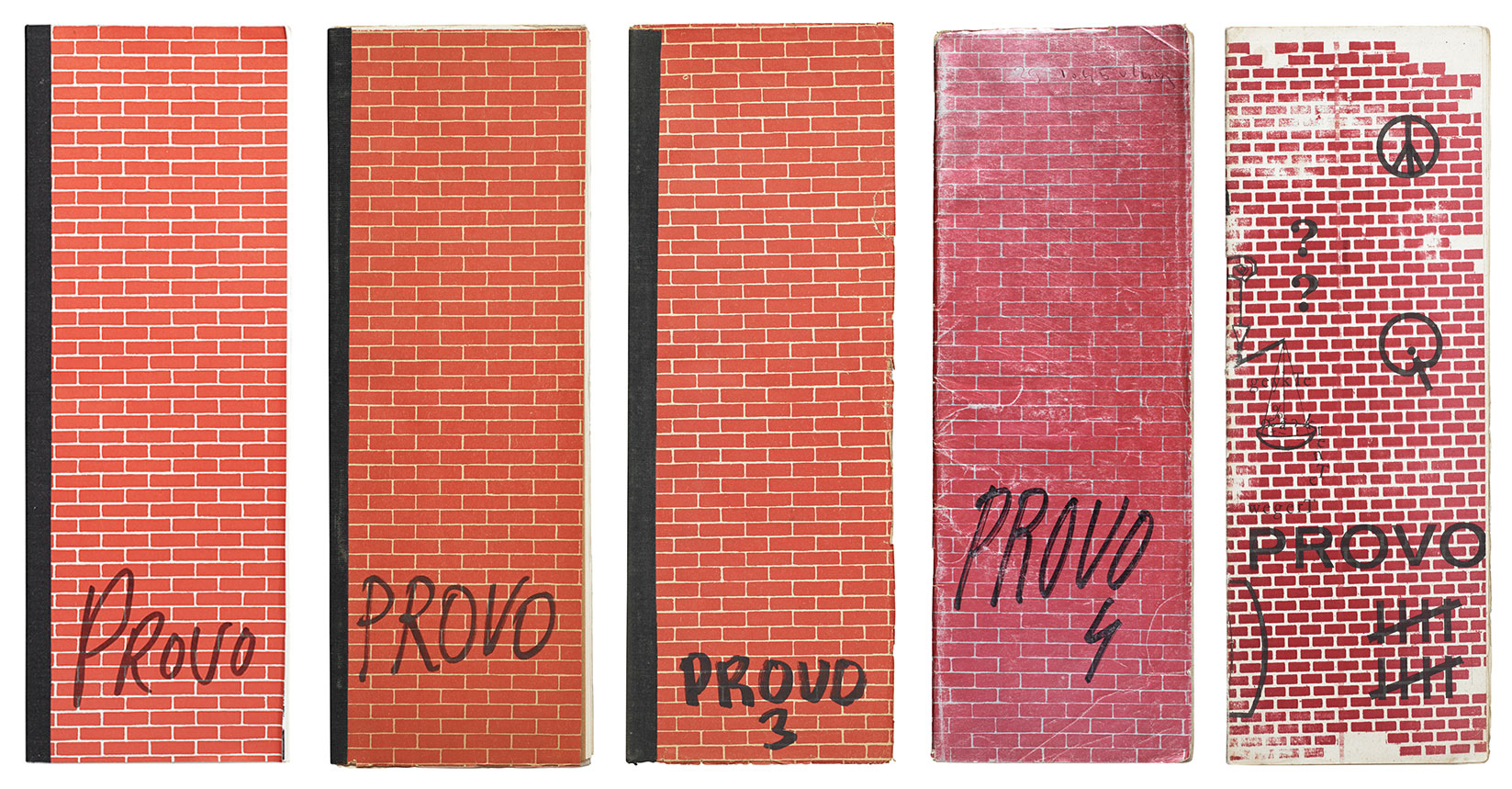
Issues 1, 2, 3, 4, and 10 of Provo
Another side from Provo that continues to inspire us is the notion of the “blow-up.” Within the narrative of Provo, images (in Provo-lingo, “Imaazjes”) had to be “blown-up,” in both senses of the word. Images were enlarged, stretched beyond recognition, and ultimately destroyed. This practice was ultimately also applied to the image of the group itself: the liquidation of the movement, as took place in 1967, was a conscious attempt by the Provos themselves to dissolve the image of Provo.

A2-sized poster, announcing an exhibition curated by Experimental Jetset. The first edition of this exhibition took place in 2011, at W139 (Amsterdam). A second (and more extended) version took place in 2012, at the Moravian Gallery in Brno.
Based in Amsterdam and founded in 1997 by Marieke Stolk, Erwin Brinkers, and Danny van den Dungen, Experimental Jetset has been consistently reinterpreting the implications of modernism, often from the perspective of a youth-based counterculture. The studio is perhaps best known to US audiences from their appearance in the documentary Helvetica (2007), and their dogmatic use of that typeface has become a defining aspect of their work and has influenced new generations of graphic designers. Experimental Jetset’s iconic print work explores ways in which we are both shaped by and help shape our material environment. Projects for cultural clients include collaborations with the Amsterdam Stedelijk Museum, the Whitney Museum of American Art, Purple Institute, Centre Pompidou, Colette, Dutch Post Group, Réunion des Musées Nationaux, Le Cent Quatre, De Theatercompagnie, and 2K/Gingham, which released their iconic John&Paul&Ringo&George T-shirt design. The studio’s work has been exhibited in galleries across the world, and in 2007 New York’s Museum of Modern Art acquired a large selection of their projects for inclusion in its permanent collection. Since 2000, members of Experimental Jetset have been teaching at the Gerrit Rietveld Academy in Amsterdam, and since 2013 they have taught at the Werkplaats Typografie.


