A Selection of Design Quarterly
By Andrew Blauvelt

For nearly fifty years the Walker Art Center published Design Quarterly, a remarkable magazine dedicated to covering the fields of contemporary architecture, landscape architecture, urban planning, and product and graphic design. The first twenty-eight issues of the magazine were titled Everyday Art Quarterly and began publication with the opening of the Everyday Art Gallery at the Walker in 1946—one of the nation’s first museum spaces dedicated to modern design. In 1954 the magazine changed its name to Design Quarterly and shifted its emphasis away from consuming design to understanding design’s impact on society and its processes and methods of practice and inquiry. Each issue would be dedicated to an in-depth exploration of a specific subject—a much-needed outlet for publishing important design research.
The changing shifts in taste and subject matter across five decades of the magazine chart a history of design—from a form-follows-function modernism of the 1940s and 1950s and its crisis in the 1960s and 1970s to the affectations of postmodernism in the 1980s and 1990s. Through its diverse topics DQ established an international reputation through a network of guest editors, seasoned writers, and provocative thinkers creating a virtual who’s who of the design world.
In the course of its nearly fifty year history, DQ had just a handful of managing editors, including Hilde Reiss, curator of the Everyday Art Gallery; Meg Torbert, design curator; Peter Seitz, design director; Mildred S. Friedman, design curator; Laurie Haycock Makela, design director; and Martin Filler, design critic.
Following are a selection of issues of Design Quarterly by Andrew Blauvelt, Senior Curator, Design, Research, and Publishing at the Walker. Each featured issue can be downloaded in its entirety.
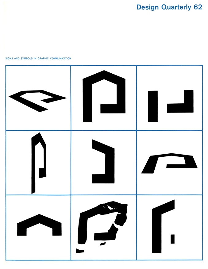
Martin Krampen, educated at the famous Hochschule für Gestaltung, Ulm, Germany, provides a primer on the signs and symbols of visual communication. Examining aspects of visual perception and gestalt psychology, elucidating a semiotics of visual language, and documenting the cognitive challenges of conventionalized systems of pictograms such as ISOTYPE, Krampen concludes: “[The graphic designer] may come to realize that signs, symbols, and pictures are not mysterious: their appeal is not ineffable, nor is one picture worth a thousand words.”
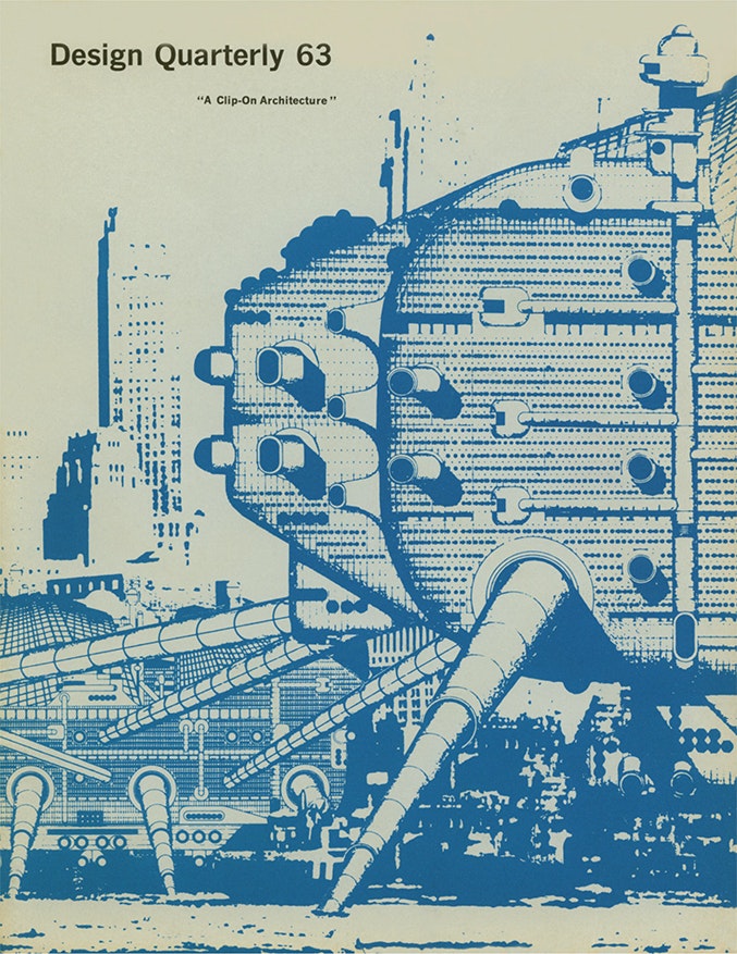
Guest editor Reyner Banham provides an illustrated account of the idea of a “clip-on” or “endless” architecture of systematic repetition of additive modules—particularly how it evolved in England through architectural collectives such as Archigram and in the work of Cedric Price. Locating its roots in the United States during the postwar period in, for instance, the endlessly repeatable facade of Eero Saarinen’s General Motors Technical Center, Banham argues the concept never really caught on in America but instead found itself useful in the more hesitant, indeterminate planning efforts in England. Predicated on notions of interchangeability, adaptability, and flexibility, “clip-on” architecture suggested a more improvisational, even ad hoc approach to compositional massing, introducing a modular and industrial approach to the production of architecture, moving from building construction to mass fabrication.
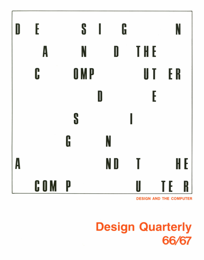
Walker design director and DQ editor Peter Seitz edited this pioneering issue on the creative potential of the computer as an aid in the design process. He intones in 1966 what would become a professional reality more than two decades later: “Very much like the children who are caught between the old math and the new, today’s designers have to face the computer age, turn away from security of the familiar and learn to adapt the new methods. Furthermore, in order to avoid the computer specialist solving the designer’s problems, the designer will have to involve himself in this computer technology.” Seitz himself would be among the first to embrace the computer, initially in site planning for the Minnesota Zoo at his own pioneering multidisciplinary office, InterDesign, and later introducing the computer at the Minneapolis College of Art and Design, where he taught for many years.
Download Design Quarterly 66/67
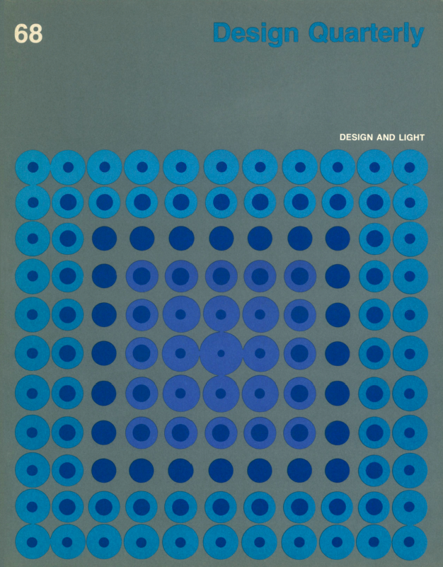
Guest editor György Kepes chronicles a history of light, both its creation and perception, used for artistic expression. Having worked with László Moholy-Nagy in Berlin and having led the Department of Light and Color at the Institute of Design in Chicago, Kepes draws upon innumerable examples of experimental work with light. Artistic and scientific experiments with light came to the fore in the 1960s when its status a new medium of expression was evident in everything from liquid light shows at rock concerts to Dan Flavin’s signature use of fluorescent light tubes. The Walker would also host the exhibition Light/Motion/Space that same year, featuring the work of artists such as Otto Piene, Julio Le Parc, and the USCO collective.
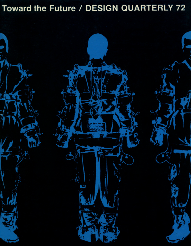
Although topical to its moment of increasing environmental awareness, this issue guest-edited by artist, writer, and sociologist John McHale telegraphs our current climatic crisis: “Is it too soon to inquire if these factors, plus others, may be contributing to an upset of nature’s delicate balance? Are we slowly overturning the oxygen-carbon dioxide system upon which all life is dependent? … Are we thus shifting certain basic weather patterns upon which our various civilizations have come to depend?” Although not a prediction about the future, but rather an exploration of the way we look toward it, McHale looks at visions of space travel, habitation schemes above and below the earth, computerization and robotics, amongst other things.

Editor Christopher Finch’s essay, “The Role of Spectator,” signals the magazine’s intent to move beyond the realm of design into related fields of the visual arts. Largely centered on a discussion of Marcel Duchamp’s concept of the readymade and his philosophy that the work of art remains essentially incomplete until the role of the viewer is engaged, Finch’s essay considers a similar role for the user in design. Supplemented by Andrew Rabeneck’s titular and philosophical contribution, the issue telegraphs an imminent postmodernism and radically revises design’s famous dictum that form follows function by arguing that design must operate in a social climate of accelerating change which precludes any real understanding or predictability about human patterns or behaviors of use, rendering design as an act of fiction. Included in this issue is Tablet, a visual contribution by artist and future gallerist Tony Shafrazi.
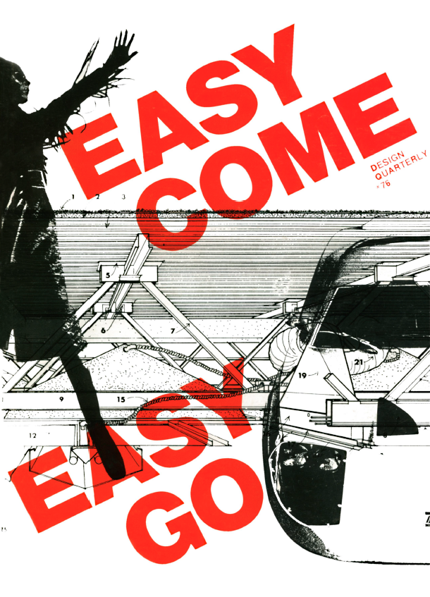
Originally conceived as an issue dedicated to the phenomenon of “supergraphics,” guest editors and designers Barbara Stauffacher Solomon and Daniel Solomon broadened that charge to consider architecture in an age of disposability and ephemerality. Stauffacher Solomon designed the issue, bringing her revolutionary architectural-scale typography of the supergraphic to bear on the small-scale real estate of the magazine page. Daniel Solomon, who penned the text, argues for architecture to embrace the contemporary conditions of the ephemeral and even the fashionable, drawing parallels to the world of modern industrial design such as the automobile and to experimental works of architecture like modular or plug-in living units that can be changed over time as well as the period’s call for more a systems-based architecture. The specter of environmental degradation, however, seems oddly downplayed in the issue which was published the same year as the first Earth Day.

John Margolies guest-edited this issue under the term conceptual architecture—a direct reference to Conceptual Art of the period and the experimental architecture of a mostly younger generation that eschewed conventional forms of practice and disciplinary limits and instead embraced theoretical constructs, ephemeral environments, cultural critique, and speculative visions. Margolies defined the term by the people he invited to participate and their contributions, which were to be published as direct, unedited statements that they designed. Among the contributions: Peter Eisenman’s essay “Notes on Conceptual Architecture: A Definition,” an otherwise blank text but with visible footnotes; Ant Farm’s World’s Largest Snake, an inflatable serpent that consumes both media equipment and its producers; Haus Rucker Co.’s traffic-stopping giant inflatable mattress deployed in the streets of New York City; Superstudio’s Hidden Architecture, a project whose drawings were burned and entombed in a metal box; and photos of five of Ed Ruscha’s girlfriends from 1965.
Download Design Quarterly 78/79
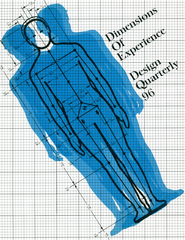
Industrial designer Niels Diffrient, co-creator of the Humanscale series that mapped the dimensions of human bodies to aid designers, expands the discussion of ergonomics or the fit between users and their environments to encompass the larger domain of individual experience. Written in the context of systems thinking and the emergence of human ecology and broader ethical concerns, Diffrient offers one of the earliest explorations of “experience design.” With Joan Bardagjy and Nicholas Polites, Diffrient charts the tools and techniques that probe, document, and measure human experience.
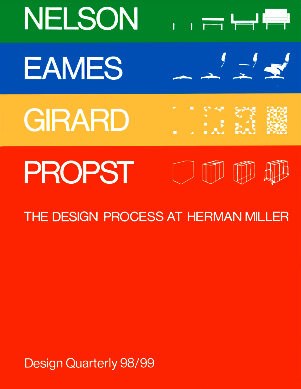
Serving as the catalogue for the Walker Art Center exhibition of the same name, this issue explores the pivotal roles played by these icons of mid-century modernism in America, whose careers converge and flourish at the legendary furniture company Herman Miller. With insightful essays about each designer by leading critics and historians, the exhibition and volume move beyond the powerful forms they created to describe the design process behind its conception and production. In doing so, the exhibition and issue delve deeper into its subjects’ methodologies without dismissing the intrinsic aesthetic appeal and formal attributes of the designed objects.
Download Design Quarterly 98/99
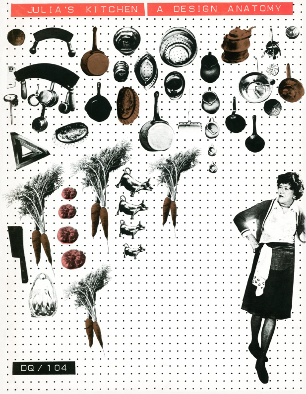
Twin Cities-based industrial designer Bill Stumpf, who championed user-centered approaches best exemplified in his iconic chair designs, expanded his ergonomic research interests when he proposed an issue of Design Quarterly dedicated to a study of celebrity chef Julia Child’s kitchen—a space designed and constructed by Child and her husband Paul in 1961 for their Massachusetts home. Stumpf and his team embedded themselves in the kitchen for several days, observing Child as she moved about the three-room space, cooking and using the many pieces of kitchen equipment that hung on utilitarian pegboard. They studied the efficacy of the kitchen layout and appraised the appliances and tools. A poster was also included in the issue, which shows a perspectival sketch of the kitchen and notates its various features and uses. Child’s actual kitchen is on now on display at the Smithsonian Institution’s National Museum of American History in Washington, DC.
Download Design Quarterly 104 plus posters
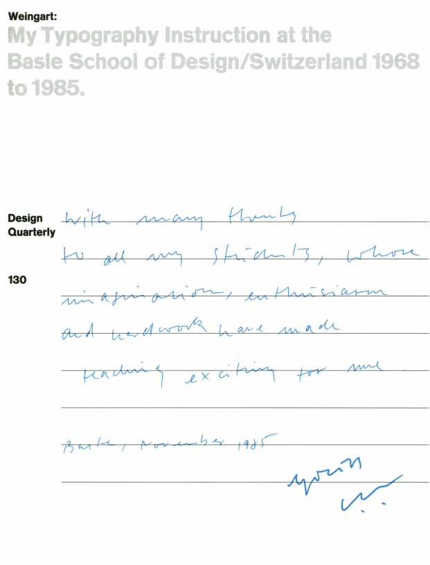
A concise history of Swiss typography is contained in this slim volume by two of its most influential practitioners, Armin Hofmann and Wolfgang Weingart, who taught at the famous post-graduate program of the Basle School of Design since 1968. The elder Hofmann, representing the refinement of modernist typographic principles and theory, had effectively exported Switzerland’s design philosophy around the world since the 1950s, while Weingart, the contrarian, rebelled against the dogma of Swiss design and in the process ushered in its second flowering during the 1970s and 1980s. Weingart’s influential philosophy of typographic experimentation and expression is mapped in the issue, which he summarizes as: “For me, making typography is like coordinating a four-headed creature: design ideas, conceptual thinking, typographic elements and printing techniques.”
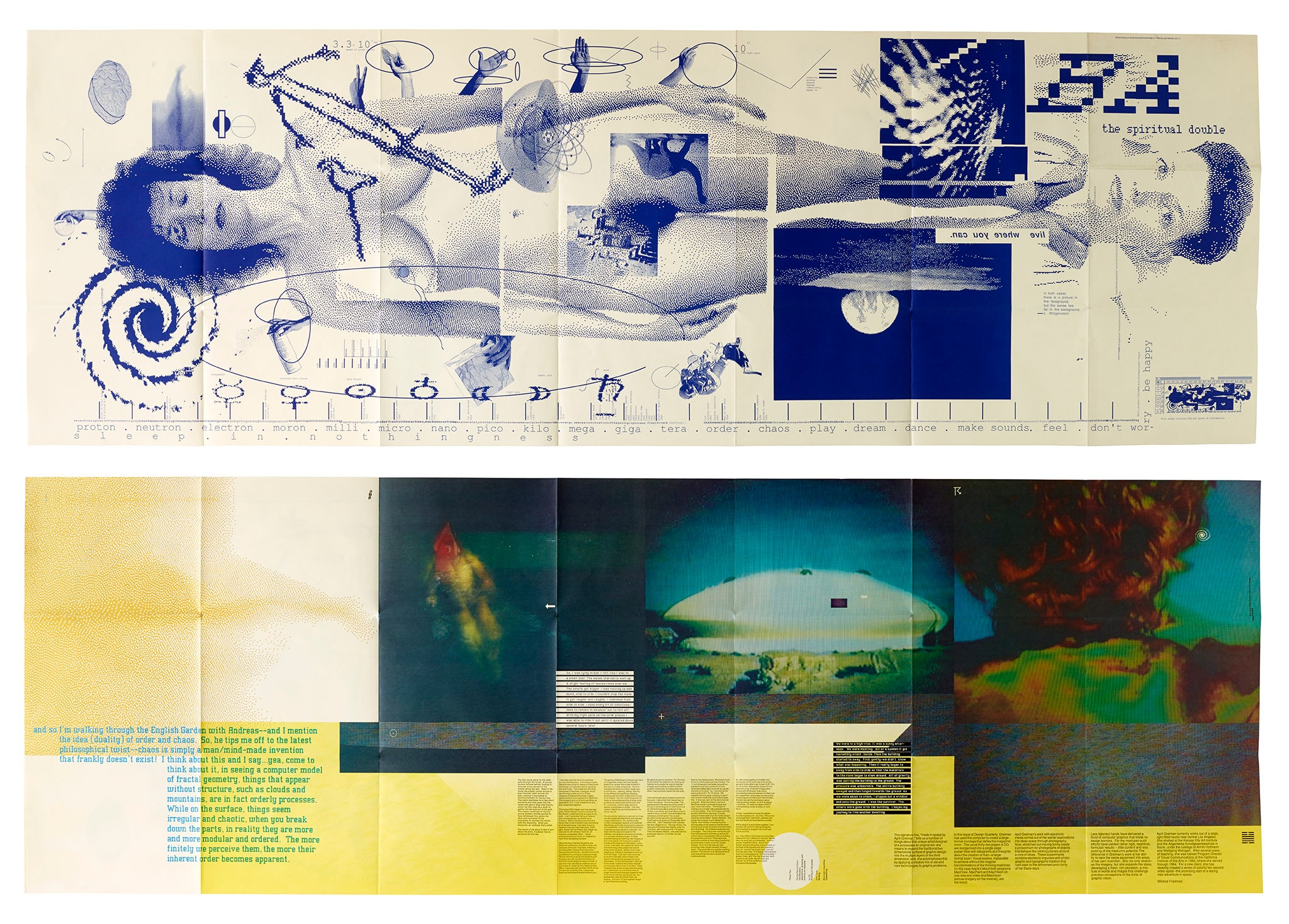
Based in Los Angeles, April Greiman is a renowned designer who, beginning in the 1970s, established her signature approach through experiments using typography, photography, and video image capture. Commissioned to create an issue of Design Quarterly about her work, Greiman rejected the expected survey of her work in favor of conducting a new experiment. She chose to reinvent the format of the magazine itself, turning a regular 32-page issue into a large-format poster. One of the first designers to see the creative potential of Apple’s Macintosh computer, Greiman composed the issue entirely in the computer—merging type, still frames captured from video, digitized photographs, and computer-aided illustrations using MacDraw software—a technical feat at the time for desktop publishing. One side of the poster features a life-sized, pixelated self-portrait of the designer dubbed, “The Spiritual Double.” The title of the issue refers to a notation by philosopher Ludwig Wittgenstein that Greiman recalled: “If you give it a sense, it makes sense.”
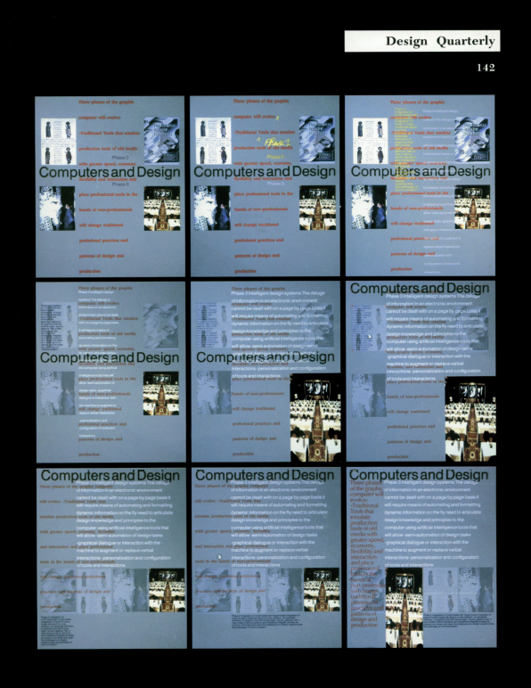
Guest-edited by Muriel Cooper this issue explores the pioneering work in display interfaces and data visualization by Cooper and her students and colleagues at the famed Media Lab at MIT. Tracing the relatively nascent history of visual computing, Cooper draws upon examples of older media and technologies to make her case for a comprehensive understanding of the potential of digital technology in the age of burgeoning multimedia. As the founder of the Media Lab’s predecessor, the Visible Language Workshop, Cooper had created inventive book designs at the MIT Press before abandoning that successful career path in 1976 to explore the potential of new graphic languages that could bridge the worlds of art, design, and technology.
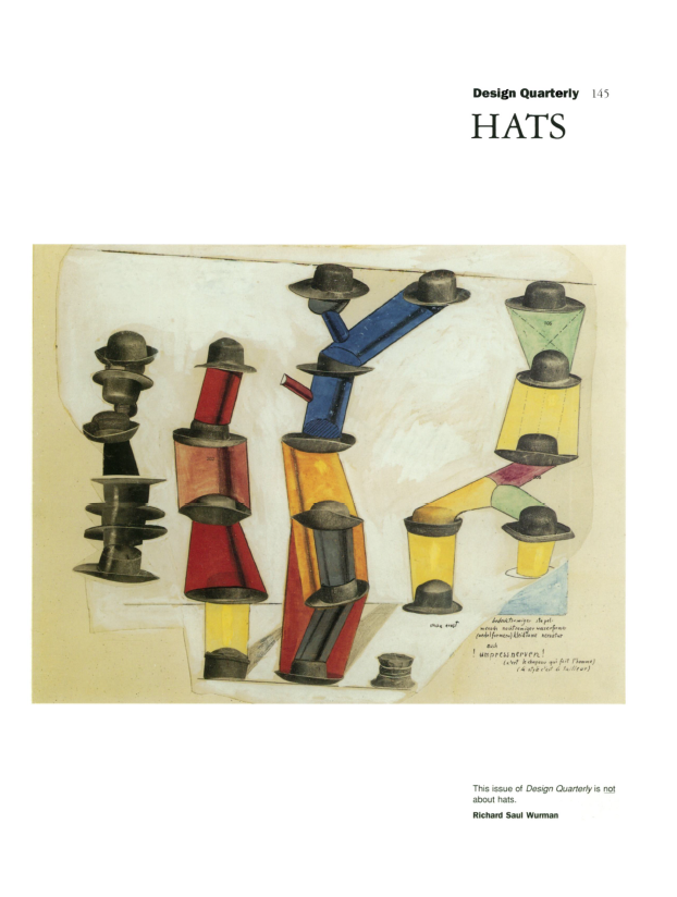
“The issue is not about hats. It is about hats as a metaphor for units of information,” declares the frontispiece of this issue guest-edited by Richard Saul Wurman, founder of Access Press, a publisher of maps, guides, atlases, and comparative charts. Wurman lays out his sage advice to aspiring information architects, describing the five ultimate “hat racks” for organizing or hanging information: alphabet, time, location, continuum or magnitude, and category. Through copious examples and typologies, Wurman hints at his future fame as the creator of the TED conference and its pithy, memorable presentations: “This issue of Design Quarterly is about a singular passion: making things of personal interest understandable to others.”
Related Articles
The Uncollectibles: Andrew Blauvelt on Minnesota by Design


