Designing Bon Iver's 22, a Million: An Interview with Eric Timothy Carlson
By Emmet Byrne

When I first started to see fragments of the artwork for Bon Iver’s new album, 22, a Million, I immediately recognized the hand of Eric Timothy Carlson, an artist and designer based in Brooklyn, originally from Minneapolis. Carlson’s work frequently mutates from medium to medium, a sketch becoming a poem becoming a sculpture becoming a shirt. Through it all, the idea of reading—the fluidity between text and image, the discarded pictographic origins of alphabets, the semiotic slide between icon to index to symbol—guides his work.
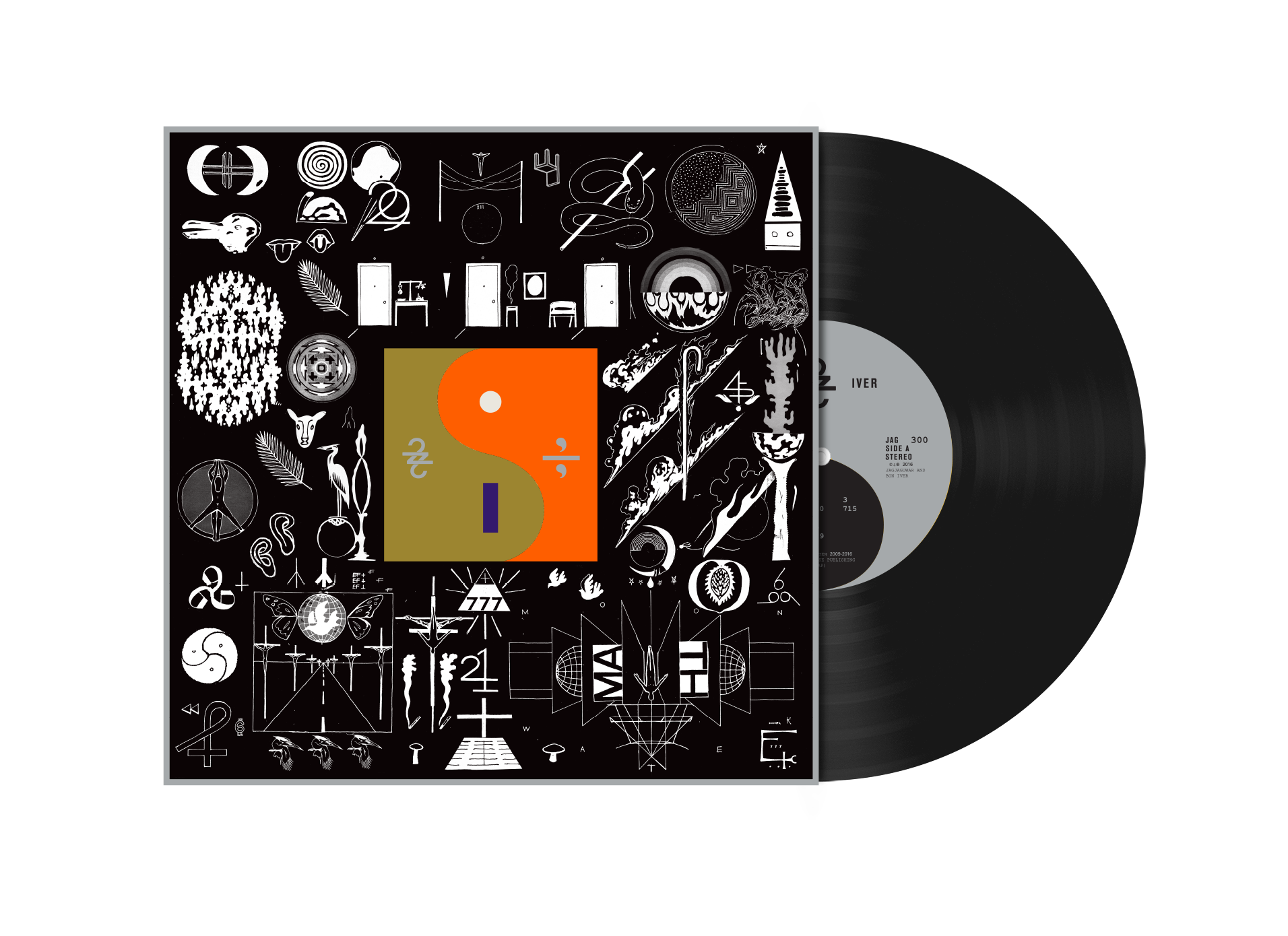
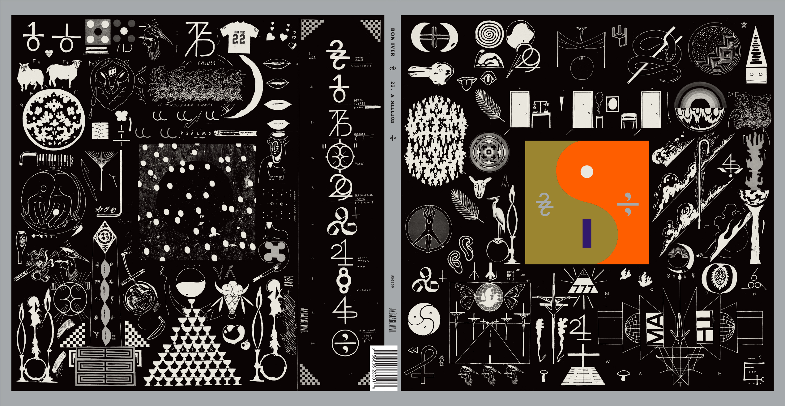
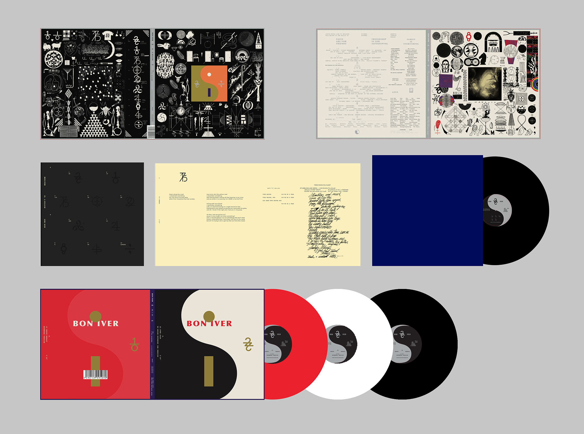
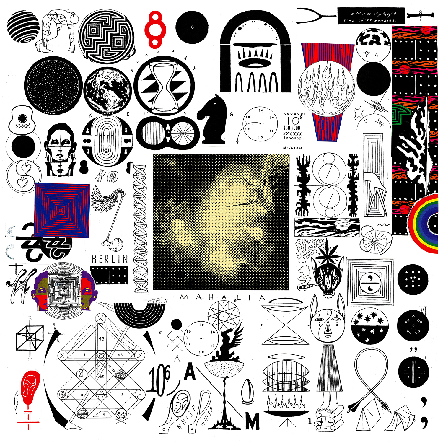
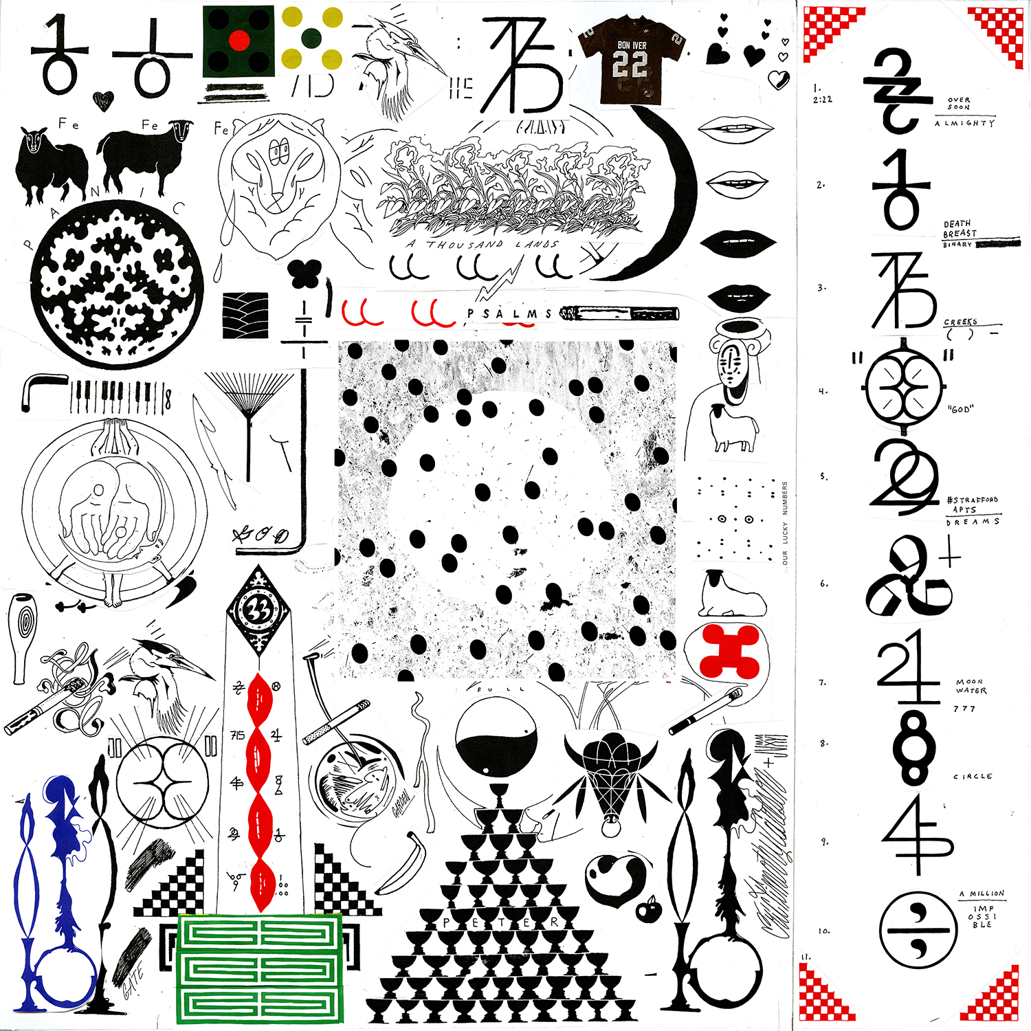
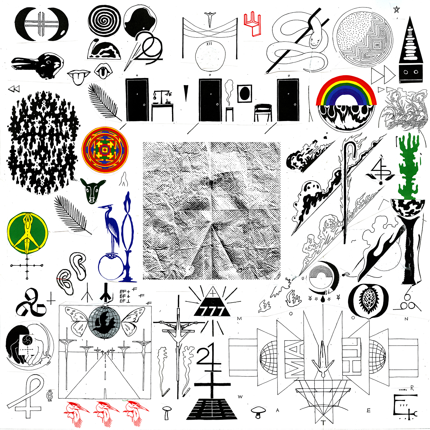
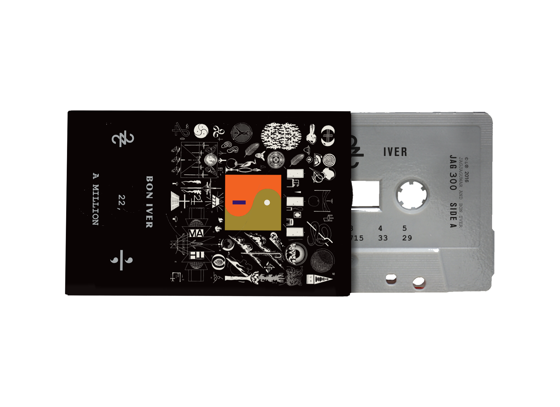
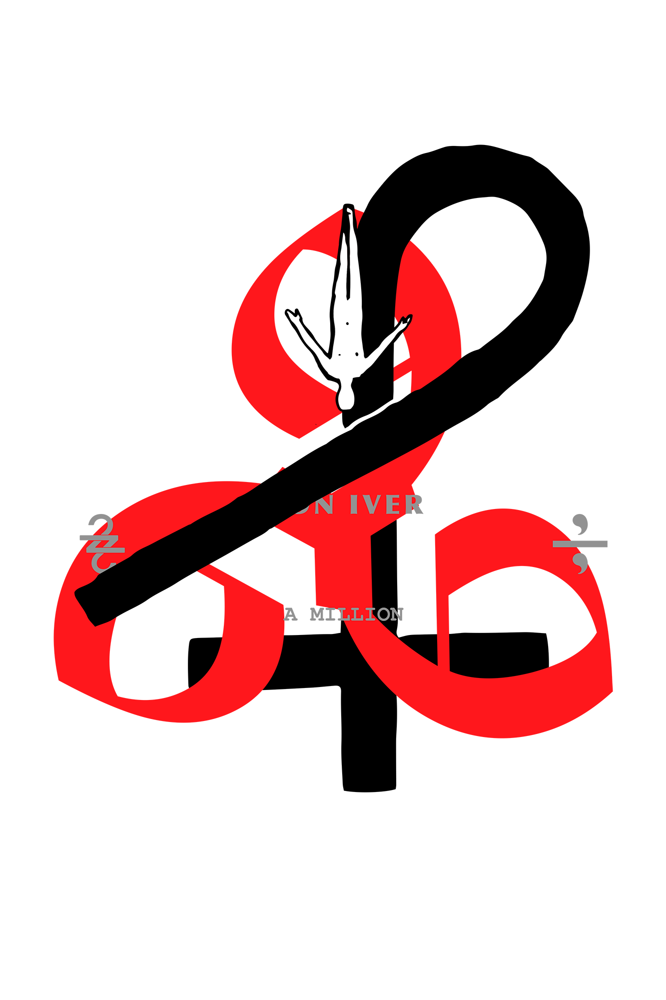
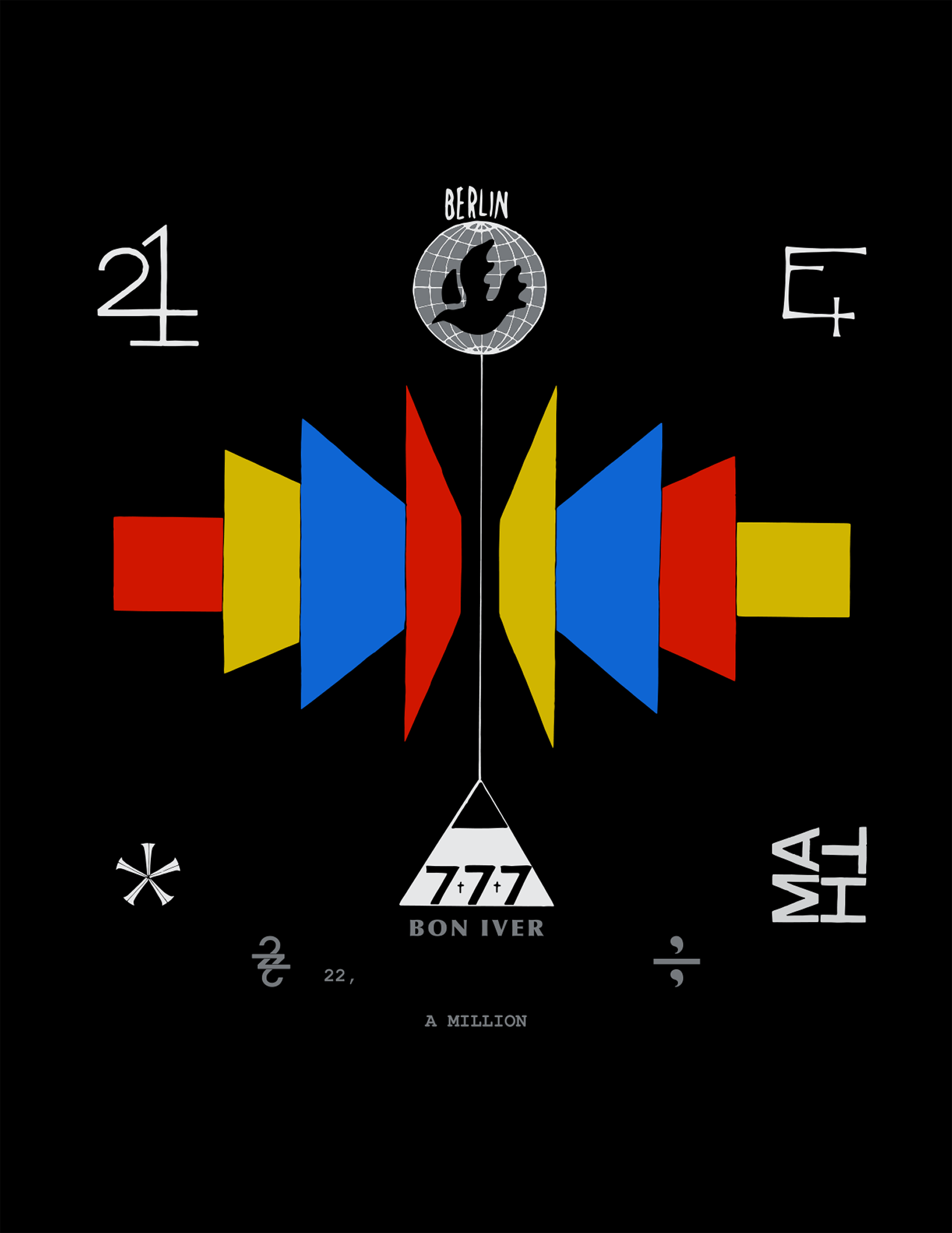
Symbols especially fascinate Carlson, who has obsessively explored their cryptic and explicit power within the realm of music, having created logos, icons, and glyphs for a number of midwestern bands like P.O.S., Gayngs, and Doomtree. In Carlson’s world, symbols rarely speak with the intent of reifying meaning, or branding something with repressive authority, but in a way that evokes multiple readings at once, asking to be adopted and infused with new life. It is this spirit that is on ebullient display in his new artwork for Bon Iver. This work is thick—an extensive collection of symbols and drawings and texts that spill out from the dense LP design (the legend/key to the entire transmedia system) to populate Instagram posts, giant murals, lyric videos, etc. The work is less a graphic identity for an album and more a documentation of a collaborative network of players, places, times, and tools.
In the following interview we present the finished artwork, supplemented with process work and related materials. Eric takes us down the rabbit hole, describing the intense, fluid work sessions with Justin Vernon and others at the Eau Claire studios, the numbers that permeate the track list, the influence of digital culture on the new album, the prevalence of cryptic symbolism throughout the Minneapolis/Wisconsin music scene, and the Packers.
EMMET BYRNE (EB)
How were you approached to work on this? Do you specialize in music packaging?
ERIC TIMOTHY CARLSON (ETC)
It’s been a long process. Five years ago, I received a message from Justin that said “I like what you’re doing, and I want you to know that.” A year or two later after actually meeting for the first time: “Can we work on something together? You should come over and we’ll vibe.”
Music has always been an important aspect of my practice. I’ve played music my whole life, and I come from a musical family, raised with it. In college I interned with Aesthetic Apparatus, screen-printing gig posters. My first design projects were for friends’ bands, and posters for art/music shows. Never really wanting to pursue any sort of traditional employment, I’ve made my way on small projects, working with musicians and artists and performers.
I lived in Minneapolis for a decade before moving to New York, so much of my work is born of that Midwest community. P.O.S’s Never Better was the first complete art direction project I had the chance to fully develop. It was a crash course in working with an artist and a label in unison, and aligning the intent and capabilities of all the involved parties/minds. I owe a lot to that community: P.O.S, Doomtree, Rhymesayers, TGNP, Building Better Bombs, Poliça, Gayngs, Skoal Kodiak, The Plastic Constellations, Marijuana Deathsquads, Dark Dark Dark, The Church, Organ House, Medusa. It was an opportunity to participate in defining a decade of music in Minneapolis.
For a couple of years, I also worked with Mike Cina, who is a book and record collector, and really learned and internalized a lot about typography and album art in my time with him. My practice has expanded outside of that through zines and the internet, but a lot of my work to this day has spawned from this continuum.
AT APRIL BASE
EB
How did you work with the Bon Iver crew to create this artwork?
ETC
Some projects, you can see what the cover is supposed to be—a floating image in the mind—or there are certain “rules” that you’re supposed to play by that determine much of what is being created. This project, however, could be whatever it wanted to be.
The original desire from the start was to create a robust world of work. So instead of pursuing a specific vision right off the bat, we just worked and experimented and tested ideas. I worked closely with Justin. I worked at April Base—the recording studio—a couple times a year, each time was a unique experience focused on that stage of the music. Usually with an intimate group of two or three guests (musicians, writers, chillers, curators) and the studio crew, for a week or so at a time, to make a unique creative space, where each of us would be a part of defining that period of creation. The whole Bon project is for the most part entirely driven in house. Each visit would be a new experiment—creating temporary installations and interventions, painting murals, sharing books and inspiration, playing music. We came to listen and work and get to know one another, to get a feel for how to work and talk and think together. Not overthink anything. Developing the conversation, making art, and sharing our scope of vision and capabilities.
In the rural setting of Eau Claire, when it was freezing outside, almost everything took place inside the studio, and we barely even left the property. It puts you in a certain headspace, and you develop a pattern of waking up and just getting into the work and process of it from noon to midnight—an uninterrupted cycle for a week at a time. But we’d make sure to sleep and eat well too, and not miss too much of the limited winter sunlight.

There were some early birds in the studio, and of course the night owls as well. The amount of people shifted depending on what was happening, and the vibe changed depending on who was around. I think the Indigo Girls were recording the week before I first visited, and there was another project in one of the sound rooms overlapping with my time there. That first visit was one of the most frenetic, fluid experiences, multiple projects developing and recording simultaneously. Sax and string players visiting to record their own work, and then session on the album in process as well. The later visits were more focused—everyone was there for the album, in a no distractions kind of mode.
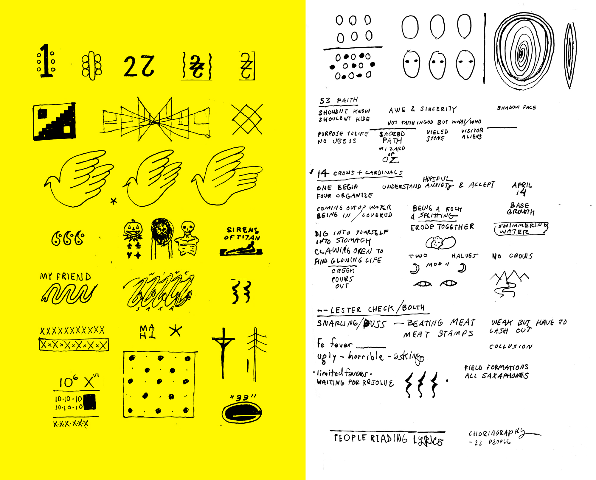
I’m a habitual drawer, so these visits to the studio resulted in an accumulation of many, many sketches, like writing. Later, these sketch pages became a reference point for the final work. There was an honesty in the notes and collection process that very much influenced the final work.
ON THE SYMBOLS
EB
How does the artwork respond to the music?
ETC
The songs were all numbers from the start, multiple numbers at first. So we would listen to each song, talk about the numbers, talk about the song, watch the lyrics take form, makes lists, make drawings. Real references and experiences are collaged in both the music and the artwork. I was able to interview and interrogate each song—digging into weird cores—and by the end of each visit, each song would develop a matrix of new notes and symbols.
Between the numerology, the metaphysical/humanist nature of the questions in 22, a Million, and the accumulation of physical material and symbolism around the music—it became apparent that the final artwork was to be something of a tome. A book of lore. Jung’s Red Book. A lost religion. The Rosetta Stone. Sagan’s Golden Record. Something to invest some serious time and mind in. Something that presented a lot of unanswered questions and wrong ways. A distant past and future. An inner journey somehow very contemporary.
EB
When I saw the artwork for the first time I immediately recognized the feeling of it, the general design language. The use of rune-like symbols felt very much like your previous work, and like the work of some of your collaborators—but it didn’t feel like Bon Iver, at least as I understood it. Was Bon Iver looking for something different than their previous, pastoral vibe?
ETC
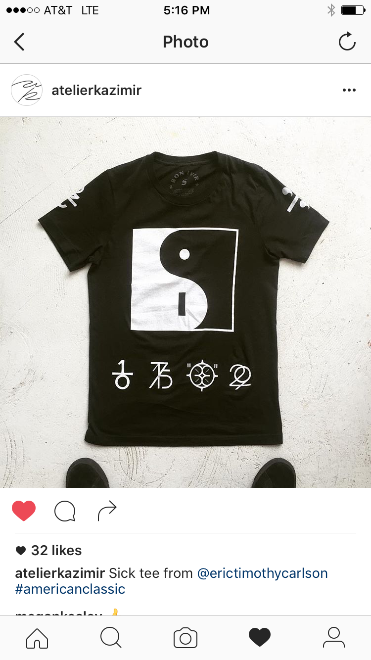
Early on in the process, it was said, “I want each song to have a symbol,” and I knew exactly what that meant. Symbols just naturally come out of me, which is why I use them so much. Icons, signs, symbols—they are cultural fragments and a well made one can cut so deep into our language. I’ve been mentally collecting these all my life. There’s an exercise I enjoy—sitting down to draw out all of the symbols you know without reference: logos, symbols, characters, etc.—and it’s often surprising what comes out, what we have locked away in memory. The anarchy A, yin yangs, Mr. Yuck, Super “S,” Kilroy, peace sign, etc. I admit that one of my desires regarding design and art is to add something to that deep cultural symbolic well of knowing. But they also come from a decades-long conversation within this specific community. I designed the Gayngs symbol for Ryan Olson in 2010 and worked with Doomtree in 2011 on their No Kings album, which also involved the generation of a series of glyphs. These ideas—claiming icons, masks, unknowables, unsayables, unpronouncables—resonate with that community. The Artist Formally Known as Prince. Zoso. CRASS. etc.
And as far as the feeling of the previous Bon albums, I mean, they brought me in for a reason. That version of Americana was ripe and appropriate when For Emma, Forever Ago and Bon Iver happened, but the Bon project didn’t want to further perpetuate that aesthetic. The new album remains explicitly connected to those before it, but the feeling has undeniably evolved, as has the culture around it.
I spent years in a perfectly weird corner of the heartland making apocalyptic noise art in the vibrant community of Minneapolis. Landlocked bloggers. High and low are just as much the fabric of our home as is a melting pile of snow. So on the surface, the new album aesthetic might seem like a dramatic shift in the Bon aesthetic, but I see it true and deeply bonded to its current state as well as the history out of which it developed.
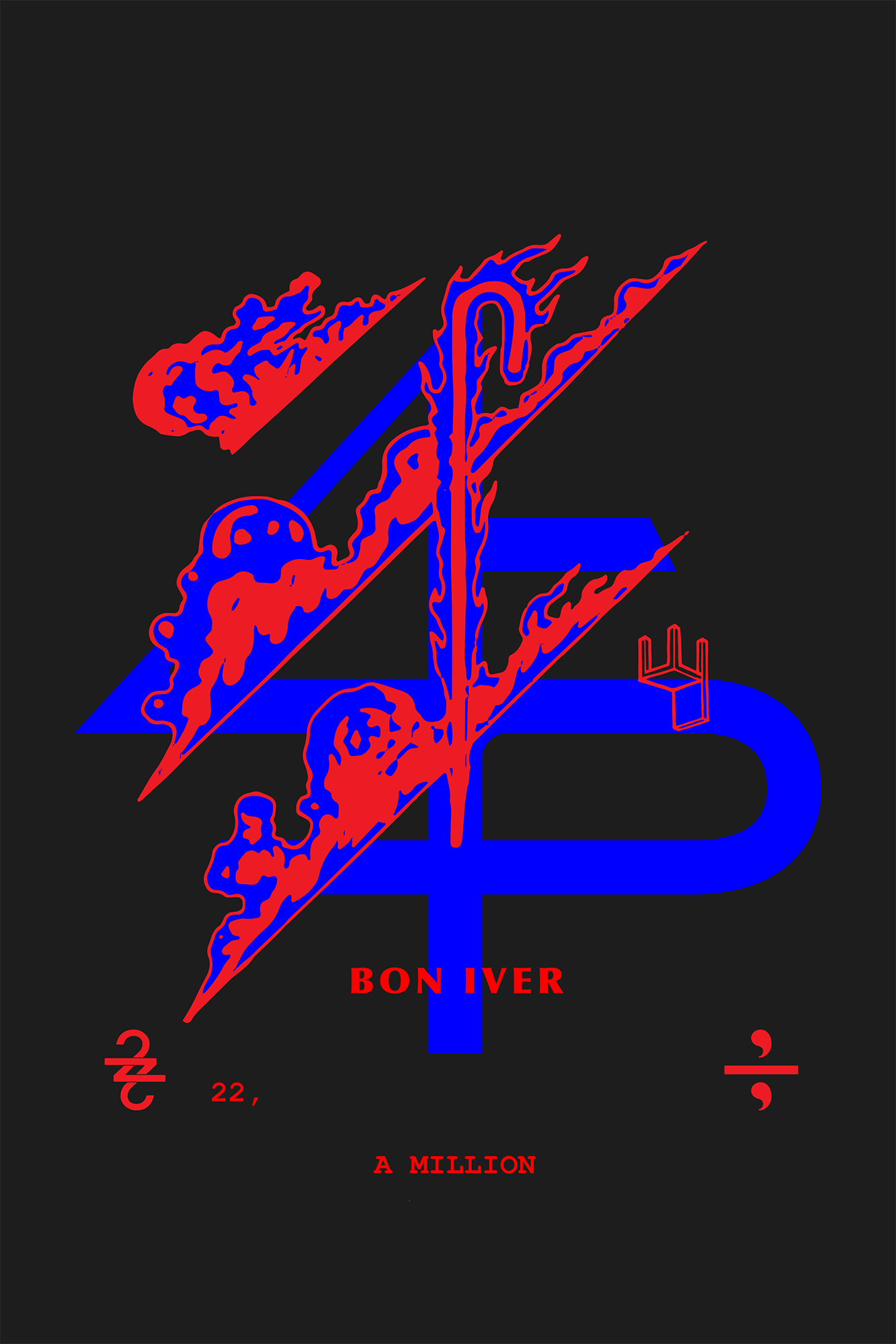
For 22, a Million—in their creation—they felt automatic. I enjoy the puzzle of creating a ligature. Justin assigned a specific meaning to the numbers and a logic to their creation, but in the end, they are open containers to be filled with new meaning. Symbols in the context of music have a lot of power, and people are very willing to own and wear/display their cultural experiences and allegiances.
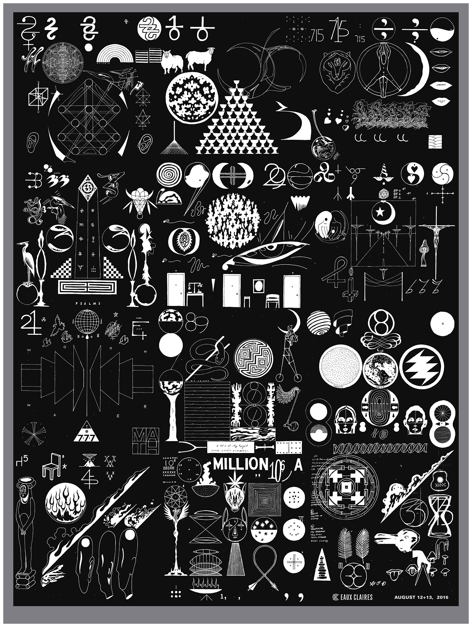
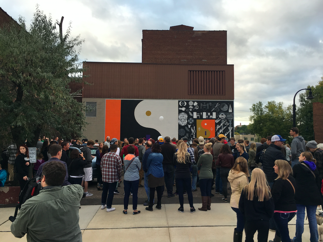
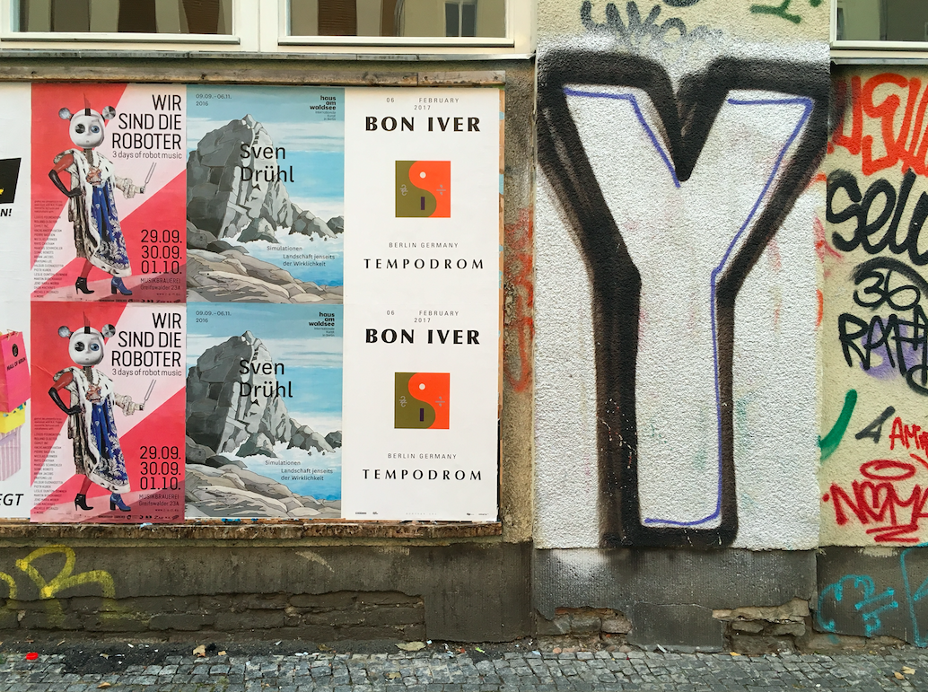
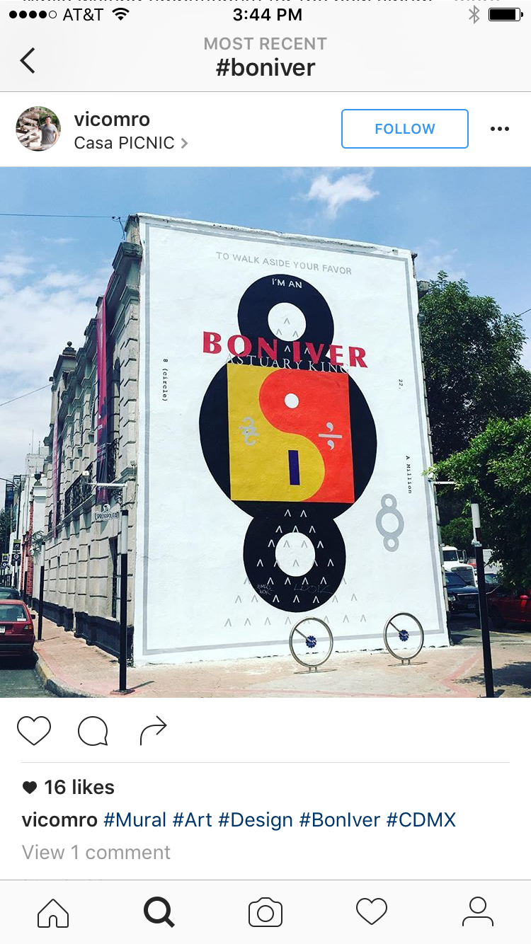
As the artwork developed, it became clear how we would seed the material into the public. With 10 symbols, we would make 10 murals, and 10 videos, and a 20-page book, etc. As with many numerologies—just follow the numbers—be them true or not.
The artwork is a collection of hundreds of pieces, icons, ideas, motifs, most of which are capable of standing on their own. The proper album packaging is the legend of symbols, where you find everything all in one place. When applying the art to outside uses (murals, ads,Instagram posts, etc.), we could utilize individual components. But no piece should be as comprehensive as the album packaging.
EB
How did you land on the prominent use of the yin yang symbol?
ETC
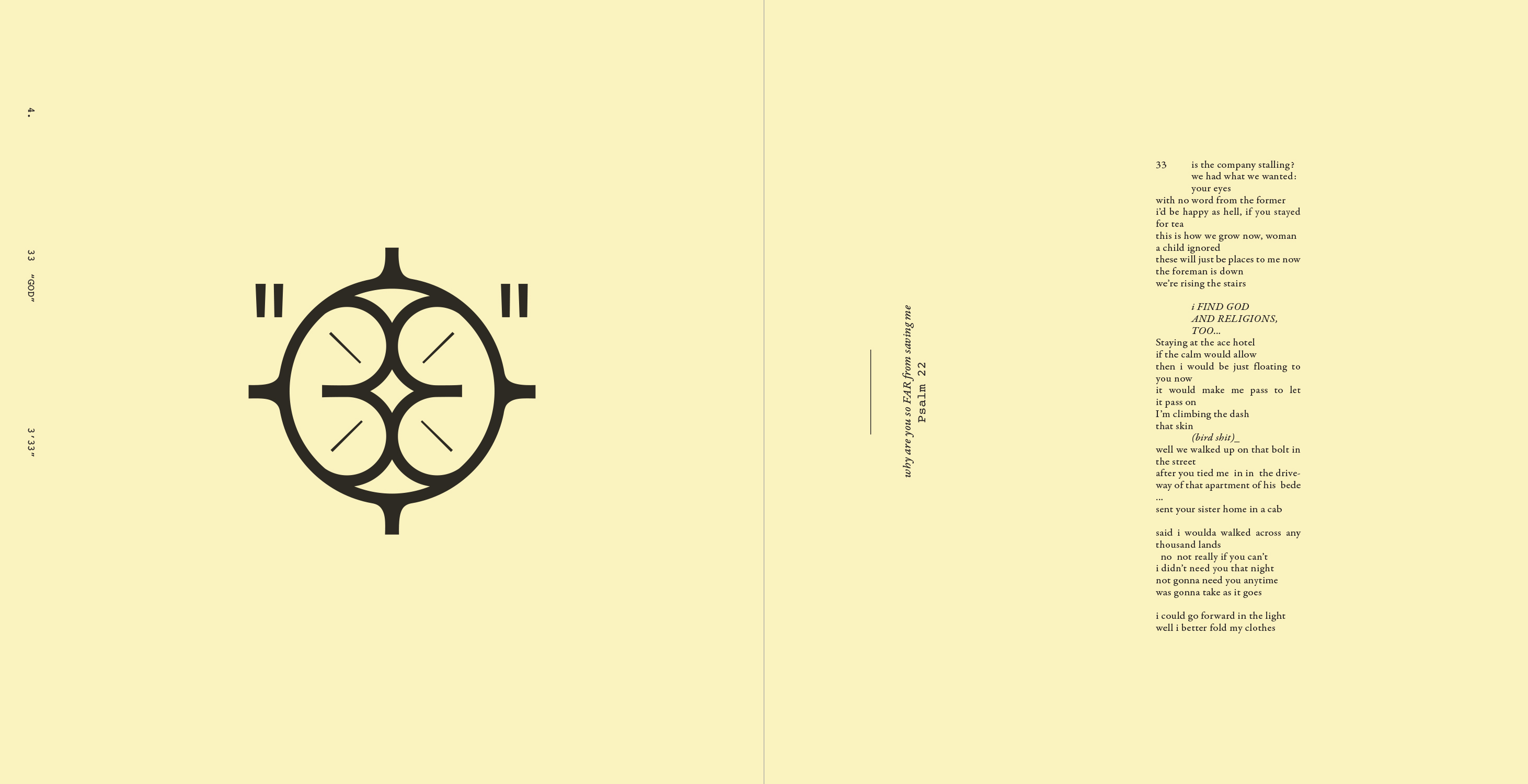
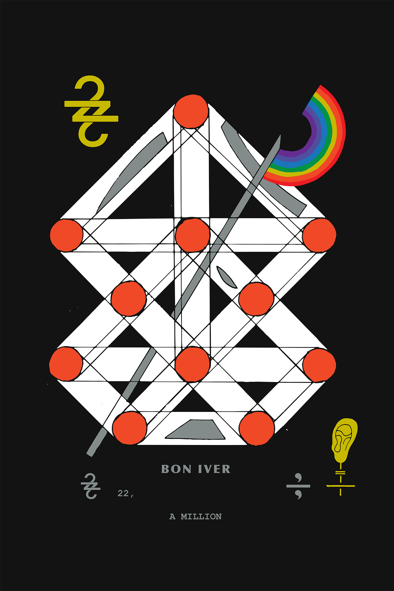
In establishing that each song was to have a symbol or a set of symbols designated to it, I wanted to also arrive at an overarching symbol, to house them all within. The yin yang proper was in play loosely from the start, working well in the context of the humanist/spiritual pursuits of the project. I created the collage compositions for the LP package by hand at 33˝ x 33˝, as it proved the best way for me to deal with the amount of material produced, and to massage it all into a sound and organic composition. The center was originally occupied by an altered mandala, as a satisfying placeholder, waiting to be filled with the final symbol. The yin yang design we ended up with happened while working in vector—on something of a whim. Changing the symbol into a square format proved to be enough to keep it recognizable but make it unique to the project. The “smile in the mind” bit of the “i” and “b” emerging from the mark was the final step in both owning the mark, as well as settling its roll. It is a simple design, two circles centered, but the point where they touch in the center is sensitive and requires some optical adjustments. Following the geometric paths produces a little tick that requires massaging to look right. The proportions of the “i” work within the proportions system created for the LP design, and align with the typographic proportions as well. As organic as it feels, it’s a tightly made structure throughout it all.


There was a short conversation as we arrived near the final art design, where I wanted a very clear confirmation that this was where we were going to land, “There are going to be yin yangs and down crosses on your album cover … and … you’re down with that?” and the response was more or less, “Dude, yesssssss!”
ON THE DIGITAL MILIEU OF 22, A MILLION
EB
You’ve described the way ideas of digital collage, digital formats, digital thinking really encompassed the creative conception of the album, both musically and visually.
ETC
22, a Million to me still feels very tied to Emma and the self-titled album. There is still the gospel and folk and mountain songs, but in the studio I could feel and see the visceral digital collage of it all, how our technology and the internet has truly affected the way we collect, organize, think, and make. This album is built on our history of music, noise, poetry, and Americana, but also seamlessly incorporates and celebrates the technological nuances of our contemporary—employing it and expanding it.
Visualizing music has been an exercise I’ve practiced since I was young. The first PlayStation had the visualizer function where you could customize your equalizer/screensaver with the controller, responding to any CD you put in, which informed a bit of how I approached it then. I try to let the ideas be more expansive now. When I first heard the digital disturbances crackling over these new songs, it was such a trip, seeing layers and relationships I hadn’t yet encountered.
The computer so readily pairs with futurist visions, pushing forward futuristic, technology-oriented aesthetics. But the reality of our relationship with digital technology always retains this messy pulsing humanity. Marshall McLuhan predicted computers in every classroom, people connected around the world, utopian vibes. Technically he was very right, but we still have bad carpeting and ugly plaid couches and gas station tchotchkes and dirty bathrooms. Regardless of time passing, we remain in communion with the century preceding us, and even the previous millennium or two.

EB
How do you understand album artwork in the context of the digital music economy? Prior to the proper release of the album, your artwork was published in a variety of ways, from a cryptic track-list graphic approach on Instagram to the YouTube lyrics videos. The graphics seem to be very front and center in Bon Iver’s pre-release strategy—they are presented as standalone thoughts, with very little context, in lieu of a slick marketing campaign. Was this the intent from the beginning?
ETC
I believe Bon Iver has had unique success with both digital and physical album sales, perhaps an anomaly of sorts. Being of my generation, I can’t help but desire access to music and movies and such things for free—I understand how that is problematic, but upon tasting Napster, it was hard to go back.
Labels, album makers, vinyl fetishists—people love the richness of album art, the nostalgic object to own and consume. It’s fun to produce that stuff, and much of the best album art was made for that format. CD’s are junk, and Digipaks are junk, in my opinion. (My favorite CD format is those massive Case Logic binders of poorly labeled CDRs.)
Given the opportunity, I like to make artwork first for the LP format because it is the most generous format for artwork (assuming one pursues the object creation). Then I try to find a good way to make a system of format conversions. I love old cassette tapes where they just drop the square album art on the cassette cover, and type out the titles again bigger underneath in the worst/best way. So honest.
Format conversions are such a crazy part of doing a big release like this, because there are so many when it comes to international releases: LP, CD, Cassette, Euro LP, CD, Central/South American CD, Australian CD, Japan CD, etc… all slightly different sizes, with different printers, different distributors. Aspects of this obviously become a certain hell, but I can’t help but pursue quirky packaging details in the different designs, which, if done well, can result in so many unique details that make each version special in their own little mutant way.
When working with bands, I’ve often made the case that they should find a way to make an album available for free, since someone will do it anyway, and if you try to control it, you end up keeping people away from the work. I can’t back up any financial rubric supporting this, but it feels right to me. Most of my friends are posting their work on SoundCloud or YouTube. When they release an album that is freely available, the ideas that form around the real base are a little more true to humans than the rules as laid out by companies.
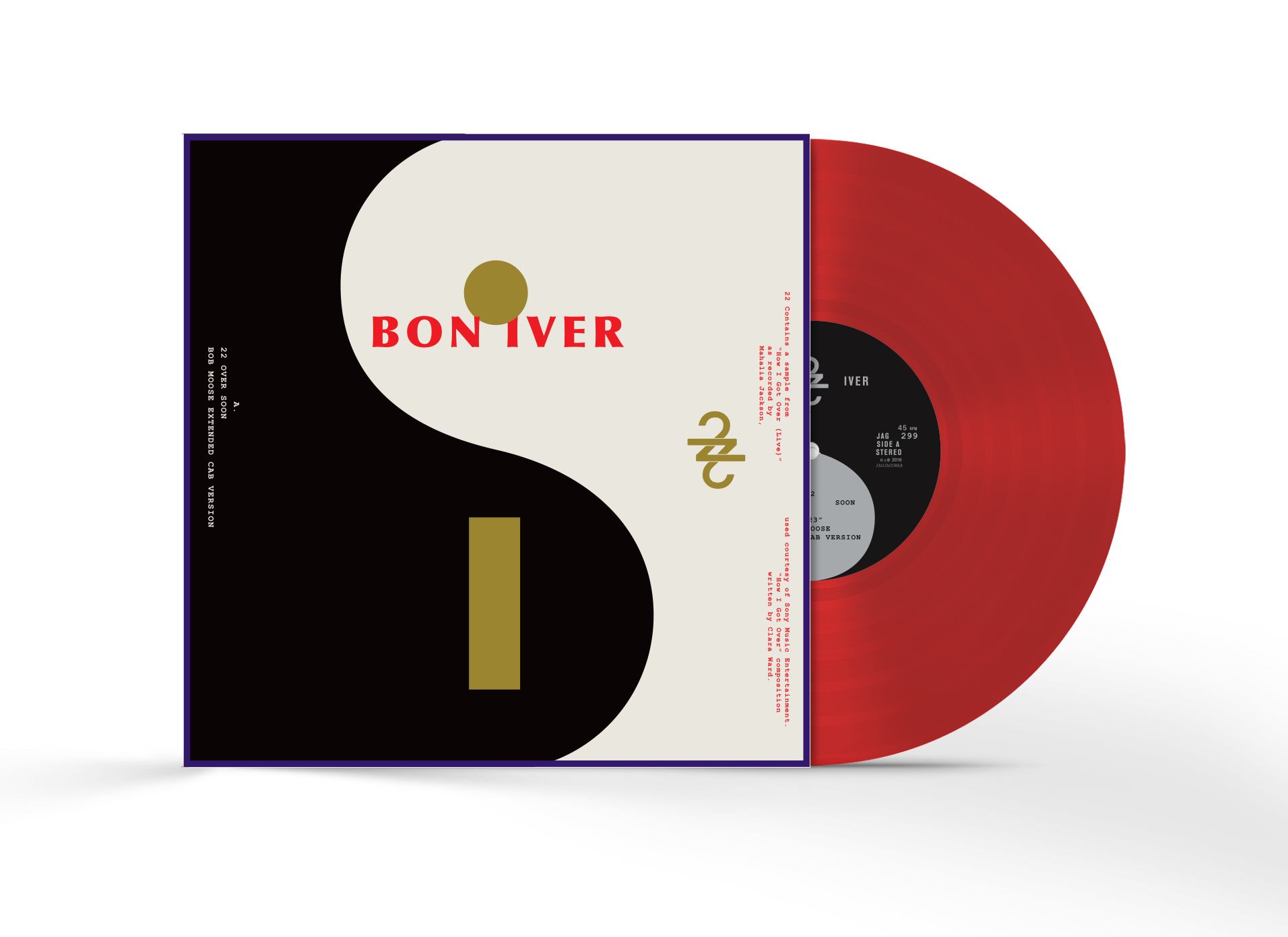
For 22, a Million, there will be lyric videos that I created with Aaron Anderson for each song that will be available for free on YouTube (save the ad experience/big data), which is great as it opened another gate for us to expand the language of the artwork into an entirely different realm—time and motion and the casually fluent—because internet.
EB
Lyric videos are an interesting choice for an album like this. Vernon references Richard Buckner when talking about becoming comfortable with writing words that sound like something, instead of lyrics with explicit meaning. “Sound things out and find out what it means later. Gave me the courage to write like that.” I feel like your cryptic use of symbols matches that strategy pretty closely. It suggests a deep, diverse world of language but the viewer is allowed to fill in the meaning of what it is actually saying. The lyric videos seem deliberately deadpan in their delivery of the lyrics—a little too straight up for lyrics that make very little “sense” at first listen. There’s something unnatural-feeling about literally reading these lyrics while listening to the music…
ETC
The lyric videos initiative came from Justin. I’m not sure they ended up looking like what he was imagining, but that’s one of the things that has been so great about the project: the trust in the work of everyone involved. I was originally a little hesitant about the lyric video concept, largely due to the quality of lyric videos in general, and because I was dreaming of an entirely abstract/ambient visual component to live with the music online, without typography. But many lyric videos found online are made by fans—iMovie/After Effects motion graphics class projects. I feel that that amateur aesthetic has gone on to inform what official, professionally produced lyric videos look like. Those videos are getting a lot of views, so they are probably important to produce and control, but I can’t imagine any of them are allotted budgets comparable to that of a music video—they are more of a checked-off assets category in the end.
But it was a good challenge, figuring out how to do it good/weird/right, how to acknowledge the format, and how to expand the album art into this realm. They didn’t need to be explicitly narrative, and they didn’t need to live by the rules of the print material. They are made for YouTube, to ultimately listen to the music in that format—but we wanted to prod at the format, and use it to expand upon the inherent digital truth of the album.
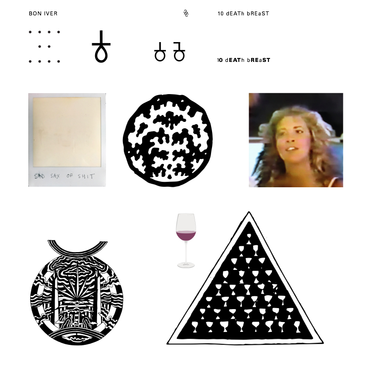
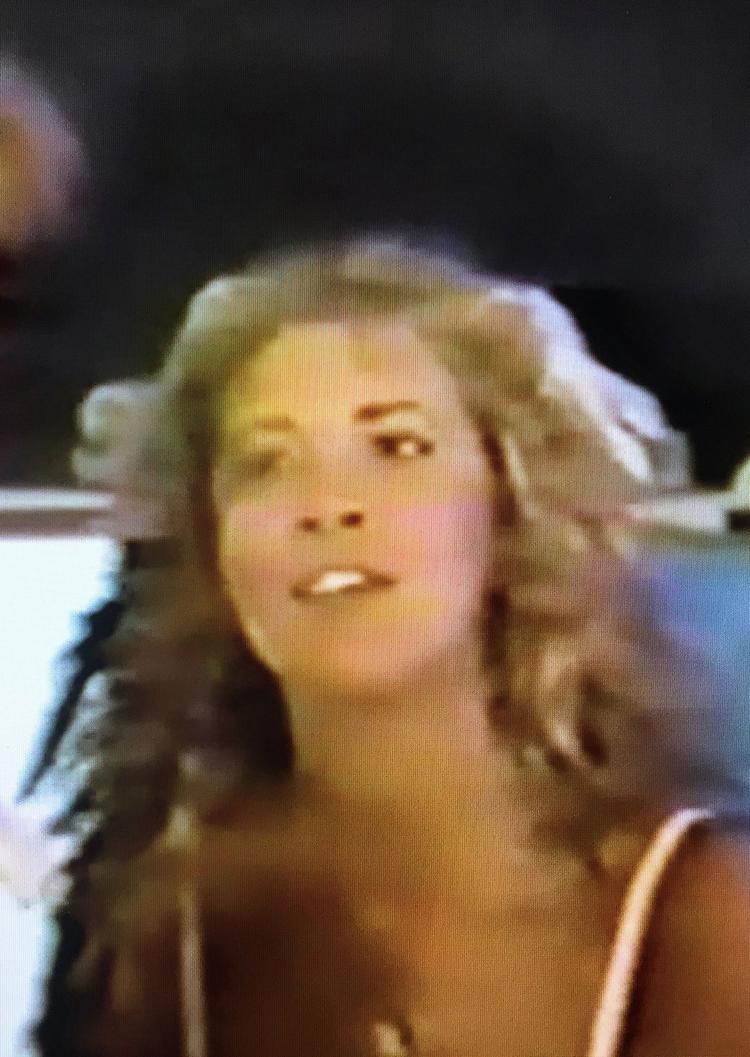
The simple and natural aesthetic of digital collage that these videos utilize is deeply rooted in the core of 22, a Million. From the start, the note taking, the creative process, and the music embrace the idea of digital collage. For example, “10 d E A T h b R E a s T ⚄ ⚄” samples a low-resolution YouTube video of Stevie Nicks casually singing backstage. These lyric videos where the perfect place to expand upon this digital aesthetic.
It would be amazing to take a 5K to New Zealand and make all the videos of Gandalf blowing lyric smoke rings, but we have a lot of readily-available capabilities in our pocket already, and feel capable of making something great on a napkin. I’ve always loved making design work in text edit, for example. The initial footage from “10 d E A T h b R E a s T ⚄ ⚄” is all video screen captured in Acrobat. The video for “22 (OVER S∞∞N)” is a slowed down video text message, with the lyrics applied in a broken subtitle generator, shot off the screen because it wouldn’t export correctly. It feels right to leave some of these inconsistencies, like a painting’s visible underdrawing. Something beautiful in mistakes—techno wabi-sabi. Folk motion graphics… motion graphics are so bad.
I like the idea of domestic psychedelia. Which isn’t so much tie-dye as it is being half asleep on an ugly couch and the floaties in your eyelids.
The artwork certainly goes to reference something ancient—a lore—but so does the music, with the voice, the folk and gospel music. But it is also inherently new, and defining what comes later, the future, so it seemed important to address the contemporary, to break the contemporary, and show how fucked up good and weird our domestic tools can be through simple layered process.
ON FOOTBALL JERSEYS AND RAINBOWS
EB
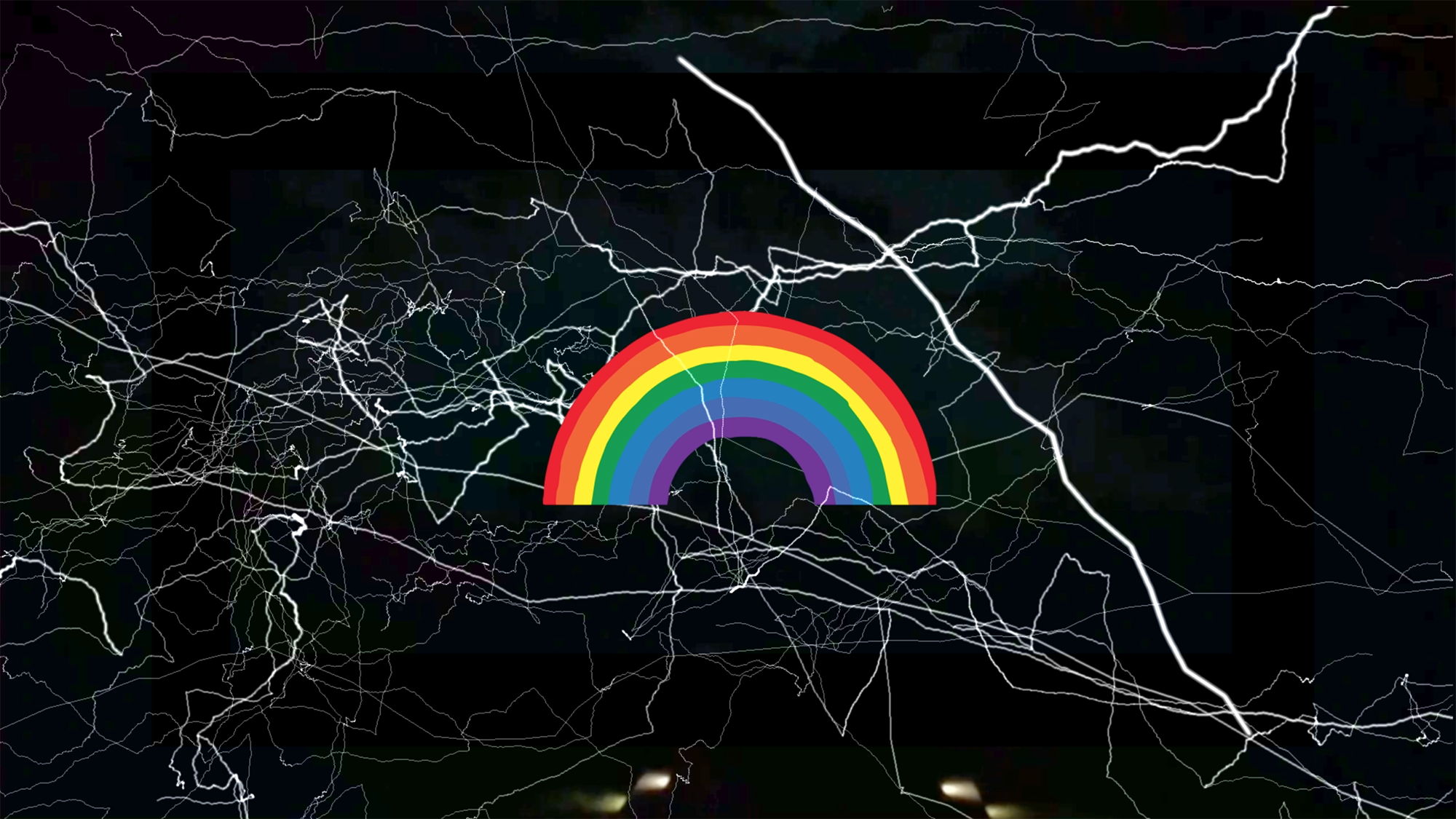
It feels very natural, the way you mash up your ancient/masonic-looking symbol system with contemporary, mundane imagery such as football jerseys, bad YouTube videos, old hotel rooms, beer cans, rainbows. What’s that about? Nostalgia? High/low? Irony? Is it recontextualizing the everyday iconography we live with? Is it something much simpler?
ETC
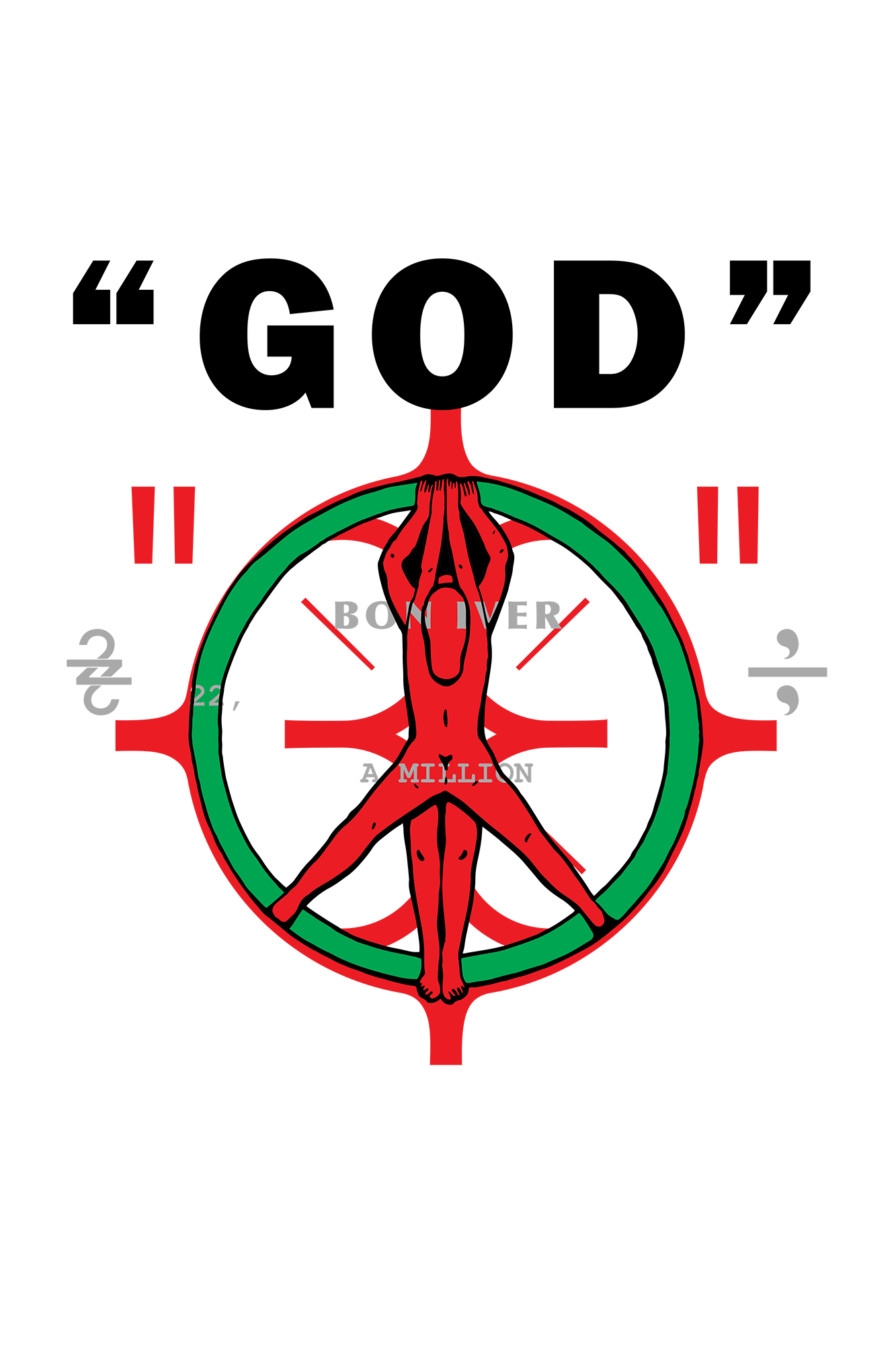
I like the natural humanity of all these things. These just feel like very human marks to me, from the fabric of communication and the material of our lives. I like acknowledging how weird and aesthetic our environments and immediate cultural surroundings are. Prodding at basic structures of communication and language. At the same time, I’m drawn to these old symbols, as they have so much responsibility for what we are and how we communicate today.
The symbols are deeply ingrained in the social mind, and define so much for us. We grow up seeing and accepting symbols as part of our reality. Spades, clubs, diamonds, hearts: where do these come from, and is there a deeper meaning? Are they violent, or controversial, or of the tarot? The cross, the star, sun and moon, the spiral: they all have vast meaning and association inherently available to anyone and everyone—owned at times by a particular culture or movement—forever shifting, but retaining a trace of a cultural pulse.
The letters of the Roman alphabet developed out of other symbols older and of meaning that no longer register in their use. Quelled by changes in regime and religion. Conquerers assimilating the occupied. Symbols collage through time.

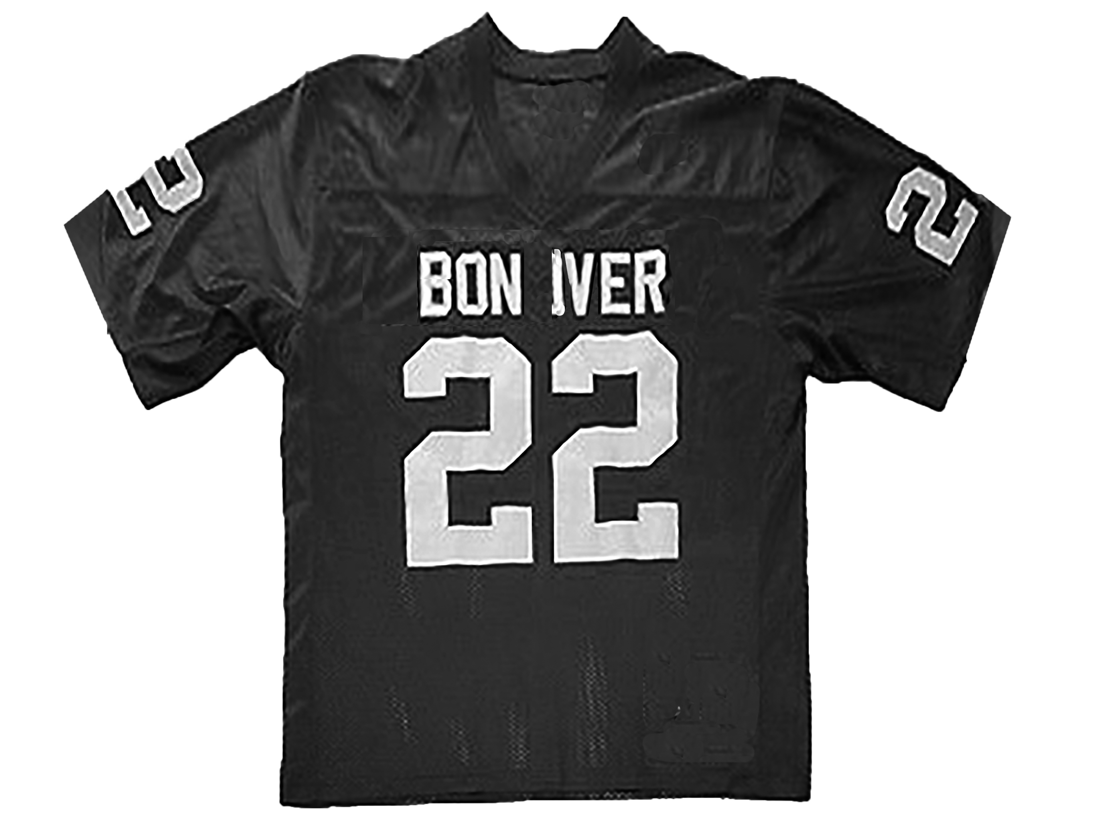
These simple things—jerseys, beer cans, rainbows—function in a similar way to the symbols. They too are symbols. The beer can is there, suggesting traces of the people behind the project. Everybody drinks the same Coca-Cola Classic. Chipotle has the same burrito any place you eat it. The football jersey—I mean, nothing ever got done at the studio on Sunday afternoons because the Packers were on, and I was like, “Noted.” It’s real.
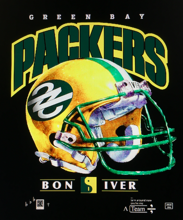
Above: unrealized concept art of a Bon Iver/Packers mashup
Though of course, contemporary symbolism is heavily influenced by branding and advertising. I imagine a good portion of the last century’s most enduring symbols come from that sector. “I Heart NY,” though an endearing sentiment, in part serves an economic end.
We so naturally have embraced a form of communication now defined as the social spaces of the internet. Images work in this space in a way unique to the speed and format of it all. We can accumulate and disperse vast immaterial fields of information, sifting through it all collectively. This field absorbs all that is fed into it and expands exponentially.
I’m not explicitly working to employ irony beyond what is casually interlaced. I don’t see it as nostalgic or particularly mundane—though at times perhaps critical, taking specific notice of problems, things understood as ugly or wrong. The Papyrus typeface. A simple awareness with unpleasant political implications—the peripherals we blissfully allow to escape notice. So re-contextualizing, yes, but also exposing some truths.
Stop and smell the flowers, connect the not obviously connected to new end. I find a lot of beauty in these things, which doesn’t require aesthetic and defies design. Slick is good and buttoned up but so often such a facade.
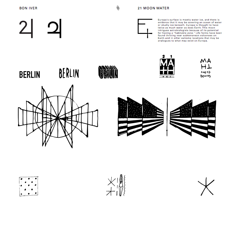
We also collected a massive amount of found imagery during the process, often texting these images back and forth. Some of these images appear in the newsprint zine released the day before the album came out in cities around the world—drawings of my own, a number of images from the Taschen Book of Symbols, a still from the Eames’s Powers of Ten, and a napkin drawing from one of our first conversations about the album art. The found imagery also showed up in other formats: the lyric videos, posters, etc. The actual album packaging itself very strictly required entirely original work, though.
ON TYPOGRAPHY
EB
Why Optima?
ETC
I didn’t want anything too tricky. A system font felt good, since I was working with the lyrics in text-edit documents. Optima just looked so right spelling out “BON IVER.” It sung the first time I saw it. I didn’t share it with them right away, or even implement it in design off the bat—but it continued to resonate every time I went back to it, which is usually a solid test. The first example I found of Optima in use that stuck out was the McCain presidential campaign, and I thought, “That’s legit” —thought it was funny—so there’s your irony. Helvetica-y was too sterile, and Garamond was too sentimental. Optima proved it could be both contemporary coffee-table book and Magic the Gathering. Find yourself a font that can do both.
I also just use Univers and Garamond for pretty much everything I do, so I wanted to do some due diligence in playing with other things. I had been using Courier New for all of my process pdf’s—because I think it looks great digital—when its all the same size (12pt or under), but kind of loath it any larger.
EB
How did you approach designing the booklet?
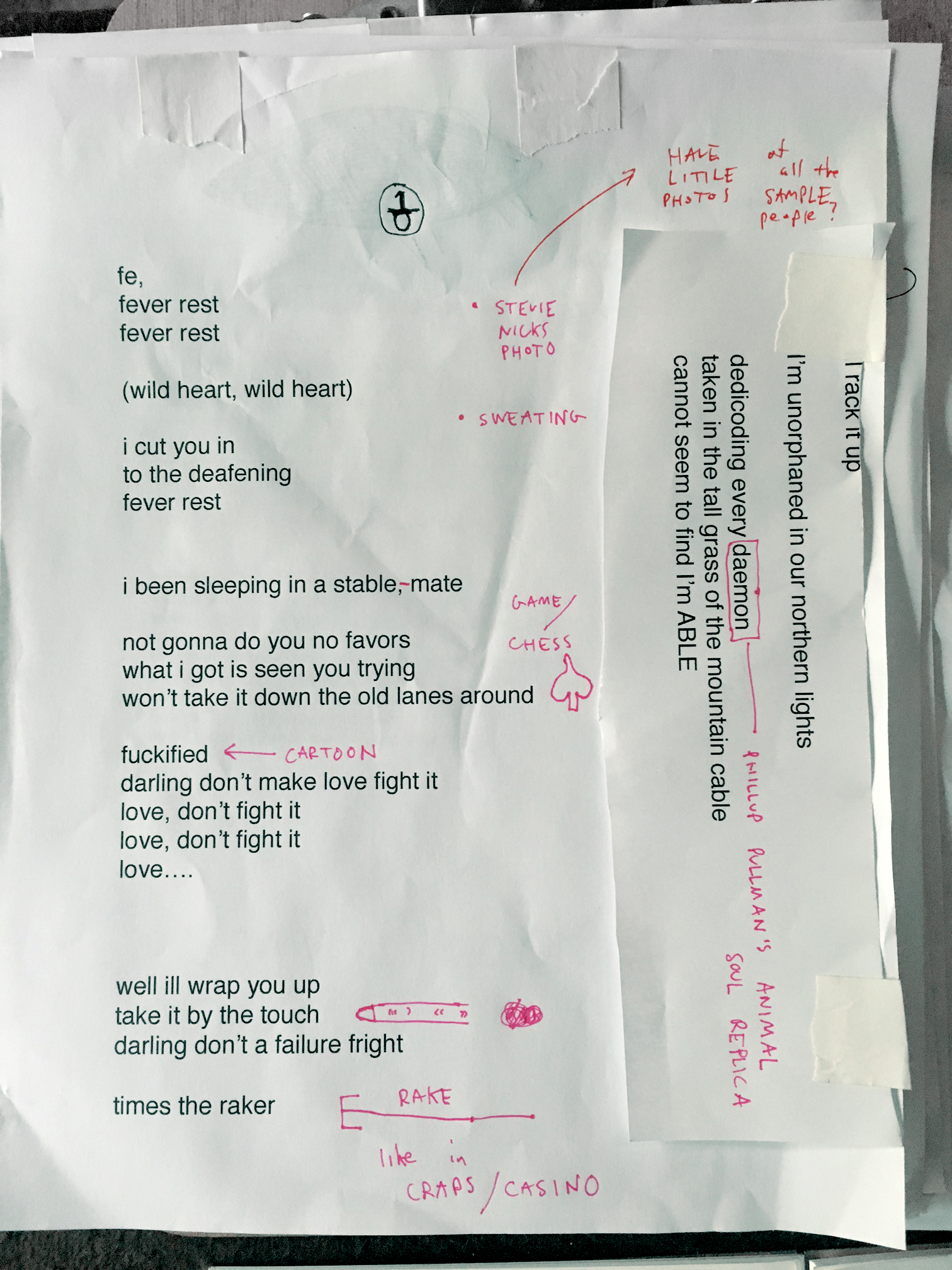
ETC
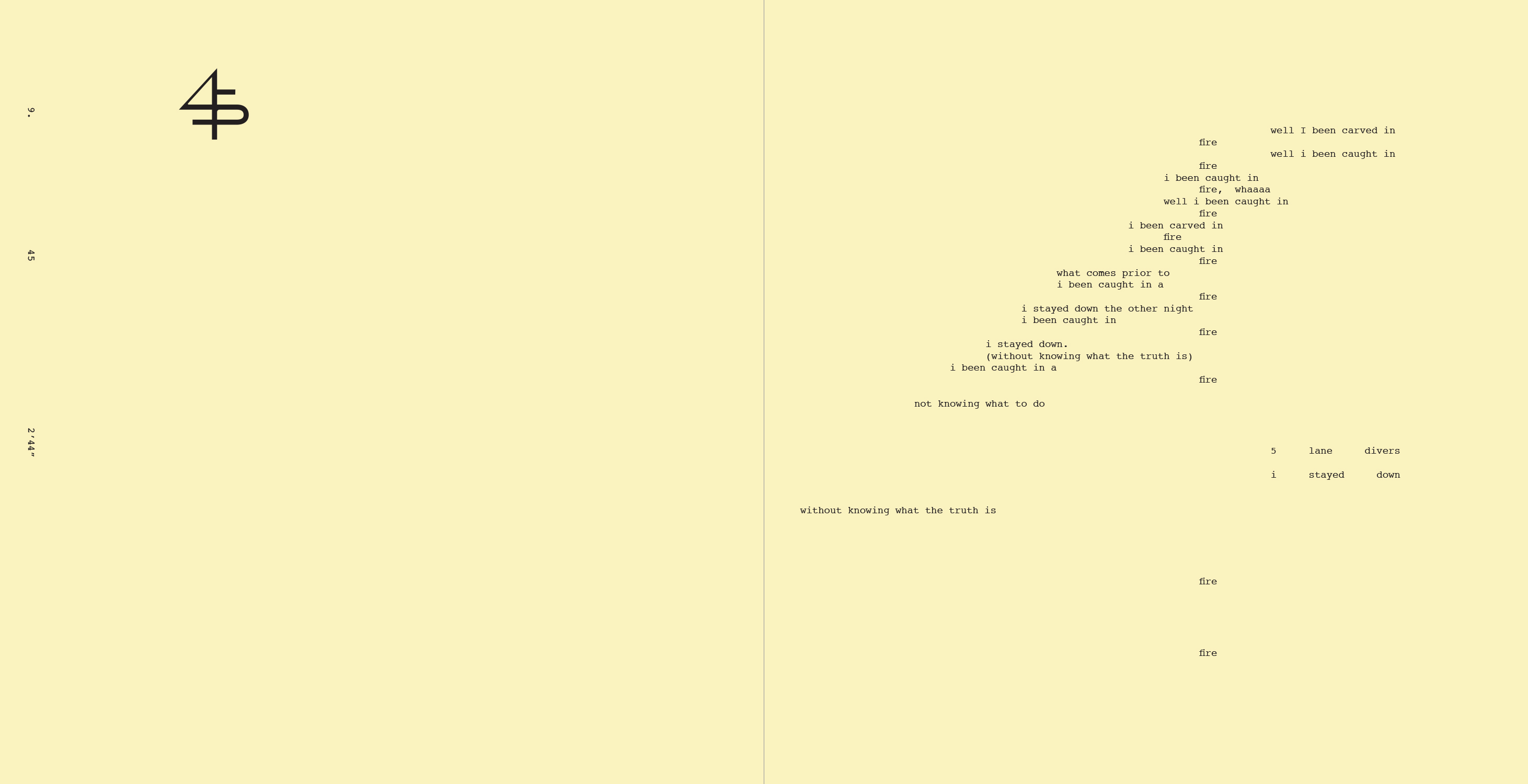
We knew from the start that we wanted a substantial booklet in the LP. Upon establishing that all of the drawings would be on the jacket, I was excited to limit the booklet to just typography, and find a way to keep that experience just as rich and nuanced as the rest of the system. I started using Courier, and that immediately started evoking the feeling of concrete poetry and ’60s conceptual art, employing the limitations of a typewriter. The hipster in a coffee shop working on a typewriter is the worst thing ever, and I was perhaps towing the line of steampunk a bit, but the direction felt right.
By the time I was working on the book I had listened to the album in process nearly a hundred times, so the layout decisions proved natural and intuitive, knowing where the phrases broke, making visual decisions in response to the music of it, using parallel columns where the lyrics overlapped.
Personally, this approach also connects to strategies of working with text digitally, such as finding ways to successfully break a blogspot layout.

ON THE BON IVER ILLUMINATI
EB
One last question: How does it feel to blatantly expose the Illuminati once and for all?
https://www.youtube.com/watch?v=NzU30fV__WU
ETC
“Ouroboros! Obelisk!” Such perfect confirmation. I’d like to note that there is no Ouroboros in that video.■


Above: spreads from the newsprint zine that was distributed at surprise listening parties worldwide the day before album release
Related Articles

Insights 2021 Design Lecture Series

The Passion Projects That Power the National

A Definitive History of Rock the Garden
Watch: The Staves and yMusic Perform "The Way Is Read"
Investigating the Magnetic Field that Drew the Staves and yMusic to Eau Claire
