Interventionist Typography: Erik Brandt on Five Years of Ficciones Typografika
By Paul Schmelzer
My favorite neighborhood in Minneapolis—sadly, the one I no longer live in—is Powderhorn Park, a south Minneapolis community known for its potent mix of activism, creativity, and inclusivity, and for the May Day festival that for nearly 45 years has filled its streets with puppets and drummers, stilt-walkers, floats, and exceedingly tall bicycles. It was also the home of one of my favorite interventionist art projects‚ one humble in scale, but not in reach: the brainchild of graphic designer and educator Erik Brandt, Ficciones Typografika was a 72 x 36-inch panel on the side of his garage that for five years hosted an eclectic array of typographic experiments by design innovators all around the world, from Eike König, Sarah Boris, Bráulio Amado, and Ed Fella to designers who’ve done time in the Walker’s design studio (including Jasio Stefanski, Ryan Gerald Nelson, Mika Albornoz, Ben Schwartz, Aryn Beitz, João Doria, and Matthew Rezac) as well as students at the Minneapolis College of Art and Design (MCAD), where Brandt serves as chair of the design department.

A Ficciones Typografika poster ready to go up. Photo: Erik Brandt
Hosting 1,641 posters between 2013 and 2018—all printed, trimmed, and wheat-pasted by Brandt, year-round, rain or shine—the project also had a robust digital life: Brandt connected with potential contributors online, and once each poster went up, he shared photos via the main project Tumblr site and related social media, quickly building a large-scale international presence. The work ranged from the topical to the wildly experimental—from pieces that referenced the death of Muhammad Ali, the Trump administration, Iranian/US relations, and the killing of Jamar Clark by local police to pieces that are so abstract or theoretical that I struggle to describe them. But at the same time, the project made an intimate connection with the neighborhood Brandt and his family call home: he’s reported conversations with dog walkers who altered their routes to see each new poster set, sex workers waiting for customers, and garbage haulers making their weekly rounds about what it means to share the work of global designers in such an environment. (For a piece I wrote on the project in 2014, he told me about the shirtless construction worker came down the alley in a truck and leaned out the window to ask, “What the fuck is this? It’s driving me crazy. I love it, don’t get me wrong. Just, what is it?”)
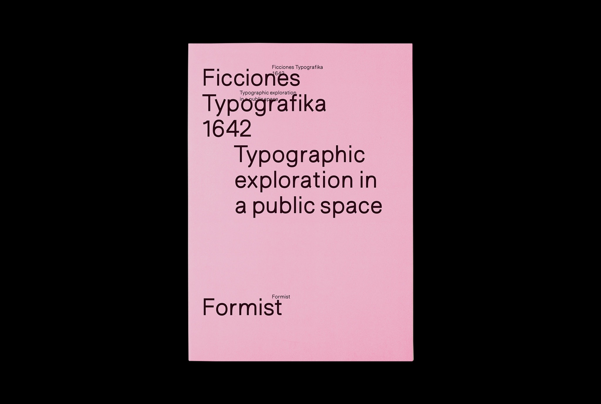
This month, the entire project is captured in a new monograph published by Formist Editions; dubbed Ficciones Typografika: 1642, it’s conceptually considered the 1,642nd and final contribution to this worldwide poster project. It features an essay by Ben DuVall and an afterword by Brandt himself. And it includes an interview—excerpted here, courtesy Formist—I did with him last April to commemorate the project’s conclusion.
PAUL SCHMELZER (PS)
You’re someone who has lived all around the world—Cameroon, Malawi, Germany, Japan, several US states. My theory is that now that you’ve settled down in Minneapolis, the side of your garage is a way that you can still be an international traveller without getting as many airline miles. Is this a way to have roots in, and identify strongly with, a place while also remaining a global citizen?
ERIK BRANDT (EB)
Absolutely. I came here because of a position at MCAD, and I started my blog, Geotypografika, right after I arrived. When I first started, I was writing for my students here, but I wanted to bring them something from all over the world. So I’d find this designer here, that artist there, and I would write up a short thing, and it gained a life of its own. Suddenly, I realized, “People are actually reading this!” Ficciones naturally came out of that.
PS
That brings me back to day one—to the first poster you did—as well as the title: “Ficciones,” which is Spanish and references Jorge Luis Borges’s work, and “Typografika,” which is Czech. Can you talk about the fusion of those two words, as well as that first work, a Letraset construction that feels like language, like letter forms, but isn’t?
EB
The origin of the project is within both my teaching and my practice. The first studio name that I coined for myself was ¡ü16.øäk! [pronounced “uh-zhe-schten-ük”], which was a typographic conglomerate of various languages I’ve spoken in my life, plus the number 16, which is a lucky number for me. I like that idea of a conglomerate because that’s how I identify my nationality. In the past there was a sense that as a designer you are a servant, a facilitator for a message. Especially in American circles, the idea was of a neutral figure. You’re invisible but should be flexible enough to adapt to the needs of the client. That idea has thankfully been largely dismissed in recent years. But at the time, I liked it.

Erik Brandt, Ficciones Typografika 001–003, installed June 16, 2013. Photo: Erik Brandt
I changed it to Typografika eventually because, as I often joke, ¡ü16.øäk! was really hard to write checks with! Typografika is a word in the Czech language which relates to typographic unions, which is a left-wing concept that I could relate to strongly. Ficciones comes from the Borges book; he was a strong influence on my development as a designer, thinker and writer, despite his obvious political problems. “Typographic fiction” is a term that I discovered early in my studies at VCU [Virginia Commonwealth University] in a magazine called Do Normal, which was devoted to an exhibition of Dutch work in the mid-’90s in LA. Rolf Müller was doing typographic sketches of basketball or team handball being played. He used the term typographic fiction, and it really resonated with me because, as you were mentioning, a lot of my early work was experimental in that regard—looking at ways of using language and distorting language, of creating alternative language, alternative symbology, substitution, alphabets, asemic marks, et cetera.
I started using that term early on, so when I was looking for a name for this project, it fell into place.
PS
The reality of for-profit graphic design today is largely that you need to do what the client wants. This must be an appeal to project contributors: “You can do whatever you want on my wall. You’re not getting paid for it, but I will bring you an audience.”

Spread from Ficciones Typografika: 1642, featuring contributions from Rob van Leijsen and Eric Hu (2014)

Spread from Ficciones Typografika: 1642, featuring contributions from Eike König and Tobias Hönow (2017)
EB
Absolutely. Most people understand that the field has its limitations, but I think we are looking at a more positive time. What graphic designers are struggling to do is to establish authority over the field, to take back what they gave away. Ironically, what I was describing before—that American orientation of designer as servant—it’s our own fault, because we perpetuated that thinking. We said, “We can translate anything, and that’s why you need to come to us, because we will find the way to represent you that you can’t, and then we will project that and it will be you.”
We’ve done that to ourselves, so I think now the larger global discussion around graphic design is about designer as author. I was part of a jury last summer in Chicago, and I was asked about some of the work that I had chosen: “What does this work communicate?” That question, to me is a 25-year-old American graphic design question, because it’s exactly that philosophy I just described. What is it communicating and how is that justified? I couldn’t care less. It’s beautiful and strange, and that’s exactly why I like it. I think that’s what we are struggling to overcome, so, yes, I think the project was a refuge for some younger designers.

Spread from Ficciones Typografika: 1642, featuring contributions from Mary Yudina and Cyril Pitet (2014)

Spread from Ficciones Typografika: 1642, featuring contributions from Giandomenico Carpentieri and Benoît Bodhuin (2015)

Spread from Ficciones Typografika: 1642, featuring contributions from Gabriela Baka & Inga Gibiete and Tuscani Cardoso (2016)
There’s real momentum. If you look at the early Ficciones contributions, some of those aesthetics are part of the global design language right now. It’s been joyful to have that happening on my garage. There are tangible things that have come from some of the experiments that have taken place there. I’ve heard from a large number of people over the years, how frequently they see examples from Ficciones on mood boards and decks within agencies and larger studios.
PS
Have you noticed a change in content over time? I feel that earlier on in the project, there was more overtly political content, but more recently the work has been more speculative, less direct. I wonder: maybe as the world has gotten more absurd, direct address makes less sense?
EB
I think you’re right about that. Despite the fact that this is arguably the most political time in human history, there’s a lack of engagement with that. I get a gauge of it talking to students. It’s not that they’re afraid of politics, I think they’re just overwhelmed with the weight of the world.
PS
Did you give a lot of thought to the pacing of the more political works?
EB
More often than not, I think the political pieces have been my own. I feel empowered by that, but also slightly self-critical: Did I take advantage of that? Did I interrupt the long form narrative that was developing? I’ve struggled with that personally, but in the end, I think I’m okay with it because to me, the argument always outweighs the question of interference. I’ve never had somebody say “Keep your mouth shut. This is all about aesthetics. It shouldn’t be political.”

Spread from Ficciones Typografika: 1642, featuring contributions from Daniel Kent, Åbäke, Huiqian Wu, and Lauren Thorson (2013)

Spread from Ficciones Typografika: 1642, featuring contributions from Audrey Quaranta and João Doria (2015)

Spread from Ficciones Typografika: 1642, featuring contributions from Erik Brandt and Danny Faria (2016)
When you have something that reaches such a large audience, you should say something on certain occasions. I’ve tried to be respectful, though, and as I’m looking at reinventing this space, there’s a part of me that is now very excited about taking advantage of this as purely Erik Brandt Land and being able to do that work more frequently without worrying.
PS
How do you think about the decollage process, all these figures and messages and aesthetic experiments peeling off?
EB
To me, that has become the real heart of the project. When I first started it, I didn’t think that at some point, the weather, the sun, they’re going to start warping the posters and make them start peeling off. The first time I starting breaking one apart it came off in large chunks, and as soon as the first bit came off, I thought, “This is brilliant! Look, there’s a totally unexpected thing.” Over time, I developed an almost surgical technique using hot water and a blade. Because only one side was wheat-pasted, one single sheet of paper will split into two, and there’ll be interesting typographic, graphic and textural moments. There are little monsters that you find, sort of anthropomorphic or zoomorphic things.
On a couple of the more successful ones, I’ve been able to gather works by quite a few contributors in one shot, and it’s really fun to put that photo online and tag everybody on this little tiny remnant. I feel the reverse of what my painter friends get to do when they are building a piece, when they’re working and reworking and coming close to a conclusion of a painting. That’s the best part of it, just to see this little sliver of this and that designer’s work, over and under.

Spread from Ficciones Typografika: 1642, featuring contributions from Benedek Takás & Dániel Kozma and Greg Ponchak (2015)
PS
What is the final piece you’ve got planned for Ficciones, and how are you thinking about the end of this project?
EB
The last piece is going to be one of the first pieces submitted that literally says “The End.” It was submitted by a student who was really cynical and angry, when the project was still by invitation only. I said, “I know you sent this in five years ago, but I’ve been holding it ever since, and now I’d like to use it.” He replied, “Oh, man, I was in such a cynical place back then.” I think it’s perfect for the last piece because it’s going to go over Mark Gowing’s piece, which is this fantastic, monumental ultra-formalist piece. Then before the afterword—an essay I wrote on Oripeau, a billboard project Ficciones inspired in France—there might even be a last decollage. I think that would be the nice way to go.

Spread from Ficciones Typografika: 1642, featuring contributions from Mark Gowing and Brian Walbergh (2018)
PS
April Greiman’s contribution, which is on the wall today, reads: “The past cannot be found anywhere. The future is a fiction. This moment is indeed the only moment that has ever happened.” It feels like it could be the concluding poster for Ficciones Typografika, but also like a mission statement for the entire project.
EB
It’s an embodiment of April’s practice, both as a designer and as a serious student of Zen philosophy. Like so many others, it fits well with the essential idea of Ficciones Typografika, which, for about five years, has been a moment-to-moment practice of engaging with experimental work. Hagen Verleger’s work from 2014 springs to mind. Referencing a German nursery rhyme—“A, b, c, / die Katz’ die läuft im Schnee, /…” [A, b, c, / the cat runs through the snow / …]—he wrote of the “trick of placing ephemeral typography in […] that strange space between persistency and the ephemeral.” But it’s true, looking back, I would focus on the work of an innovative designer, printing, pasting, photographing, and sharing, only to cover it up after a few days. It’s funny that the materiality of these works that go up on the side of my garage in Minneapolis also holds its evanescence. In the end, I’m grateful to have a book capture all these beautiful, fleeting moments.
PS
So, in a way, the past can be found somewhere after all?
EB
Exactly! Yes! That was also a magical part of the intermezzos, carefully removing the pieces also yielded new and unexpected work. Just a joy; the whole thing, it was a joy.

The final Ficciones Typografika contribution, from Brian Walbergh, about to be installed. Photo: Erik Brandt