Ronald McDonald Ollie Dos & Don’ts: What Mascots Can Teach Us About Branding
By Other Means

For the Rest of Your Life
In the summer of 2007, a well-rested man wearing pajamas and a nightcap shaved off his mustache and reintroduced himself to the world. This image shift was likely the decision of market studies predicting that a younger-looking man would sell more mattresses, or, that in post-9/11 New York, his ambiguous ethnicity was bad for business. This is quintessential branding. When a corporation feels the need to adapt to societal shifts, align with new trends, or recover from a scandal, the easiest thing to do is put on a new face.

Mascot for Sleepy’s, a mattress retailer in the northeast, before and after re-brand. This character was permanently retired in 2017 after the company renamed itself “Mattress Firm”
Since the early 2000s there has been a near total embrace of branding by museums, performing arts institutions, and public art organizations. Wally Olins saw this coming, writing in his 2004 book On Brand that after conquering nation-states and cities, branding was moving into the “complex web of organizations principally defined by the fact that they do not exist to make a profit.”1
The agencies and design consultancies that do this work make no distinction between America Online and the New Museum, Popeyes Louisiana Kitchen and the Philadelphia Museum of Art, Target and The Met, Citibank and MoMA, or Unilever and the Tate. For them, “Culture” is just another category2 in their portfolios next to Finance, Energy, Hospitality, and Technology.

Merchandise for sale at The Met store
Graphic design grew alongside industry, first as a tool for advertising, then as a way for corporations to control visual consistency and appear trustworthy to the public. Throughout all of this, many designers managed to stay connected to the arts which was, after all, the foundation of their profession. The term graphic design may have replaced commercial art but the oxymoron persists in practice, and looking at a sample of work by some of the most celebrated early designers we see equal representation from both sides: Paul Rand worked for Coronet Brandy and designed The Documents of Modern Art publication series; Wim Crouwel designed an identity system for the Dutch financial institution Rabobank while working with the Stedelijk Museum; and Chermayeff and Geismar designed logos for the Massachusetts Bay Transportation Authority and The Museum of Modern Art.
These designers applied the same modernist approach to everything,3 reducing form to make simple logos, and rational systems for organizing information, to give the appearance of efficiency despite the complicated mechanisms working behind the scenes. Branding agencies have taken this reductive approach even further, simplifying entire organizational structures to catchy slogans and “brand essence” statements. In both cases design obscures complexity. This is a welcome sales tool for a corporation selling goods and services, but for institutions it prevents people from entering into a necessary state of confusion that encourages inquiry and dialogue.
There is Only One Snoopy
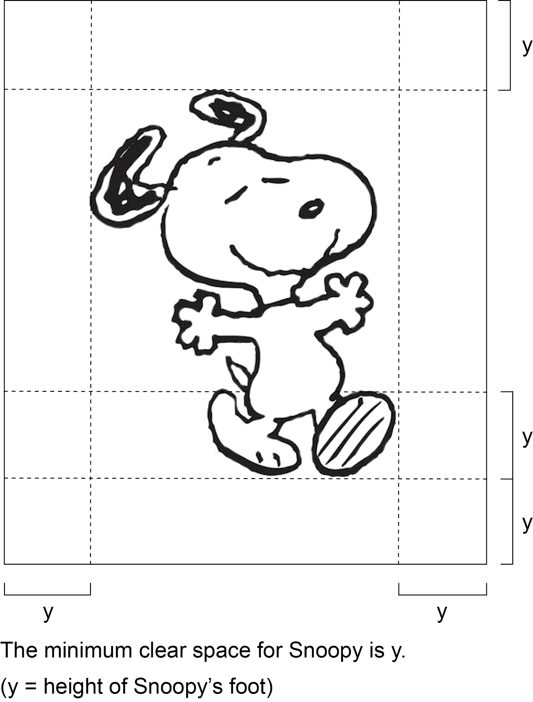
Snoopy was recently let go as MetLife’s brand ambassador after thirty years making the obscure world of insurance more approachable.4 He appeared on everything from their blimp to their stationery, and a style guide existed to ensure proper implementation. In it, there was a diagram for how to give Snoopy his personal space using his foot as a unit of measurement, and a “do’s and don’ts” section with rules like “Snoopy cannot interact with himself. There is only one Snoopy”; “Snoopy cannot speak, i.e. no bubbles with words”; and “Do not depict [Snoopy] with alcoholic beverages. Snoopy likes root beer” that reminded the staff that Snoopy brought his own personality to MetLife.
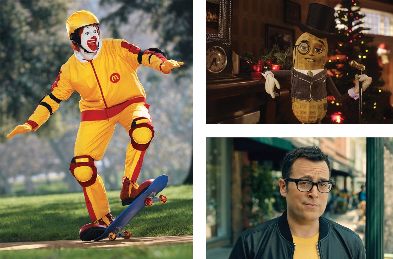
Corporate mascots have personalities that, although exaggerated for effect, have the ability to evolve in ways a style guide could never predict. Despite the fact that most of these changes are the result of pandering to new customers—Ronald McDonald loses weight and takes up skateboarding, Mr. Peanut puts on a vest and starts talking like a celebrity, the Verizon guy switches to Sprint—in their ability to adapt to new situations while maintaining their identity, mascots come closer to representing the complexities of an organization than any so-called flexible brand identity ever could. In this way, they provide an alternative to the prevailing obsession with top-down branding systems, created by agencies who are brought in to do design thinking but don’t stick around for their application. That work is left to the designers tasked with building the identity with a logo, a few fonts, vague strategies, and a style guide telling them what not to do.5
We Don’t Cut Corners When it Comes to Quality
Style guides are relics from a time when corporate design programs (as they were called before they were known as “brands”) were dictated by oversized binders full of type specimens, colors, and grids meant for typesetters, printers, and sign makers to help ensure quality. They seem unnecessary now that implementation is handled by trained designers working with software that makes achieving consistency as easy as applying style sheets and master pages, or copying and pasting.
The fetishization of these manuals—seen in the recent crowdfunded reprints of the New York City Transit Authority, U.S. Bicentennial, NASA, EPA, and British Rail guidelines—is evidence of a misguided belief that graphic design is a problem-solving profession with the ability to create stability in a world where answers are increasingly hard to come by. Truth is slippery, identity is fluid, and traditional social and professional hierarchies are being challenged. But designers can find comfort in high-priced, luxury versions of yesterday’s industrial production manuals, while the publishers reissuing them capitalize on something never meant to be sold in the first place.
Sample Applications
If you’ve ever worked on or with a style guide, you probably know how little time goes into them. In one case, we received guidelines from the Museum of Arts and Design (MAD) that had two words on the cover other than the museum and design agency’s names. One of those words was misspelled, and that word was “identity.”
At that time, MAD was working with an independent designer on institutional materials that adhered to Pentagram’s guidelines, while the curator of public programs brought in other studios to work specifically on his projects. Because many of these programs were drastically different from MAD’s typical exhibitions it made sense to work outside their identity. But even if there was a desire to work within it, Pentagram’s system relied on a custom typeface that was so specific it left no room for the content to speak for itself. Perhaps it was appropriate for a design museum to be so heavily branded, but this approach didn’t work for more experimental programs, therefore the identity wasn’t capable of growing with the institution.

Collecting notes from conversations with curators and designers. Booklet produced during Other Means residency at Museum of Arts and Design
To address this issue, we were invited to participate in a residency at MAD to research the role of graphic design for public programming, and make recommendations for how the museum could expand their visual identity. We used our time in the museum to meet with curators and designers from other institutions, and collected our research into a booklet that was distributed within the museum.

Each of our meetings were promoted as public programs open to anyone in the museum. For our last one, we invited artist Jacques Louis Vidal to engage directly with the visitors. He dressed up as a fictional museum founder and lead improvised tours of the exhibitions. (Photo: Nathan Nedorostek)
Ultimately, MAD hired an in-house designer who has continued using the logo and typeface suggestions from Pentagram’s guidelines, but paired them with a more decorative approach that, while not really our preference, works well for the type of exhibitions they present.
In 2013, we started working with the Institute of Contemporary Art at the University of Pennsylvania (ICA Philadelphia). The project was initially a redesign of their website in order to celebrate their fiftieth anniversary and develop a new way to display and connect their archive. It expanded into a larger institutional redesign due to the need for a consistent visual language that would work across the website, print materials, exhibition graphics, and exterior signage and banners. ICA had never worked from a style guide with their previous visual identities, and were interested in having one at the end of our collaboration. We were, too, but recommended treating it as an evolving document—something that could be revised after we spent some time working with the identity.
We produced a document that summarized our initial idea and worked from it for a few seasons. It was a fairly simple system of threes meant to flatten typographic hierarchies: three-column grid, three type sizes, and an approach to positioning information in asymmetric “constellations” the spread across the page. This was based on the three letters in I-C-A and their alignment in the logotype, a response to the positioning of galleries in their building and how visitors moved through them.
ICA Philadelphia has a dynamic exhibition and program schedule. Since we’ve been working with them, the number of exhibitions has been different each season, the issues they address are constantly expanding, and the curators are always finding new ways to present work—especially performance-based work—in the museum, challenging how the building functions and forcing the design to constantly adapt to new situations. As a result, our approach and the visual identity has evolved each season, but always in response to what came before: either to build continuity or signal a bigger change. What has remained constant is the typeface, the logos, and a consistent way of working closely with the institution. There is a visual coherence and a recognizable identity and voice, but no firm rules that we’d be able to dictate through a style guide.
I’m Lovin’ It
The alternative to a corporate, style-guide driven approach to branding is developing a visual language over time. This is a bottom-up vs. top-down approach, or what philosopher Gilbert Ryle describes as the difference between “knowing how” and “knowing that,” which Keller Easterling has used to explain a dispositional approach to design that unfolds over time6:
Ryle once explained the difference between the two by using the example of a clown. The clown does not possess the correct answer to the question, “What is funny?” The clown’s antics are not a single reasoned executive order. His knowledge and experience unfold in relation to the situation, from encounter to encounter, circumstance to circumstance. He has well-rehearsed knowledge of how to do a pratfall, exaggerate his facial expressions, modulate his voice, or introduce any other gag from his bag of tricks. What is funny involves a set of choices contingent on the audience’s reactions, and the clown’s performance relies on “knowing how” rather than “knowing that.”
For Easterling, knowing how “does not describe a constant, but rather a changing set of actions from which one might assess agency, potentiality, or capacity.” This is the designer that has internalized the complex nuances of an institution and makes work appropriate for each situation, regardless of its relationship to what came before. Knowing that is the branding agency that sets rules for every design choice without any engagement in their execution, assuming it will remain constant forever.
Like clowns that know how to be funny, and mascots with personalities that evolve naturally over time, institutions should partner with independent designers, design studios, and build strong in-house teams. These long-term collaborations can replace large branding agencies, and develop truly adaptive, flexible visual identities that accurately reflect the necessary complexities of cultural institutions.
Other Means would like to thank Aryn Beitz and Sarah Stephenson for editing, and another thanks to Aryn for the above layout.
Related Articles
