Found/Seen: Lawrence Weiner, van Munster’s Moustache, and Kouba’s Sausage
By Ryan Gerald Nelson, Ben Schwartz, Aryn Beitz, Jasio Stefanski

With over 35,000 contemporary art books, 150 subscriptions to art journals/magazines, and a collection of 1,800 artist books (including the Rosemary Furtak Artist Book Collection), the Walker’s Library and Archives, unsurprisingly, has a magnetic attraction upon us—the members of the Walker’s Design Department. We periodically find ourselves in the Library’s stacks, pulling aside books and printed matter that are noteworthy for their content, unusual in format, or simply beautiful in form. We share our findings through this series, titled Found/Seen.
Found/Seen by: Ben Schwartz
Found:
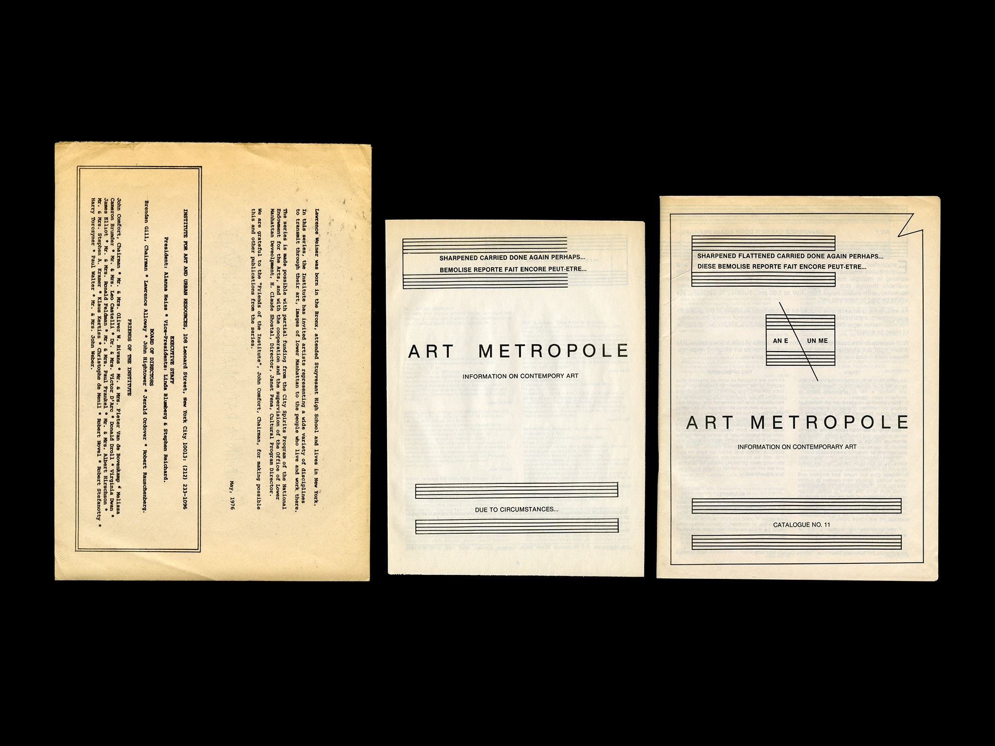
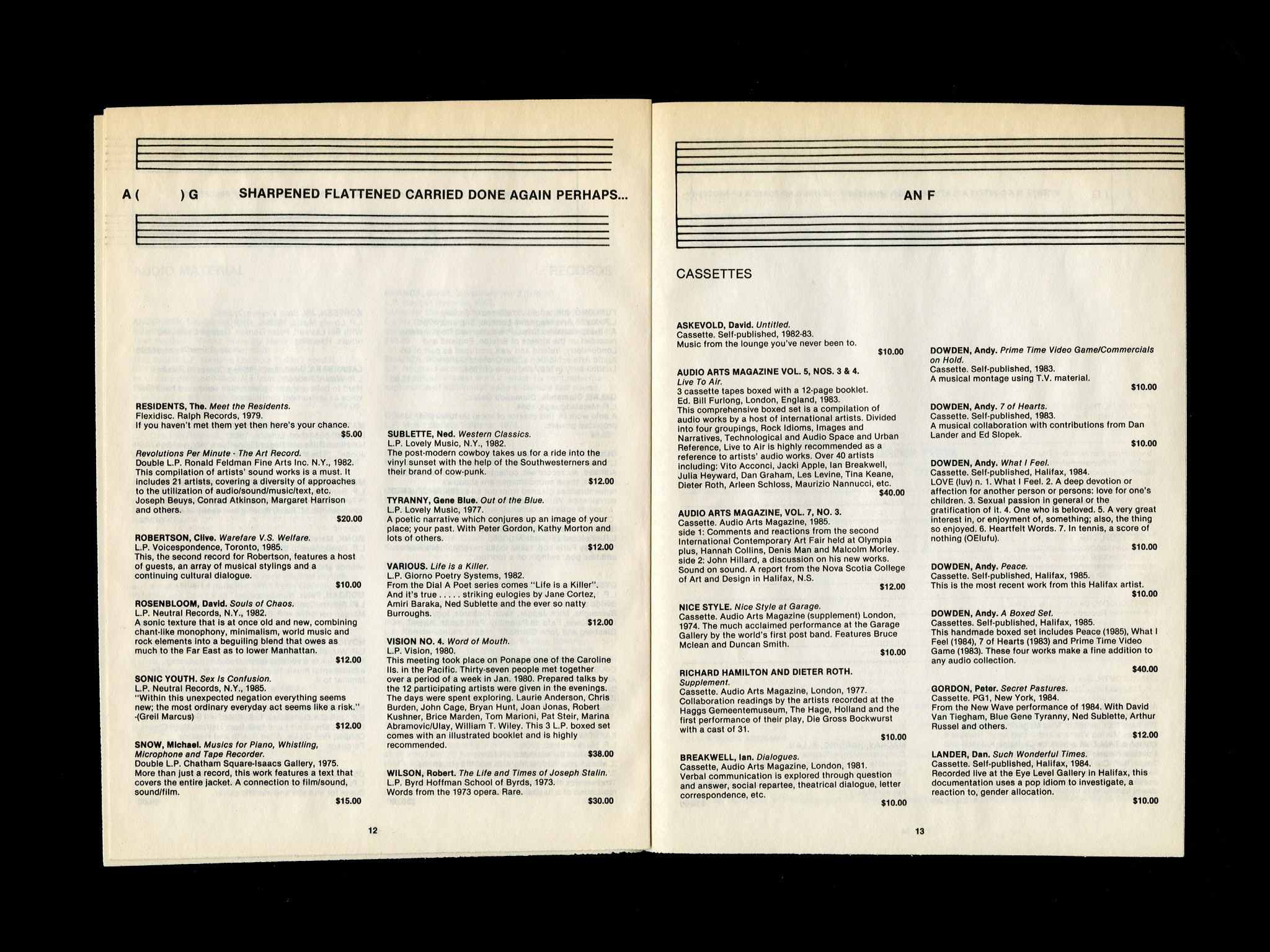
Art Metropole Catalog No. 11 and Addendum to Art Metropole Catalog No. 11
Author/Designer:
Designed as works by Lawrence Weiner, edited by A.A. Bronson (General Idea, Printed Matter, NYABF)
Identifying Marks:
The contents of the newsprint Catalog and Addendum adhere to a standard mail-order structure. Unique elements include a running header as a work by Lawrence Weiner. The illustrations resemble a music staff with poetic phrases about musical notes such as “A HIGH C SHARPENED CARRIED DONE AGAIN PERHAPS WITHIN THE CONTEXT THAT PRECEEDED”. The Addendum to the catalog is a similar structure and includes predominately audio works.
Found:
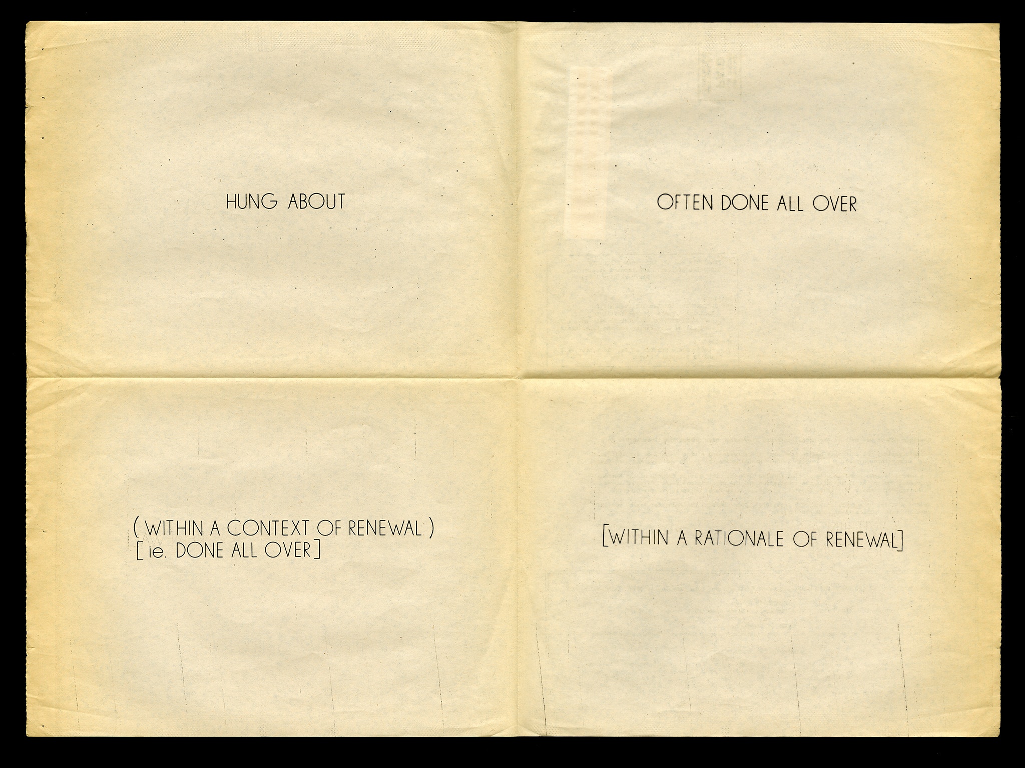
Institute for Art and Urban Resources, New Urban Landscapes # 6
Author/Designer:
A work by Lawrence Weiner
Identifying Marks:
The New Urban Landscapes Project was a series by the Institute for Art and Urban Resources where artists were invited to “transmit through their art, images of lower Manhattan to the people who live and work there.” The work is a newspaper broadsheet containing four lines of text: “HUNG ABOUT,” “OFTEN DONE ALL OVER,” “(WITHIN A CONTEXT OF RENEWAL) [ie DONE ALL OVER],” “[WITHIN A RATIONALE OF RENEWAL].” Surprisingly the poster is not set in Weiner’s typeface Margaret Seaworthy Gothic as is characteristic of a large body of his work.
Until next time…
Found/Seen by: Ryan Gerald Nelson
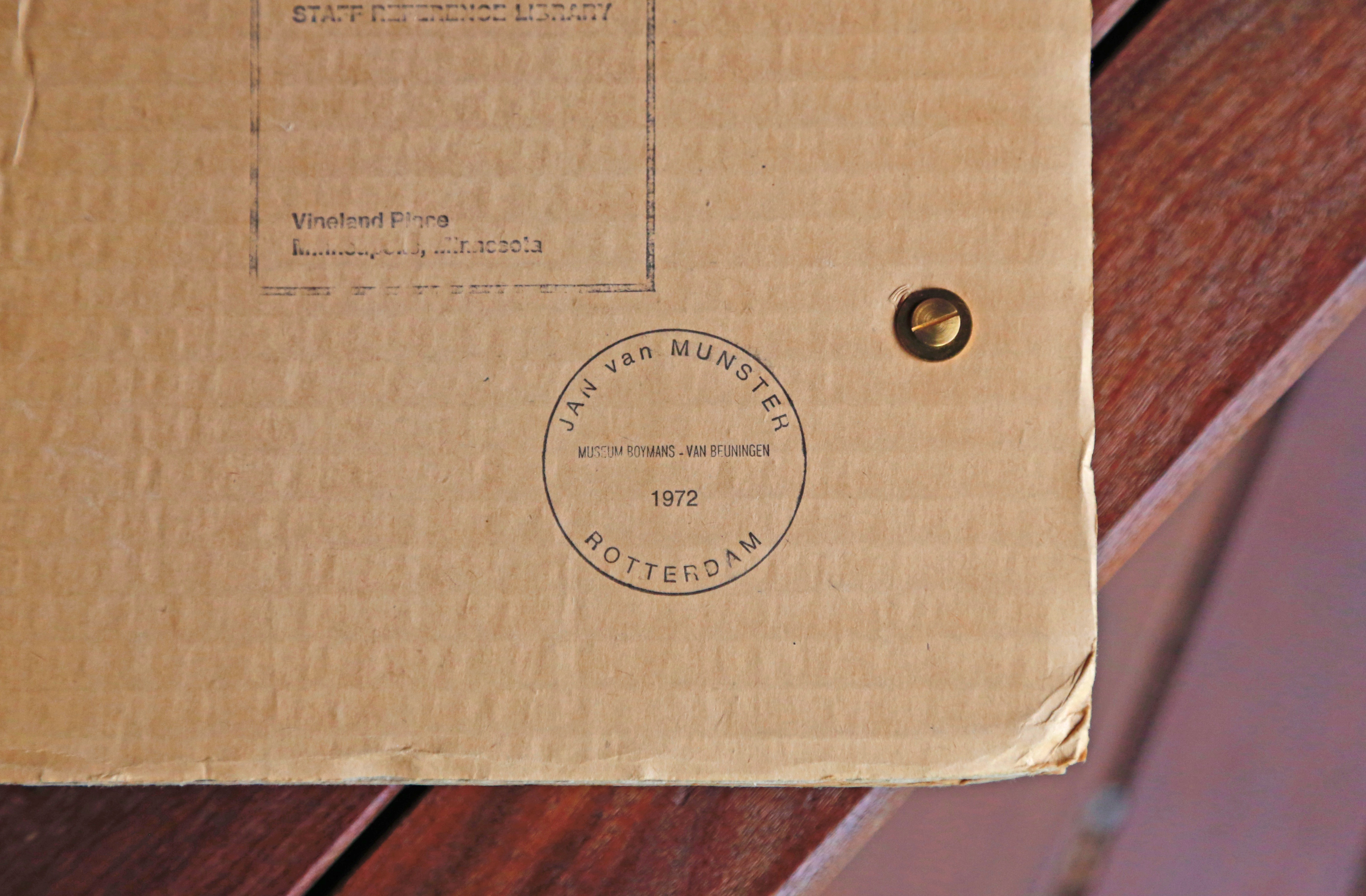
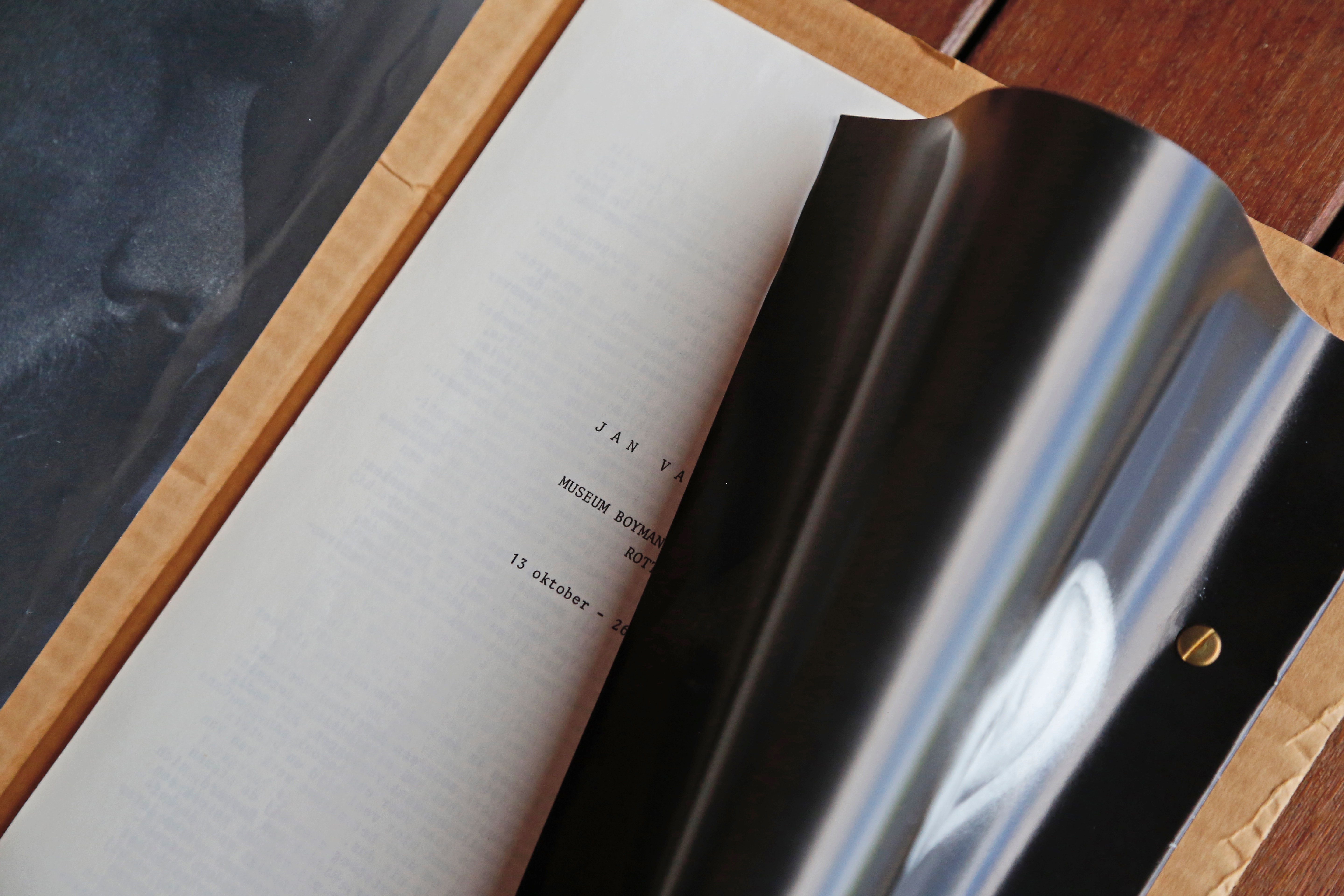
Jan van Munster
Published by Museum Boijmans Van Beuningen
1972
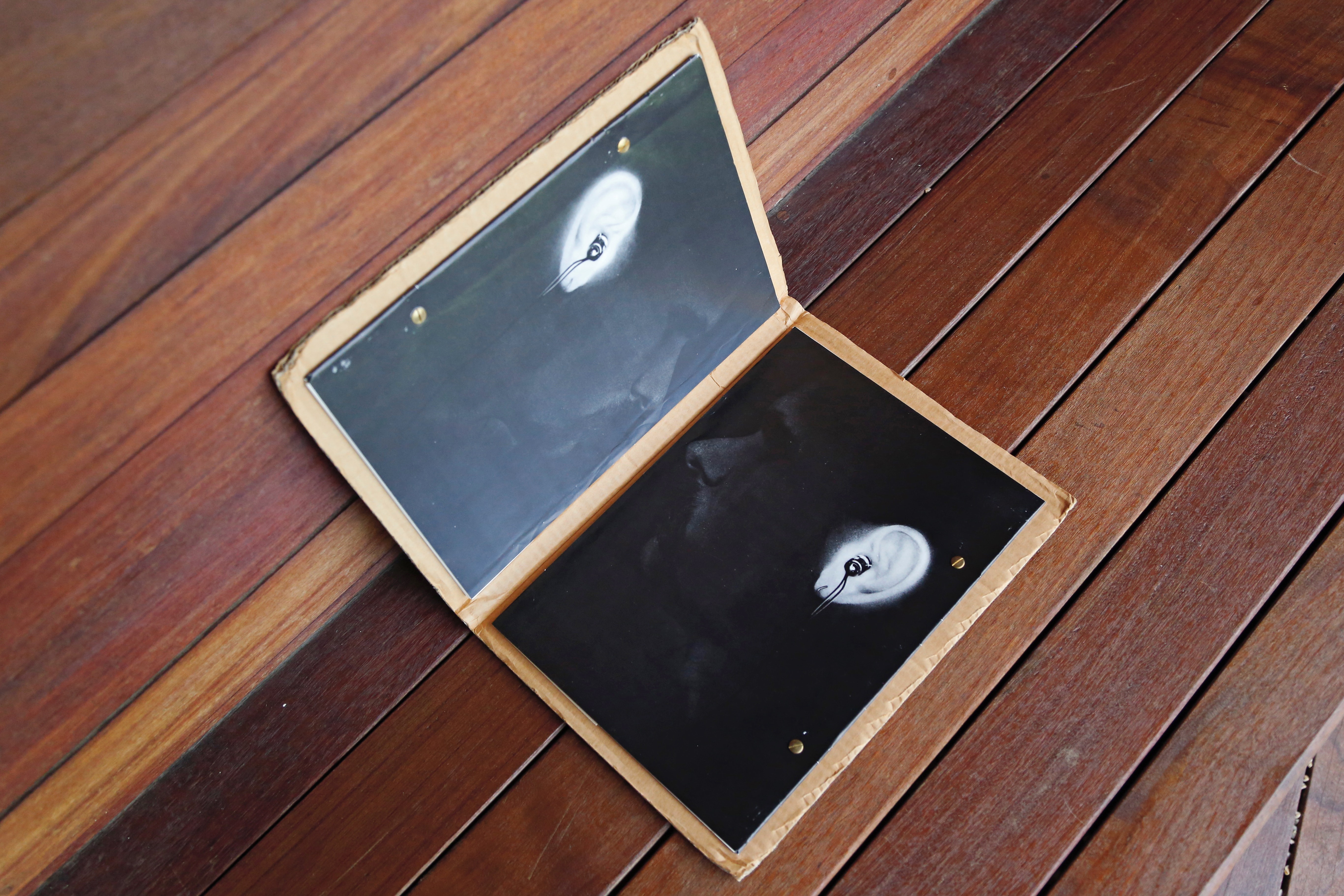
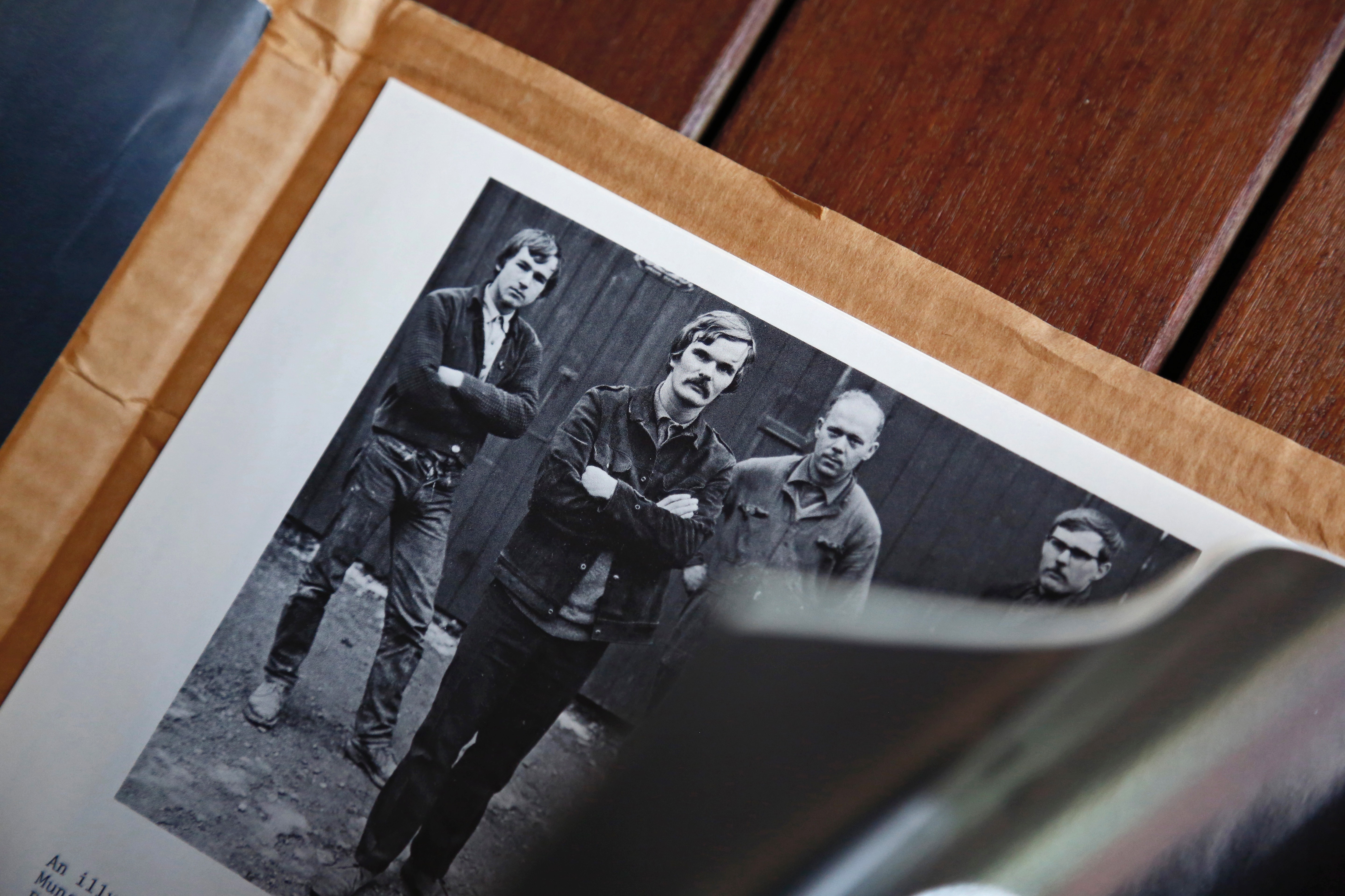
I know very little about this book and can only imagine the scenario of how it came to be. Or, I should say: these books. Two loose-leaf gatherings, bound into both sides of a cardboard folder/cover, each secured to the cardboard with two respectable-looking flat-head brass bolts with matching washers and binding posts, one opening to the left, one opening to the right. Should I consider this one publication? Two? Three? I digress. Back to imagining.
It’s 1972. Rotterdam, de Nederlands. Thirty-three-year-old Jan van Munster, a Dutch sculptor and installation and light artist, is preparing a solo exhibition with the Museum Boijmans Van Beuningen. A publication is in order. Jan meets a team of curators with some photo and design department staff in tow. Everyone is chain smoking. A certain laissez-faire attitude is in the air. Jan wants a cardboard cover, so they give him a cardboard cover. A newbie art handler’s uncle works down on the Rotterdam docks at a packaging plant and can proffer a deal on some pallets of flat sheets of corrugated cardboard. But how to mark the cardboard cover? A rubber stamp, naturally. The rolodex materializes and they call the guy that made the rubber stamps used for the museum’s order forms. It’s a classy type lock-up set inside of a circle. It’ll do the job.
A precocious photo intern down in the basement, just tinkering around one day on lunch break, subtly lights Jan’s mustachioed side-profile on a black sweep and snaps a few. The shots make their way to the covers of each of the core publications. On the left, we see Jan’s right side. On the right, we see Jan’s left side. Both faces starring inward, toward the content of the book. Or perhaps it’s simply Jan starring at Jan? Whoa, meta. On both, his ears are illuminated by some super concentration of light (the result of some crafty darkroom dodging). I think he has earbuds in. Did those exist in 1972? No matter. Jan’s just doing his thing.
An assistant on the curatorial team, the beneficiary of a little departmental budget boost in ’71, has a basically new IBM Selectric II Typewriter with 10 and 12-pitch type settings and an IBM Tech III Ribbon cartridge at their desk and volunteers to typeset the pages. The assistant isn’t the fastest typer, but damned if she isn’t accurate. The A4 pages are composed and perfected, stacked in a rigid mailer, and sent to the printer down in Breda to be photographed for reproduction.
Okay, I’m just letting my imagination run.
What I do know is that I love how effortless the decisions of this book come across. It’s design and typesetting are dry and uncomplicated (worthy attributes to people like me), but not without a few modest artistic and conceptual gestures that make the book an object worth appreciating.
Found/Seen by: Aryn Beitz
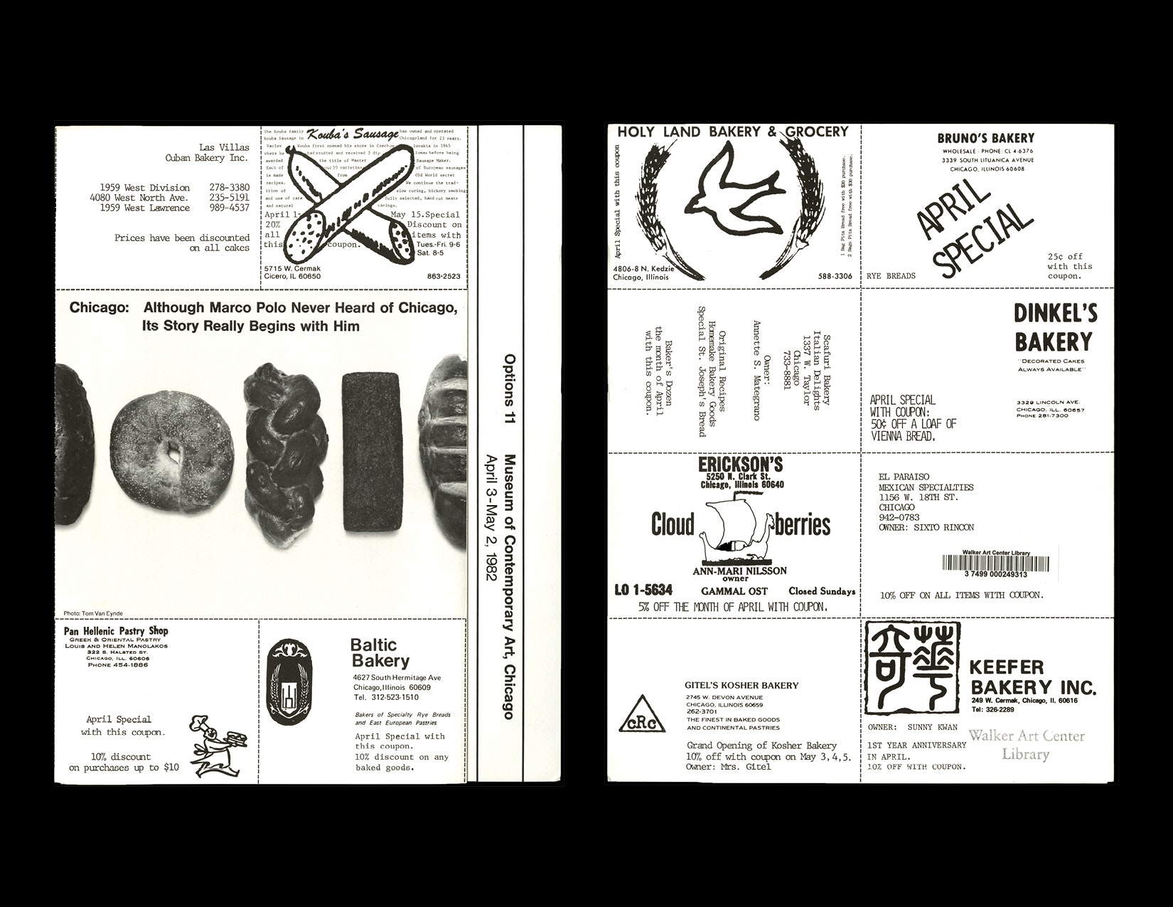
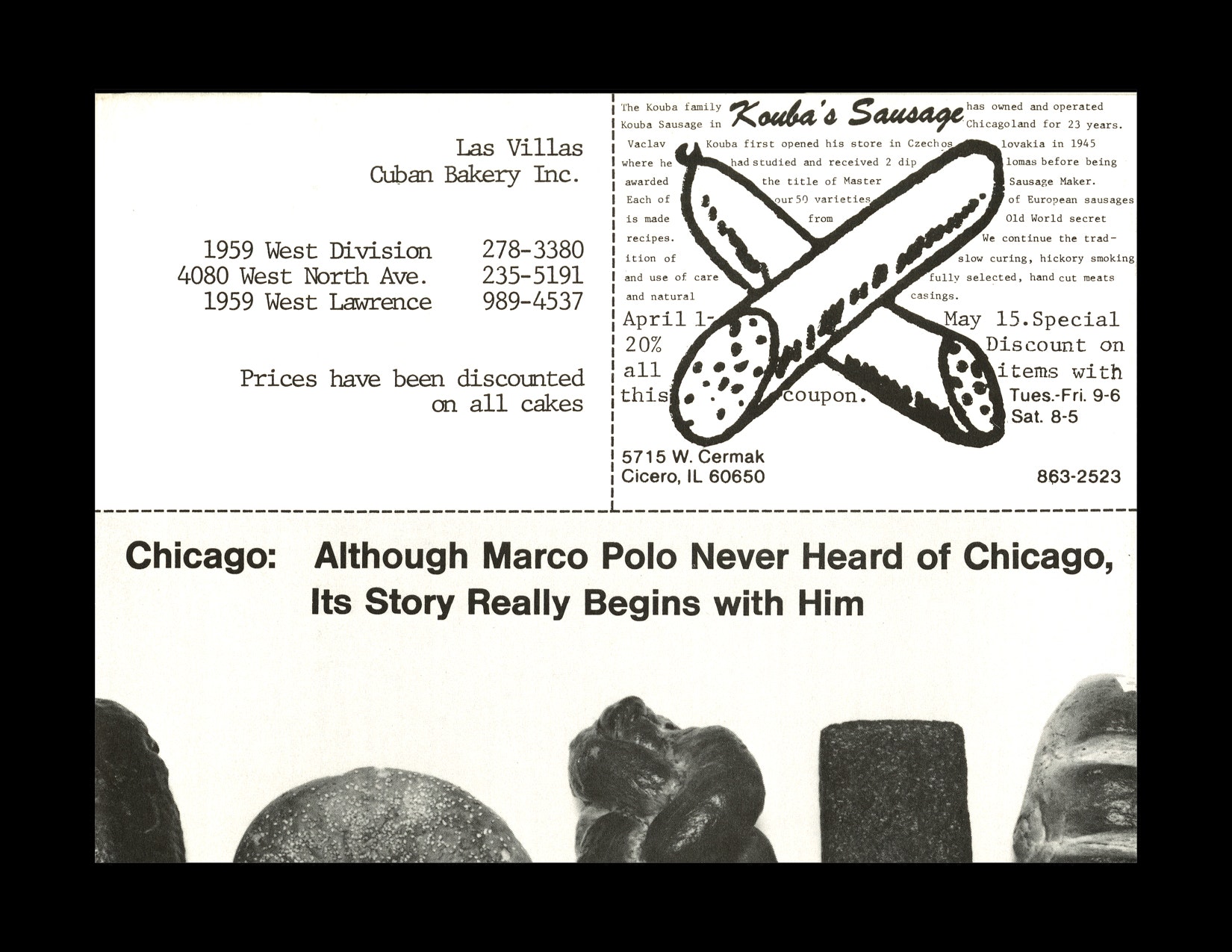
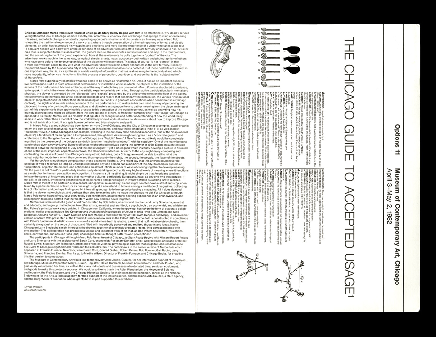
This 8.5 x 11, two-fold brochure was designed for an exhibition at MCA Chicago in 1982 titled, Chicago: Although Marco Polo Never Heard of Chicago, Its Story Really Begins with Him. Many of the graphic elements feel familiar, if not contemporary: Kouba’s overlaid sausage illustration and the random loaves of bread on the front cover and the coupon-style adverts on the back cover. It’s not clear if the coupons were valid or not, but the bakeries did exist at the time of this exhibition (many still remain in business today). The interior features a description of the show written by Assistant Curator Lynne Warren. According to Warren, the exhibition was “an affectionate, wry, deadly serious yet lighthearted look at Chicago, or more exactly, that amorphous, complex idea of Chicago that springs to mind upon hearing this name, and which changes constantly depending upon one’s situation and circumstances.
The Chicago Guide to Accepted Usage spans three pages and consists of a glossary of terms and accompanying illustrations. A few of my favorite terms:
CONTEMPORARY: A good thing.
COFFEE: Induces wit. After dinner it is taken standing up with lots of milk—very swank; gives the impression you have lived in the East.
CRITICISM: Always render it in a loud voice, especially when in a museum. Don’t get into the habit of criticizing only after the event.
MUSIC: Makes one think of a great many things. Soothes the breast. Stirs the soul.
THINK (TO): Painful
According to the footnote, the text “informs the reader of those usages which are “in accord with Local Tradition Order and Sound Convention. This compilation owes much to the work of Gustave Flaubert, (see especially his The Dictionary of Accepted Ideas).” “Introduction” Proceedings, First Congress of Illinois Teachers of English, Chicago, 1933, p. 47.”
Found/Seen by: Jas Stefanski
“A development that repeats, as it were, stages that have already been passed, but repeats them in a different way, on a higher basis (“the negation of the negation”), a development, so to speak, that proceeds in spirals, not in a straight line;” —Vladimir Lenin, Karl Marx
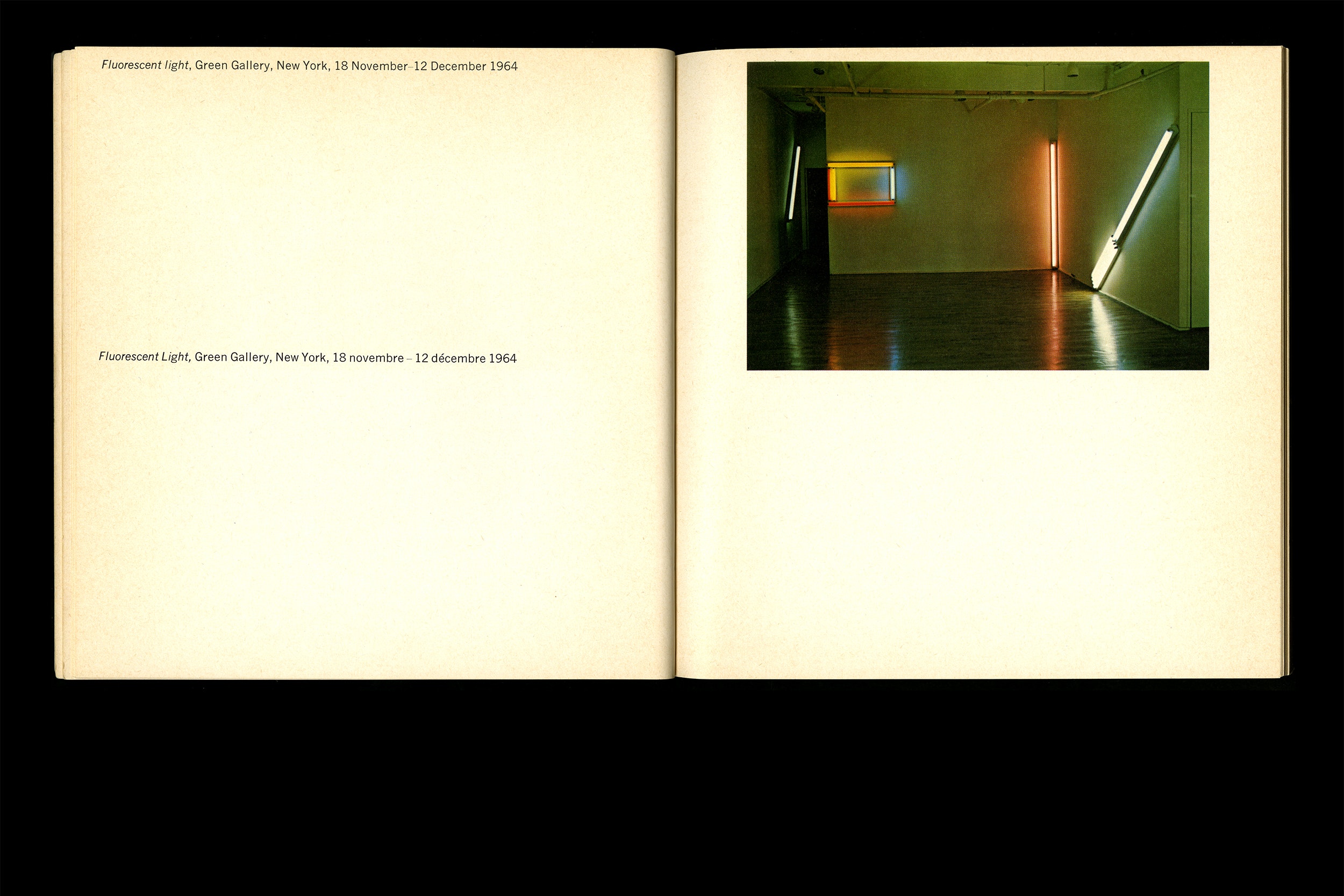
A joint effort between the National Gallery of Canada & The Vancouver Art Gallery, Lumiere Fluorescente, Etc./Flouresecent Light, etc (1969), was printed on the occasion Dan Flavin’s traveling respective featuring a comprehensive one hundred and fourteen pieces. The resulting 20 x 20.5cm, 272 pg. catalog is indiscriminately minimal, allowing the typography to run from the most outer margin into the spine. Page numbers are economically set at ninety degrees, rejecting the notion of aesthetic intervention. There is no shortage of Falvin’s work, documented in both color and black and white, providing a basic idea of what projected light in space looks like.

Perhaps more interesting (Or more accurate) than documentation of Flavin’s installations are his sketches. I was particularly drawn to those rendered for his “monuments” to Vladimir Tatlin. The series of work consisted of thirty nine pieces created over a 36 year span, the first of which were created just a few years before Lumiere Fluorescente, etc. was published. Flavin’s linearity juxtaposes the spiral form integral to the ideology of Tatlin’s models yet maintains a structural resemblance. Though he often created work addressed to various people, the thirty-nine attempts to Tatlin seem to acknowledge the potential of the unrealized monument.
