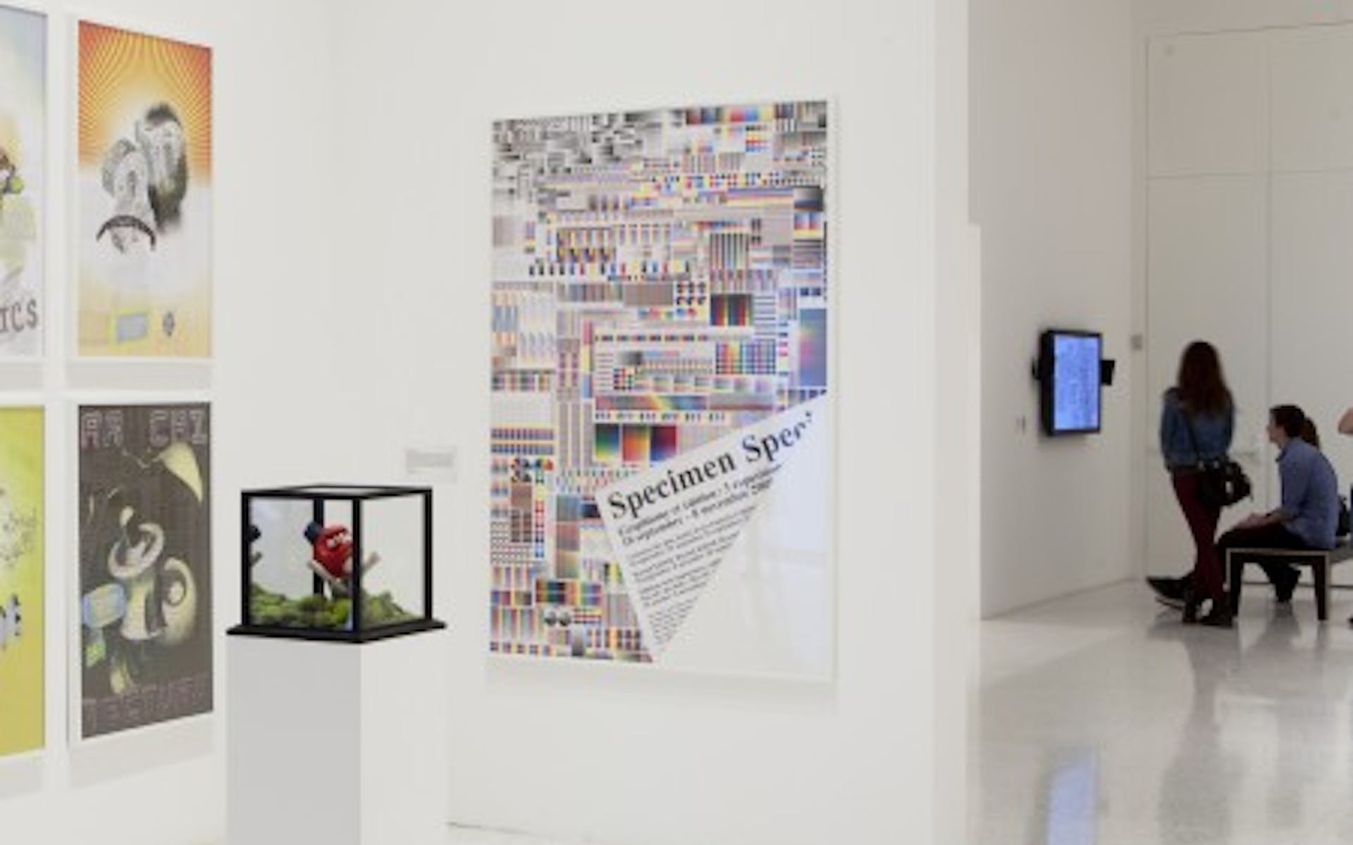
French graphic designer Fanette Mellier has two pieces in Graphic Design: Now in Production. The first is her Specimen poster, a meticulous patterning of printer’s marks and color bars, and the other is a conceptual redesign of the book Bastard Battle, a novel by French author Céline Minard.
I recently emailed Fanette and asked her a few short questions about her work. I quickly realized that the language barrier was going to make for a less than straightforward exchange. (Fanette claims her English isn’t very good, but I think she is selling herself short, and as for me, my French vocabulary consists of maybe two words.) To circumvent this, we decided to communicate using Google Translate as an intermediary. Below you will find both the English and French translations. It’s not perfect, but it works.


Could you talk a little bit about Specimen and the ideas behind it?
Specimen The poster was designed for a series of exhibitions on design editorial in the town of Chaumont, which is an international design festival. Editorial design is not assessed on the same scale as the poster, and its quality is related to the quality of printing and manufacturing. That’s why I obsessively recomposed a tapestry, with the technical control of printing, because it is a common language for designers, but is still on the sidelines. This poster is not really an image, it is made to be seen up close. The title of the poster is printed on the back, it appears to the fold. The gesture reminiscent of the fold on fragile paper, and the cornea of the book page. This poster introduces a report text / image that refers to the very substance of the paper, as one giant page.


In the Moon


Circus


Common Agenda
From looking through your website it seems that vibrant color and geometric form play a distinctive role in your work, almost to the point of becoming a personal style. Could you talk about color and the way you utilize it from one project to the next?
The color is fundamental to my work. I use it functionally (classification, hierarchy of content) and poetic. Often the forms I create are very geometric, rigid, organized. Plasticity and poetry involved with color, that flows through these forms, sometimes freely and randomly when I leave an element of chance in printing. But I can also say that it is invested differently in different projects related to the content. For example, in the project “Royans” color allows the book to dive into the colorful glow of a season: summer. For the project “In the Moon”, the color makes a significant step forward in the lunar cycle, and an exploration of the technology. “Circus” for the project, the color yields of single letters, which become artistic objects, visible from near and visible from a distance. And the project “Common Agenda”, color identifies the reader in the geographical areas to classify exposures. and so on.
French version:
Avec votre affiche Spécimen il semble que passé beaucoup de temps et d’effort de collecte des barres de couleurs et marques d’immatriculation de couleur des imprimantes différentes. Pouvez-vous nous parler un peu plus sur cette pièce et le processus qui est entré dans ce qui en fait?
L’affiche Specimen a été conçue pour une série d’expositions sur le design éditorial, dans la ville de Chaumont, où se tient un festival de graphisme international. Le design éditorial ne s’apprécie pas à la même échelle qu’une affiche, et sa qualité est liée à la qualité d’impression et de fabrication. C’est pour cela que j’ai recomposé une tapisserie obsessionnelle, avec des éléments techniques de contrôle de l’impression, car c’est un langage commun aux graphistes, mais qui est toujours en marge. Cette affiche n’est pas vraiment une image, elle est faite pour être vue de près. Le titre de l’affiche est imprimé au verso, il apparait avec le pli. Le geste du pli rappelle la matière fragile du papier, et la page cornée du livre. Cette affiche instaure un rapport texte/image qui renvoie à la matière même du papier, comme une page géante.
Ce livre a été conçu lors d’une résidence au Festival international du graphisme de Chaumont. J’ai initié un projet sur les liens entre graphisme et littérature, et commandé des textes à 4 écrivains. Céline Minard en fait partie, elle a écrit Bastard Battle dans le cadre de ma résidence. L’histoire se passe à Chaumont au moyen-âge, elle est basée sur une histoire vraie. La langue est un mélange d’ancien français, et de termes empruntés à l’univers du kung-fu et du manga. Ce texte est un ovni, avec une énergie particulière, presque cinématographique. J’ai eu envie que le livre ressemble à un livre de poche (une forme pauvre et familière), qui serait devenu fou. Comme si le texte contaminait, possédait le livre. Les typographies mutent, bavent, et se transforment. Une lumière colorée se propage, et sort du coeur du livre, comme une lumière de vitrail. La comparaison avec Kill Bill est juste d’une certaine manière, car il y a des références “clin d’oeil” à l’un univers du kung-fu, et que les femmes y jouent un rôle bien particulier dans les scènes de batailles, très graphiques. Mais à mon sens, l’oeuvre de Céline Minard est plus inclassable et plus ambitieuse, les codes sont moins caricaturaux, la langue est réinventée.
De regarder à travers votre site, il semble que la couleur vibrante et la forme géométrique de jouer un rôle distinctif dans votre travail, presque au point de devenir un style personnel. Pouvez-vous nous parler des couleurs et la façon dont vous l’utiliser d’un projet à l’autre?
La couleur est fondamentale dans mon travail. Je l’utilise de façon fonctionnelle (classification, hiérarchie du contenu) et poétique. Souvent, les formes que je créent sont très géométriques, rigides, organisées. La plasticité et la poésie interviennent avec la couleur, qui circule dans ces formes, parfois de façon libre et aléatoire, quand je laisse une part de hasard dans l’impression. Mais je peux aussi dire qu’elle est investie différemment selon les projets, en lien avec le contenu. Par exemple, dans le projet “Royans”, la couleur permet de plonger le livre dans la lueur colorée d’une saison: l’été. Pour le projet “Dans la lune”, la couleur permet une avancée sensible dans le cycle lunaire, et une exploration de la technicité. Pour le projet Circus, la couleur permet d’obtenir des lettres uniques, qui deviennent des objets artistiques, visibles de près, et lisibles de loin. Et pour le projet “Agenda commun”, la couleur permet de repérer le lecteur dans les zones géographiques pour classifier les expositions. etc.
Get Walker Reader in your inbox. Sign up to receive first word about our original videos, commissioned essays, curatorial perspectives, and artist interviews.
)