Ines Cox: The Process of Design Cannibalization
By Ben Schwartz

Congratulations. You have successfully carried out a set of actions through numerous online interfaces to have arrived at this text. It’s a feeling similar to driving home. You arrive without a clear image of each turn, but with muscle and cognitive memory, you reach your destination. But what happens when you start paying attention to the processes, the interfaces, the actions that you navigate online? It becomes clear that these formats are not only containers for design, but active participants in the final output.
For some time now, Belgian designer Ines Cox, has been actively exploring how the nuances of on-screen interfaces can be translated into elements of her practice.
“For us, makers, the creative process has transformed into a series of digital clicks and actions. These actions are temporary. Once executed, they disappear from the screen. We can hardly trace back how things looked when we were creating them. Is there a way we can archive, publish and reproduce these actions?”
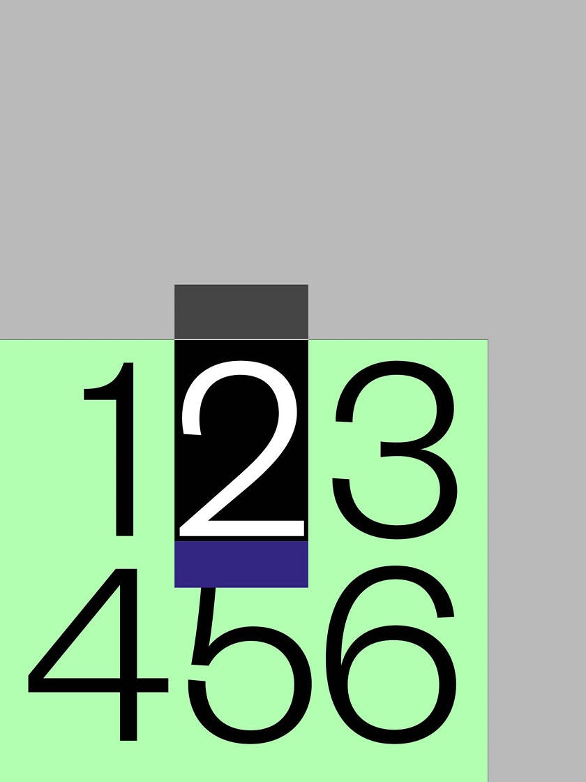
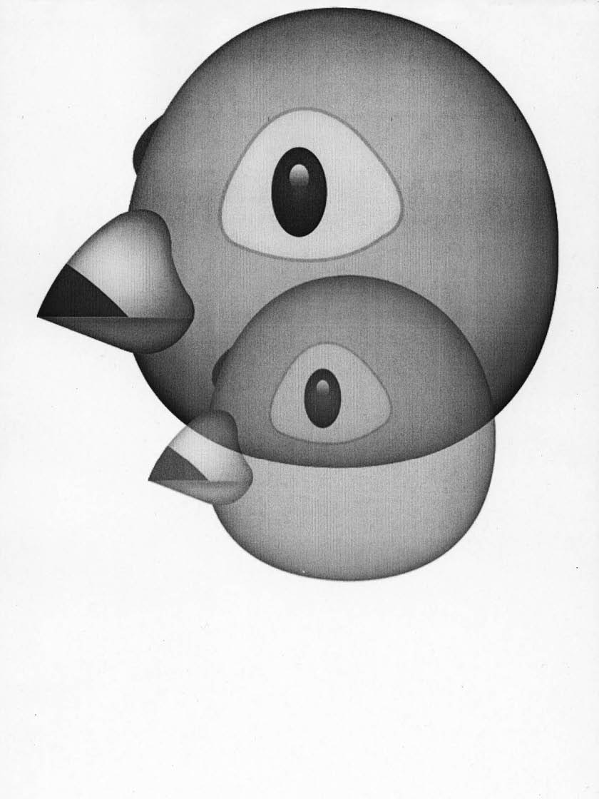
Poster sketch by Ines Cox from the exhibition “Screenshots”
In her own words, Ines not only studies and collects examples of these “platforms, frameworks, grids, and collages”, but she “cannibalizes” them. In our conversations she mentions the origins of her approach:
“In “Our Times”, a dance performance by Michiel Vandevelde, I learned about the possibilities of ‘contemporary cannibalism’. Vandevelde talks about Andrade’s Cannibalist Manifesto and the idea to not reject certain aspects of our Western culture we consider problematic, but rather make them our own. When confronted by a ‘new’ invasive culture or structure we should get to know it. Instead of turning our heads we could also eat it, feel how it tastes and then digest it. It’s a bit like the sampling I do with templates and user interface aesthetics. Appropriating is in my opinion an ideal engaged gesture.”
In looking at Ines’ work the traces of virtual architecture reveal themselves as both odd and familiar out of their original context. They become artifacts of our current era, remnants of her process, and a timestamp from creation. “From creating to presenting, we are constantly confronted with fixed formats. These formats carry a certain choreographic force that determines how we create and see content. In a cannibalistic effort, I do not want to destroy these frameworks and digital actions, but rather chase them, eat them, use them, digest them and reveal their nature.”
Below Ines Cox shows us examples of her design research; how a framework becomes an idea moving seamlessly from one piece of design to the next.
1. Font Not Found
Font Not Found is an error message resulting in a program being unable to locate a font file in its original location. As a result, the text is displayed in a default font devoid of formatting.
—
The “font-not-found” error message is generally of little more than an annoyance to most designers, a mistake that often remains unseen by any sort of audience. For Ines Cox, however, something about the pink highlights and odd spacing resonated with her. Her unique interest in the visualization lead to several rounds of sketches and experiments with error related graphics.
“Before I started my research project I was (and I still am actually) a maniac in documenting my design process. I have about 15 big ring binders full of sketches, test prints, dummies, unused ideas, etc. I call them my ‘darlings’ (referring to the act of “Kill your Darlings”).”

A sketch utilizing the “font-not-found” error message
One of Ines’ “darlings”, a sketch utilizing the “font-not-found” error graphics
Initial iterations of the sketches evolved and were eventually shown in an exhibition entitled “Screenshots”. The show featured several posters from Ines, all based on screen grabs from her design process.
A poster detail from the “Screenshots” exhibition

Poster sketches from the “Screenshots” exhibition
The “font-not-found” treatment was again revisited in a poster sketch for Princess Nokia.

Left: a sketch for the Princess Nokia poster. Right: the final poster
Elements from the Princess Nokia poster began to work their way into a concurrent project for Ines, an identity for an architectural research group called Research While Designing.
“I began sketching for different projects where the anchor points became visible. The anchor points are translated into a logo and a reoccurring element throughout different carriers of the (Research While Designing) identity. They serve as the boundaries of a template, which can be filled in with generated content.”

Sketches using the anchor point graphics

Initial sketches of the Research While Designing identity

Examples of the Research While Designing identity in use
2. Facebook As Frame
“(A Facebook) Profile is where you can express who you are and what’s going on in your life. You can choose what you want to share on your Profile, such as interests, photos and videos, and personal information like current city and hometown.” – Facebook Newsroom
—
Several years ago, as part of the studio Cox & Grusenmeyer, Ines and her partner Lauren created a daily collages from the negative space of newspapers. These compositional experiments lead Ines to consider other informational frameworks and explore how these types of systems could be manipulated.

Negative space newspaper collages by Cox & Grusenmeyer

Negative space newspaper collages by Cox & Grusenmeyer
At one point, Cox & Grusenmeyer were asked to put together a pitch for an identity for a children’s theatre in Brussels. For the identity, they began looking at the template of a Facebook page. Since it was the most important platform for the theatre’s communications, Cox & Grusenmeyer embraced Facebook’s specific characteristics and integrated them into the branding.

A sketch of the Facebook framework
The identity pitch involved the abstraction of a Facebook profile into a set of building blocks. Each “block” could be used as a carrier of information. The identity was never executed.

Sketches deconstructing a Facebook profile
The Facebook concept resurfaced when Ines was asked to design a folder and promotional materials for the paper range Modigliani. Her approach was to interpret each line of paper as a character, a person with a profile, since each stock has an (Italian) name. On each “character” an abstraction of a Facebook template was printed and filled with linguistic information about the name.

The “Facebook profiles” designed for Modigliani paper
Amidst other projects, Ines continued to explore the idea of Facebook as a framework . She took interest in the way Facebook grouped multiple photos and began sketching with collaged compositions and arbitrary image croppings.

Sketches exploring the Facebook image collage

A sketch of a Facebook image collage template
Ines’ sketches evolved into a poster for the Scotland Graphic Design Festival utilizing the Facebook photo collage template. In conversation, Ines mentions how the poster becomes a tangible representation of a social media post, thus playing with the act of publishing in its various forms.

Poster by Ines Cox for the Scotland Graphic Design Festival
3. Open In A New Tab
“Tabbed web browsing interfaces enable users to multi-task and easily switch between open web pages…The results of our experiment show that cards-based switching interface allows for faster switching and is less frustrating, with no significant effect on error rates. ” –Research at Google
—
Along with her studio practice, Ines teaches Typography at the Royal Academy of Fine Arts in Antwerp. Twice a year the school organizes an Open Day, a sort of exhibition in the classrooms/studios featuring student work. Tasked with creating the identity for Open Day, Ines worked towards a solution that could somehow frame and feature images of student work.

A sketch exploring how student work can be framed
When talking about the process Ines states, “I was fascinated by the design of Safari tabs on our phones, the way they simulate sheets of paper in an archive. I utilized this interface in a sketch for the Open Day leaflet and signalization. Each poster was constructed by 9 smaller post(er)s, designed to look like separated tabs / windows.”

Open Day collateral
Detail shot of Open Day collateral

Context shot of Open Day collateral

Stills from an Open Day animation
4. Formatted For The Feed
Although some people might dismiss it as a non-factor, the Instagram grid is an important feature when it comes to fan discoverability and promoting a strong brand identity. Treat the grid as a type of visual resume and see what works best for your brand’s content and messaging. –Errol Villasanta, Medium.com
—
After exploring the design system of Facebook, it seemed only natural for Ines to turn her attention to Instagram. Her initial exploration focused on a user’s ability to create a large image from several individual posts in the feed.

Sketch exploring the idea of the Instagram feed
Ines was able to implement her Instagram explorations when FAT magazine approached her to create a 6-page editorial. The brief was simple and open: “It should represent ‘Ines Cox’”. The idea of an Instagram grid provided a much-needed constraint to structure the design. She utilized the individual “posts” as containers for her “darlings” sketches; each becoming a unit in the creation or deconstruction of a larger composition.

Spread from FAT Magazine editorial

Spread from FAT Magazine editorial
Ines continued to expand on these concepts, this time for the Scotland Graphic Design Festival. The posters Ines created make clear reference to Instagram feeds and filters while re-addressing the relationship between print and social media “publishing”.

Posters by Ines Cox for the Scotland Graphic Design Festival
Looking ahead, Ines finds herself excited about a project utilizing 6 light boxes as an exhibition space / real-world Instagram feed. She plans on inviting several designers, writers, and artists to create image sequences that will be exhibited on the ‘screens’. In doing so the Instagram feed is made real, images become physical, and likes / comments / shares return to face-to-face interactions.

Gallery space featuring a 6 light box display system
In our conversations, Ines points me to several references that inform elements of her practice. One of my favorites is a quote by James Langdon where he states, “I see design essentially as a storytelling process, in the sense that I understand all human artifacts to be implicated in telling the story of the universe. I like the image of an archaeologist examining an artefact from a lost civilization. Many centuries after its designer lived, that artefact continues to suggest narratives about the culture that produced it.”
Ines’ work is full of clues revealing information about our tools, interfaces, and methods of interaction. Looking at her practice I can’t help but wonder what insight future civilizations will garner about design today. In what ways will social media feeds evolve, how will the frameworks of news outlets change, and what exactly is an InDesign error message?
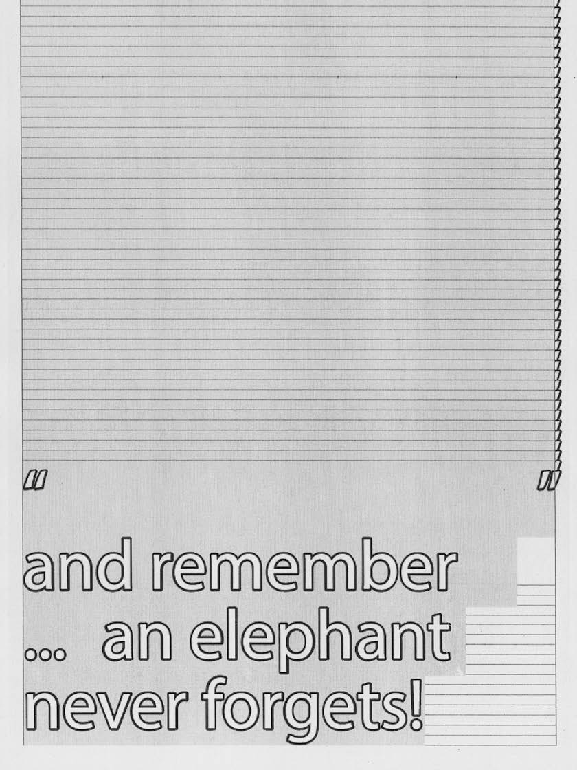
An image from Ines’ “Kill Your Darlings” series