Interview: Simon Johnston Launches Verb Editions
By Ben Schwartz

What happens when you let go of design? In 1993, Simon Johnston handed the pressman at Colby Printing Press a slip of paper containing only the words “God® Bless™ America©.” No other design instructions were specified. The resulting piece is a prime example of Simon’s art practice, which emphasizes linguistic play and exploration of pre-established design systems. The poster was printed more than 20 years ago, but, like all of his editioned works, hasn’t been available for sale—until now. With this interview, he announces the launch of his new publishing house, Verb Editions.
An LA-based, UK-born designer, artist, and teacher, Johnston’s lauded design practice includes projects with Factory Records and founding the design journal Octavo, For more than 25 years, he has been consistently building a body of personal work that has been kept relatively private. In this conversation, I speak with Johnston about the decision to start Verb Editions, several of the works in the catalogue, and the importance of maintaining a personal practice.
Spread from Mr. Below (v.14), Simon Johnston, 2016
Ben Schwartz: First of all, congratulations on launching Verb Editions. Already it looks like quite an interesting catalogue. To begin I’d love for you to talk about the sort of ethos behind Verb Editions.
Simon Johnston: Thanks. The primary focus will be on printed materials as artworks in themselves, as editions, multiples. Mostly books and prints, but I like the word “editions,” as an edition could also be a sculpture, for example, or even a recording, or a poem in some form. And you can do an edition of one. I like the sense that multiplied forms allow the work to be accessible to a greater number of people—is more democratic if you like—even though democracy isn’t looking too clever at the moment. I am also interested in the idea that a catalogue or book could be a work in itself, and come before or instigate an exhibition, instead of the other way round. Seth Siegelaub’s catalogues come to mind in that regard—the possibility of catalogue as exhibition. I think of it maybe a bit like a record label, releasing a few singles and the occasional album, some of it quick and raw, and some a bit more polished. The word ethos in your question reminded me of Tony Wilson of Factory Records, who we worked with in England back in my 8vo design studio days. I always liked Tony’s trust in his intuition and his commitment to cultural production, just putting stuff out there, frankly without any real regard for a business model. I like that ethos. So, not really a press in the commercial sense, nor just a book publishing house, more of a label.
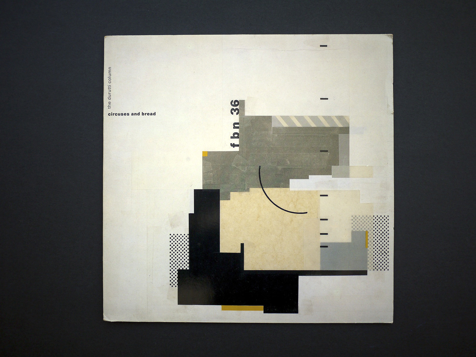
Album cover for The Durutti Column’s Circuses and Bread (1985) on Factory Records. Designed by 8vo
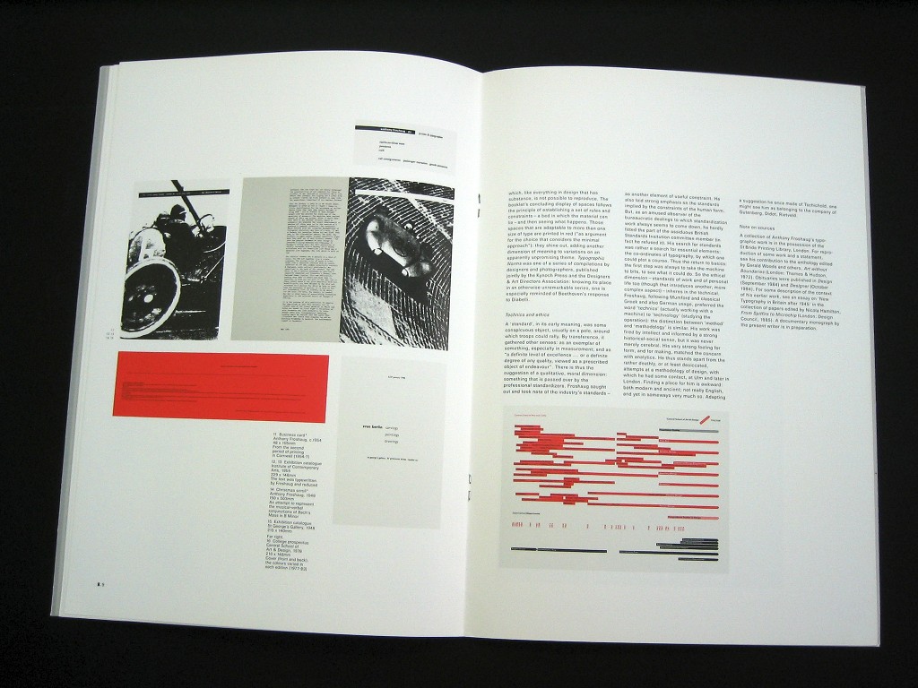
Octavo, Issue 1. 1986. Article on Anthony Froshaug by Robin Kinross.
Schwartz: It seems you’ve been producing these sort of editions throughout your career, why the decision to start Verb Editions now?
Johnston: I have been producing books and prints right from college days. I made a silkscreened book in college at Bath Academy of Art in England called Some Antics, which played with meaning and language. And when I started the typographic journal Octavo in London, it was a publishing adventure into the relationship between language, design, and art. Since then, having moved to California some time ago, I’ve been involved in publishing, designing books for galleries, museums, and artists. So it’s not really a big leap, more a case of wanting to make the work in the books as well as design the books. The main idea is to facilitate a sideways shift from design practice to focus more on my art/photography practice. I have always done both, but for pragmatic reasons, design and design education has always been on the front burner and my own projects on the back burner. I always felt like I was only making guerrilla raids into art territory, sort of a weekend conceptual artist, which was satisfying, but never led to building up the necessary momentum for a sustained practice. Publishing allows me to do both to a certain extent, but the design component is now in the service of artistic practice of some sort. It’s easy enough to print something, but distribution is the key. I have sold materials before at Printed Matter and Arcana, but the digital tools are available now to create a fairly painless online gallery, sales, and distribution channel. It just feels like the right time. Carpe diem—Fish of the day.
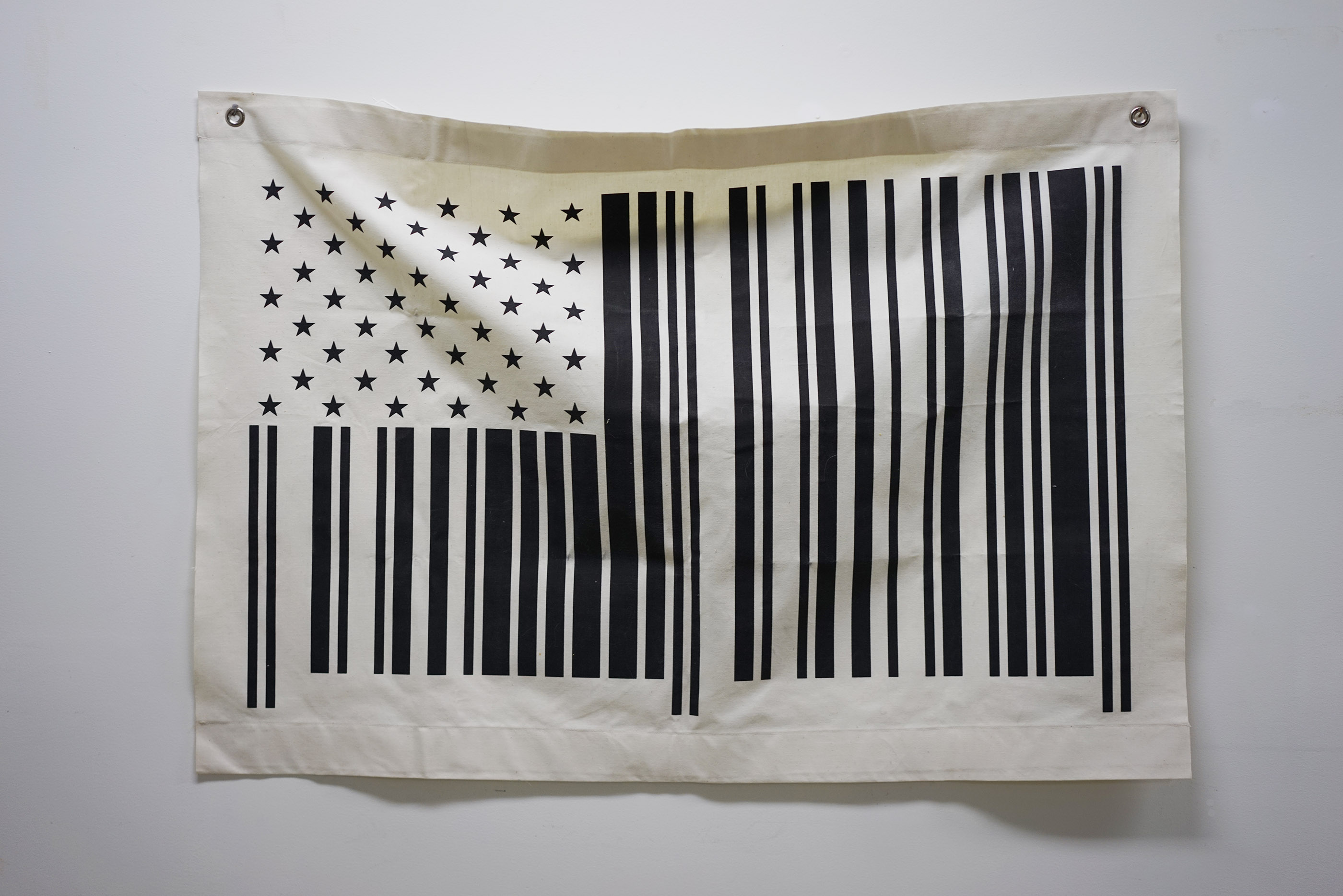
Flag (v.02), Simon Johnston, 1996
Schwartz: I’d love to hear a bit more about some of the editions. To start, both God Bless America (v. 01) and Flag (v.02) seem particularly interesting within today’s political climate. They also are the first two editions in the catalogue. What do you think about them taking on a new sort of relevance today?
Johnston: Both of those were made more than 20 years ago, and were reactions to what I saw as underlying conditions in society here, the ever-present commercial imperatives, for want of a better term. There’s a fabulous Allen Ginsberg poem called “For Sale,” in a slim volume I have called Sad Dust Glories, which may have been an inspiration, or at least is related. The God Bless America print was made at Colby Poster and was an early example for me of trying to let go of design. I just gave them the handwritten text to set in their usual manner. I can see how some people might feel these works have heightened relevance in today’s brave new political world. But, frankly, what is going on right now is another thing altogether, much darker—the apple-pie fascism that Gore Vidal warned us about—which requires a different kind of response. I did make some prints on Presidential Inauguration Day, January 20, but I am not sure whether they will make it onto the Verb Editions site yet.
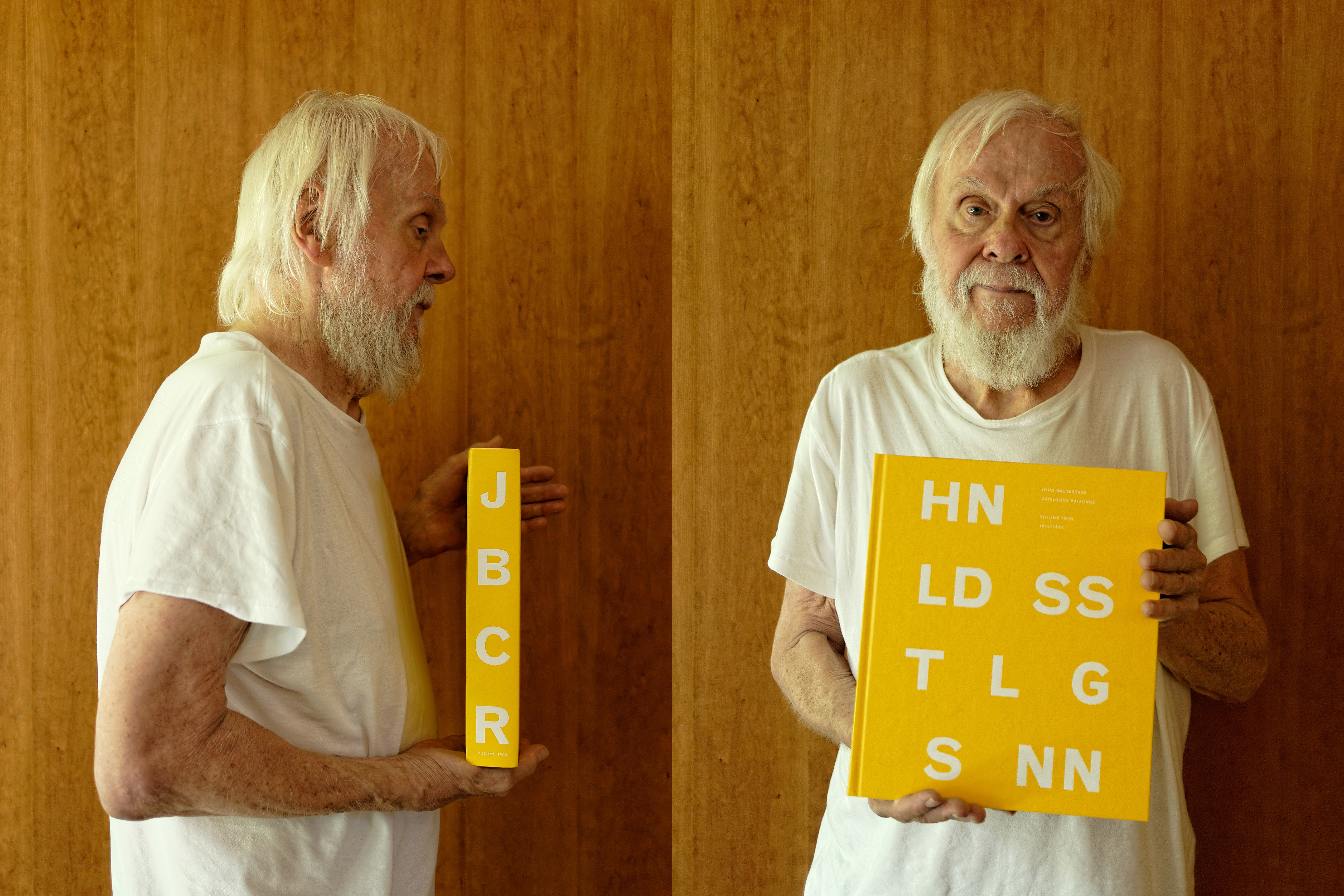
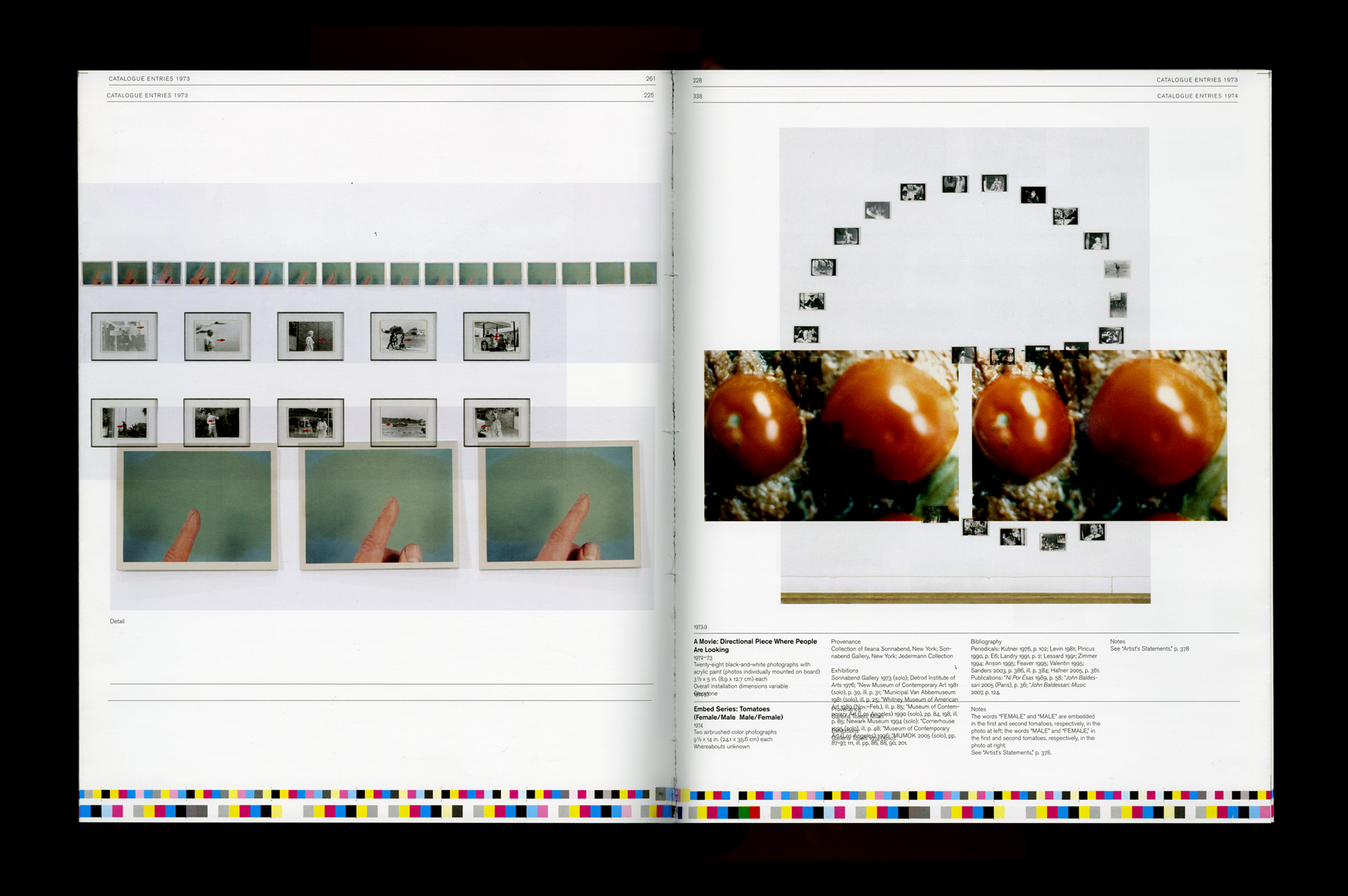
John Baldessari holding John Baldessari Catalogue Raisonné: Volume Two: 1975–1986. Photo: Simon Johnston
Schwartz: Mr. Below is another interesting project, not only for the subject matter, but also the process and resulting visual effect. I’d love to hear more about how these books were produced.
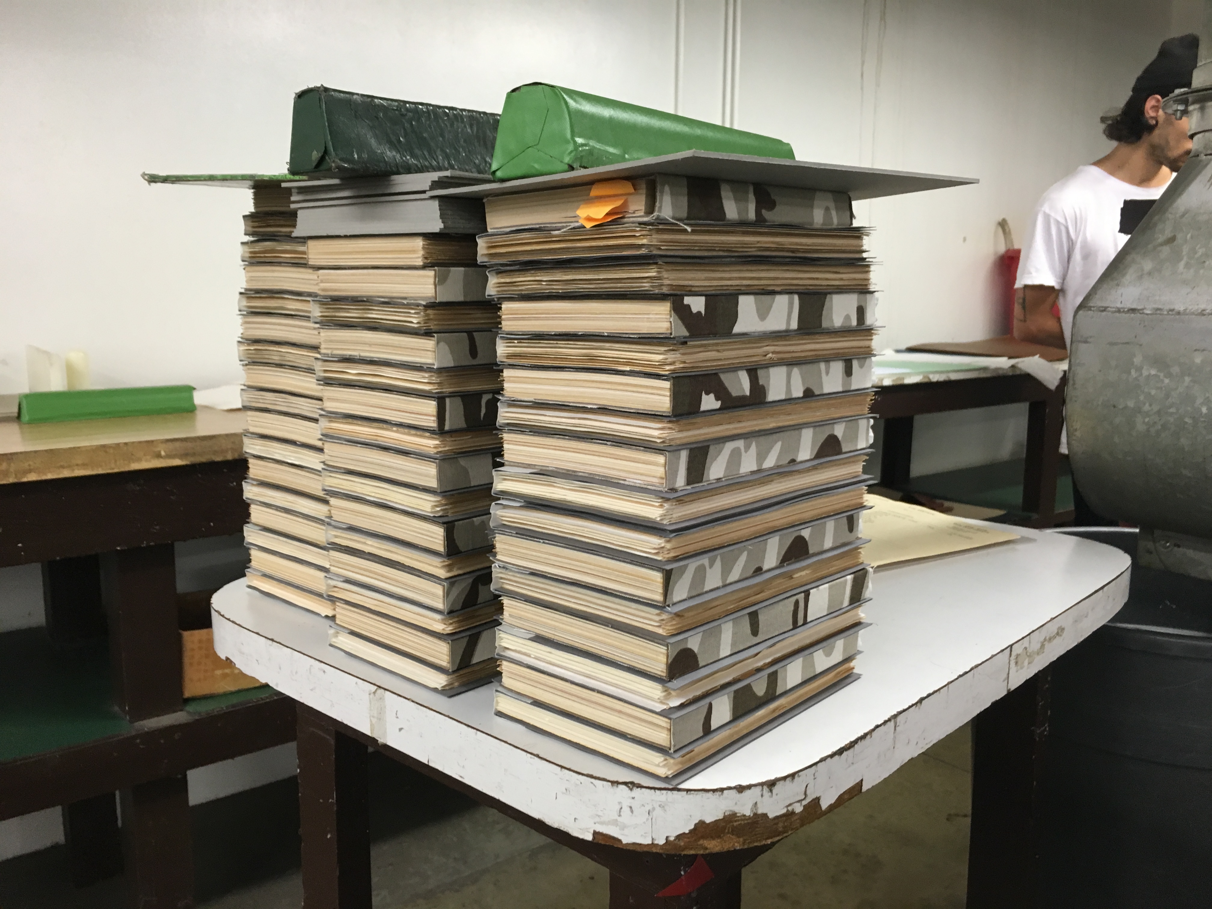
Johnston: On press at Shapco in Minneapolis with the first volume of John Baldessari Catalogue Raisonée, I could not help noticing how the accidental layering of the works on the make-ready sheets looked very interesting and related to John’s work somehow. It’s fair to say that probably all print designers fall in love at some point with the random over-printed nature of press sheets, before the press guys get the ink densities adjusted, but in this case something about the consistent grid and image placement, combined with the “Mr Below” (Make-Ready Below) tags made me wonder if something could be made from it. I worked with the press guys to save some sheets and had some very able assistance in sequencing and binding the copies.
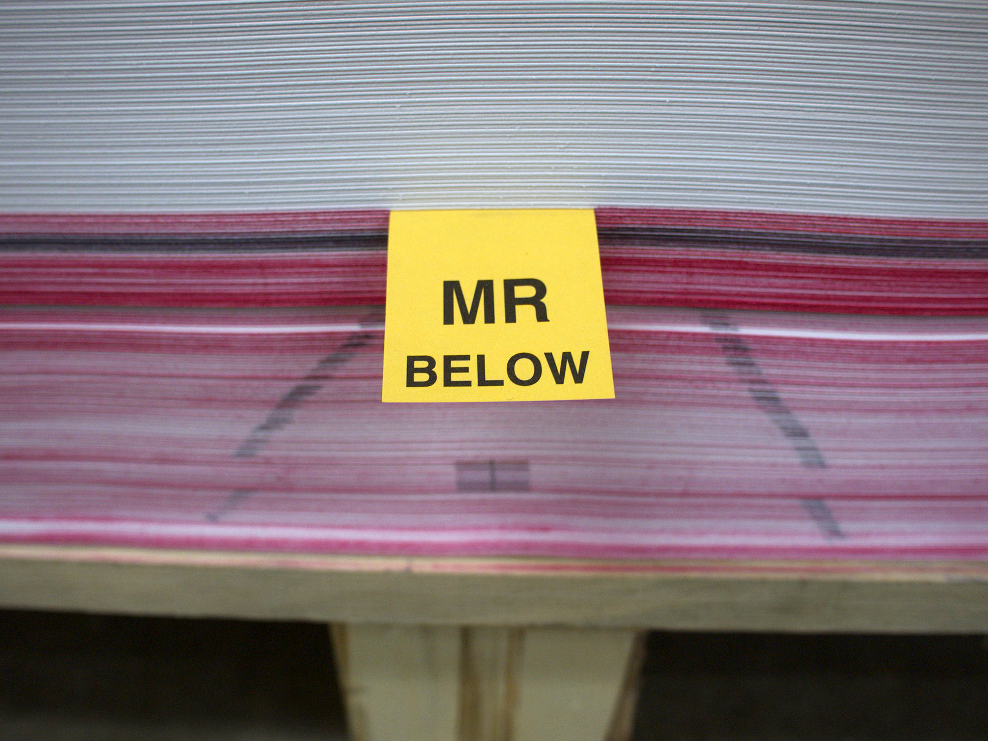
Make-ready (MR) sheets at Shapco
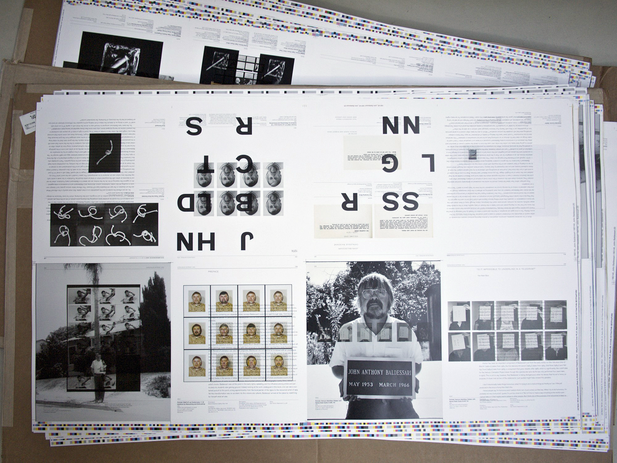
Over-printed make-ready sheets for Mr. Below (v.14)
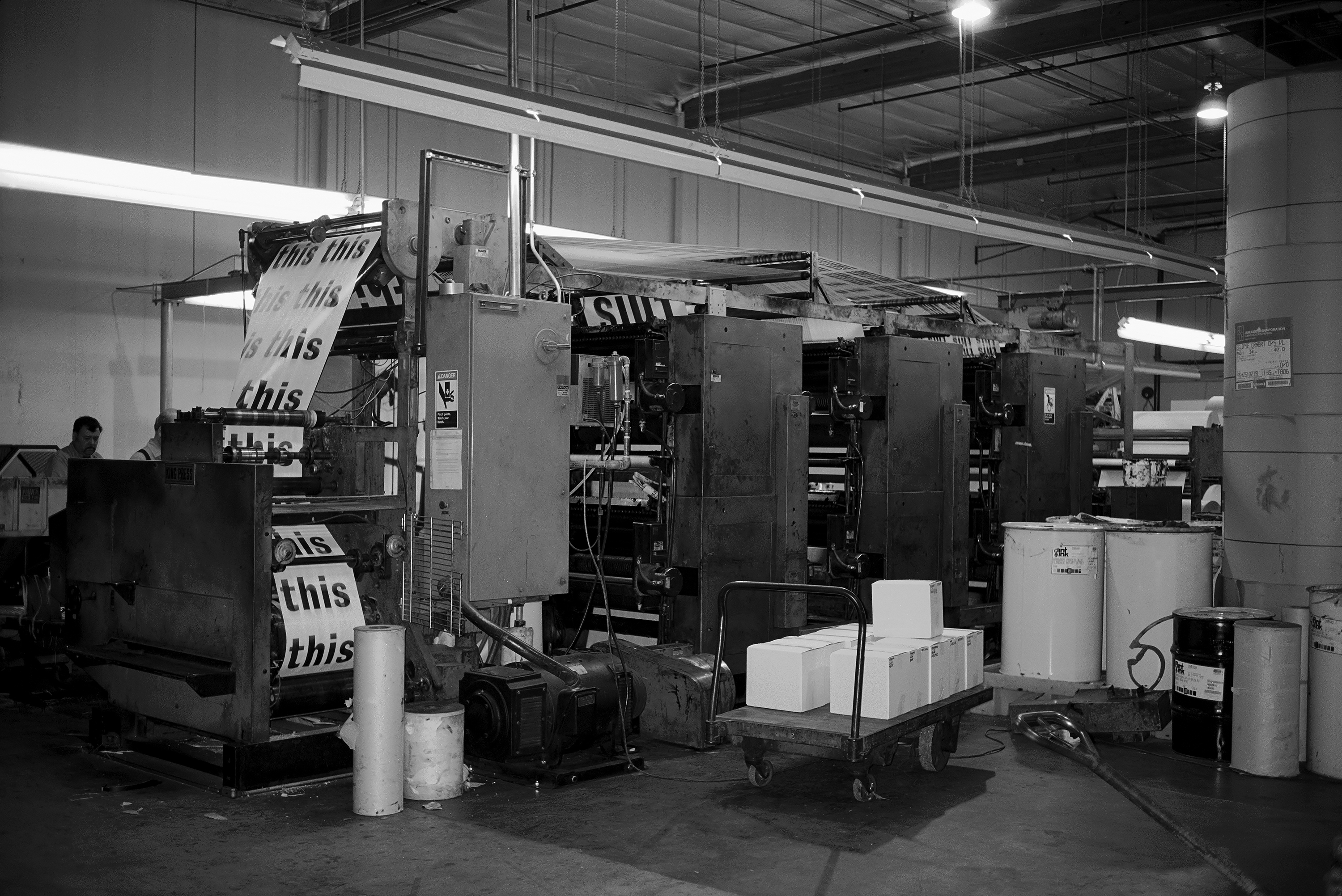
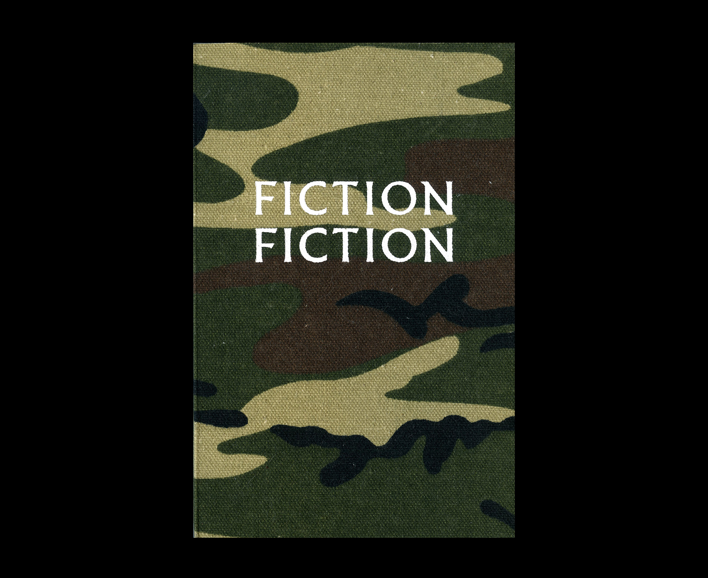
Schwartz: It looks like there’s a theme of playing with language throughout many of the editions—whether it be the cut-up narratives of Fiction Fiction (v. 18 and v. 19) or your analysis of the word “this” with the Thisness newspaper (v. 04). Can you talk about your interest in linguistic play and how it relates to your design practice?
Johnston: I have always been mildly obsessed with language, and a lot of my personal work does deal with issues related to the operations of language. The Thisness newspaper grew out of a slightly earlier project called Investigation, which consists of 256 framed pages from two copies of Ludwig Wittgenstein’s Philosophical Investigations, with every word painted out except for instances of the word “this.” In the book, Wittgenstein is writing about how language functions in use, and in order to give examples I found he would be using the word “this” a lot. For me it became the secret subtext of the book, being a word that refers only to itself, its physical typographic presence, in each instance, rather than referring to something outside of itself. In semiotic parlance, the signifier collapses into the signified, and it becomes a kind of black hole of language.
Language Machine (v.05), Simon Johnston, 2016
I had the idea for Fiction Fiction over 20 years ago, but only recently made the books. Time is slippery stuff, but I still liked the idea enough to make it happen. One hundred and twenty-eight similarly sized novels were trimmed at their spines, and their pages resequenced. Each book contains a page from each of the different novels, whilst maintaining consecutive page numbering. I am interested in setting up frameworks or systems, and then pouring material content into the frame to see what new chemistry happens. In this case the frame is works of fiction made from works of fiction. Messy nonsense narratives abound. I am also intrigued by time as a material and a medium. I like the idea of making something and not releasing it for 10 or 20 years, not just as a reaction to the instant reactionary Twitter-world of now, but as a rhetorical tactic. I am working on a related project just using some of the found cross-over texts from Fiction Fiction. I suppose you could say the interest in language relates to my design practice in the sense that I don’t think you can be a good typographer unless you care about language.
Binding process for Fiction Fiction
Fiction Fiction (v. 19), Simon Johnston, 2016
Schwartz: In addition to your interest in language, can you also talk a little bit about your photographic projects?
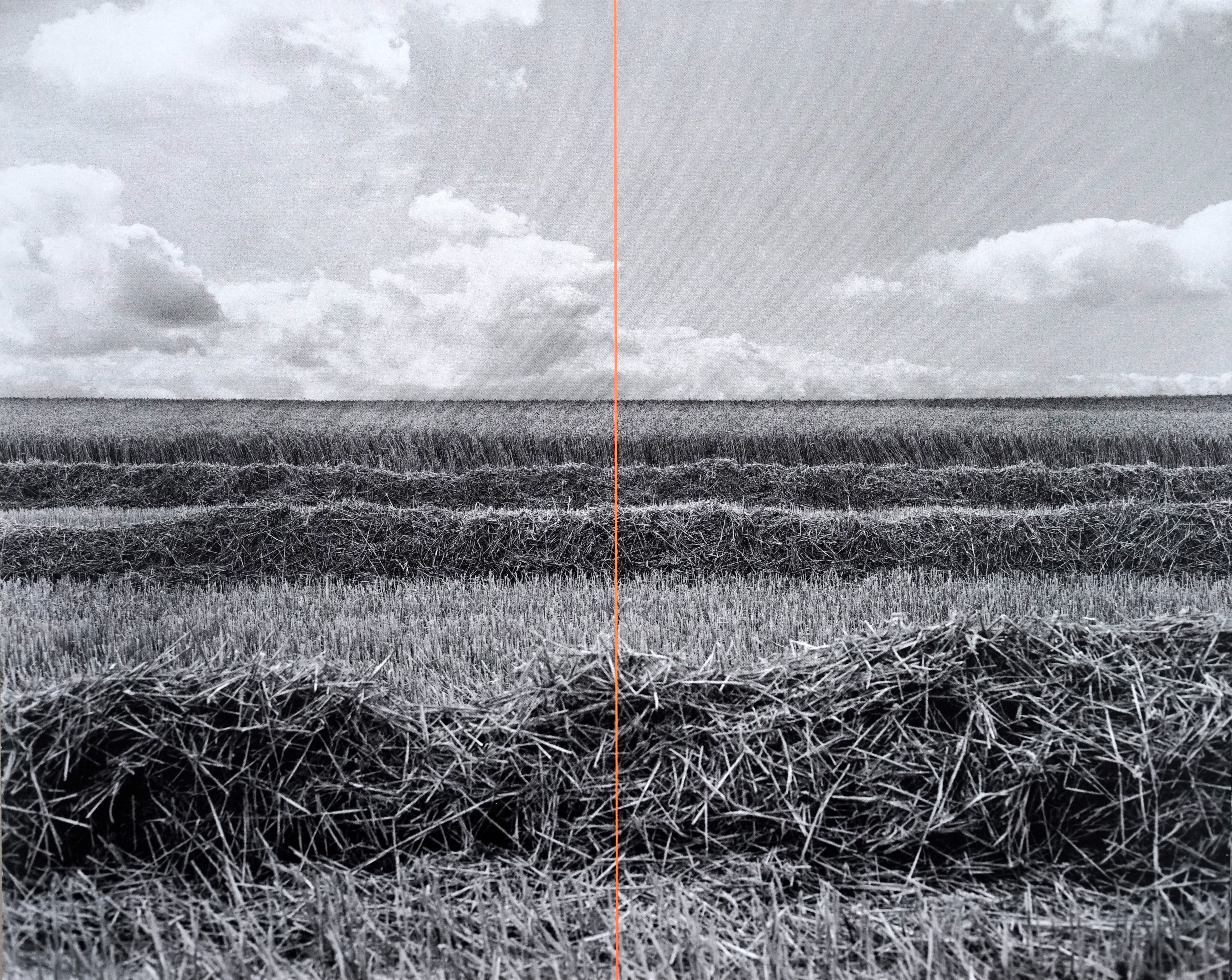
Johnston: Photography is one medium I use, yes. I also make paintings, prints, and sculptural objects. I tend to work in photographic series, and I am as interested in the thinking behind the image as much as the image itself. Even though the book Unsigned is a photographic project, at its heart it is also a study of language, or rather its absence, in this case. Both the empty signs and the graphic faux-captions are typically sites of information, but in both cases the language is absent or withheld. And a book of photographs I took in England in 2012 and 2013 called Meridian is being published by Gerhard Steidl in Germany this month (I think, I hope). Landscapes taken facing due north or south on the line of zero degrees longitude, with a fluorescent orange line superimposed on the center of the image representing the meridian line. I have the book on the Verb Editions site as well. I have seen the images on press but not a bound copy yet. Unsigned is older, but both that series and Meridian were shot on film, 4×5 in the case of Meridian.
Photograph from Meridian (v.20), Simon Johnston, 2016

Spread from Unsigned (v. 07), Simon Johnston, 2003
Schwartz: As you have been producing these editions throughout your career, I’m curious how you were able to strike a balance between your more client-based work and these personal projects? Do you feel that your personal practice provided a different sort of creative fulfillment from your design practice?
Johnston: One of the reasons to start Verb Editions is to set up a structure that allows me to alter that balance and to produce more of my own work and curate and publish work by like-minded collaborators. For me there is no comparison between making personal art work and commissioned work. They are different things. I know it has been fashionable to talk about “blurring the boundaries” between art and design, as if that is automatically a virtuous position to take, but I feel that is often a position taken by commentators, non-practitioners, or designers who want their work to be taken/perceived as art. Being a practitioner in both fields, I see them as different activities. Both are creative forms of expression, but art is expression liberated from function, whereas commissioned design is motivated expression, a form of agency on behalf of others. To confuse the two is just lazy thinking. Of course there is an “expanded” field of design, and interest in the area of intersection between the two practices—as this blog is evidence.
There are different forms of satisfaction from both. Designing a catalogue for an exhibition or artist is always very much a collaboration and a team project between artist, institution, author, editor, designer, printer, bindery, and others. So when a design project turns out well, it reminds us that at its heart, design is a commissioned, social, collaborative, commercial practice, with all of the associated financial and time-based parameters. The satisfaction there is of being part of a successful team project and of responding well to your responsibilities within that team.
By contrast, the creative fulfillment of personal works is different. The only responsibility is to yourself and the viewer. The third party (the C-word so absent from a lot of recent design discussion) that exists in the design process is not there. I think the challenge is to find, excavate maybe, the work that only you could make, from your interests and unique experiences. That’s also a bit scary. No parameters. Like freewheeling downhill with dodgy brakes and no map. But liberating at the same time.
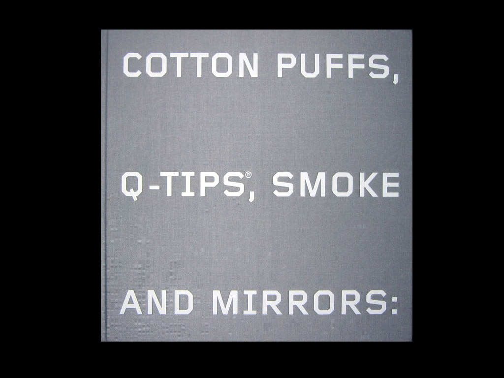
Ed Ruscha: Cotton Puffs, Q-Tips, Smoke and Mirrors, 2004. Designed by Simon Johnston
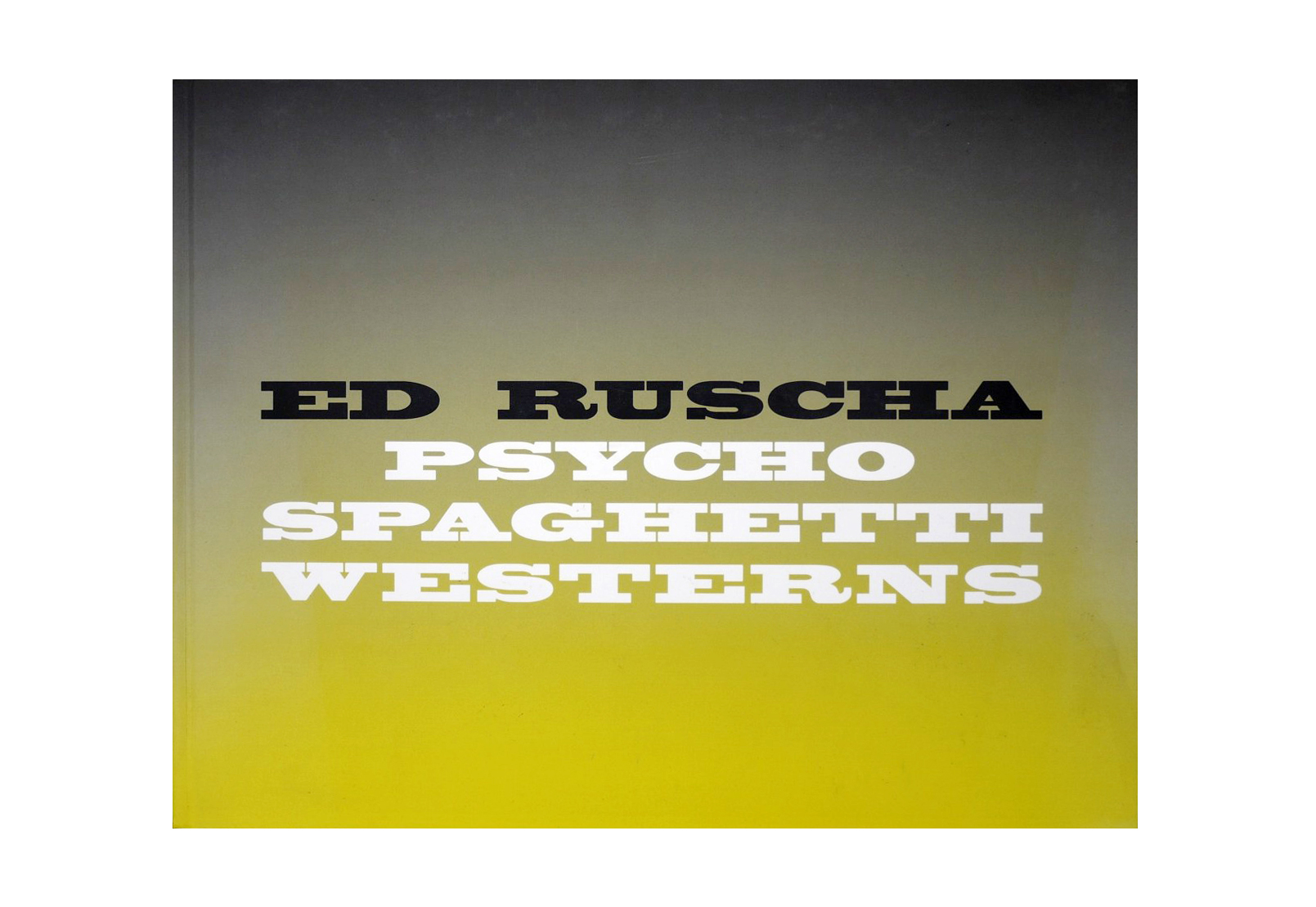
Ed Ruscha: Psycho Spaghetti Westerns, 2011. Designed by Simon Johnston
Schwartz: I know you’ve done several books with Ed Ruscha. I can’t help but of course find similarity behind Verb Editions and what Ruscha was doing with his artist books. How do you feel your design practice has influenced Verb Editions?
Johnston: Of course, Ed’s work has been enormously influential, both for artists and designers, and his early publications are seminal works in the area of artists’ books. As a designer, it has been a highlight to be able to work with him on a few projects, most notably the Whitney Museum Cotton Puffs catalogue and Psycho Spaghetti Westerns for Gagosian. But, to be honest, the first artist’s book I produced at college was made before I was aware of Ed’s work, where one of my teachers was John Furnival, a pretty well-known concrete poet. This was probably my first introduction into the possibility of a unity between artistic practice, language, and typographic form. And speaking of concrete poetry, I should also say that another figure whose work was very influential for me was Ian Hamilton Finlay, whose Wild Hawthorn Press is a touchstone. I was in correspondence with Ian and commissioned an article on his work for the third issue of Octavo, and I have quite an extensive collection of cards and booklets produced by his press. I also have a copy of IHF’s Ocean Stripe 5, still one of my favorite printed works, using found images and text, although that was published by Tarasque Press. He operated Wild Hawthorn Press long before computers and the internet, but I like the fact that, even though he is gone, the site is still up and his printed works still available. In terms of influences regarding art as printed matter, I could also point to Dieter Roth, Guy de Cointet, and particularly Marcel Broodthaers, whose work for me is an endless source of intellectual and aesthetic stimulation.
As for the second part of your question, my design practice helps in the sense that I know my way around typesetting, composition, color correction, paper choices, press checks, and all aspects of print production. You pick up a few things over the years.

Ocean Stripe 5, Ian Hamilton Finlay, 1967
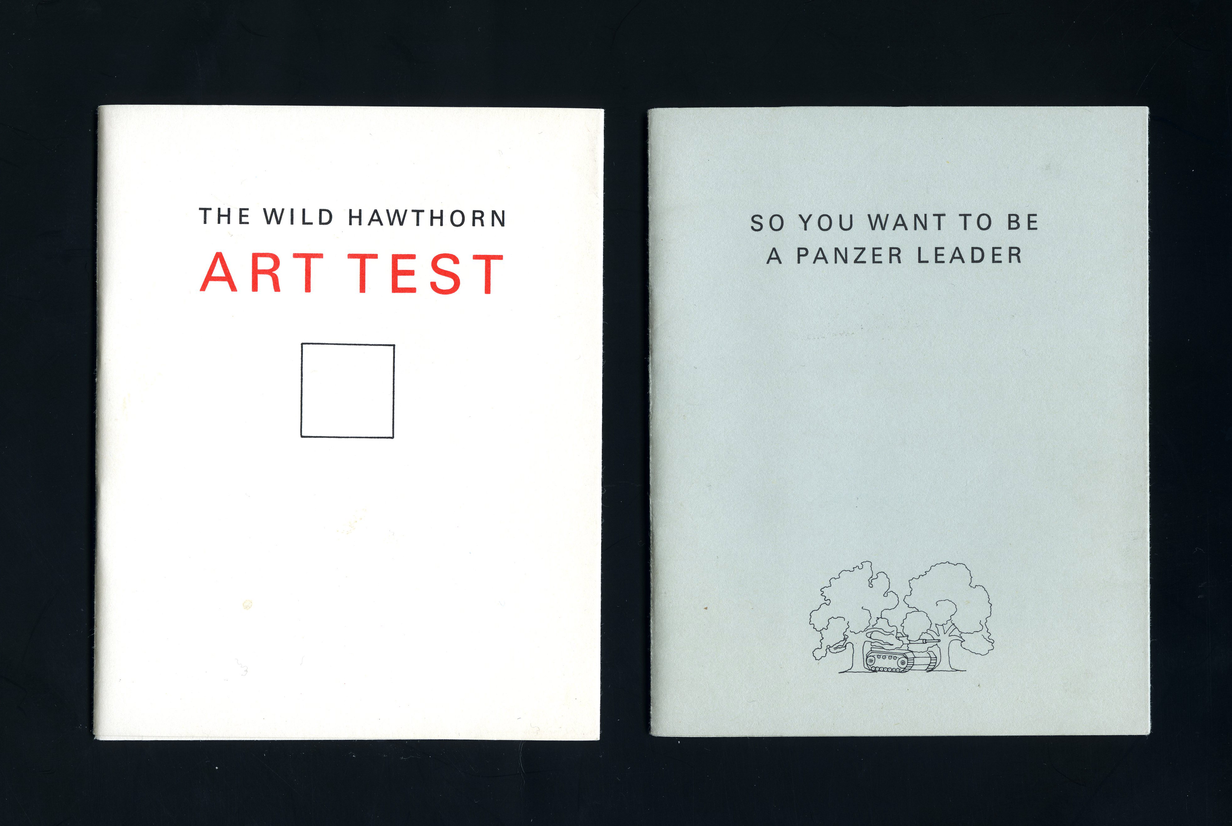
Wild Hawthorn Art Test, So You Want to be a Panzer Leader, Ian Hamilton Finlay
Schwartz: Beyond a publishing imprint, you mention that Verb also acts as an online gallery as well as a vehicle for collaboration? What sorts of things are you looking for in future Verb collaborators?
Johnston: It’s all a bit of an open-ended experiment, but I plan on commissioning and publishing some work by other artists, photographers, and poets, at the same time as producing more of my own editions. In that sense the online gallery is a way of showcasing work by myself and others, as well as sidestepping gallery and curatorial gatekeepers to a certain extent. It’s all made possible by the internet, of course, but also by a general acknowledgment that print is not going away now, despite earlier rumors to the contrary, and that it has a vital part to play in cultural production, because it is a language in itself. It’s possible that the online gallery might manifest itself as a temporary physical gallery at some point in some way, as well as show up at an art book fair or two. Collaborations are mostly by invitation to be honest, but I am open to conversations and ideas from wherever, and plan to do some projects outside of the US.
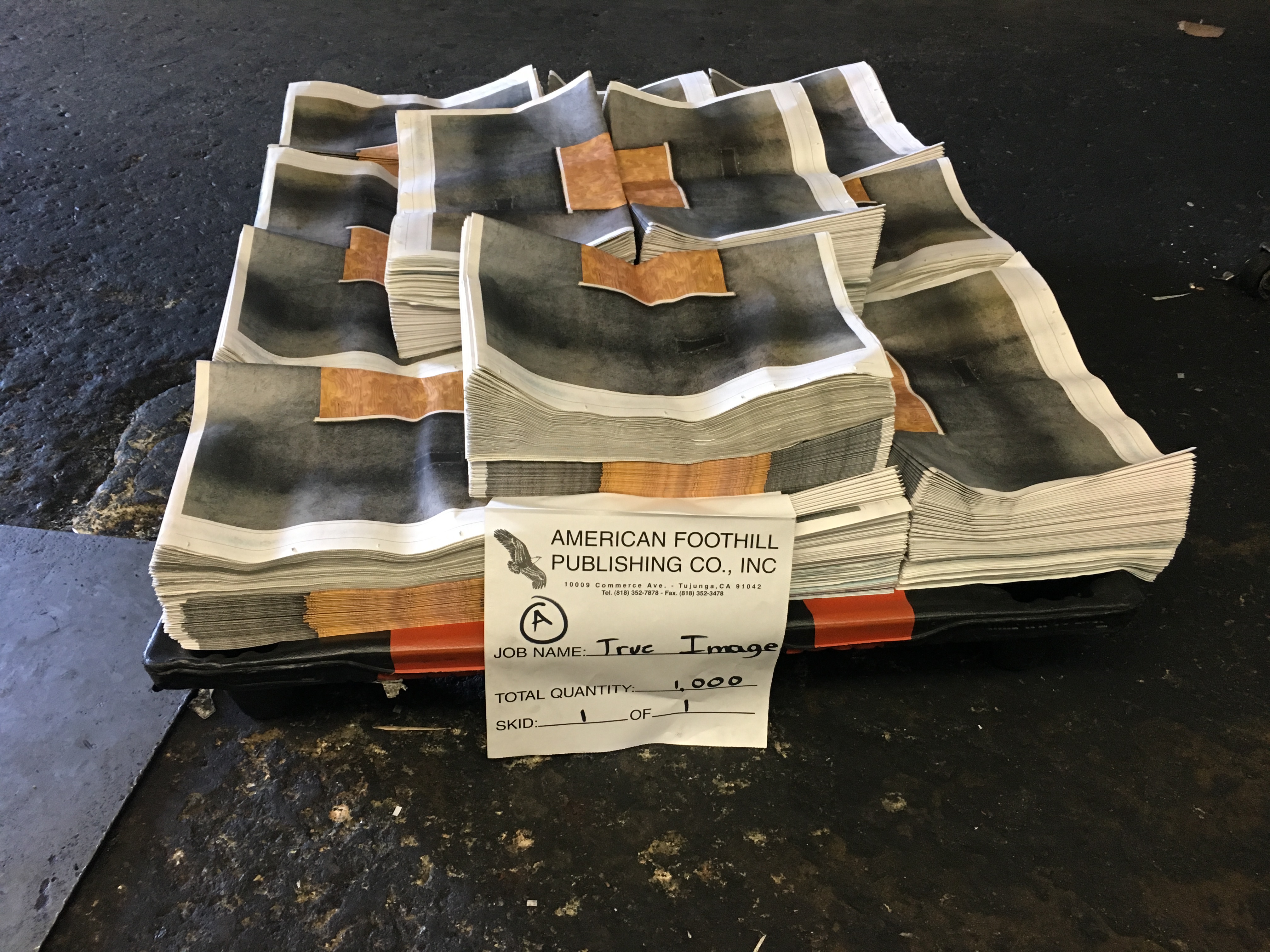
Recent release on Verb Editions: Tony Manzella, True Image
Schwartz: What lies ahead for Verb Editions?
Johnston: Now that I have built the glider, it is going to be interesting to see if and how it flies. More immediately, as I mentioned, I am hoping to see copies of Meridian very soon. Then there’s a book project called System I started printing in Berlin a couple of years back at Erik Spiekermann’s letterpress shop, p98a. I will finish the letterpress printing here, although the final version will be printed offset. And we will have a small event of some sort soon in LA. My hope is that Verb Editions can become a quietly sustainable publishing platform for artists, thinkers and makers.
In addition to the recent opened Verb Editions, Simon Johnston runs the design office Simon Johnston Design, and is Professor and Creative Director of the Hoffmitz Milken Center for Typography (HMCT) at ArtCenter College of Design in Pasadena, CA.