Maximage – Emotions & Technology
By Boris Meister
Berlin-based graphic designers Julien Tavelli and David Keshavjee are active within the group Maximage Société Suisse, a loose structure of designers, photographers, and artists working either on commissioned works or self-initiated projects.
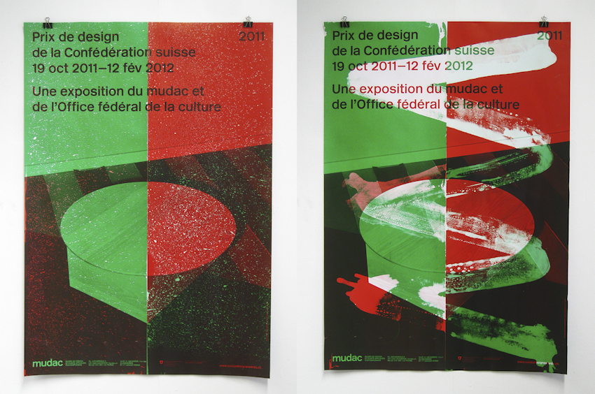
Their strong body of graphic works often explores the idea of errors and aberrations in the process of the making and how to accept them and let them create their own new aesthetic.
Emotions and technology, how does this motto drive your practice? Where do we find the emotional part?
Not sure this motto really drives our practice; it’s more a punch line, though. Graphic design involves different technologies and tools. We often try to reappropriate these tools by using them in a twisted way. The emotion comes from the result, when we reach an end that surprises us.
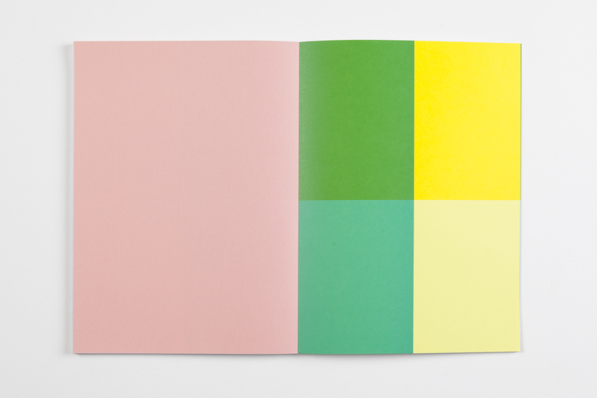
Despite the margin of the unexpected we allow when we work, we give much importance to the final result, the print, the color, the material. In Les impressions magiques, we tried to have a feeling that would emerge from the very first page.
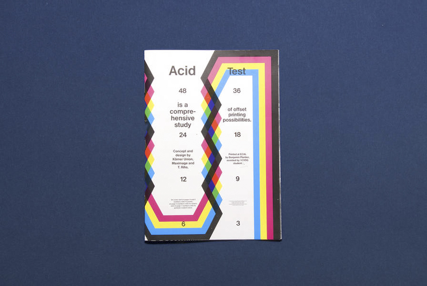
Acid Test, 2010, in collaboration with Tatiana Rihs and Körner Union
What made you start to work analogically, besides the computerized means you already used?
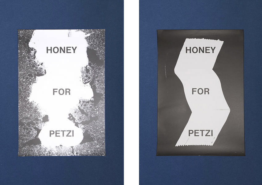
We have always been super interested in printing techniques. A few years ago, we were talking with a printer and he told us that he once cut himself and some blood dropped on the offset plate. He later noticed that a few printed pages were stained with his blood.
We loved this idea, imagined some crazy drawings mechanically reproduced. The first time we tried this was with Guy Meldem and Tatiana Rihs when we processed the plates ourselves, messed around with the chemical products, and did a first poster called Acid Test. We found it interesting and so, while on a residency in New York, we tried to push the technique further.
Please explain how you intervene on the printing process.
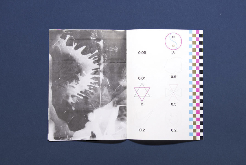
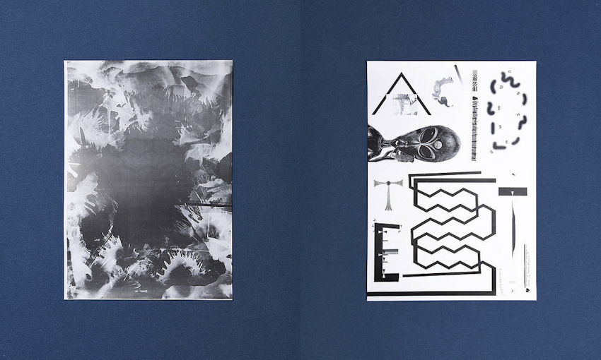
We spent a week at a printer, working on-site, directly on the plates with no computer but adhesive tape, razor blades, acids, or brushes. We had to understand how the colors would overlay, how the chemicals would react, and so on. Les impressions magiques is a “best of” all the tests we did there, presenting the large palette of tools, shapes, and gestures we created and experimented with.


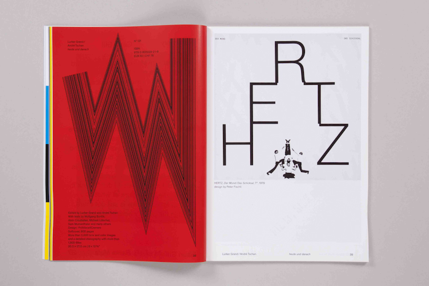
Les impressions magiques, 2010. The interventions were made directly on the offset plate using several tools and chemical processes, based on ancient lithography techniques and advanced technology of offset printing. All the process was analogical and irreversible, from crop marks to overprinting. The design process became almost a part of the production.
Various Projects (2010-2012)
How do you gauge errors or unexpected happenings?
We try to always anticipate what will be the final result, yet knowing there will always be something we wouldn’t have expected. We like these accidents. They are strange; you need to get used to them, and sometimes you need a couple of days before you start appreciating them.
You leave a remarkable signature on your works. What’s your position on “a designer as an author”?
We try not to justify our position either as designers or artists: we make forms and create our own tools that we want to use whenever there is an appropriate project in order to achieve a good result. Most of the time we try to collaborate with artists. This specific condition allows us to engage a dialogue and an attitude that cancel the boundary between designer and client. Each one brings either his rules or knowledge and we work together. The result is a cosigned printed piece by the artist and Maximage.


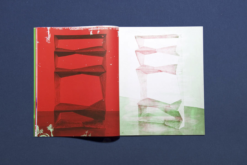
Tooled Sundays (2011) is a commissioned exhibition catalogue. They worked in close collaboration with the artist to define how they would interfere with Philippe Daerendiger’s work to create new images from the installation pictures, something between the artist book and the factual catalogue.
What does attract you in the offset printing process?
We like to work with the offset method because it’s the standard printing device in the industry. It’s kind of high-tech, and our interventions on it are rather primitive. We like this contrast and the balance that results.
What other tool or process do you like to play with?
We made a couple of works using screenprinting. We also did a book only using the publishing software of a cheap print-on-demand service, messing around with the filters and everything. Basically, we like to push the boundaries of a tool or corrupt its primary use to obtain a new result.


Commercial catalogue for an art book publishing house, made in 2013 in collaboration with Marietta Eugster
How do you relate to the Swiss modernist design heritage? I’m referring to your use of simple grids, sans-serif typefaces, color schemes, and also the fact that you published several “guides,” which is to me a singular Swiss-modernist attitude.
When we were studying, we were surrounded by great examples of modernist works, and we love some of them. That being said, our goal is not to perpetuate this style. What we love in modernism was the strong attitude of the designers in how they would approach a design problematic, and that’s what we kept from this heritage. Now we try to have our own contemporary attitude and push forward our own forms, not just a reenactment of old aesthetics.
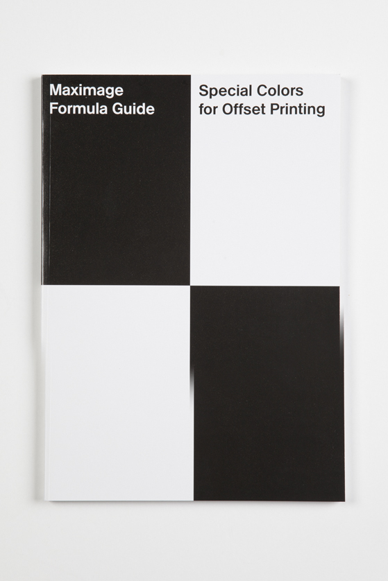
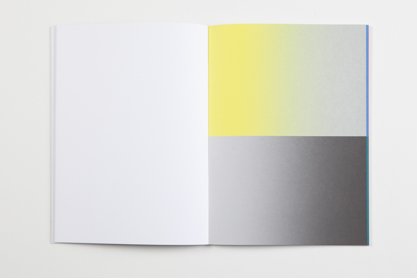
Maximage Formula Guide, 2011
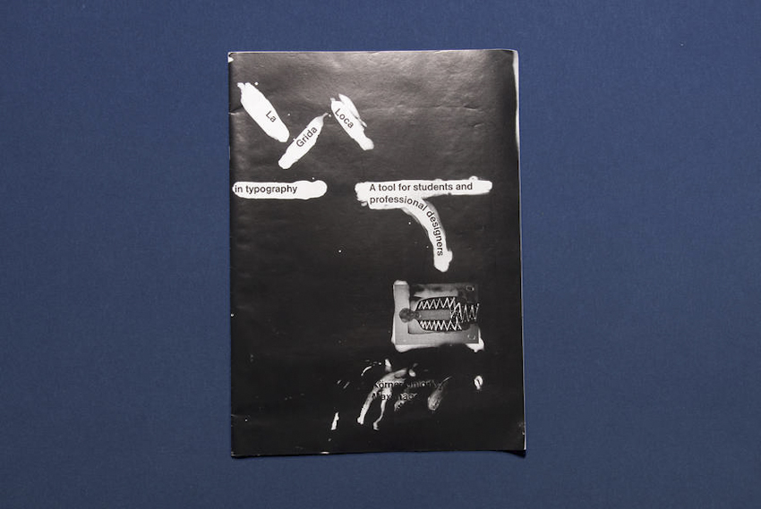
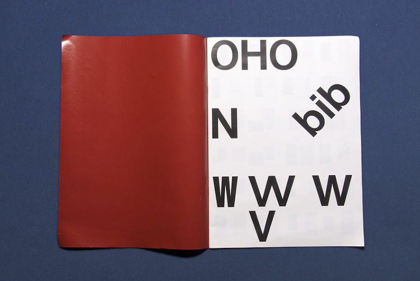
La Grida Loca (2010) is short didactic booklet addressed to graphic design students. It presents common mistakes and solutions to them, as well as designer’s tips — in collaboration with Körner Union.
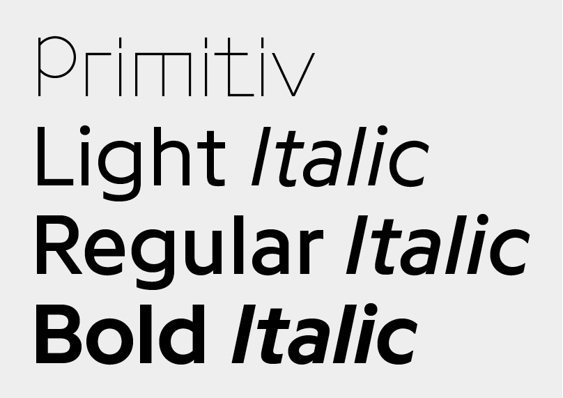
Your typeface Programme was just released on Optimo Type Foundry. How was it made?
While studying at ECAL, we started to develop some scripts that would automatize the drawing process in FontLab. The first idea was to develop a contemporary-looking typeface with tools of our age. While working on it, we noted some errors due to scripting technology—they became marks of the process, like the traces left on the offset prints. We thought these “trademarks” were strong enough to be interesting so we pushed them further in order to get an identity out of them.
Primitiv is the rough cut, and we later made more calligraphic cuts. We tried to get the full use of OpenType to allow the user to switch between the different version and make his own combination of styles.
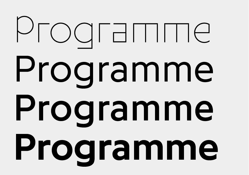
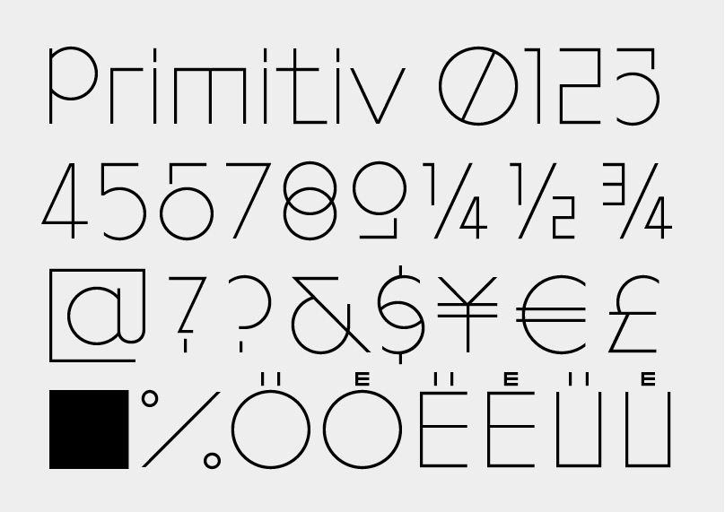
Programme in its final version, 2013.
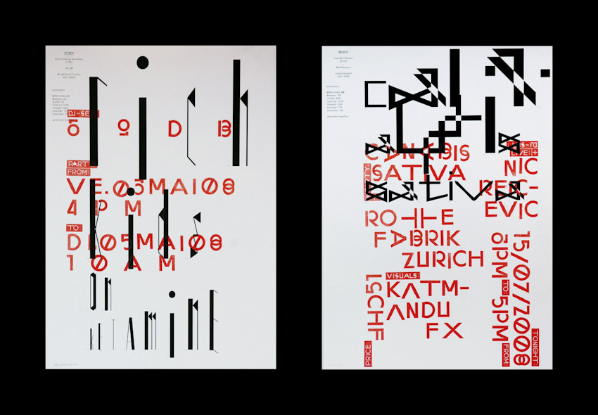
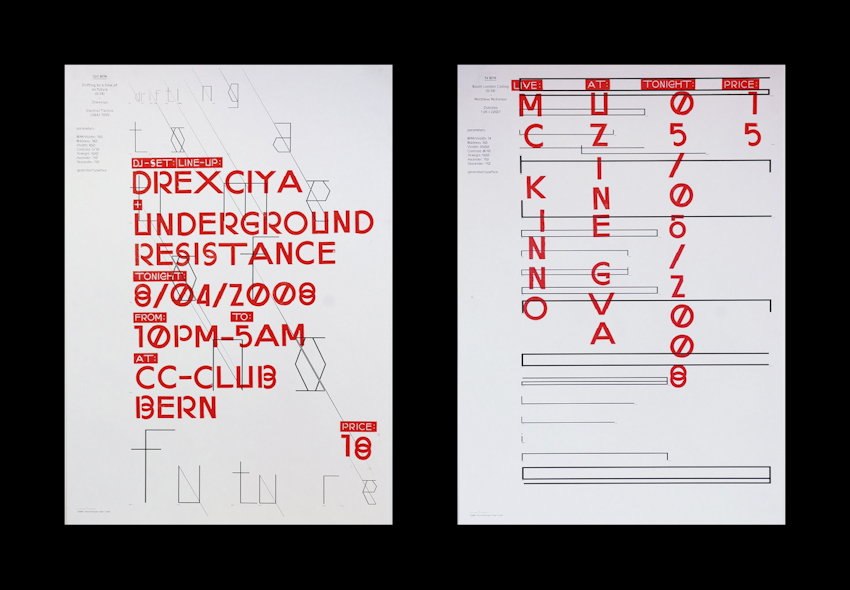
David Keshavjee and Julien Tavelli’s diploma (2009) consisted in a series of posters presenting the first version of Programme.
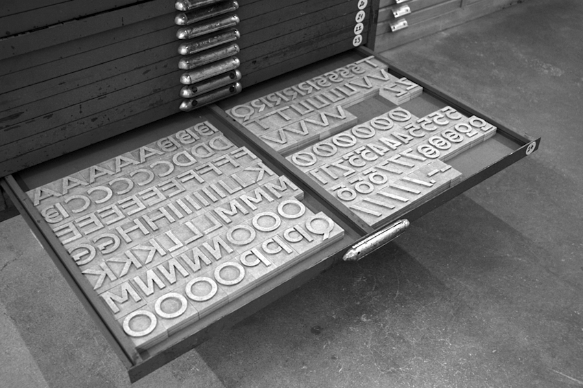
“We were not good in school,” they explain. “In Switzerland there were a lot of exhibition openings with free alcohol and good food.”… .We developed our own tools. First we worked on a program that can automatically generate a whole font (we never use serif fonts). Then with a font developed in the program, we made woodcut letters. We were interested in the process, not just the finished product.” — as they present it on Wallpaper.
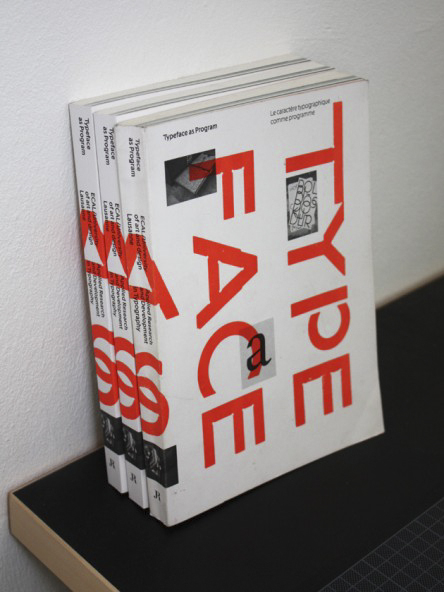
… it then became Book Medium, a later version of their typeface developed for the book Typeface as Program (JRP Ringier, 2009).
What are the next projects?
A couple of artist books, catalogues, some posters for techno festivals, record covers, and an exhibition in Zurich. Later we want to publish a type specimen for our typeface Programme.
Acoco (2013), by the artist and photographer Simon Haenni (also part of Maximage), is a book with almost no design traces but intensive editorial and sequencing work. It was edited by Andreas Koller and designed by Marietta Eugster and Maximage.