On Designing Question the Wall Itself
By Mark Owens

Having been asked to discuss the design of the catalogue for the recent Walker Art Center exhibition Question the Wall Itself, I began by asking a question of my own: “What is a design idea?” In a 1987 lecture to film students the philosopher Gilles Deleuze was after something similar when he asked, “What does it mean to have an idea in cinema?” Here, Deleuze’s emphasis is on the word in, because for him the question is not simply one of ideation in general, but one that is discipline-specific: what does it means to have a cinematographic idea? His response is to make a comparison with his own occupation of philosophy and to offer a set of brief formulations. If philosophy is in the business of inventing concepts and science is in the business of inventing functions, then cinema is in the business of creating “blocks of movement / duration.” This, for Deleuze, is what it means to have an idea in cinema, and provisionally, at least, it seems easy enough to translate his formulation to graphic design as “the invention of blocks of text / image.”
More specifically, one might go further and consider the various ways that the notion of the “design idea” have been articulated within the field of graphic design in the west since its professionalization after World War II. This would include the “big idea” of the 1960s, when Mad Men–era practitioners created high-impact, visual one-liners using clever, rebus-like typography, illustration, and sophisticated pre-digital photographic techniques. Or, one might consider the conceptualist approach of designers who have taken cues from artists like John Baldessari and Joseph Kosuth to create dryly witty, grid- and language-based work that offers a reflexive commentary on the modes and materials of design itself as a vehicle for the transmission of information. And finally, we might think of recent models of expanded studio practice that approach design in a more probative way, mining each component of a project for deeper historical, typographic, and cultural significance.
In practice, of course, graphic design might involve any one, or a combination of these approaches, and in unpacking the components of the catalogue for Question the Wall Itself I am cognizant of the many false starts and abandoned sketches that are elided in any account such as this—as well as a certain degree of self-consciousness that attends writing about one’s own work. As conceived by the Walker’s then-Artistic Director Fionn Meade with Curatorial Fellow Jordan Carter, Question the Wall Itself was an ambitious group show of 23 artists whose work makes use of décor and the construction of interior spaces as a mode of critique, taking up questions of identity, globalization, politics, and the institution of the museum itself. Within this over-arching framework, a number of motifs cut across the works presented, including patterning and wallpaper, trompe l’œil and imitation, and the cutting, perforation, and transformation of the architecture of the gallery itself. Imagined as a kind of book-as-exhibition, the catalogue thus served a triple function as a critical reader, photographic walk-through, and artist book, reserving a number of pages at the end of the volume for images and reprinted texts selected by the artists and presented “as found.”
The centerpiece and thematic linchpin of the exhibition was a 1974 work by the Belgian artist Marcel Broodthaers, titled Dites Partout Que Je L’A Dit (Say everywhere I said so), the first of his so-called Décors, large-scale period rooms created over the last two years of his life. The piece itself consists of a black-and-white illustration from a 19th-century book of ornithology, a stuffed parrot, a framed text piece, and a reel-to-reel tape player, with box, playing an audio recording of Broodthaers repeating a nonsense poem that roughly translates to “Me I say I Me I say I / The King of Mussels Me You say You.” In one way or another all of the artists in the exhibition owe a debt to Broodthaers, and in Dites Partout Que Je L’A Dit many of the show’s themes are writ small, including imitation or parroting-back, the prop, and a scenographic notion of esprit décor that prefigures institutional critique, mobilizing the construction of private, highly subjective interiors in the public space of the museum.

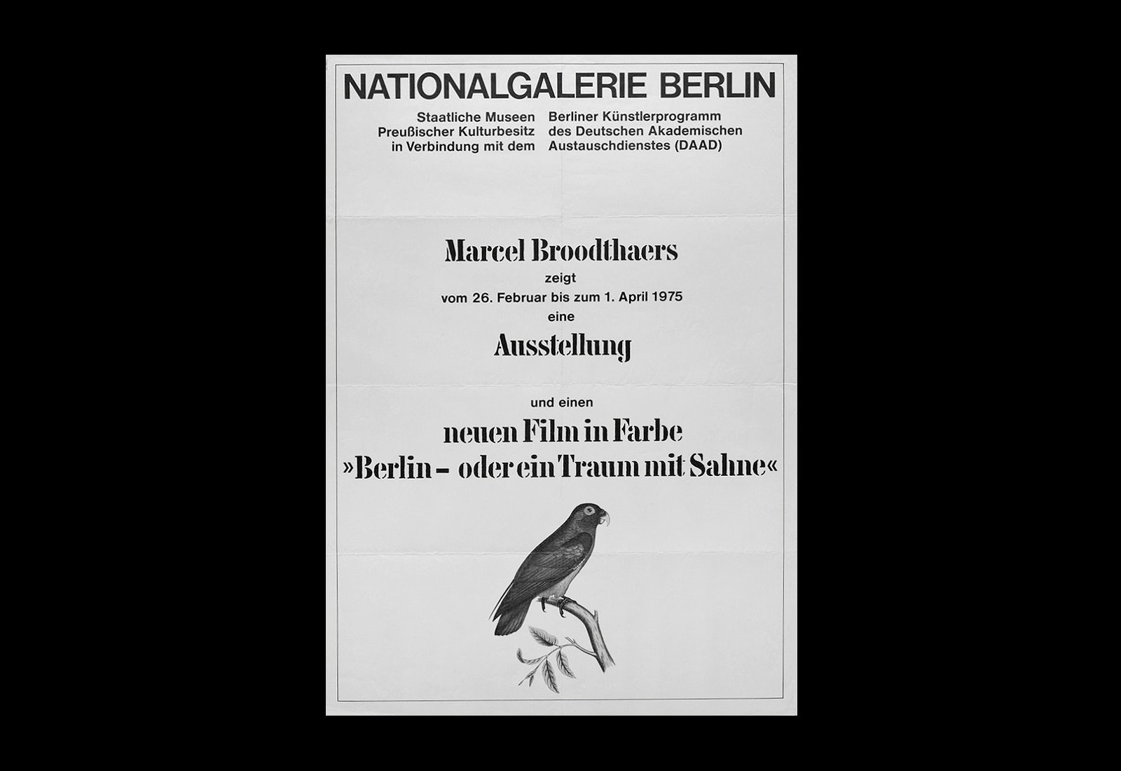
Broodthaers, then, formed the starting point for the design of the catalogue, and online visual research soon turned up an unexpected companion piece to Dites Partout Que Je L’A Dit in the form of a poster designed by Broodthaers in 1975 for an exhibition and film screening at the National Gallery, Berlin featuring the same parrot illustration and one of the artist’s trademark stencil typefaces. These two elements thus suggested themselves as visual components on which an identity for the exhibition and catalogue might hang. Immediately, typography became a question: a stencil face, while perfect for display, is generally less readable in text sizes. Enter Klod AM, a new typeface designed by Adrien Menard, a French designer recently relocated to Brooklyn, and discovered thanks to Instagram.
Unreleased at the time of the exhibition, Klod AM is based on the forms of Garamond—named for the famed 16th-century engraver—but reworked by Menard into an elegant stencil typeface in Regular, Medium, and Bold weights. Remarkably, at large sizes Klod AM functions as a distinctive, eye-catching stencil face, but when printed at smaller sizes the stencil cuts recede, rendering a highly legible text setting. Using Klod AM for both display and text thus elevated the “decorative” function of display type to a structural principle across the book. A stacked, centered setting of the title of the exhibition, with the strategic use of all caps for visual balance and hierarchy, resulted in a typographic lock-up that could function across exhibition graphics, advertising, and the catalogue.
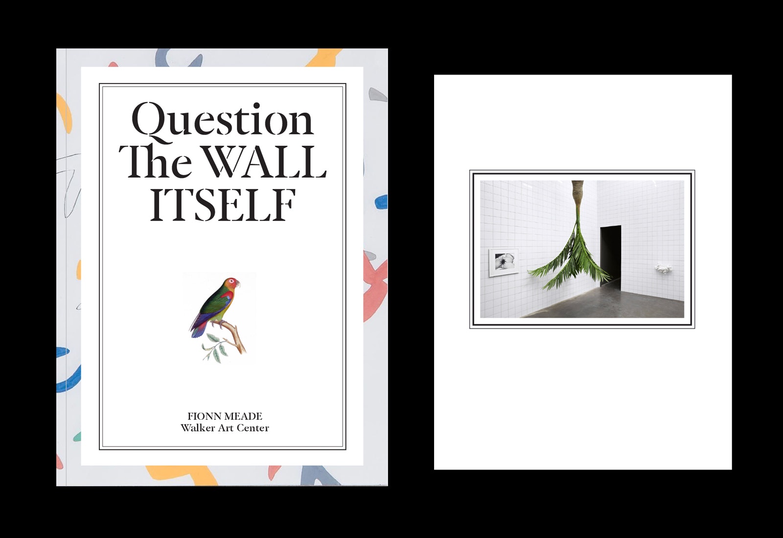
With this typographic anchor in place, the poster’s use of the parrot illustration from Dites Partout Que Je L’A Dit—materialized in the form of the stuffed bird in the installation—suggested a figurative counterpart to Klod AM. A reverse image search of the black-and-white illustration unearthed Broodthaers’s source, a page from the 1849 Iconographie Ornithologique by Marc Athanase Parfait Œillet des Murs in glorious full color. Immediately, this original image resonated beyond Broodthaers to begin to implicate other works in the exhibition, particularly as the parrot’s capacity to replicate the human voice and colorful plumage suggested both imitation and trompe l’œil and a form of decorative surplus implicit in the notion of décor. The parrot thus became a kind of mascot or portable graphic “prop” for the exhibition and began to be incorporated by Aryn Beitz in the Walker design department into the gallery guide and other exhibition materials alongside Klod AM.

As any catalogue designer knows, group exhibitions often bring with them the challenge of building visual coherence on-the-page and from spread-to-spread around works whose primary organization has been spatial. Indeed, Question the Wall Itself was originally imagined as a series of discrete period rooms, and so a graphic device was needed that could draw the various visual materials together while maintaining the autonomy of the works presented. As readers we are used to seeing images in rectanglar boxes in books, and an initial idea was to complicate this expectation with the use of frames and outlines that could suggest wainscoting or interior architectural motifs around images.
Eventually, this approach was felt to be potentially too “antique” and complex, and so a cue was taken more directly from the realm of interior design in the form of fabric and wallpaper swatch books. Indeed, one of the other central works in the exhibition included textile samples and notes from curator Seth Siegelaub’s 1997 omnibus Bibliographica Textilia Historiae. In swatch books, samples from a wide array of larger patterns are isolated in a grid and often cut out using using pinking shears, leaving a distinctive scalloped edges. Alongside an eight-unit grid to contain image content, this scalloped edge, run along one or more sides of an image, became a motif repeated across the catalogue essays and installation views, a bit of “queer” decorative surplus to tie the images together as well as organize the table of contents.
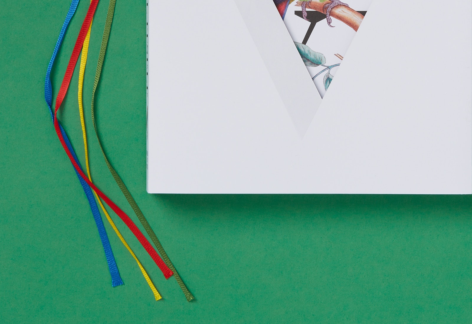
With these graphic elements in place and the work of image editing, layout, and installation photography under way, the final, and perhaps most important, component of the project that remained to be designed was the catalogue cover. Early on, the curators and Walker Design Director Emmet Byrne had been responsive to the idea of a “peek-a-boo” cover that would leave something hidden and serve to emphasize the idea of disclosure and interior space as one opened the catalogue. But it wasn’t until the show began to be installed that the central feature for the cover was arrived at with artist Marc Camille Chiamowicz’s installation of his 1978 work Here and There at the Walker.
Constructed of panels adorned with patterns and applied photographs, Here and There had been presented in various configurations over the years, including in 2010 at London’s Raven Row, whose galleries are constructed within in an 18th-century domestic interior. At the Walker, however, the installation included a unique architectural intervention in the form of a diamond-shaped “keyhole” cut into the gallery wall that permitted a view from a smaller front room into the rest of the exhibition space. With its combination of intimate disclosure and architectural intervention, this particular device encapsulated so much of what we wanted to achieve with the cover that we asked the artist if we might feature an image of the cut and the “wall itself” on the cover.
With Marc Camille’s blessing, the question still remained as to what might be disclosed through this aperture: the exhibition title? an installation view? Returning to Broodthaers and the grounding elements of the exhibition graphics and catalogue design, inspiration was drawn from the use of illusion and trompe l’œil by artists in the exhibition like Lucy McKenzie and Walid Raad. Reducing the exhibition title to its initials, “QTWI,” the parrot, perched on the filigree of its green bough in bright primary colors, was interlaced with the forms of the typography, the tail of the capital “Q” overlapping the bird to create a single graphic image. With the full title of the exhibition reserved for the spine of the book, this image was printed on an inside double cover and could only be glimpsed through the die-cut keyhole, fully visible only when the cover flaps were unfolded and the interior of the book was revealed.

As a book object the catalogue thus seemed almost complete, but it wasn’t until going on press at Die Keure in Belgium that the finishing touches were decided upon, budget permitting. With the parrot serving as a kind of stand-in or prop for the exhibition as a whole, it had always seemed that the catalogue itself required an additional, perhaps even superfluous, decorative element, something that would exceed the bounds of the book-as-exhibition held within its pages. This took the form of four ribbon bookmarks in red, yellow, green, and blue, bound into the book block to function not simply to separate the four sections of the catalogue—curatorial essay, installation views, critical essays, and artist pages—but to serve as its own kind of colorful plumage. With this final material gesture—tucked into the interior of the catalogue and sight unseen until the books were shipped—the design idea behind the catalogue for Question the Wall Itself perhaps found its most clear realization.


