I remember asking him,
“Since you've stopped making art, how do you spend your time?”
And he said, “Oh, I'm a breather, I'm a respirateur, isn't that enough?”
He asked, “Why do people have to work? Why do people think they have to work?”
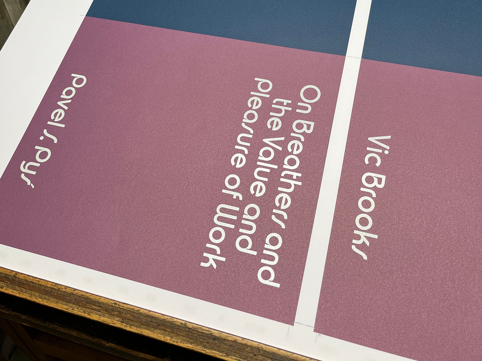
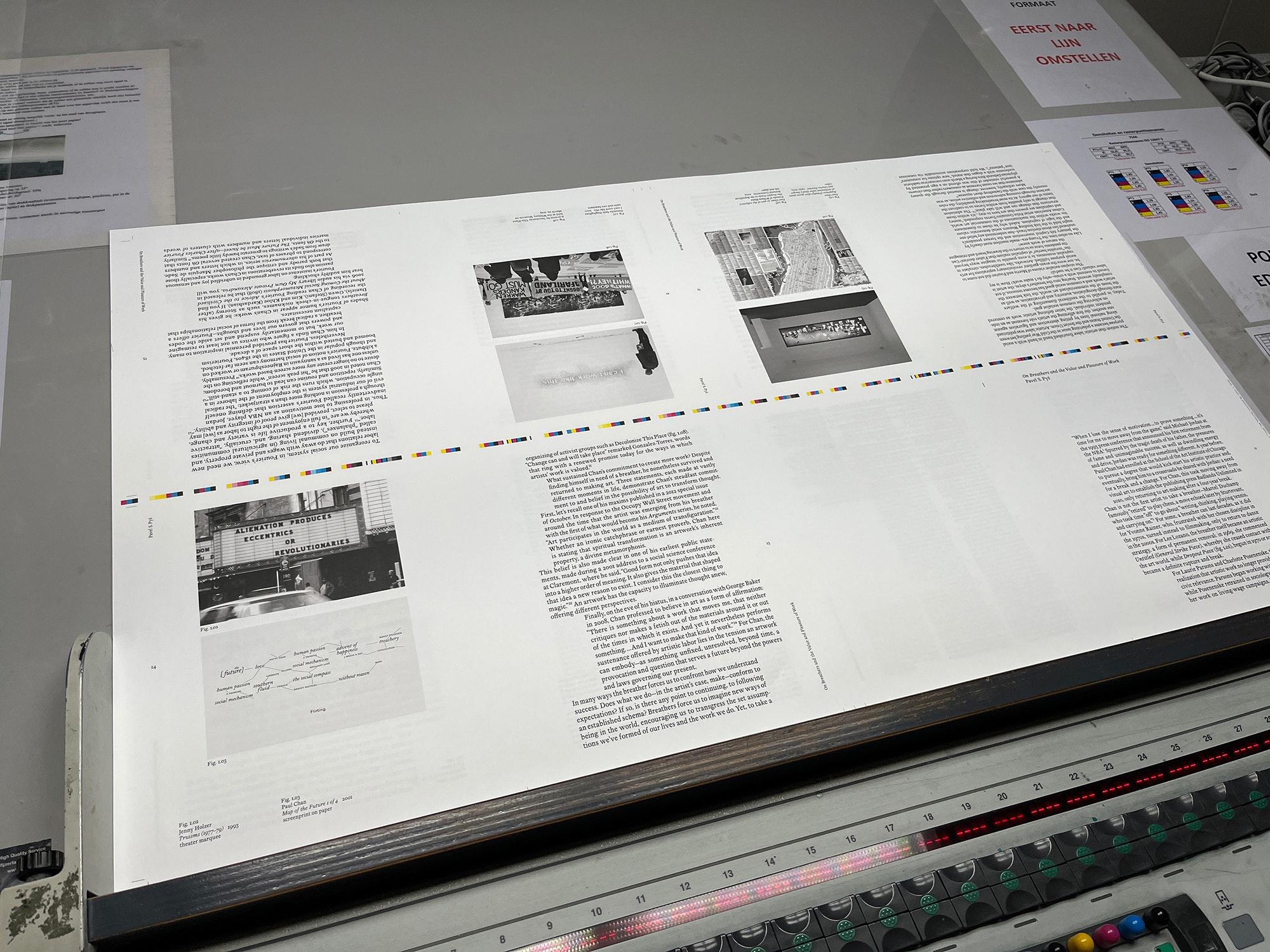
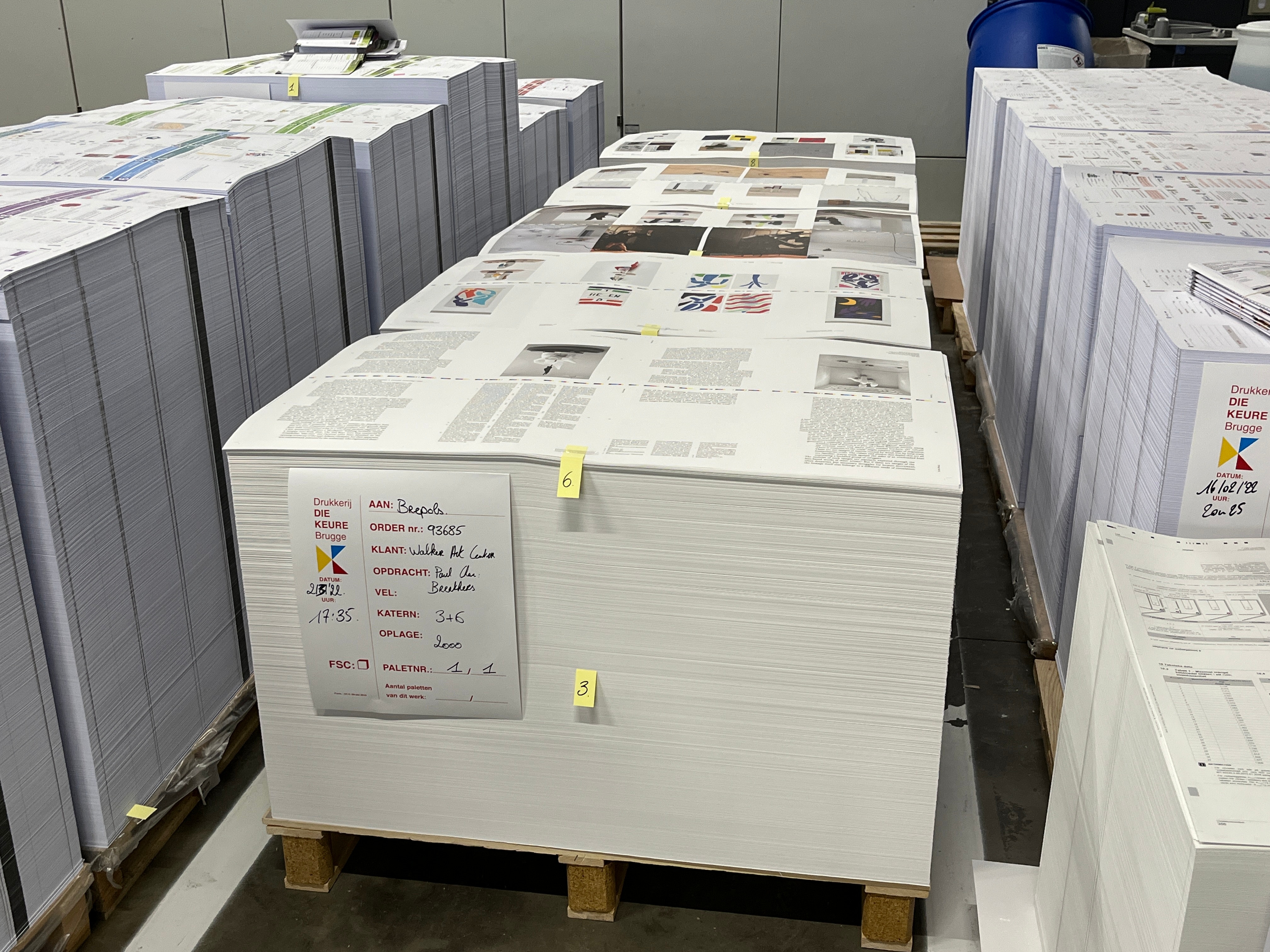
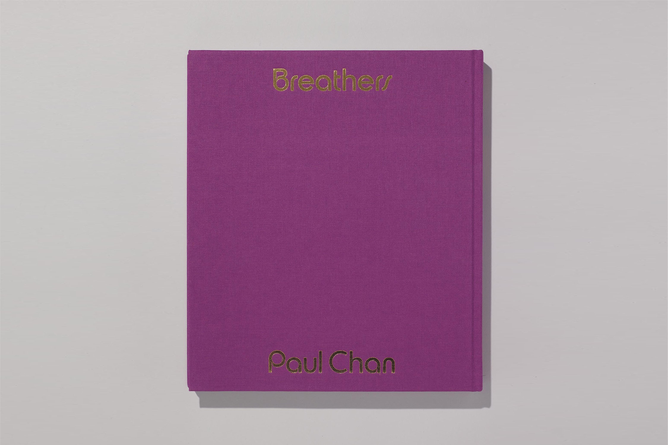
So begins the cover of the catalogue Paul Chan: Breathers. The Walker Design Studio recently worked with artist Paul Chan to design the catalogue to accompany his upcoming exhibition of the same name, opening at the Walker in November of 2022.
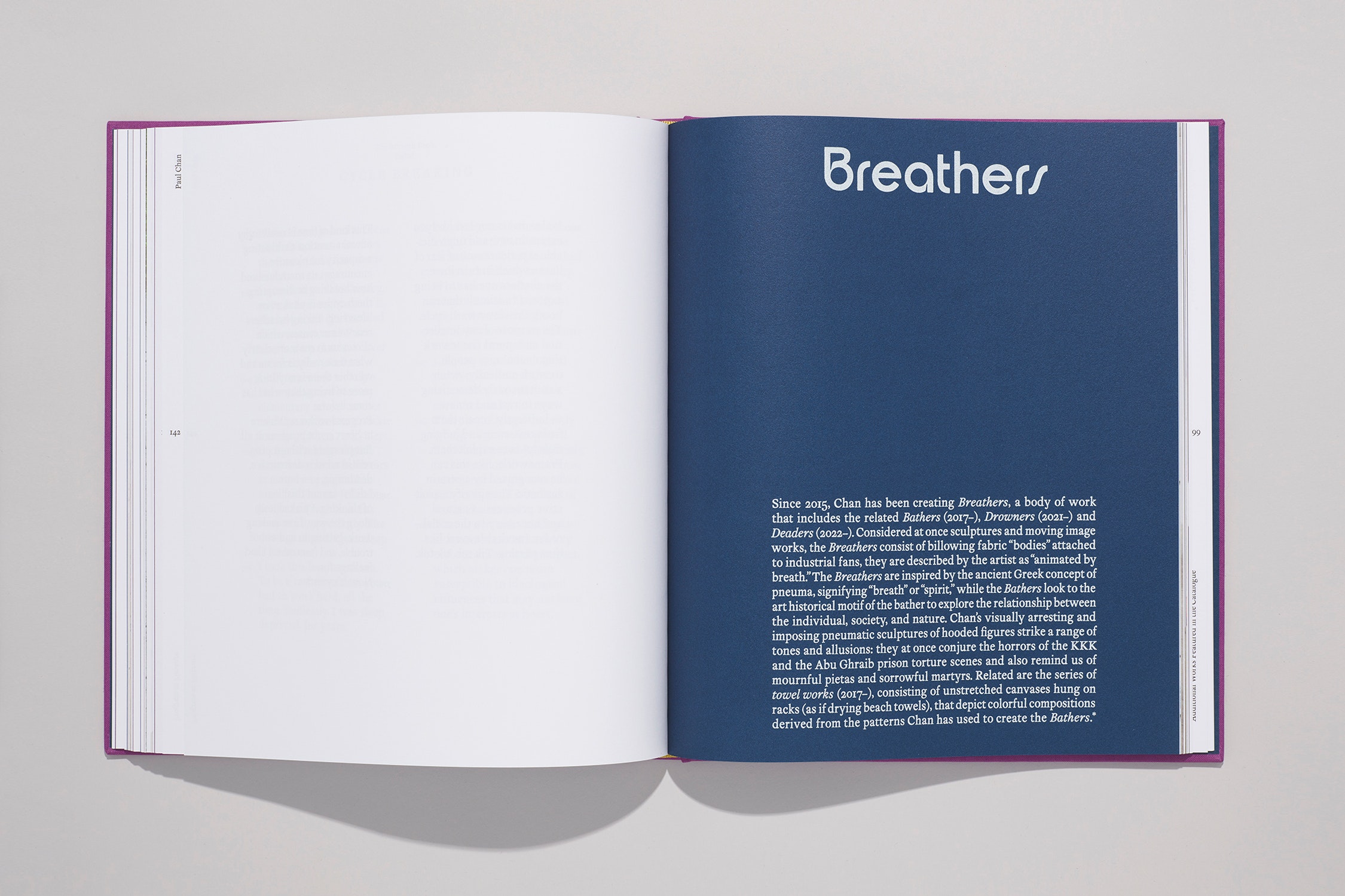
In 2010, following a decade of artmaking, Chan embarked on a self-imposed four-year break, turning away from creating moving image works, and instead immersing himself in experimental publishing by establishing his own imprint, Badlands Unlimited. The Walker exhibition, spanning the period between 2010 and 2022, surveys Chan’s publications and works made following his return to artmaking. The exhibition takes as its organizing principle the notion of the “breather,” a word that can signify a moment of rest or pause, but can also reference a purposeful redirection toward other activities. The term is also the name given by Chan to a major recent body of work, the Breathers, a series of pneumatic sculptures that he also considers as moving image works. Tacitly and overtly, the metaphor of the “breather” underscores each of the works in the exhibition.
In late October of 2021, Paul Chan sat down with catalogue designer Brian Huddleston to discuss the typeface he designed for the book. In this interview Paul asks Brian about his background as a designer, his beginnings in type design, and the process of creating the typeface Breathers.
Paul Chan (PC)
How did you become a designer?
Brian Huddleston (BH)
In sixth grade, several working professionals from the area came to our classroom to talk about their jobs, and one of them happened to be a graphic designer. And I just thought what she did was so interesting, it struck a chord with me, so I started pursuing it on my own.
PC
In sixth grade?
BH
Yeah, that next year in middle school I started teaching myself web design. I got a cracked copy—I didn't know about Photoshop then, so the one I used was called Paint Shop Pro—and I just started going online and viewing people’s source code on their websites and teaching myself HTML and CSS. Then I started making silly little websites for me or for my friend’s band or things like that. And it grew from there.
PC
Where were you when you were doing this?
BH
Jefferson City, Missouri.
PC
Graphic design is one thing, and then font creation and typesetting are another. What is your relationship between those two fields? Did you see them naturally entwined? Did you go from one to another? How did that happen?
BH
For years I was focused on design—I'd been a designer for over ten years before I ever thought about making a typeface. Then in 2014 I had recently relocated to Philadelphia and I had the urge to try to make one, just as a personal exploration. I feel like that desire must have been present in my subconscious for a while before I made the attempt. Part of it was just learning to listen to myself and my intuition—I finally quieted down enough to hear what my subliminal mind had been telling me for years.
So I started teaching myself type design slowly on nights and weekends over the course of four years or so. I’ve always been an autodidact, and that was really useful for self-educating. A lot of what you need to know is out there online and in books, if you spend time figuring out where to look. There was an initial learning curve mastering the software. Once you're fluent in the tools, it becomes more interesting to think about the ideas embedded in whatever it is you want to make.
PC
One of the reasons I wanted to do this conversation with you is because I have a real love for fonts and font making, too. It’s always interesting to me to hear about other people who are also interested in thinking about fonts as a form of expression and as a form of production. Can you talk a little bit about what makes it pleasurable?
BH
It probably comes back to a love of reading. When I’m thinking about these things, I’m never thinking of them as isolated entities, but about the whole ecosystem. It’s not merely what a single character looks like, but the effect of all of them coming together.
You could compare it to going for a run: at a certain point you’re not really aware you’re even running anymore. Once you warm up, your muscles take over and start to control your body with an automatic cadence, and suddenly your mind is off thinking about something else entirely. And I get that same sensation after periods of working on type: over a long session there’s a moment where it stops being about you controlling the tools and you enter into a kind of no-mind state. For me, I think that’s where the pleasure aspect of it can come in as well. Those moments of deep focus are so beneficial in terms of your mental health and overall balance. The idea of the focused mind—I think type design is a perfect extension of that.
PC
That’s so interesting. It sounds meditative at a certain point.
BH
Yeah. With design projects, the possibilities are endless to a degree, but in type design the alphabet is your container. Having it be limited to that allows you to harness your efforts. The concept of an alphabet, which is something universally recognized, helps to focus your energy.
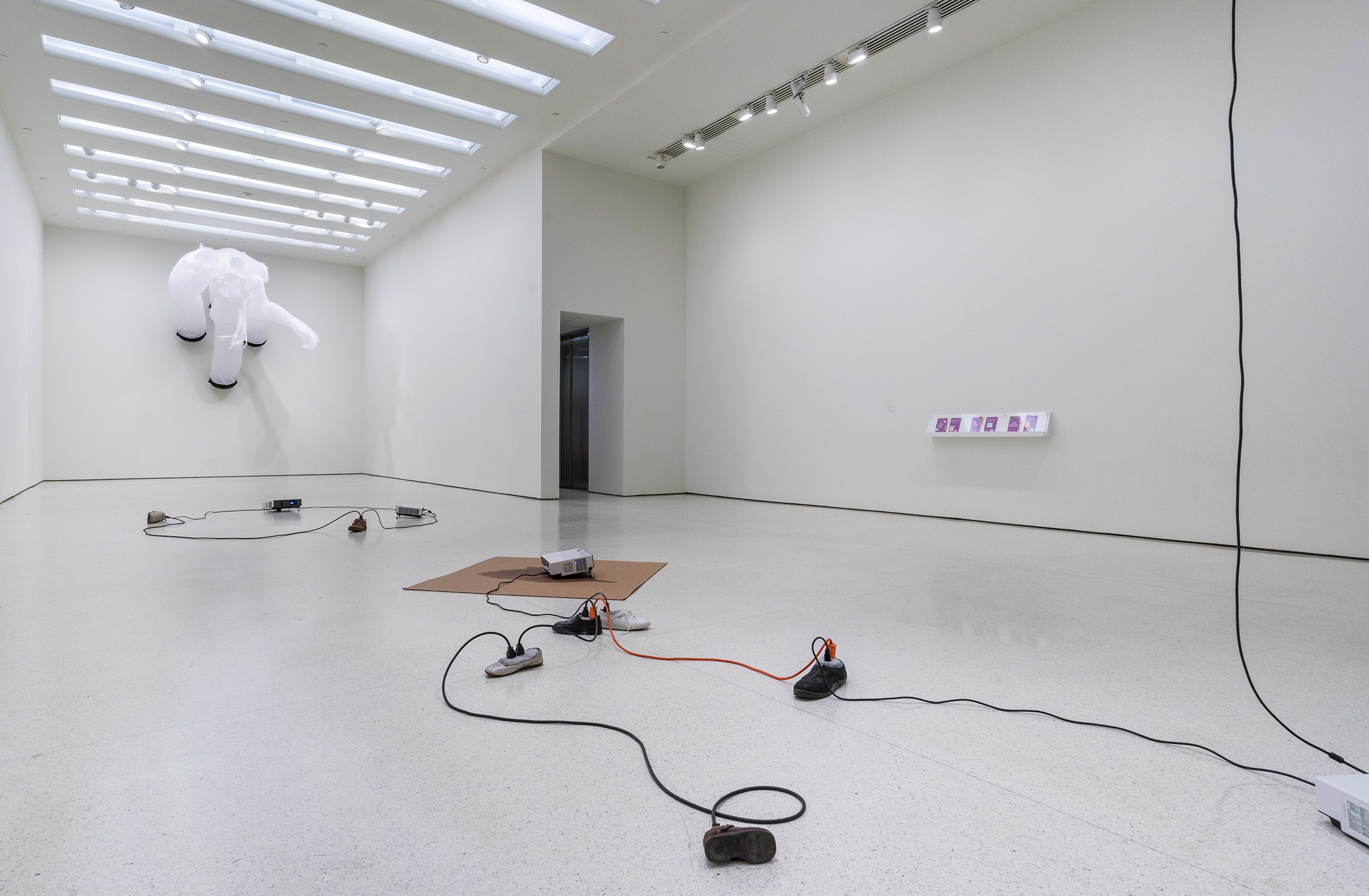
Guggenheim Museum, New York
March 6–May 13, 2015
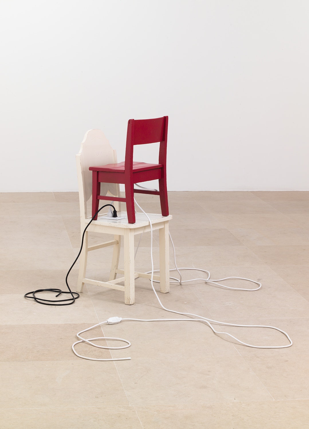
The argument: Marcus Aurelius 2013
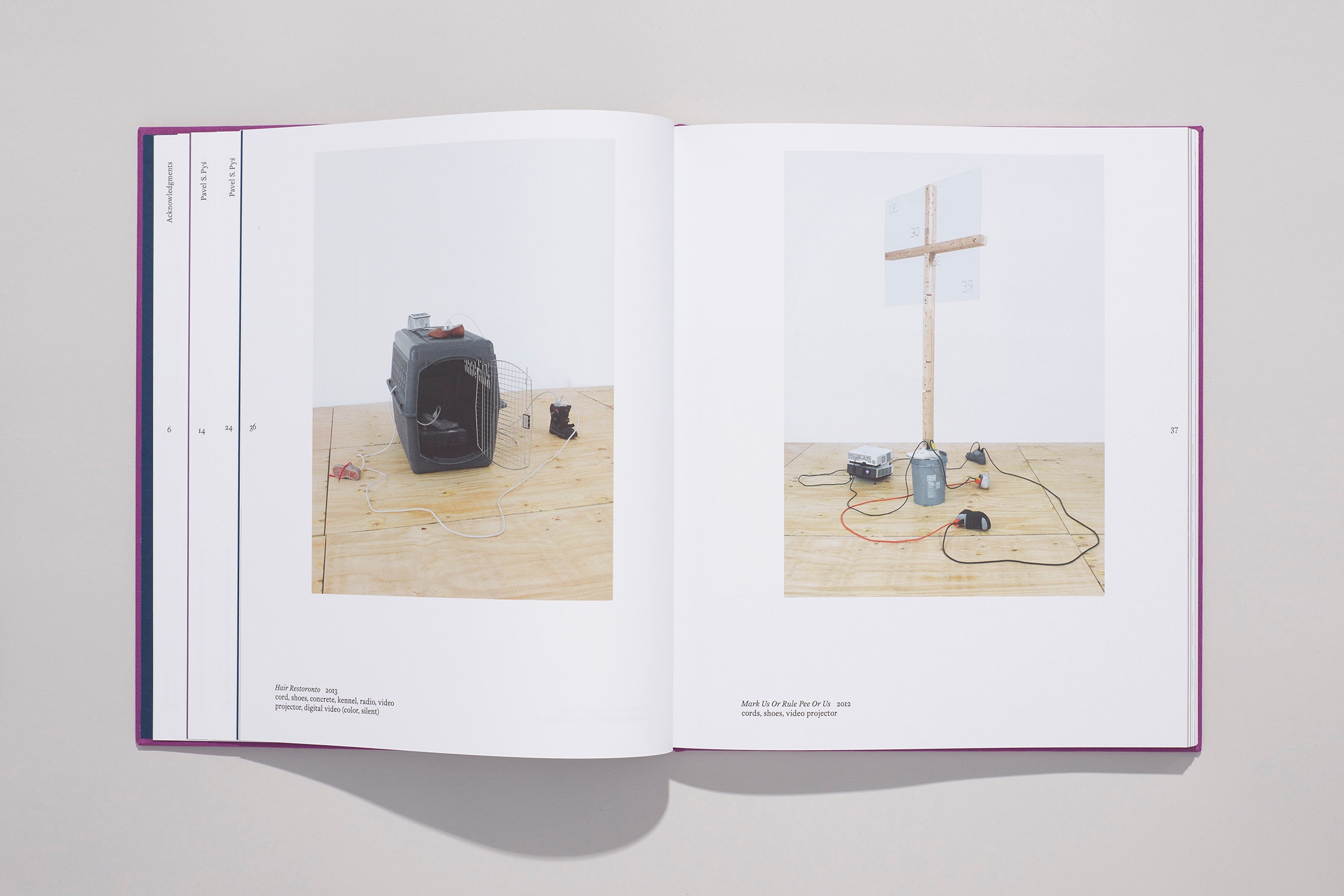
2 electrical outlets, cords, chairs
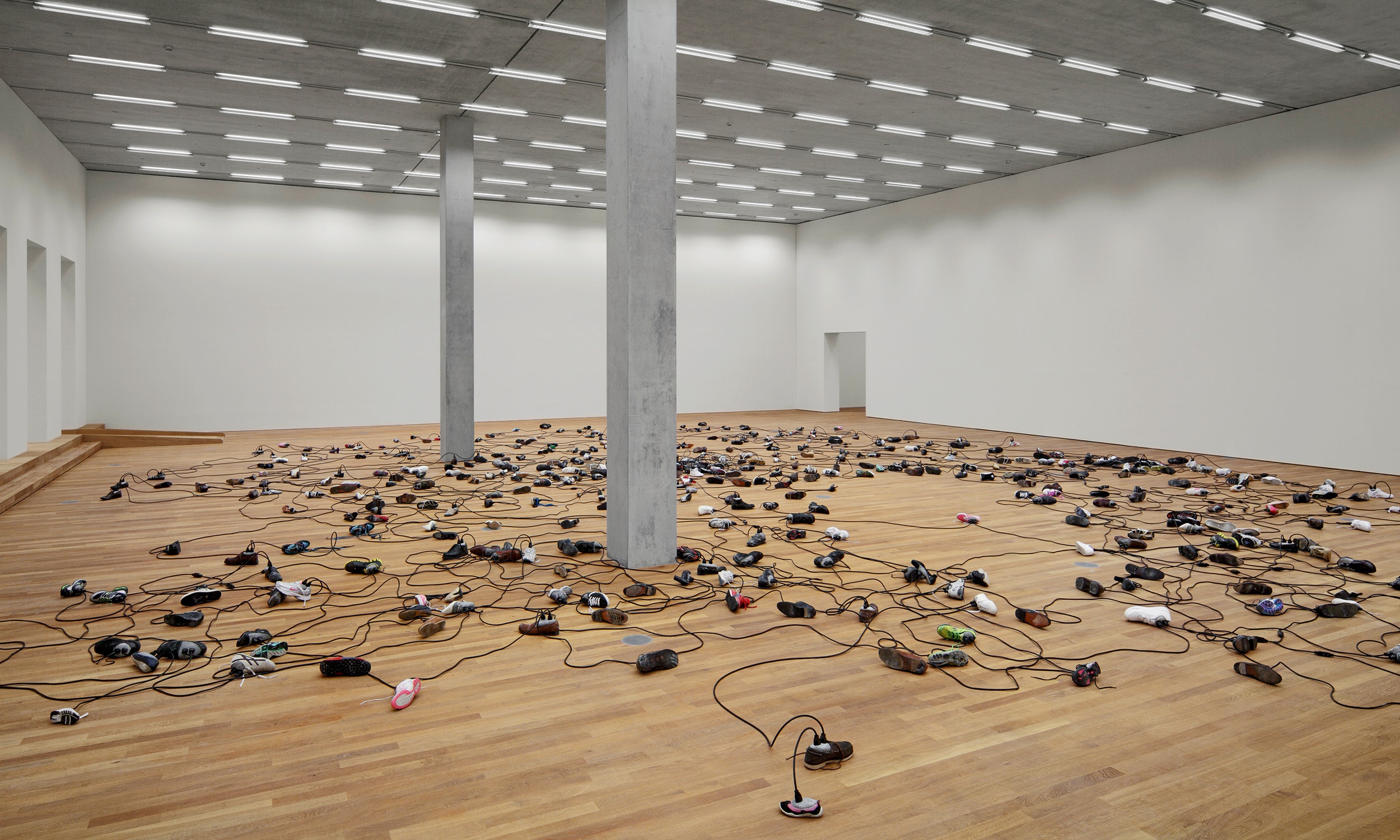
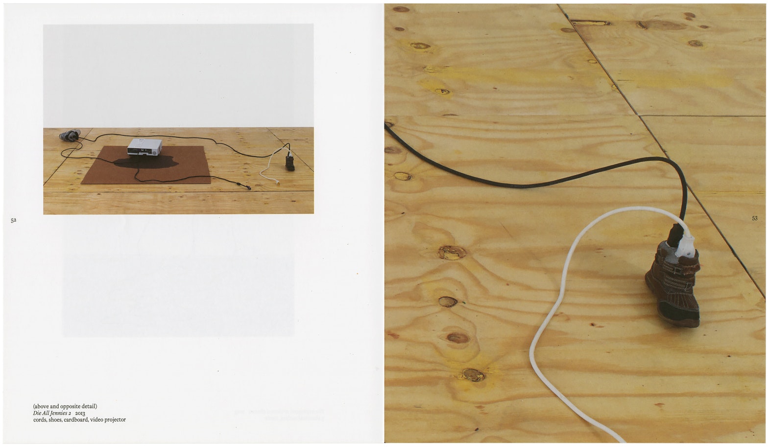
Master Argument 2013
cords, shoes, concrete
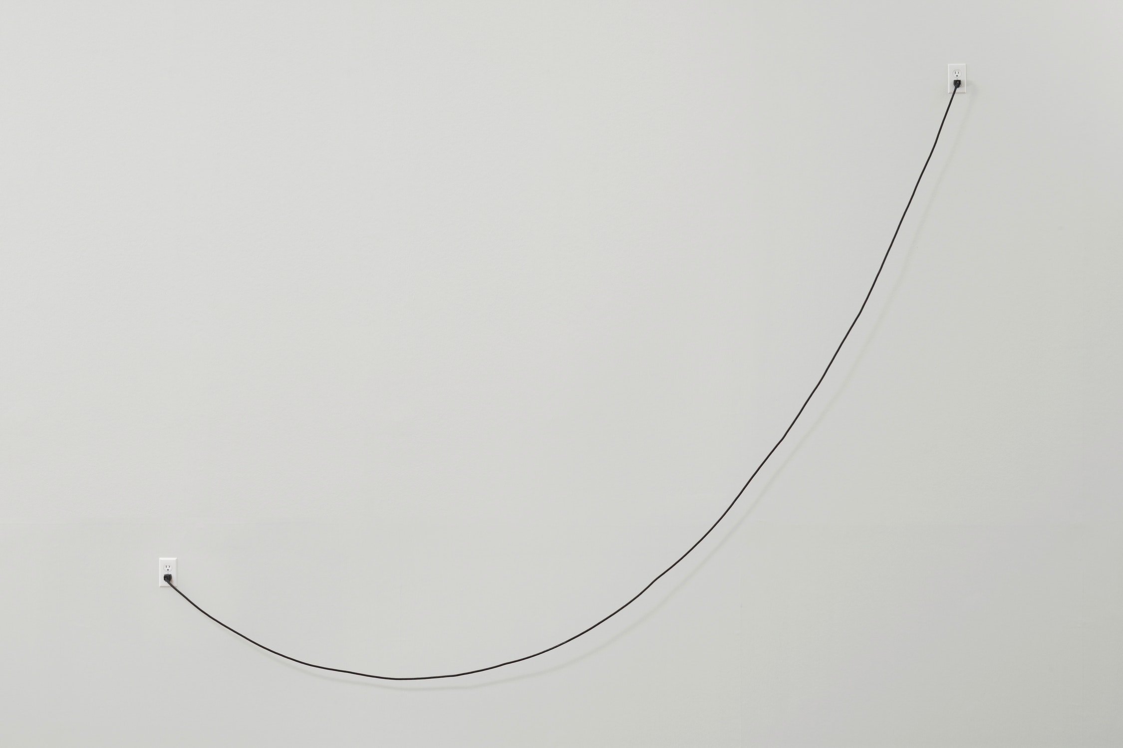
The argument: herbal supplements 2013
cord, outlets
Schaulager, Switzerland
April 12–October 19, 2014
Guerrilla Wife by Louise Reid Spencer 2014
oil on fabric, paper, cardboard
(right) Paul Chan Untitled 2011 oil on paper, cardboard
archival inkjet prints on foamboard
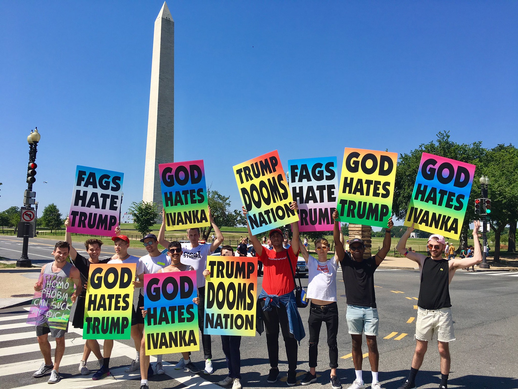
Used at the March for Equality Washington, DC, July, 2017
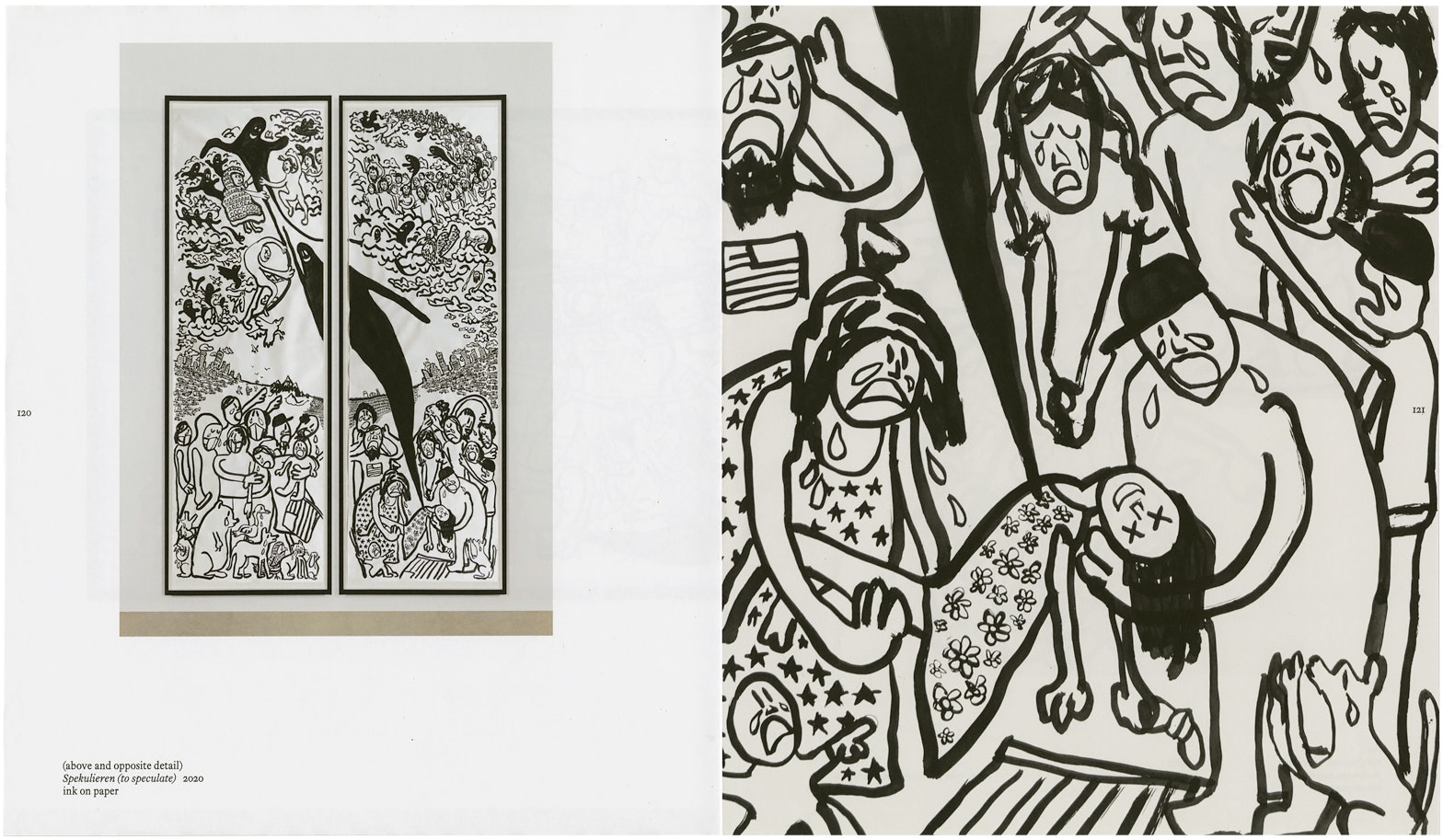
(right) Paul Chan zwitschern (to tweet) 2020 ink on paper
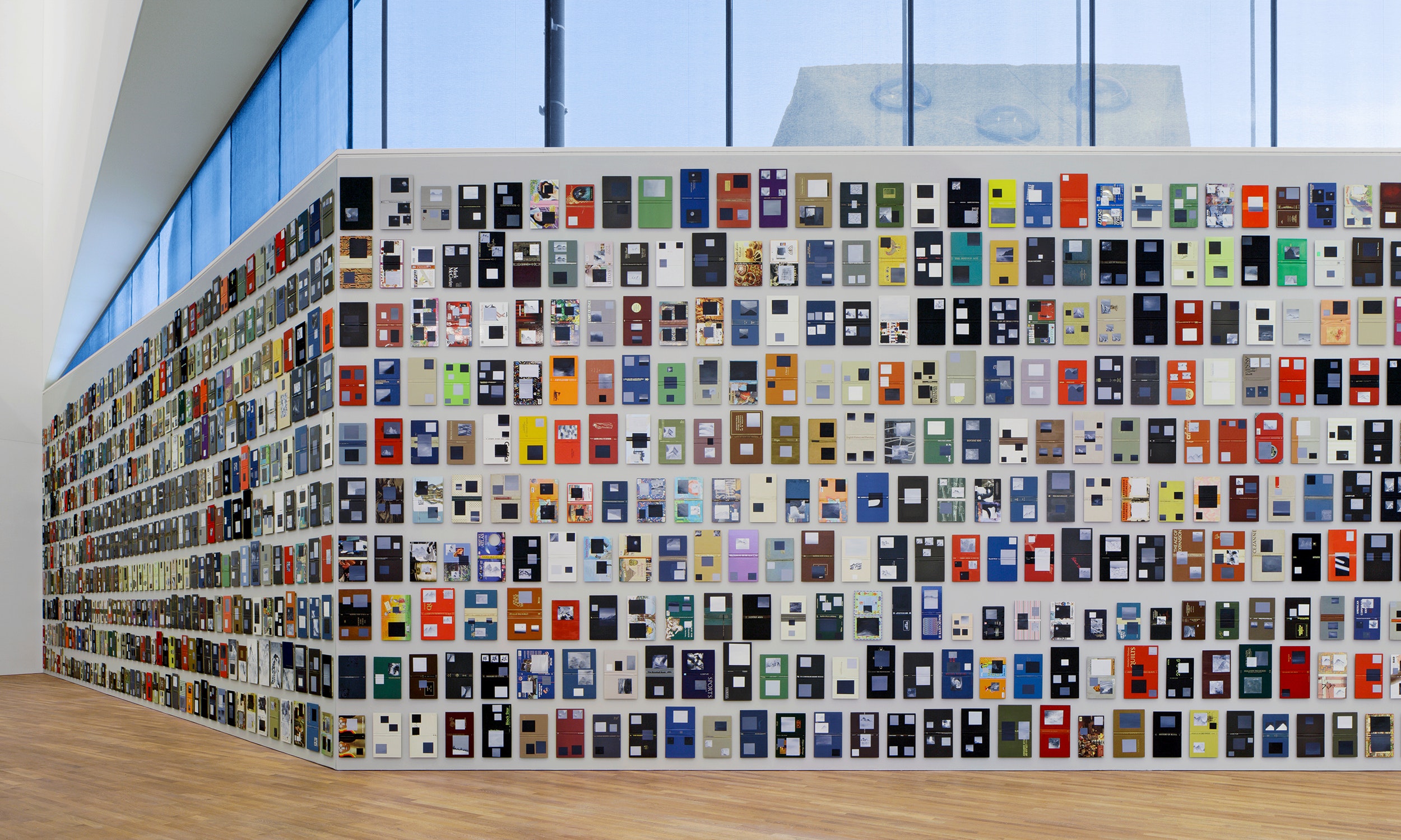
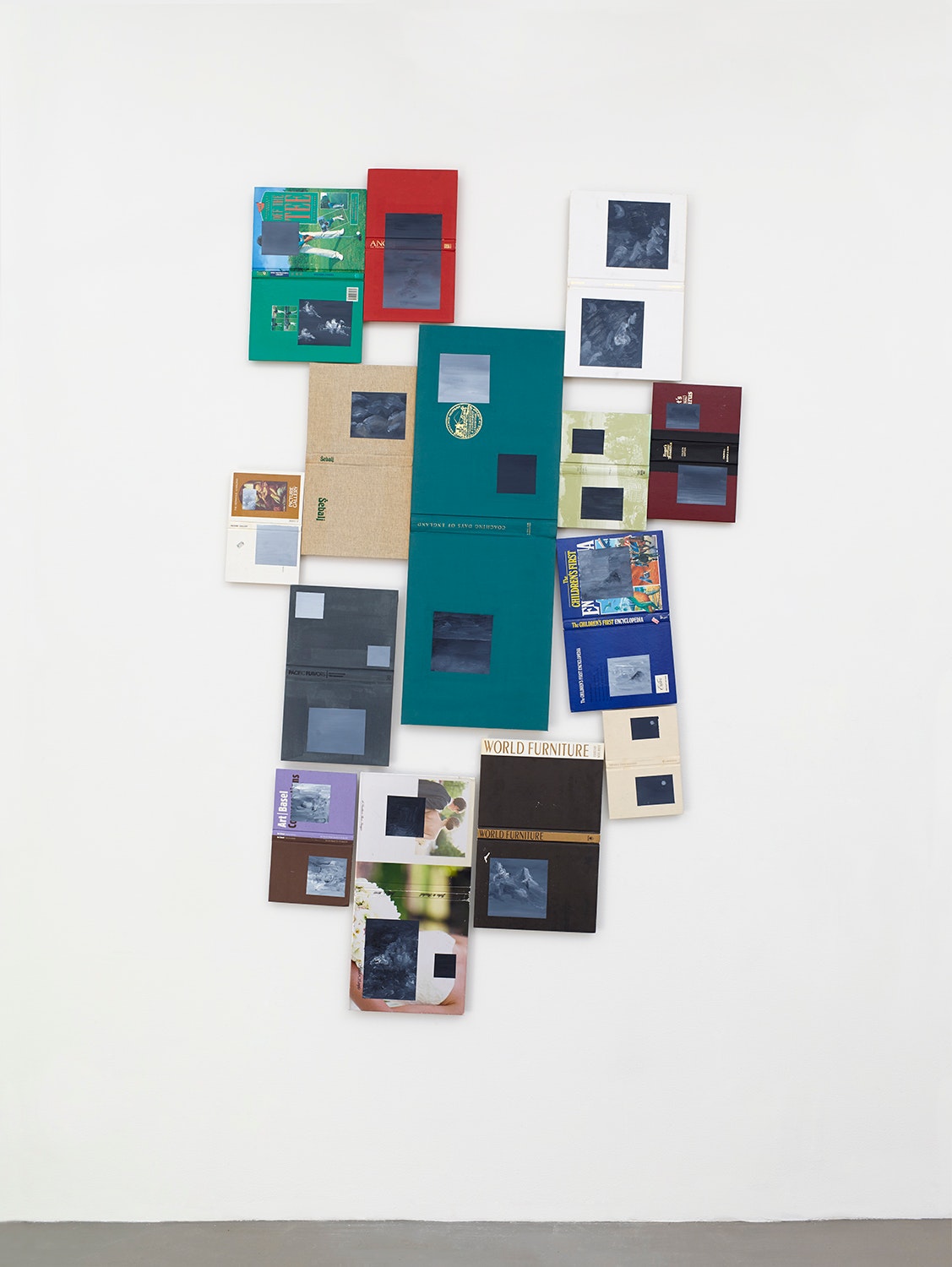
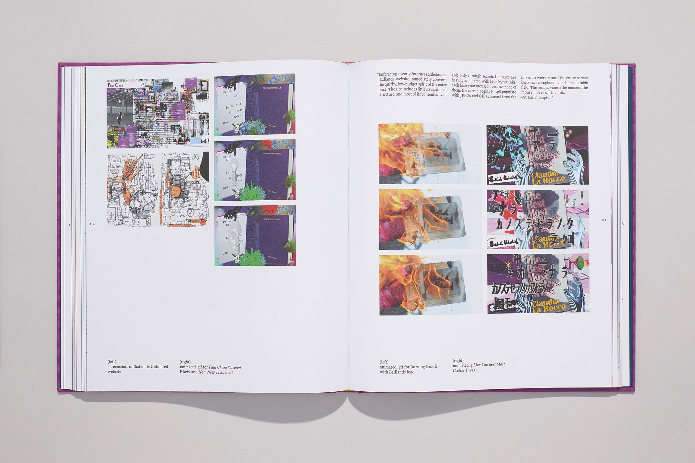
metal shelving, books, cardboard, wood, printed matter, acrylic paint, ink, yarn, animatronic cats
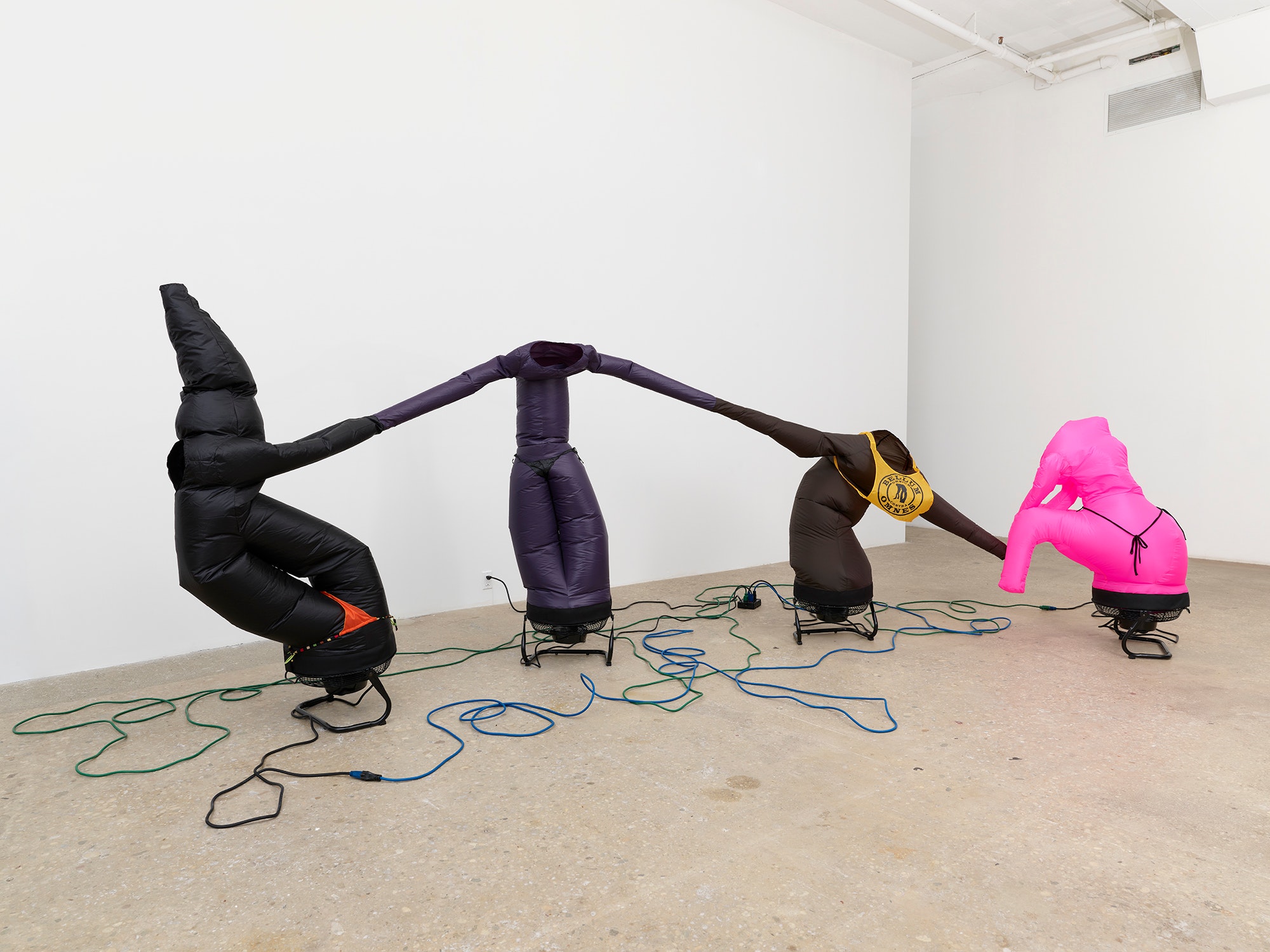
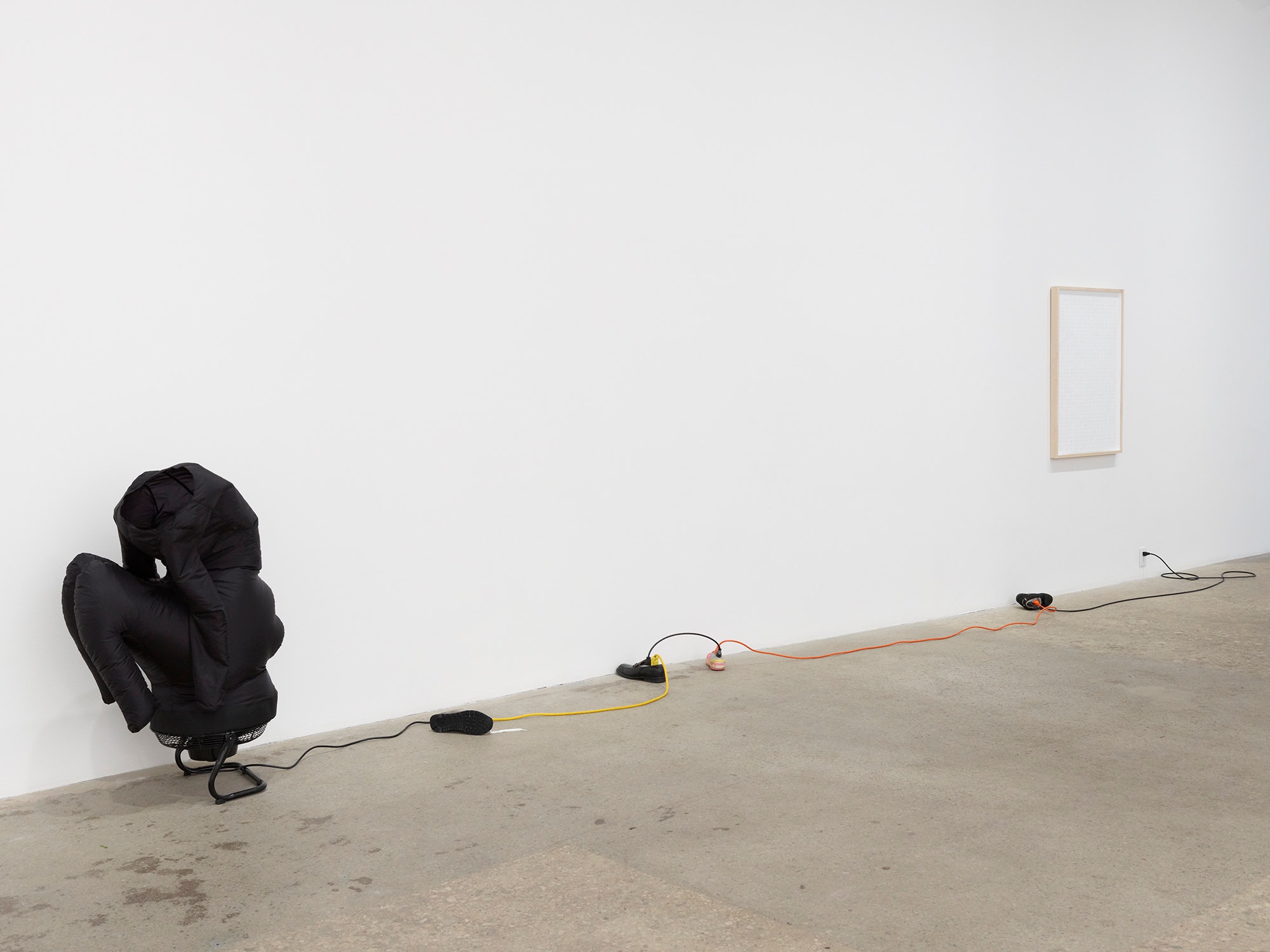
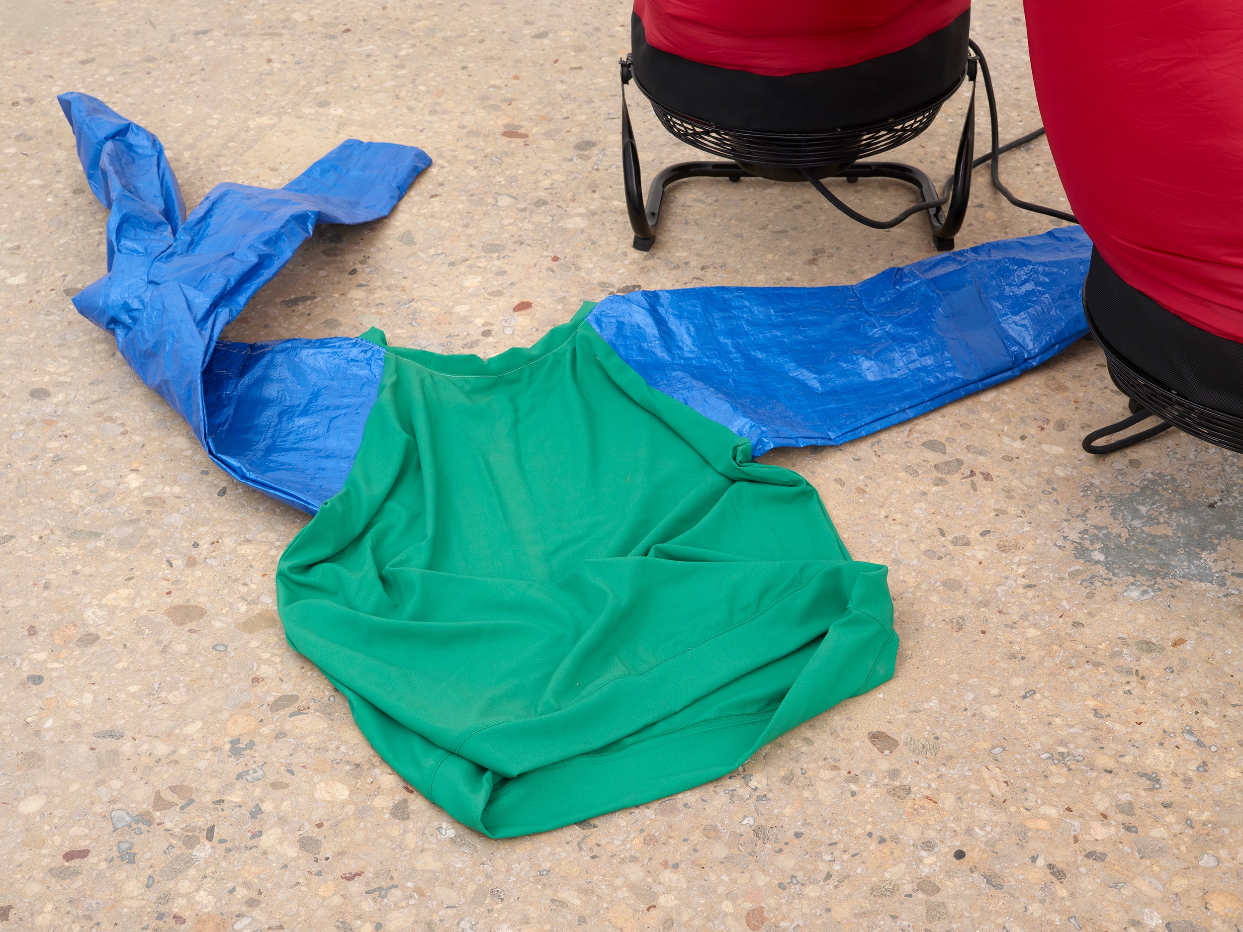
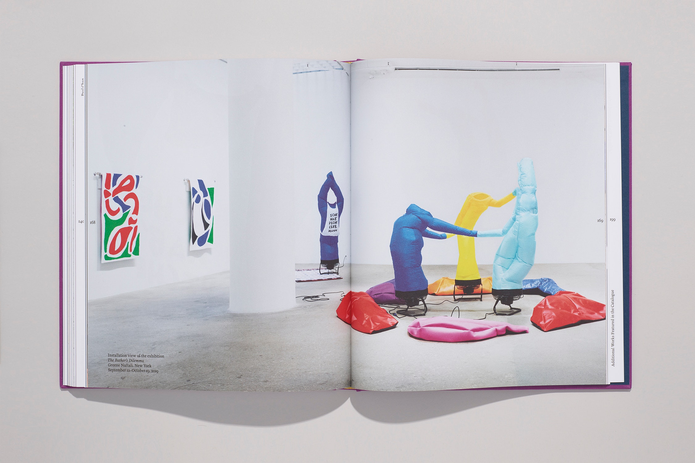
Katabasis, 2019 2019
nylon, fans, power cords, suicide cords
Greene Naftali, New York
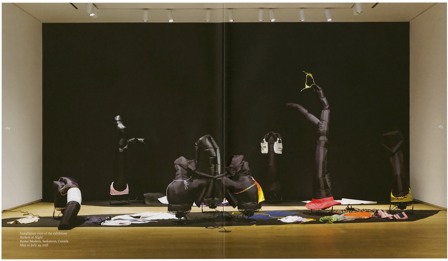
September 12–October 19, 2019
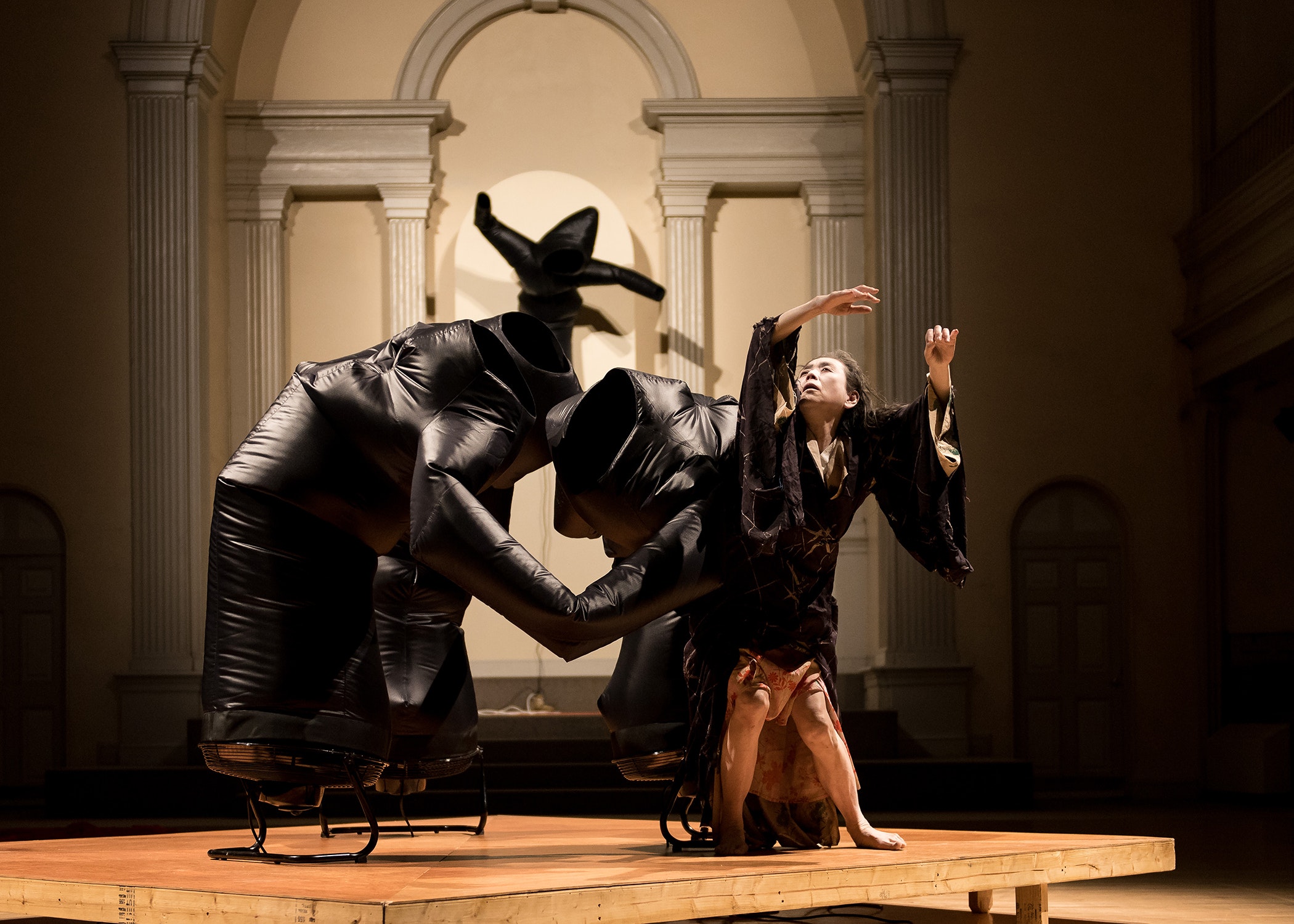
Part of Platform 2016: A Body in Places
Danspace Project, New York
February 23, 2016
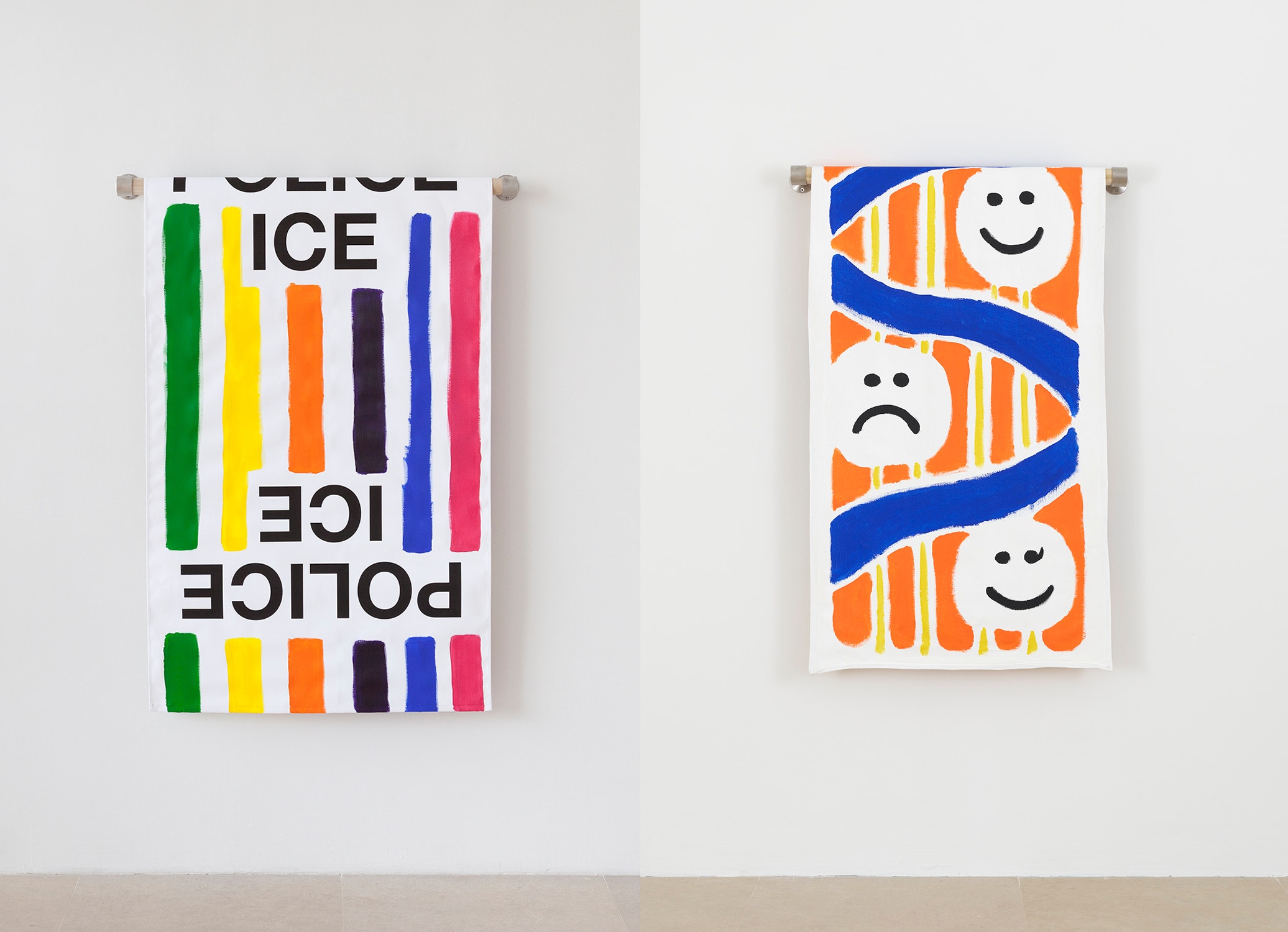
(right) Paul Chan Towel (emojis) 2018, acrylic on canvas, metal bracket, wood dowel
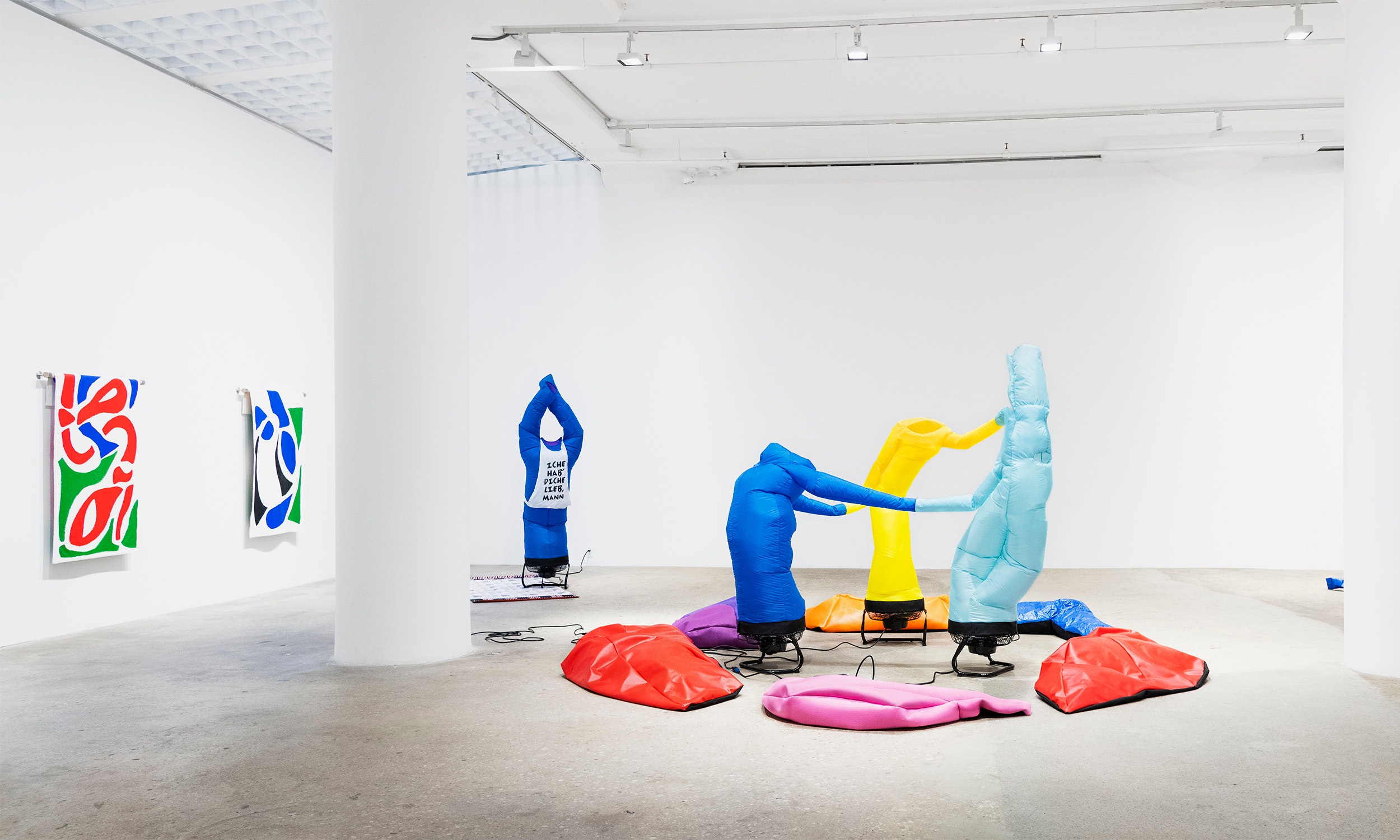
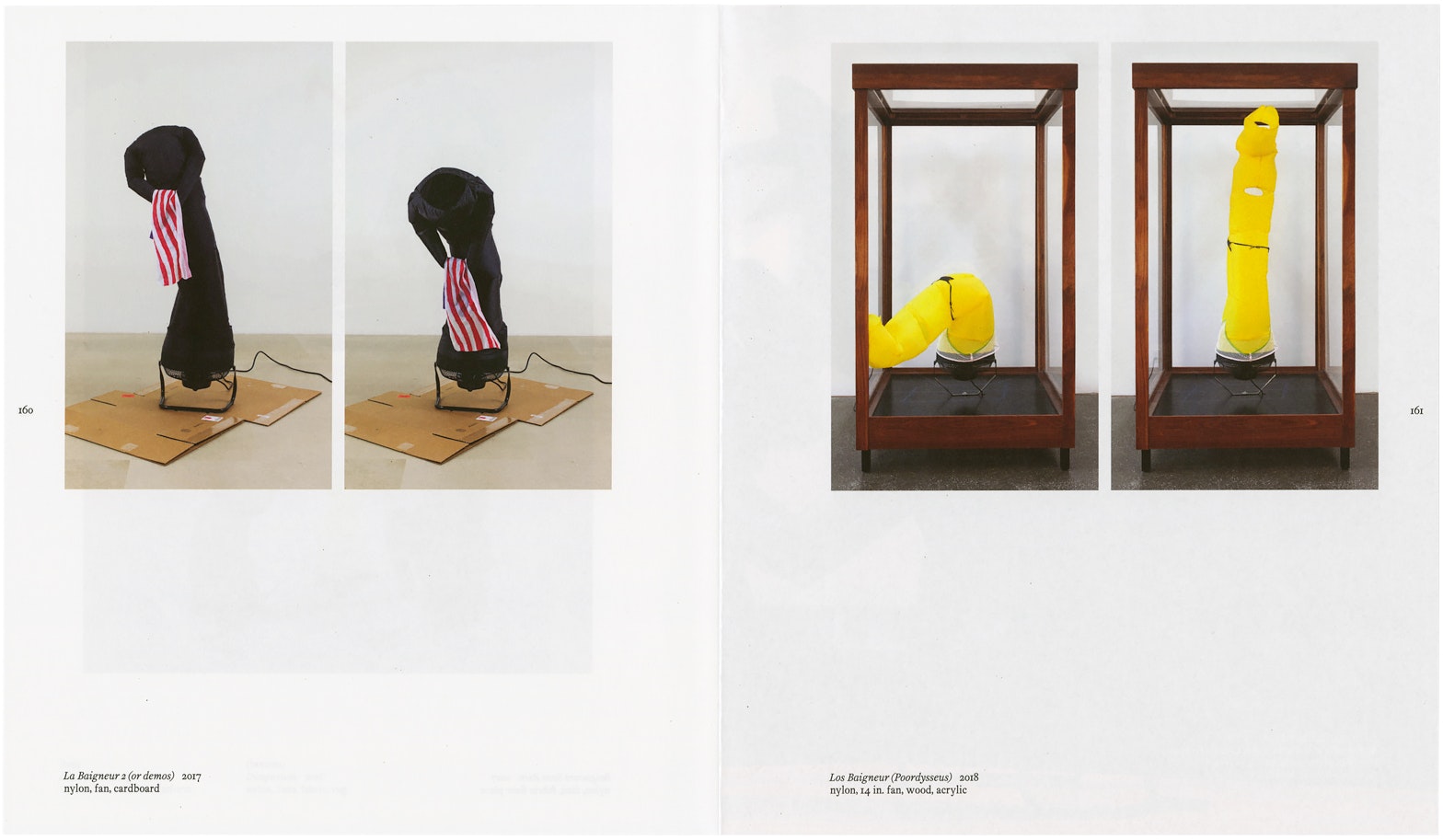
Le Baigneur 1 2016
nylon, fan, concrete, shoes, specially made cords
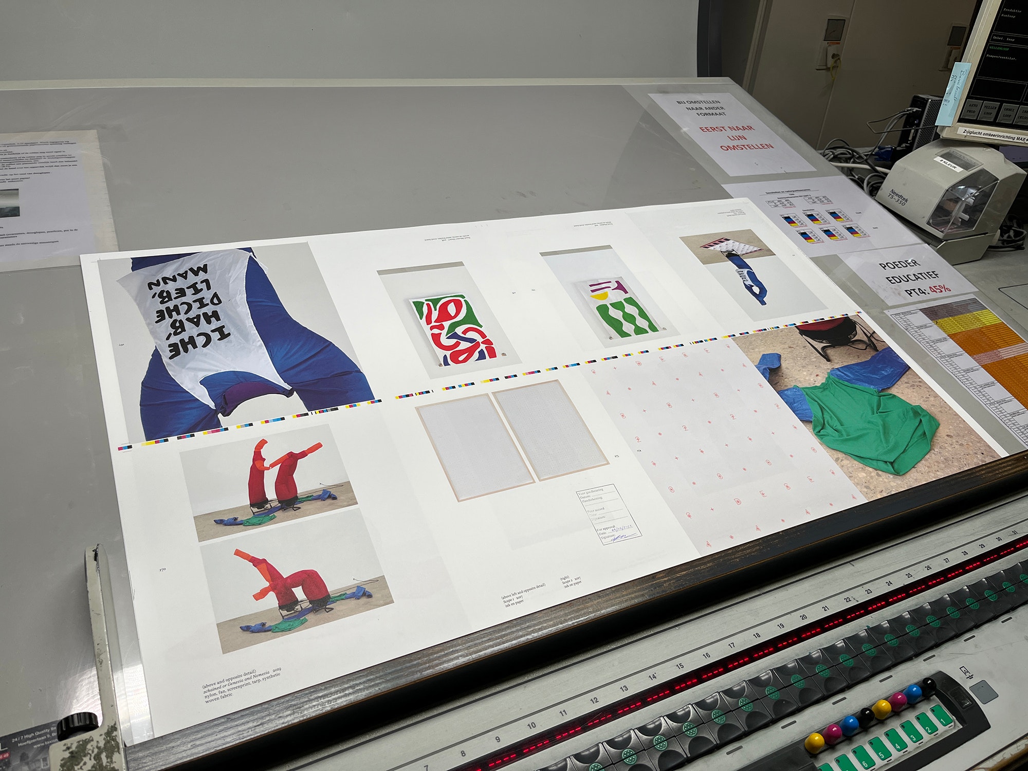
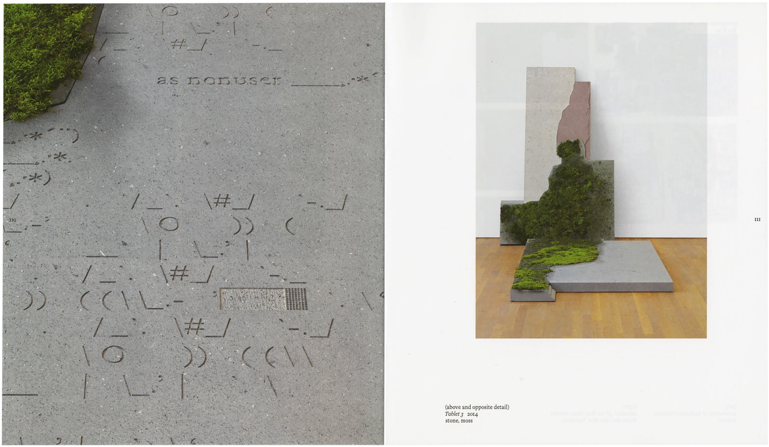
Paul Chan
Scape 1 (detail) 2017
ink on paper
PC
It’s the magic of fonts, it seems to me, because it’s a finite set but an infinite possibility. It’s remarkable, really. What was the first font you made?
BH
In school I used to open Illustrator and I would draw these modular fonts—bits and pieces that could fit together, so like a half-curve segment next to a straight line, and I would piece them together. They weren’t working fonts you could type with, but rather I was hand setting them from the raw vectors.
The first font I made with type design software was a geometric sans serif, because I thought that would be one of the simplest forms to start with. I quickly learned that the more unadorned a font is, the fewer places there are to hide your mistakes. That was a big learning experience. If there are fewer expressive moments within a typeface, there’s less room for error.
PC
And when you say error, what would that mean? Inconsistency in spacing? Misplaced senses of proportion? What would an error look like in a font?
BH
At the time I was interested in trying to learn to draw correctly with the tools. So it was a sense of proportion in the vectors, where the relationship of your vertical strokes to your horizontal strokes don’t feel like they’re harmonizing with one another, or the overall inflection might be off or, definitely, the spacing and kerning could be off as well.
PC
There are so many aspects to it, and it’s the play between the positives and the negative space. To me, in my experience, it is meditative. It’s also maddening at times.
BH
To make a typeface is a ton of work. I think my way of working is more of a slow burn. For me, it's usually spread out over weeks, months, or even years. That kind of working method suits my own temperament very well. These are things that you can pick up and work very intensely on for a period, and then you can put them down and come back to them later and pick them up again.
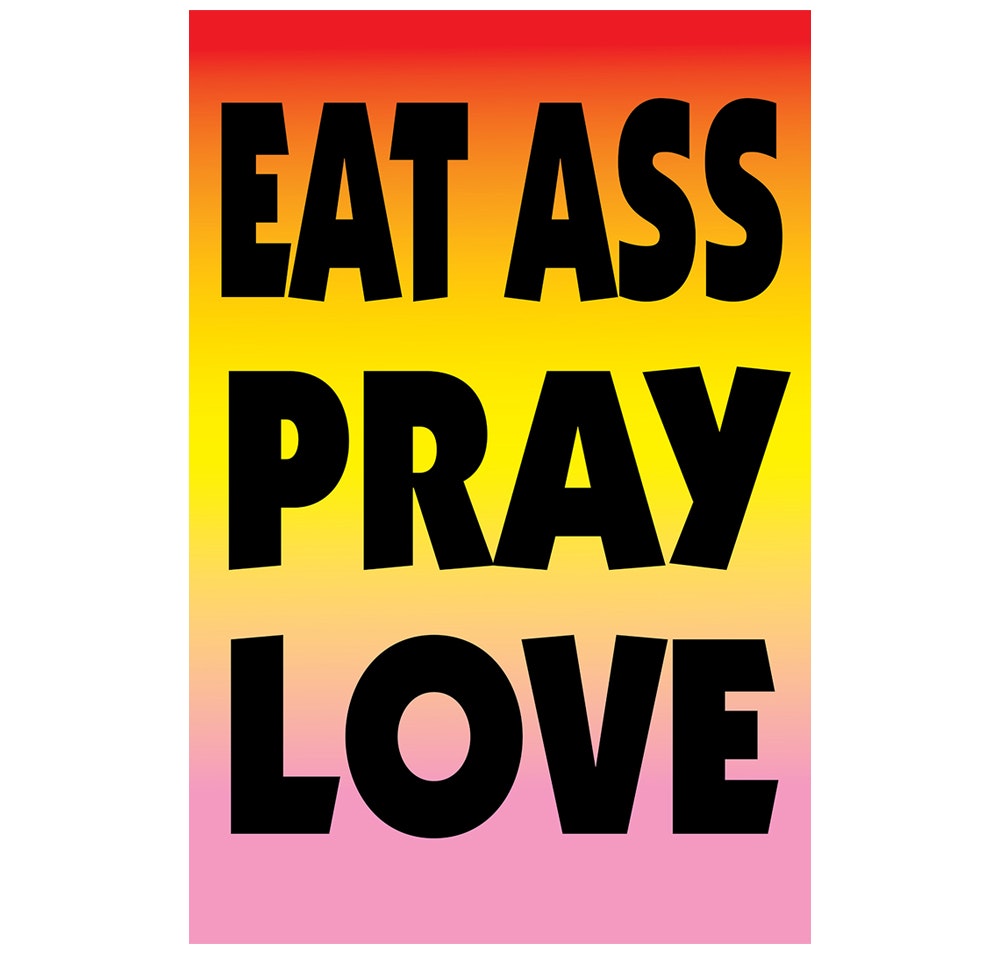
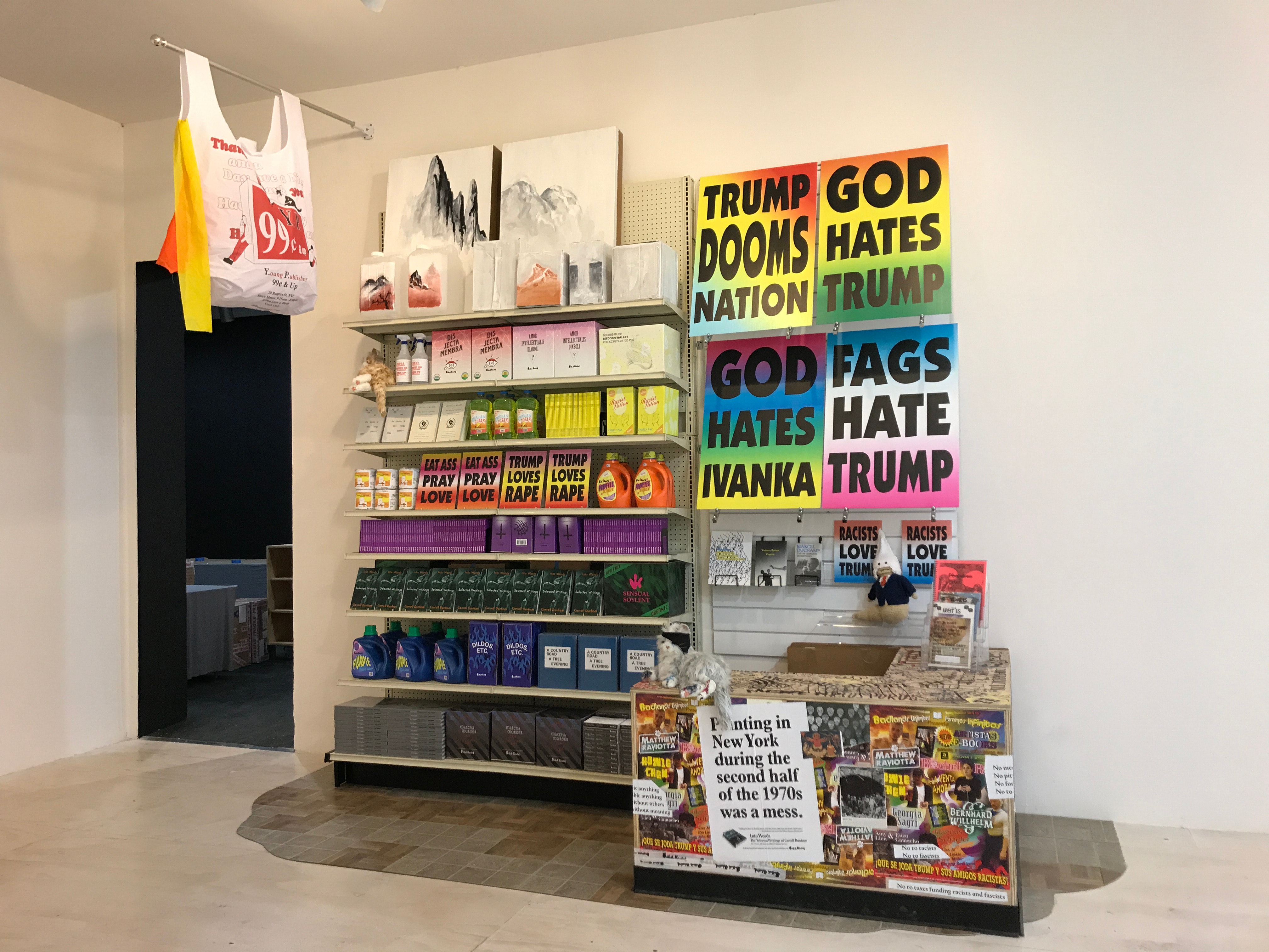
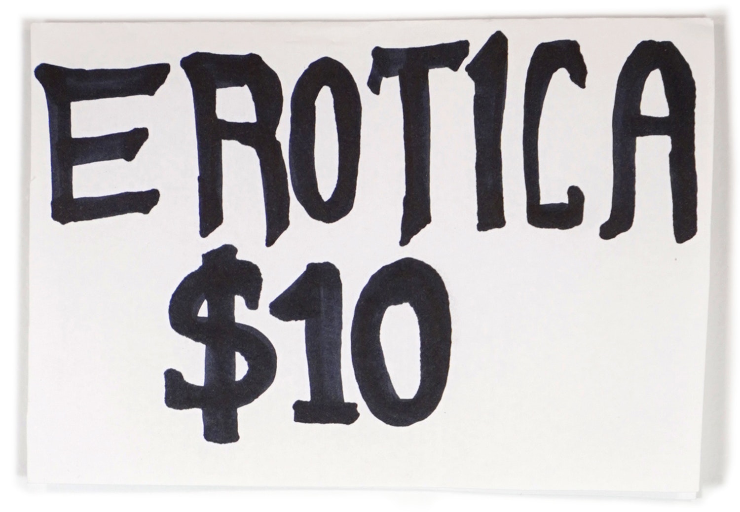
Eat Ass Pray Love 2018
inkjet on corrugated plastic
PC
Are there particular fonts in your mind you really admire?
BH
There are specific fonts I like, but I often enjoy the collective output of certain type designers more—thinking about not just one instance of their work, but how all these pieces relate to the whole. Honestly there are too many type designers that I admire, both historical and contemporary, so I'll focus specifically on people I was thinking about for this project.
A big inspiration was W. A. Dwiggins. He was working in America in the 1920s–1940s. He had a number of radical ideas at the time for how he was working on his typefaces. He didn’t only design type. He was doing calligraphy, painting book covers, and designing marionettes. All these things fed back into his type design work.
PC
Sure.
Background:
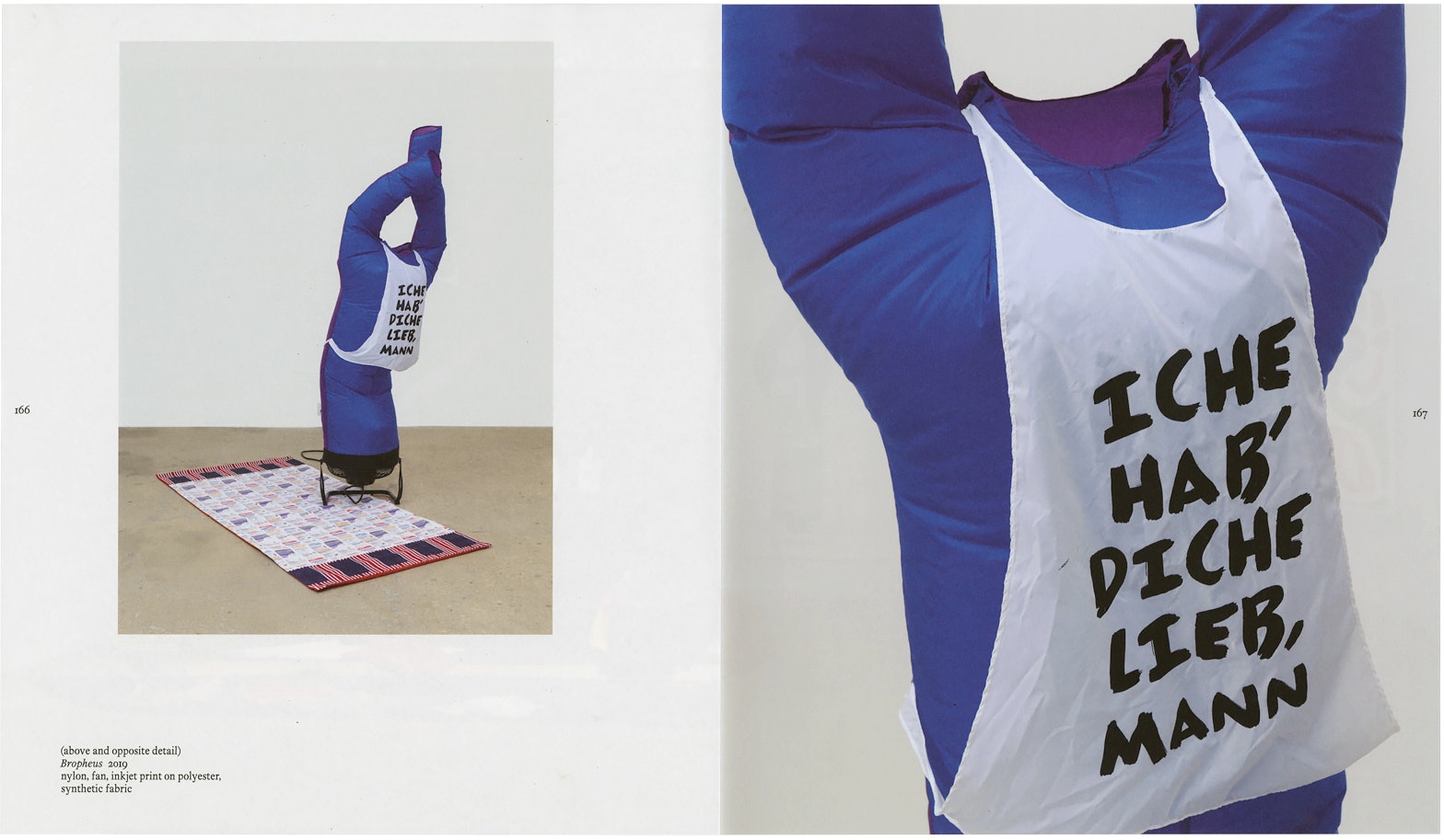
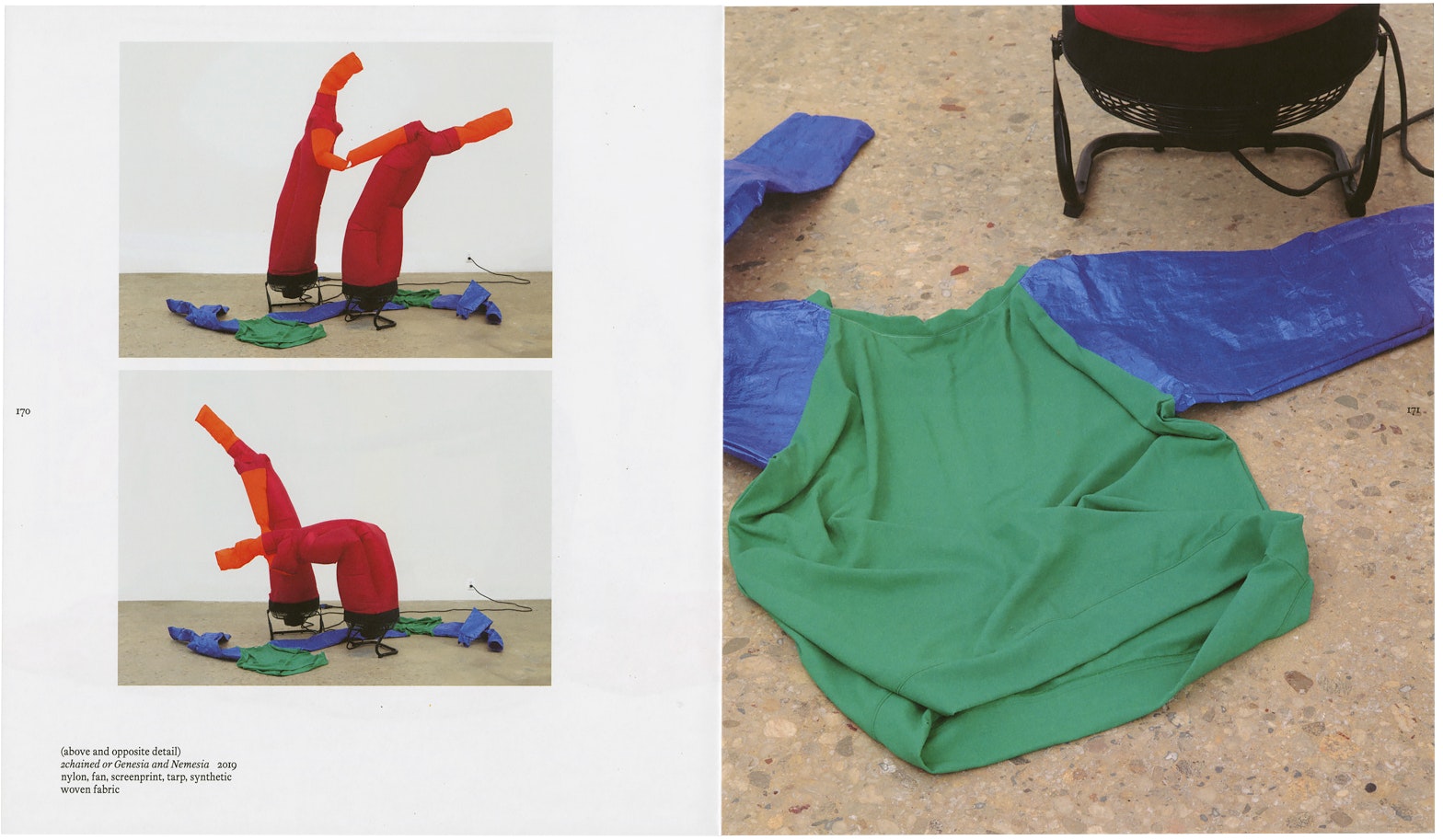
Paul Chan
2chained or Genesia and Nemesia (detail) 2019
nylon, fan, screenprint, tarp, synthetic woven fabric
BH
Another type designer I was thinking about is Evert Bloemsma. He was a Dutch type designer working in the late 1980s–2000s. He had ideas about injecting some idiosyncrasy and some warmth into his typefaces.
PC
How? Curves?
BH
Yeah. He had a teacher, Jan Vermeulen, who taught him that “a straight line is a dead line.”
PC
Whoa.
BH
His work embodies that. His typefaces are full of these very subtle movements. When you’re reading in a body text size, you might not even be aware of it, but your subconscious picks up on it. But when you enlarge the letters . . .
PC
You can see it.
BH
For sure. A straight line that is supposed to be straight might be one or two degrees off from where it’s supposed to be. The overall intention, I think, is to warm up the typeface.
PC
I want to get to the Breathers font, but before that, I have to ask you: Are there fonts you hate? Are there typesetters you just can’t stand?
BH
That’s a great question. For years, the answer was yes. But now I’ve come to appreciate things that are made poorly. Sometimes it’s nicer to see something that’s made poorly than something that’s made perfectly. And to kind of . . .
PC
Now, when you say made poorly, what would a poorly made font consist of?
BH
Either something that is maybe naive on the part of the creator, or maybe something where the technical proficiency isn’t there, but the ideas are coming through very loudly. You could consider those poorly made. But those “poorly made” things are often way more satisfying to me than something that’s perfectly made.
PC
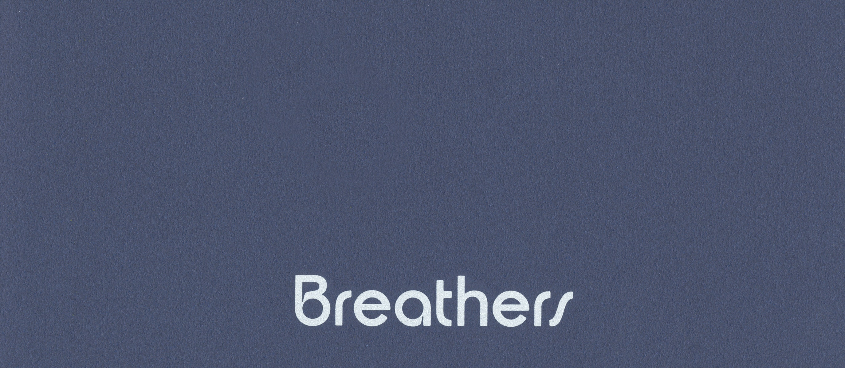
Right. So talk to me about the Breathers font. So, we've been working on this book for the show. Walk me through the process of why you thought you wanted to make a font called Breathers.
BH
The initial urge to make it was twofold. I had a long period at the beginning of the book design process where I was researching your work. This idea I kept coming back to was that you obviously were making screen-based animations, hitting “peak screen”, and then finding an analog way to animate the Breathers. So, taking a physical object and using mechanics to animate it into a body or imbue it with some kind of humanist quality. That idea was really interesting to me.
One thing I hit on early on was—what would that look like in terms of an art catalogue? How would you animate that? How would you give that some kind of pneuma or spirit? I was thinking in that sphere, and then I realized that the DNA of the book is the text. It’s even called the body text. That seemed to be a very natural fit. You’re animating bodies, and what could we do to animate the body of the book? Which for me was the text running through the whole thing.
So, I started doing some experiments. I wanted to see if I could make a type that would breathe. That was the initial impetus for making a typeface. I wanted to make a variable font that would expand and contract, as if it were breathing as you paged through the book. And I did show that in one of the early rounds of sketching. Since the typeface in question would need to be heavily modified, it seemed to make sense that, if I was going to do that, it would be something I had made so we could do whatever we needed with it.
The other piece of it was you had just suggested some initial ideas for what the book could be—size, materials, and there were some typefaces in there, too. And one of the typefaces you threw out that I latched onto was Plantin, which was one of the starting points for the Breathers font.
PC
Ah, love Plantin.
BH
Plantin is great. It’s a re-creation of an earlier typeface that was called an “old style.” They're this particular collection of typefaces I’ve always been interested in. They existed after Caslon but before Times Roman.
PC
That’s so cool, your timeline is based on fonts.
BH
They’re very nondescript, very robust. They were called a jobbing typeface. . .
PC
Workaday fonts.
BH
Yes—you would go to the printer and say, “Set my book in a serif.” And that’s what they would use. I love that because they’re not draped in this big legacy. They don’t draw a lot of attention to themselves, and that also seemed to be a nice fit. We ended up not going with the breathing typeface, but we used the base font, which we called Breathers.
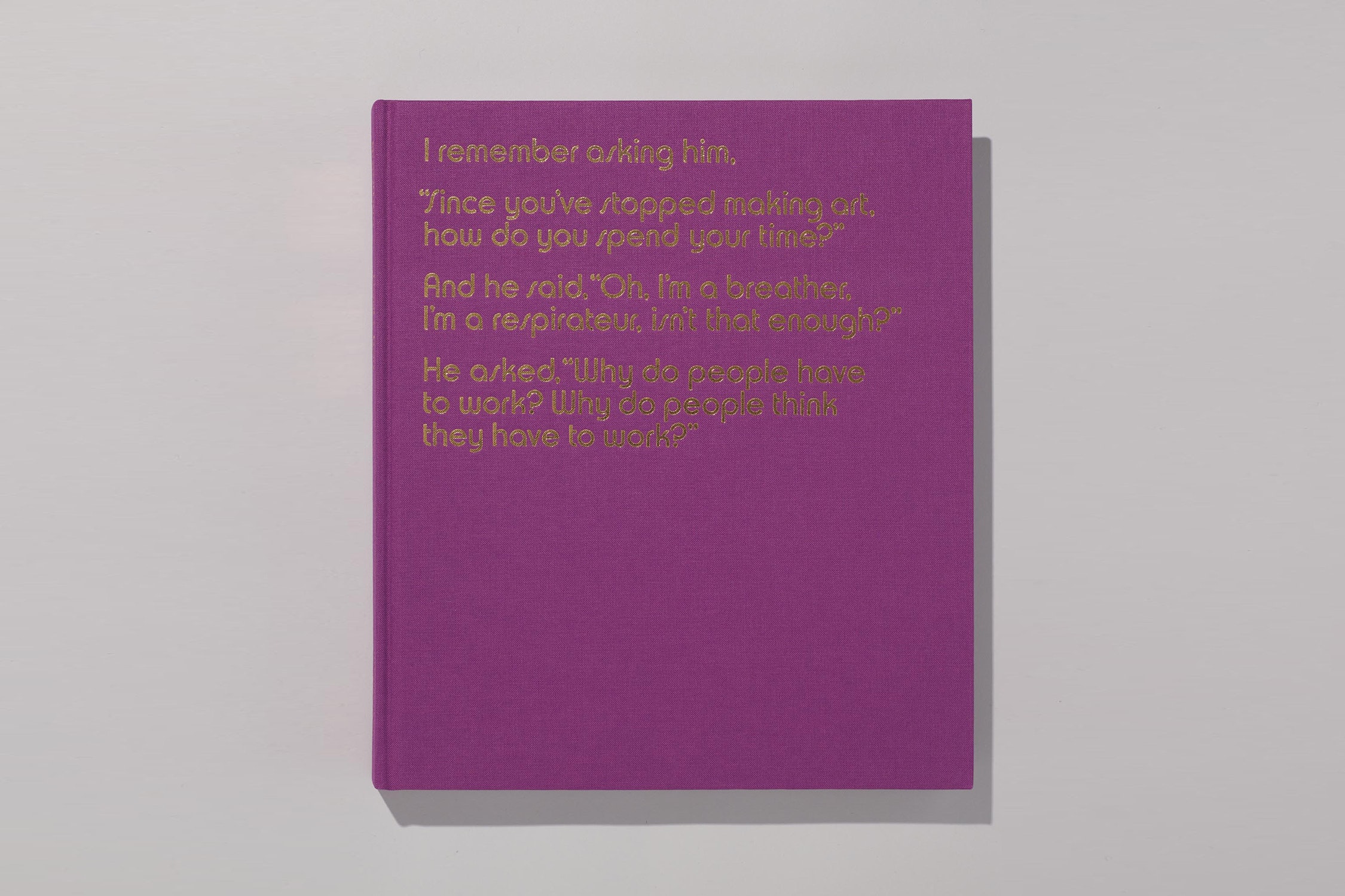
The front cover feels like a back cover and features a quote by Marcel Duchamp, quoted by Calvin Tomkins during an interview with Paul Chan. This quote, when taken out of context, applies almost 1:1 to Paul.
Excerpted from Marcel Duchamp: The Afternoon Interviews, published by Badlands Unlimited, 2013.
Naturally then, the back cover feels like a front cover.

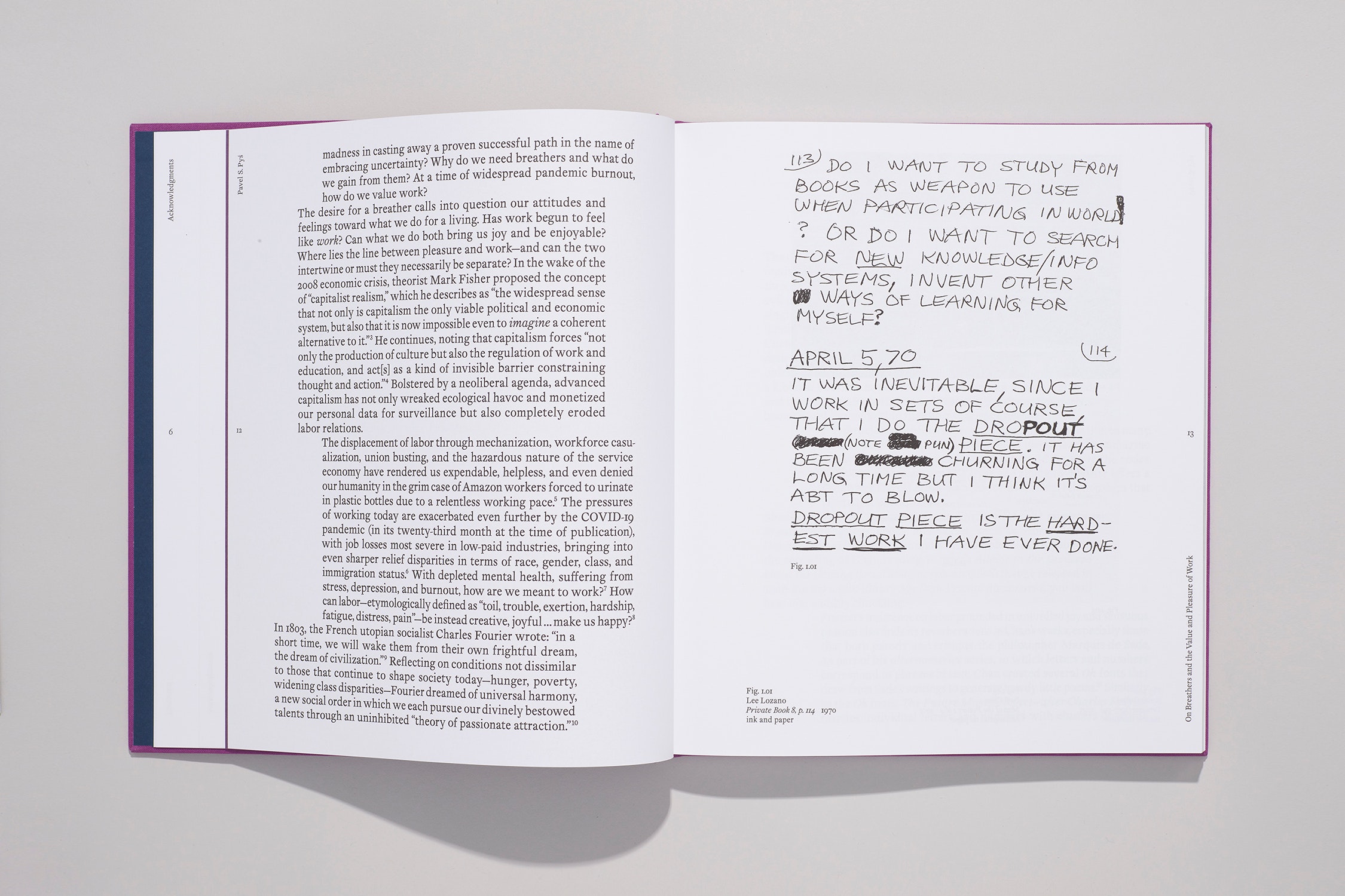
The typesetting in the essay sections groups the paragraphs into shifting blocks which undulate back and forth, evoking the motion of the breathers.
Bits of Badlands ephemera are interspersed throughout the plates section alongside Paul's work.
Each of the three plate sections starts with a title page and introduction.
BH
In terms of the design of the font, I’ve always been interested in how, when someone is trying to describe something, they will often reach for other like-minded things. You’ll describe how a wine tastes by mentioning flavors, but what if we think about it in more descriptive terms—such as, if somebody says to you, “This wine tastes like waking up from a good dream.”
PC
I see.
BH
Something along those lines. So in that sense, I wanted this typeface to feel like a warm, lazy day. To that end, I worked with some of those ideas from Dwiggins and from Bloemsma to embed some irregularities into the typeface. I also tried to instill some of the thinking you were doing with the Breathers into the typeface.
To start with, there are no straight lines in the typeface. They're all off by a subtle degree. Also, all the moments in the typeface where there’s a 90-degree angle or straight lines joining each other—everything is slightly curved, it’s all softened. I used perfect circles to measure out these curves. Purposely, because it’s very mechanical and there’s always a moment when you’re working with design software where you can measure things very precisely, but it comes down to what feels better to your eye.
So instead of a perfect circle most of the time you would use more of an oval or smooth the curve in some way because it looks more natural. But I intentionally used these perfect circles throughout because they feel a bit awkward. Some of the characters, if you zoom into them, they have these kinds of lumpy details to them. But human bodies are lumpy, we’re not perfectly smooth.
PC
Or proportioned.
BH
Yeah. Similar to the Breathers themselves, it’s this idea of a precise mechanical method that’s controlling the underlying construction of it, but it gives the final form this very irregular, organic quality.
PC
It is what struck me when I first saw your font, even at the size of body text but also closer. I wouldn’t describe it as awkward, but it’s interesting to hear you talk about how the typesetters you admire have a certain way in which they animate lines. Nothing straight. Everything’s slightly off and that intimates a kind of momentum or movement. I certainly felt that in the Breathers font. What you describe as the awkwardness, or what was the other word you used besides awkward?
BH
Irregularity?
PC
Irregular. They manifest in a kind of movement in the text, which I thought was completely fascinating. It was super cool that way, but it’s interesting now hearing you talk about the typesetters you admire and them also playing a role in giving you a sense of what’s possible. Making that movement out of the font.
BH
Another thing we should mention is the typesetting itself. Within the essays, the paragraphs are formatted into blocks of text. These blocks then sway back and forth across the page, hinting at the movement of the breathers. For your section, since the writing was based on the form of an epistle, I researched ways that bibles have been historically typeset and we brought in some of those devices. So, depending on the section, there are several different kinds of movement all happening at once. You view the letters individually, and the details are there but they’re pretty subtle. But then you take that and amplify it in terms of the entire character set, and then you amplify that in terms of all of the body text throughout the book. Suddenly, that effect is very present.
PC
You could see it.
BH
For sure. The body text in this catalogue is set at 15 point type over 18 point leading, which is quite large, so it reads very smoothly. It has kind of a buttery texture as you go across the page and that, for me, hearkens back to this idea of reading for pleasure, not reading an art catalogue.
PC
Not reading for work.
BH
Exactly. Sitting on your couch on a day off and just reading at your own pace.
The other thing all this makes me think about is that there are a lot of ideas relating back to this idea of bodily time. That idea is very important for this, too. There’s this thing that happens to me when I have time off. If I take a long vacation, it always takes a few days for this mental shift to occur. There’s a moment where I feel my mind shift from thinking about time as these discrete units of productivity and thinking about all the things I have to do, to thinking about time as one long continuous stretch. Time starts being measured by the body. And it’s not just the body itself, but the body in relation to everything around you. The body in relation to the sun moving overhead, or people walking a dog nearby, or the trees or water or grass, all these things. It starts to draw your perception outward away from yourself.
PC
I absolutely agree because I think we’re just coming to terms with how necessary our complete whole body is in relation to sensory perceptions in general. We see more than with just our eyes, and our capacity to make sense out of all those sensory perceptions. To create a feeling or a thought is remarkably complex. It has been unacknowledged for a long time, and we can blame many people. We can blame Plato, and many of the philosophers, terrible people who reduced our sensory capacities to just our eyes or our brain. But we know different, common sense tells us it’s different. I personally feel like I can feel light.
BH
Yes. Absolutely.
PC
It’s interesting that as we’re talking about the Breathers font, one of the experiences looking at the font is knowing that something’s happening but you’re not sure what. That thing is that weird movement the font has through your composition. It really comes through but it’s perceivable in a way that you’re not used to, and I think that’s the cool part about it.
BH
Yeah.
PC
Within the broader history of the Walker, has there been another font book project like this? Has there been an example of a font being made specifically for a catalogue, for instance?
BH
I think there’s only one other instance, and that would be Chad Kloepfer, whom you’ve worked with, who designed a typeface called Fox while he was working in the studio at the Walker. It was initially used on smaller projects. The first catalogue Fox was used on was by Emmet Byrne for Tetsumi Kudo: Garden of Metamorphosis. Chad then later used Fox for his catalogue The Quick and the Dead.
PC
As you continue your practice as a designer and as a typesetter, are there other fonts that you’re looking to do?
BH
I think so. One important lesson I’ve learned is to ask yourself: why? Why are you doing it—and is it necessary? What are the implications? I’m aware of the fact that making a custom typeface is embedding more of my voice into the project, and that may not always be the best fit. So even though it’s something I know how to do, it’s important to always keep asking why.
PC
Well, I’m certainly glad you interjected your voice in the font. I thought that was remarkable that you had designed the font called Breathers and how well it works on the page. As someone who really appreciates and admires font makers, it was really a thrill to see you had done the work of making a font for the book.
A full title page marks the beginning of each essay.
Paul's essay was written in the form of an epistle—to compliment this, the design was inspired by researching typesetting devices from Bibles.
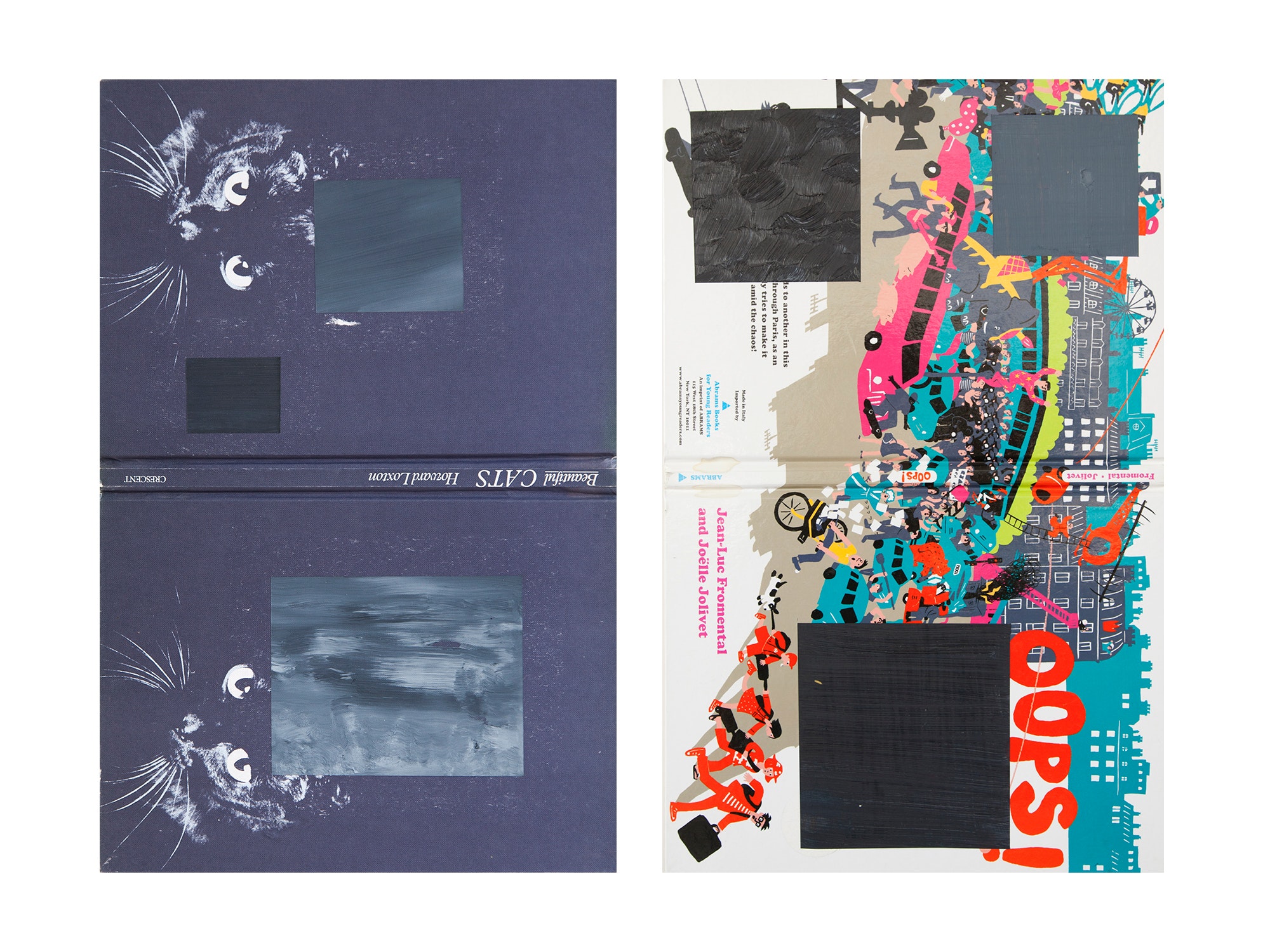
Selected plates in the Badlands Unlimited section are given extended captions in the form of quotes from Paul and other collaborators.
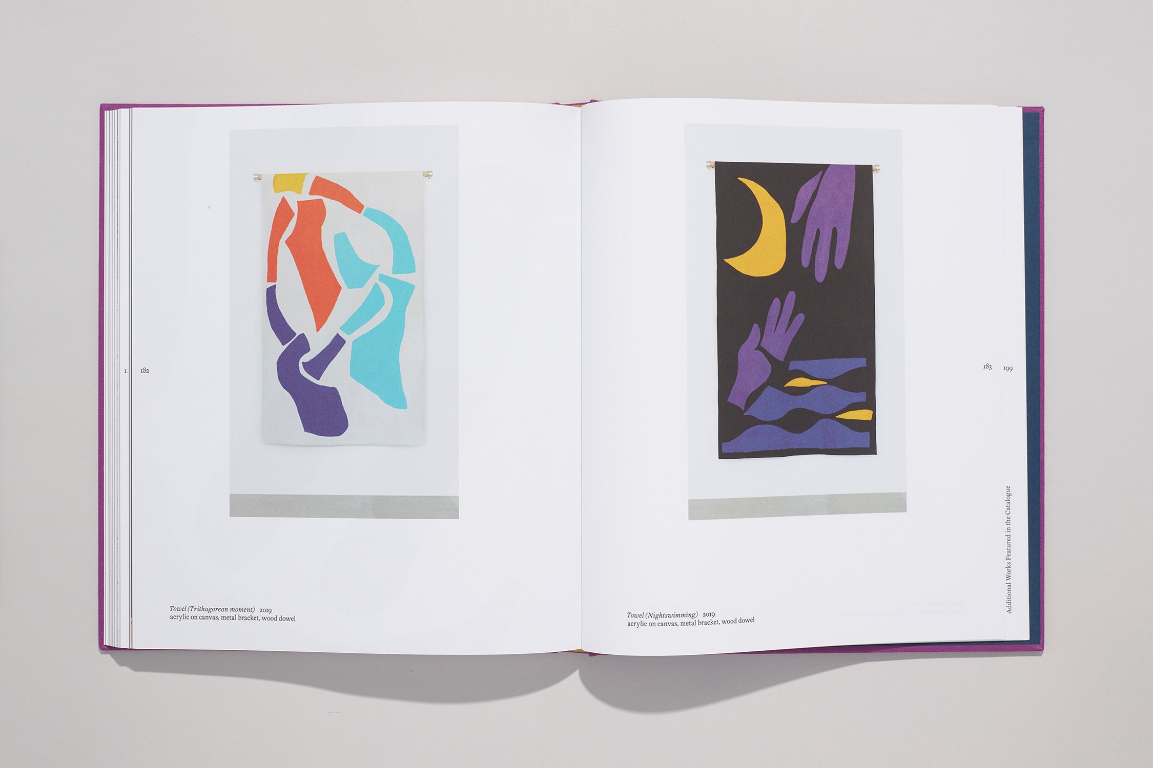
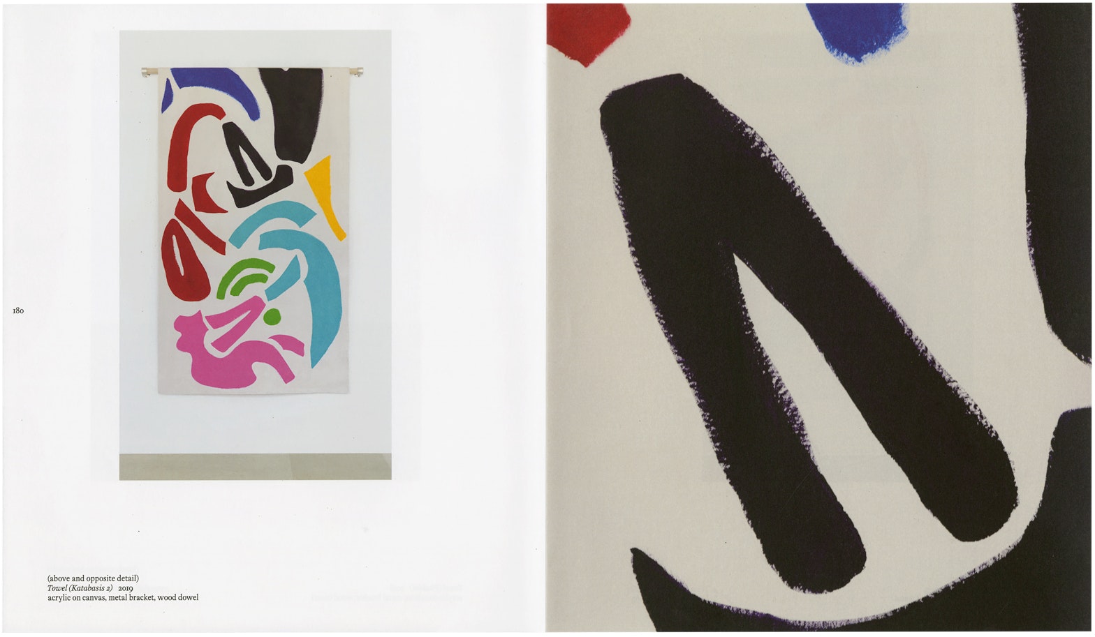
The color scheme of the catalogue is derived from Towel (Nightswimming), shown here.
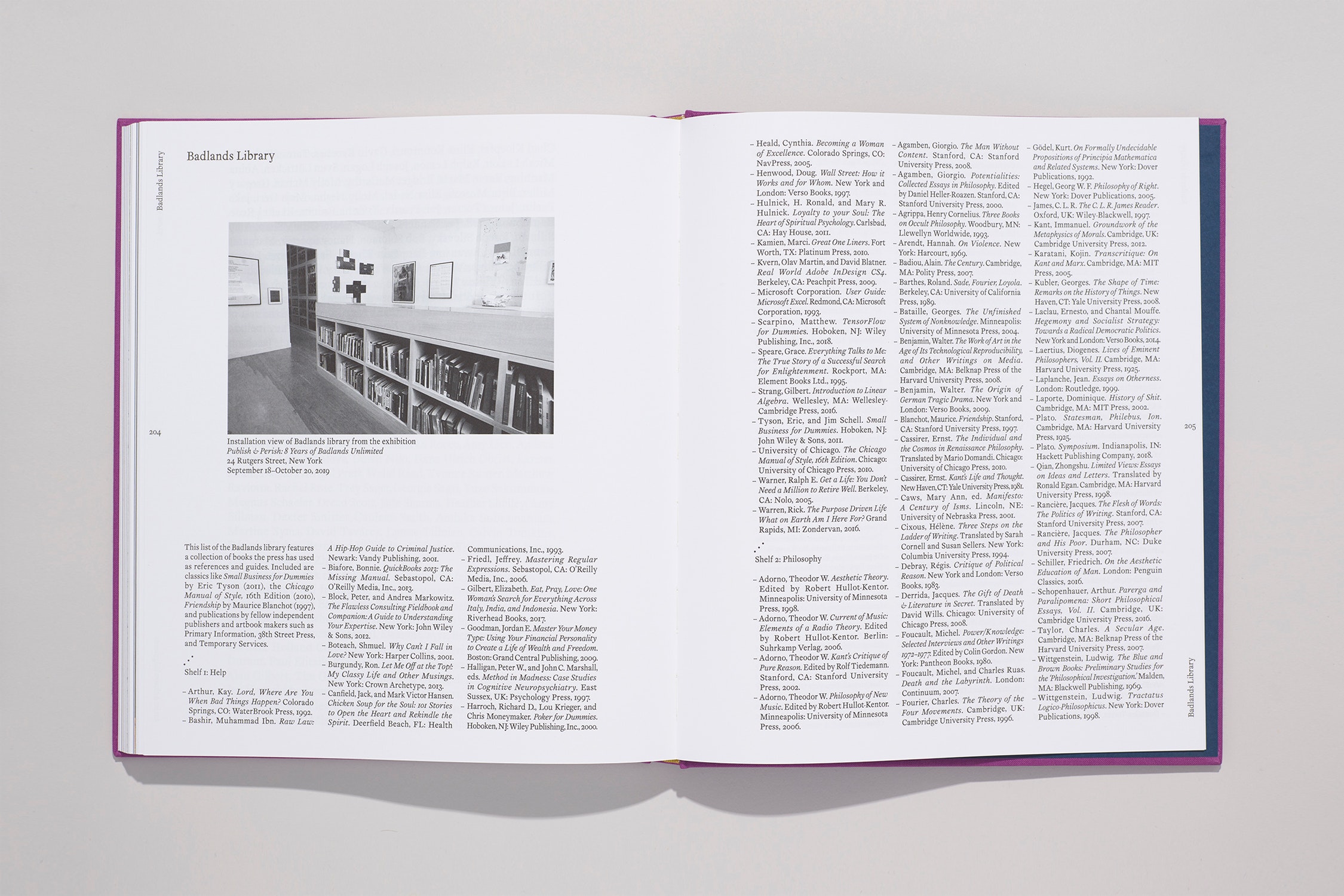
A full list of the books in the Badlands Library is included in the back matter.
BH
One thing I forgot to mention earlier is that obviously I was aware that you were someone who had worked in fonts before. I think The Future is Sweet might have been the very first piece of yours I ever saw.
PC
Oh, yeah?
BH
So there’s that aspect of it as well. I was wondering how this would be received because you have knowledge in this area. There was an early thought of, “Could I design something and then give it to Paul and then have him do some kind of intervention on it?” Then that’s what we use. But as we went along, I felt like that might be a little too on the nose.

PC
I don’t know if I would’ve intervened. I would’ve felt like that would be disrespectful. I know how much work it takes to make a font. The fonts I make are nuts and technically janky. They don’t even work as fonts, the vectors are so bad, they’re just so inefficient, but I didn’t make them to be.
So I respect the amount of work it takes just to make a working set. I don’t feel like I would’ve done that, but what I generally felt first and foremost was gratitude that you had taken the time to do it and that it worked so well. It sort of makes the uniqueness of the project. It goes to the DNA of the book, which is the letter.
That’s something I think is remarkable and appreciate, really. It’s just great, I love it. I love it. That’s why I wanted to talk to you about this, to get it on record, about the process and your history and experience working with fonts, and your experience working with this particular font for this book.
BH
Yeah. I was happy that it was well received. I remember that review where we were looking at, I think, the first variation of the interior design, and you said, “What font is that?” And I said, “Oh, I made it,” and it kind of spiraled from there.
PC
Yeah, it spiraled. I was like, “Oh my God, what? You made that font?” It's hard. Font-making is hard. I understand the work it takes.
BH
Yeah.
PC
It’s never-ending, isn't it?
BH
It is. It is never-ending.
PC
When you try to invent a new language, it’s endless work.
BH
Thanks again for taking the time to talk about it.
PC
You’re welcome. It was fun. I love talking about fonts.

Map of the Future 1 of 4 2001
screenprint on paper
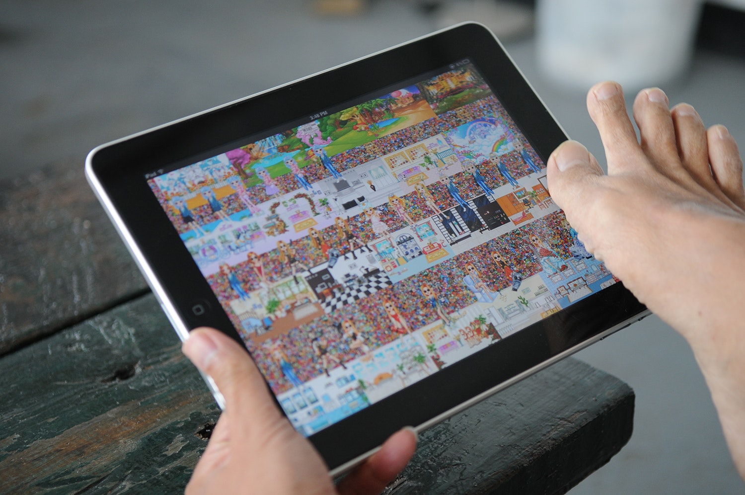
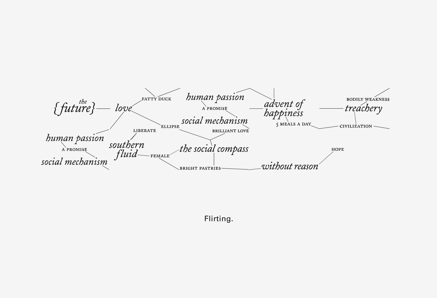
Paul has generously provided a copy of his nuts and technically janky typeface The Future is Sweet to be freely downloaded.
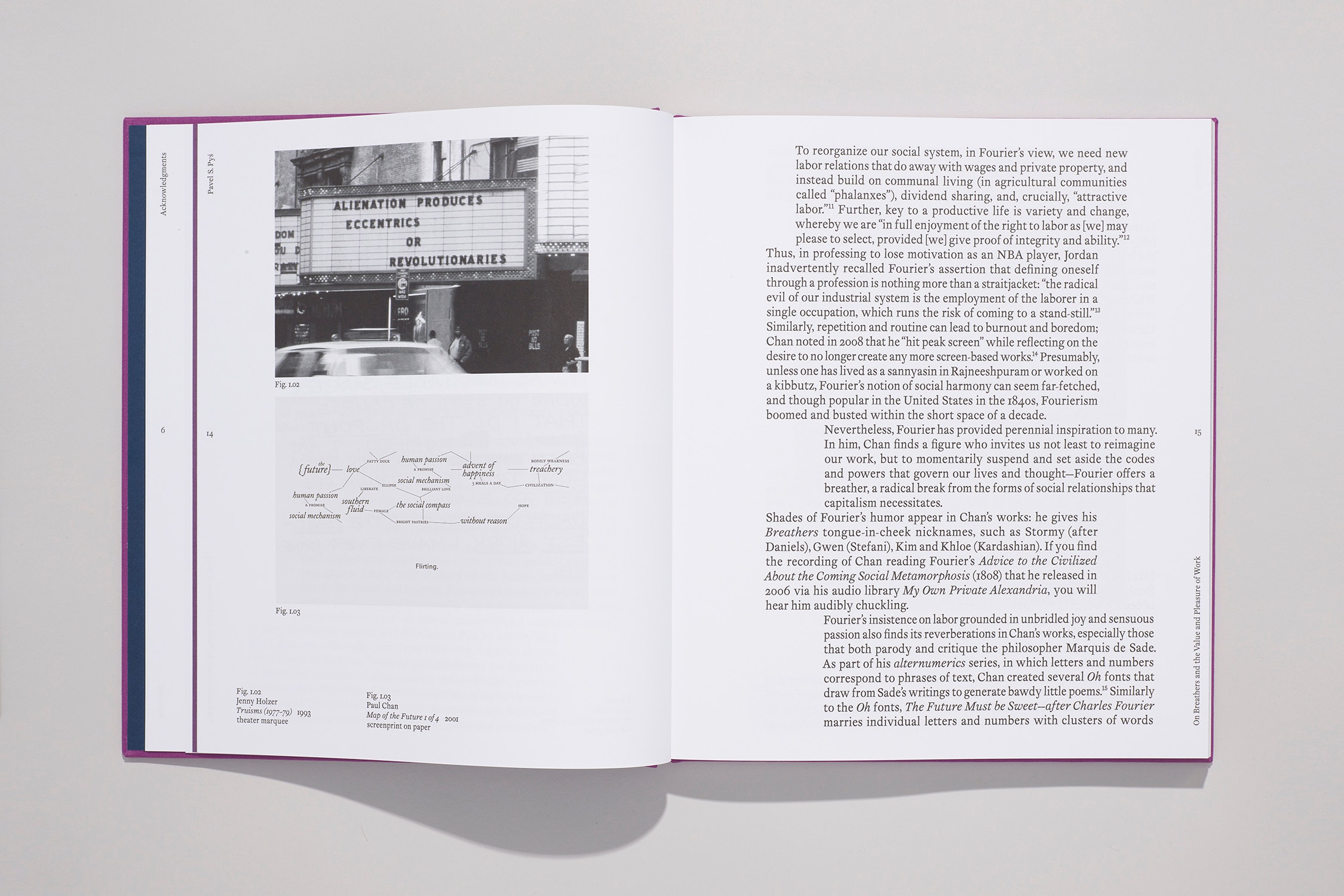
Utopian Socialist Charles Fourier thought the world should be organized around our pleasures: everyone should have equal access to affection, justice, and exquisite food. This font reinterprets Fourier's philosophy into a textual graphic system and gives form to the unique connections Fourier made between radical politics and utopian desires. Different relationships between the letters (and words) develop based on simple changes in point size, page width, leading and kerning.
Download The Future is Sweet (394kb .zip file)
)
)
)
)