Physical Labor: An Interview with Geoff Han
By Ben Schwartz

Since 2006, New York–based designer Geoff Han has focused on creating an independent design practice. For Han, this means focusing on meaningful, long-term collaborations that blur the lines of typical designer/client relationships. Han has built a comprehensive body of work comprised of carefully selected and experimental projects that rely on a genuine level of trust, understanding and creative freedom. In the following conversation, Han is refreshingly candid about the consequences of running an independent design practice and speaks in depth about the collaborative processes behind his work.
Ben Schwartz (BS)
I’ve always experienced your work somewhat unexpectedly, in fragments over time. Because you don’t have a typical portfolio website, your practice has always seemed a bit elusive. Could you begin by talking about your background and current studio set-up?
Geoff Han (GH)
I’m originally from Canada and moved to New York after completing an MFA in Graphic Design at Yale. Since 2006, I’ve been working as an independent graphic designer and educator primarily in the fields of art and architecture.
Before graduate school, I worked for a year as a night shift production artist at Sing Tao Daily newspaper in Hong Kong. Using Photoshop, my sole job was to cut out sports figures from photographs using bezier curves which would then be placed throughout the newspaper. The cutouts were especially difficult to make because they usually involved the intricate tracings of people’s hair while lunging at balls in the air or scoring goals. Within the constraints of the job, I learned to operate software at very high speeds late into the night, and during this period of time, I experienced a physical connection to that kind of labor.
For my graduate thesis, I focused on working with restrictions including 8.5 × 11” and 11 × 17” formats, system fonts, and default software, making 1 second videos, exploring the limits of toner-based, commercial laser printing, and redoing old assignments from the Yale archives by instructors including Joseph Albers, Walker Evans, and Paul Rand. Since starting my own practice, I’ve continued to use restrictions in an attempt to achieve more unexpected outcomes.
For the past 11 years, I’ve worked fairly stubbornly in this manner and mostly alone. A friend from Amsterdam was in town recently and he said that in Amsterdam, most designers he knows have practices whereas, in New York, most designers seem to run businesses. I realized during our conversation that most of the intuitive decisions I have made as a graphic designer in New York have been counter to the idea of running a business: I don’t have a website, operate fairly invisibly as a practitioner and often turn down opportunities that don’t seem like the right fit.
Naturally, running an office in this manner comes with a severe cost. Although I was fortunate enough not to have student debt, I have taught for 11 years to supplement income, rarely have the resources to hire assistants, struggle to land larger-scale projects and often feel alienated as an independent designer in New York. Money and time is often limited. Even the answers to this interview, for example, have been written intermittently, on cellphone or laptop, whenever I’ve had a free moment, and then edited together. Yet, over the years, I’ve found people to work with who share a similar set of values, and I’ve established a small practice in New York where I can work in an experimental manner.
BS
I’d love to hear more about your relationship with common room. common room describes itself as an “architectural practice with a publishing imprint”. I’m curious how the design process changes working outside of a more straightforward graphic design studio model. Is your involvement only related to publishing projects?
GH
When I moved to New York in 2006, there wasn’t a lot of interest in independent graphic design practice or education and most talented designers went straight into jobs in branding and advertising. It felt like there was a lot of opportunity. I met with David Reinfurt to show him my thesis work and he, along with Stuart Bailey, introduced me to common room. I remember Stuart telling me about an exhibition, Communist Guide to New York City, by Russian artist Yevgeniy Fiks documenting 100 sites related to the American Communist Party in New York.

common room, letterhead, 2010. Because common room is located in both New York and Brussels, the two addresses are printed upside down from each other at the top and bottom of the letterhead.

common room, letterhead, 2010. The letter was printed in red and black thermography by Desmond Yu, a printer in Chinatown, Manhattan that I’ve worked with for many years.
I met with common room to discuss a publication for the exhibition. There were 2 essays, a series of images, and a very small printing budget. One of my first decisions was to propose having the text translated into Russian as well. The text was then set in Times Cyrillic and Helvetica Cyrillic, in bold and regular weights, and the two languages interweave through the book. As I can’t read Russian, Yevgeniy had to sit beside me for a couple of days as I typeset and ragged the entire book.

Communist Guide to New York City, Yevgeniy Fiks, common books, cover, 2006. For the cover, the dollar sign is repeated following the proportions of the golden ratio.

Communist Guide to New York City, Yevgeniy Fiks, common books, interior spread, 2006. The text was typeset in both English and Russian. Quotes are typeset with large word spacing for emphasis.

Communist Guide to New York City, Yevgeniy Fiks, common books, interior spread, 2006. The publication is bookended by a thumbnail image index of the 100 sites that Fiks documented relating to the American Communist Party. Sites that no longer exist were left blank.

Communist Guide to New York City, Yevgeniy Fiks, common books, interior spread, 2006. In the middle section of the book, the images are rearranged by order of building height from shortest to tallest.
Since that first project, I’ve continued to work with common room for 10 years and am a member of the collective. Members of common room are usually involved in various roles that can include administration, budgeting, scheduling, management, writing, editing, design, and production. Projects I’ve worked on have included publications such as Communist Guide to New York City and Arts for Living, identities for The Public School for Architecture, The Ends of the Library, and the New Art Dealers Alliance (in collaboration with Francesca Grassi), and signage and exhibition design for the International Center for Photography and Zuiderzee Museum.
BS
What is your background with architecture? Did you have any formal training in the subject or has it been a process of learning through design?
GH
I don’t have any background or training in architecture and I’ve only worked with three architecture studios: SANAA, SO–IL, and common room. I was also the first designer of PIN–UP magazine. In writing this, I now realize that I met all four offices in the same East Chinatown neighborhood in New York which, in 2006, was one of the last affordable neighborhoods to live in Manhattan.
I first met Florian Idenburg from SANAA while playing soccer together in Sara D. Roosevelt Park in Chinatown. He had just moved to New York after 8 years of working for SANAA in Japan to work as Project Architect for the New Museum. The first project we worked on together was a publication called The SANAA Studios: 2006–2008 which documented 3 years of SANAA teaching at Princeton School of Architecture. I admired SANAA greatly and one day, Florian told me that Kazuo Sejima and Ryue Nishizawa were coming to town and wanted to meet to talk about the book. On the day of the meeting, somehow, to my embarrassment, I completely forgot about it. I got a call from Florian asking where I was and, because I was teaching at Fordham University deep in the Bronx, I wasn’t able to make it back downtown in time and I never got to meet Sejima and Nishizawa.
In 2008, Florian, along with Jing Liu, and later on, Ilias Papageorgiou, set up their own office called SO–IL. They asked me to make their first website and stationery. Since then, projects that I’ve worked on with them have included their visual identity, another website, and their first monograph. Designing for SO–IL has often been driven by finding ways to unite often disparate visual content within tight budget constraints, and based on their always changing needs at the moment.
Around the same time, I was introduced to common room by David Reinfurt and Stuart Bailey. common room’s office is located in an unassuming white brick building on the Eastern edge of Chinatown and the Lower East Side, part of the Seward Park Cooperative, designed by Herman Jessor, the pioneer of cooperative housing in America. Most of my work with common room has been in support of their manifesto for social-minded architecture and community.
Finally, I was introduced to Felix Burrichter, the Editor-in-Chief of PIN–UP right before I graduated from Yale. Felix had recently graduated from architecture school and wanted to make a zine about architecture and Jop Van Bennekom, whom I had met through a teacher, recommended me. The design fee was $300 per issue. I asked a friend from school and my new roommate in New York, Dylan Fracareta, to collaborate on PIN–UP together. Neither of us had ever designed a magazine before and we worked for three months straight in our living room, during the evenings after our day jobs, on the first issue. We would sit side-by-side on a computer designing layouts, print everything out and lay it all down on the apartment floor. Dylan was working at a corporate branding agency in Chelsea at the time and we would sneak in after-hours and print out everything on their high-performance color laser printers. At one point, we had a big disagreement with Felix as we had typeset the whole magazine in Arial, Times and Courier but Felix wanted us to use more ornamental typefaces. We refused and he took it to Jop on a trip to Amsterdam to ask his opinion. He returned to New York with the news that Jop had said to listen to us, and to this day, I’m still very happy that PIN–UP is still set in Arial.
BS
Of course when working with relationships between design and architecture there is a translation of 3-D space to a 2-D surface. I’ve always been interested in the ways in which you’ve played with spatial metaphor in your work. Perhaps no project better exemplifies this for me than the Public School for Architecture Brussels identity. The project was self-initiated through common room. What was your involvement in the development of the school? Could you talk about the execution of the identity for Public School for Architecture Brussels? In particular, I’d love for you to touch on how the identity is translated between the book and web space? (I should mention that I’ve had that book on my desk for the past months and everyone who picks it up is completely enamored)
GH
The Public School for Architecture Brussels was established in 2014. The first thing that needed to be designed was a website. More and more, one of my interests has been in repurposing designs that I’ve made before and reusing or manipulating them in different contexts. I’m interested specifically in how a “lazier” approach can lead to new results and experiences. For the The Public School for Architecture Brussels website, I wanted to reuse the website of common-room.net, set it in a new color palette which included a yellow background, and then warp it in CSS using the principal of one-point perspective. I worked together with the artist and programmer Jonas Lund to develop the idea.
After a year, The Public School for Architecture Brussels was awarded a small grant and common room decided to publish an annual report documenting their endeavors. For the book, I asked a printer I’ve worked with for 15 years years, Dick Mak of Kei Mei Printing in Hong Kong, to first to give me the maximum angle in which he could trim the top and bottom edges of the book. I then warped the layout in perspective to that angle so that when the book is open flat, the entire book is subtly warped. In order to do this, every page had to be outlined in Indesign, copy and pasted into Illustrator, warped, and then copy and pasted back into Indesign.

The Public School for Architecture Brussels, common books, cover, 2015. For the cover, I asked the printed what the maximum angle he could chop the top and bottom edge of the book block at and the entire book is designed around this angle.

The Public School for Architecture Brussels, common books, interior spread, 2015.

The Public School for Architecture Brussels, common books, interior spread, 2015.

The Public School for Architecture Brussels, poster, 2015. The poster is cut in the middle and folds out from an A5 brochure to an A2 poster.
BS
SO-IL is another collaborator of yours; an architecture studio renown for its inventive and unorthodox use of material throughout their body of work. The publication you designed, SO-IL Solid Objectives makes impressive use of papers and inks giving close crops of buildings a new sense of depth. Do you find it generally to be a seamless process working with architecture studios and helping them understand how their ideas can be translated to print and/or online?
GH
For SO–IL’s monograph, the studio designed an amateuristic mock-up themselves and at our meeting, the three partners said to me something like, “Geoff, please don’t change it, we’ve worked very hard on this and we’ve showed it to Lars Müller and he thinks it’s great. We just need you to pick a nice font and make it look nice.” I hesitantly agreed and thought the circumstance might be an interesting challenge to respond to. The main idea that SO–IL had come up with was for the book to be comprised of an exquisite corpse, a flow of images that visually related to each other. The thing is, I knew that SANAA had already made a book a bit similar to this idea and I thought it needed something more.
BS
I am assuming this “something more” is the incredible printing and production of the book. What was the process like?
GH
Yes, my main contribution to the book is for foiled and colored paper to act as a spot color for color photography. This was achieved in collaboration with lithographer Sebastiaan Hannekroot by masking out a spot color of a photograph, printing the inverse area of the spot color in white ink on colored paper, and then printing the remaining CMYK values on top. This idea first came about when I realized that a lot of SO–IL’s work involved mirror and I thought that it would be nice if the mirror in the photograph was represented by mirrored paper. Most of the finished projects, photographed mostly by Iwan Baan or Naho Kubota, are rendered with this printing technique, while the rest of the pages which, were mainly comprised of architectural drawings or process images, were printed in black and white.

Solid Objects, Order, Edge, Aura, SO–IL, Lars Müller Publishers, cover, 2017. The publication involves full color photography printed on top of white ink masks so that various foiled and colored papers become spot colors in the images.

Solid Objects, Order, Edge, Aura, SO–IL, Lars Müller Publishers, 2017, interior spread.

Solid Objects, Order, Edge, Aura, SO–IL, Lars Müller Publishers, 2017, interior spread.
For the printing, I flew to Shenzhen to oversee the production. Everyday, I was driven an hour and a half outside of Shenzhen to a factory in a small, industrial town in the countryside that specialized in printing. The factory that I worked with specialized in UV printing on foiled Chinese cigarette boxes. The printing was outsourced to this factory because the foiled and colored paper needed to be printed with fast-drying UV ink so that the white ink would dry quick enough for the CMYK ink to print on top of it. I became quite close with the foreman in charge of printing the project and who lived with his family at the factory. He even told me that he liked my printing concept. On my last day there, we all went out for dinner in a small restaurant on a dirt road in the local town. Earlier in the week, I noticed that he was wearing a t-shirt that said “New York” on it and told him that I lived there. He told me that he never knew what it said because he couldn’t read English. Upon finishing dinner that night, the foreman paid for me and to my protestation, he said, “when I come to New York you can take me out for dinner.”
BS
The book Taratine for the artist Daisuke Yokata, as well uses a unique printing process, playing with dimension through the use of thermography. The text, along with the graphic work of the artist, is raised off the page so it can be touched. Could you talk about the relationship here between the artist’s work and the tactile process you used?
GH
In Daisuke Yokota’s photographs, the artist uses heat to create textured patterns that appear on top of the images. When Miwa Susuda of Session Press first showed me Daisuke’s images and explained to me how they were made, I immediately thought of thermography and wondered if it could be used in a book format. I had always known of thermography as a cheap printing technique favored by printers in Chinatown that produced a raised, glossy texture and was often used for business cards. For 10 years, I’ve worked with a printer in New York named Desmond Yu. Desmond trained at the Royal Printing Academy in Singapore and then moved to New York, setting up a basement printshop in Chinatown with various small, often manually-converted printing machines. There’s a letterpress converted to a hot foil stamp machine, a cold foil stamp machine, a receipt printer, a thermography machine and a small offset press. Desmond once demonstrated to me how thermography worked by dipping his thumb in black ink, fingerprinting a piece of paper, sprinkling some powder on top of the fingerprint, and then passing the piece of paper on a conveyor belt through an oven. The fingerprint then came out of the oven with a raised, glossy texture.

Taratine, Daisuke Yokota, Session Press, 2015, cover. The cover was printed thermographically.
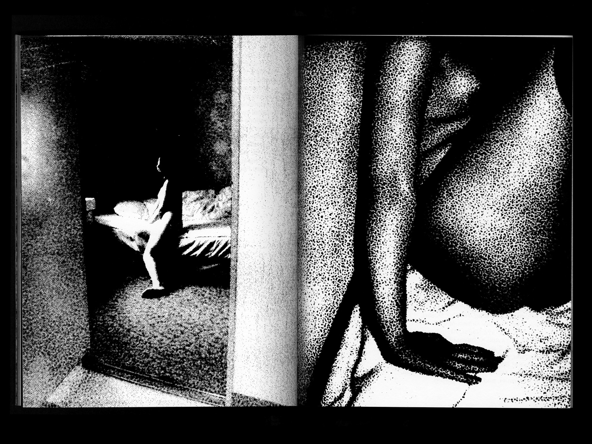
Taratine, Daisuke Yokota, Session Press, 2015, interior spread. The spread was printed thermographically with bitmapped images.

Taratine, Daisuke Yokota, Session Press, 2015, interior spread. The spread was printed thermographically with text in English and Chinese on each page.
For Taratine, I proposed printing a 16-page signature of the book with text and images bitmapped in high contrast using thermography. I contacted as many thermography printers in the US and Europe as I could find to see if they could print double-sided and on large-format sheets that could be folded down into a book format. All printers told me that it could not be done. Finally, after almost a year, Die Keure, a printer that I’ve worked with a lot in Belgium, figured out a way to print large-scale thermography double-sided using a silkscreen.
BS
The graphic nature of some of Yokata’s work reminds me of another project of yours, the website for NADA. The site begins with a relatively paired back page, until manipulated images materialize on top of the text and eventually fade away. So much design related to contemporary art leans towards understated, where as I feel like you are able to push forward moves that feel more experimental. How do you find that balance between showing the art but adding an additional layer?
GH
For the visual identity, which I work on in collaboration with Francesca Grassi, we scan physical images using cellphone scanning software from the Image Collection of the New York Public Library. We then crop and render them in high contrast bitmap in one of six colors — red, green, blue or a mix of 2 of those 3 colors — and then use them on various deliverables including print and digital ads, printed matter and the website. Every year, there are hundreds of deliverables and every deliverable employs a different image from the Image Collection.
Francesca and I worked with Kristian Henson to develop the concept for the animations and Linked by Air and Jeffrey Scudder to develop the site and digital ads. One day, Kristian showed us a YouTube clip from The Exorcist that involves bitmapped images cycling between various degrees of contrast. When we showed Linked by Air the YouTube clip, they immediately showed us various ways in which images could be rendered in bitmap and in varying degrees of contrast using programmatic tools. In the end, the images on the website and digital ads are rendered in bitmap using hand-coded Javascript with their color randomized between the 6 colors of the NADA color palette.

NADA, print advertisement, Artforum, 2017. Images are scanned using cellphone scanning technology and rendered in one of 6 randomized colors on top of text. In collaboration with Francesca Grassi

NADA, print advertisement, Frieze, 2016. In collaboration with Francesca Grassi.
I see design as an active means of representation of content and I spend a lot of time communicating and negotiating that idea with clients. Francesca and I are now entering our 8th year of working for NADA and we’re very fortunate to have found a client that has been so supportive of our experimentation.
BS
This leads me to your work with Ran Dian. Even amidst a grouping of other design-forward art journals, Ran Dian stands apart with it’s wonderfully chaotic methods of production. Could you talk about your approach for this project? Is there an underlying system or is each issue unique?
GH
I began working on Ran Dian in 2015. I had previously worked with the Editor-in-Chief, Daniel Ho, on a student-run, East Asian Studies publication when I was an undergraduate student. After graduate school, Daniel moved to Shanghai and started Ran Dian, a bilingual online platform about Chinese contemporary art. We had kept in touch on and off, and in 2015 he asked if I’d be interested in working on Ran Dian magazine.
The design of Ran Dian is based on a fixed kit of parts that responds to the theme of each issue. For the first issue, I worked together with designer Lu Liang to develop the identity. The fixed elements include the typefaces Hiragino – ironically, a Japanese typeface – for Chinese and Univers Condensed Bold for English, 4 section openers printed on card stock, hot glue perfect binding without stitching, and the grid. Because Chinese and English, when translated, appear in drastically different character counts where Chinese always has about 2/3 the amount of characters as English, the layout of the bilingual texts is always a challenge to respond to in different ways for each issue.

Ran Dian magazine, issue 2, cover, 2015. The cover and section openers throughout the issue are printed in two layers of black ink: images in one layer on top of text in another layer.

Ran Dian magazine, issue 2, interior spread, 2016. A mailing card with imagery printed in black ink on top of black text.

Ran Dian magazine, issue 2, interior spread, 2016. A section opener with imagery printed in black ink on top of black text.
I’d worked on two other magazines in the past and when I started working on Ran Dian, I was looking for a new challenge and knew that I wanted to explore the limits of printing and production in China. The economics of printing in China are very different to printing in Europe and North America. In China, hand collation and unconventional production techniques can be very cheap while imported materials can be very expensive. For example, the price difference between printing in one versus four inks is barely noticeable, whereas printing on an imported paper stock can be four times the price of printing on local paper. Printing in China made me think about magazine design in an entirely different way and ultimately this plays a large role in Ran Dian’s identity. Each issue responds to the theme through different printing or production techniques. Unfortunately, Ran Dian magazine has paused production but I hope that it picks up again next year.

Ran Dian magazine, issue 4, cover, 2016. The theme of the issue was “happiness” and the Chinese character for double happiness was die cut on the cover.

Ran Dian magazine, issue 4, interior spread, 2016. For the section openers, the same die was reused to cut out the character.

Ran Dian magazine, issue 4, interior spread, 2016. Because of extensive hand collation, the magazine is perfect bound with PUR glue but unfortunately the binding breaks very easily and copies often apart.
BS
What are you currently working on, or what projects are you looking forward to in the future?
GH
Currently, I’m working on publications for Japanese photographer Nobuyoshi Araki and a photographer from New Zealand named Maya Handley, and a website for the photographer Ann Woo.