Pluralism and Power Dynamics in Indian Design: November Studio
By Somnath Bhatt

The impetus for this interview was kind of selfish. As a designer of south Asian background, I wish I’d read something like this when I was a student. I was excited to probe Shiva Nallaperumal and Juhi Vishnani about their India-based independent design studio, November, because their practice operates in a paradigm that helps us make sense of post-independence Indian design education and the realities of the design culture and scene there. Founded in 2018, November has worked at the intersection of design, culture, and typography with a wide range of clients and collaborators. November has designed identity systems, printed matter, books, covers, and multi-script typefaces for clients in fashion, news, art, film, and technology. In addition to its studio practice, November’s founders explore their interest in Indian design and cultural history through the initiative November Library, an archive and research project on the history of India’s visual culture.
In our discussion, Nallaperumal and Vishnani generously provide rich and useful references and introduce us to discourses of contemporary and historical design thinking of the Indian subcontinent from a democratized, inclusive, and critical standpoint. We unpack developing a framework for a plural design practice, gathering a regionalized Indian graphic archive, exploring nuances of world typography, and questioning what it means to design in an era of rising fascism.
SOMNATH BHATT (SB)
Before we get to Indian aesthetics, let’s start with what was design education in India was like.

Juhi Vishnani and Shiva Nallaperumal
NOVEMBER
Our design education was very standard: Bauhaus-Swiss modernism-Helvetica is the best-corporate work is everything design education.
We realize that this is because we were learning things that were essentially alien to us. It was very paradoxical because design is meant to create things that impact people and life. But Braun products, Paul Rand logos, Wim Crouwel posters, Vignelli subway maps, Bauhaus chairs, etc., were far out of our reach. We were surrounded by things like Indian film posters, Tamil/Hindi magazines, a plethora of bank logos, Indian stamps, books etc. Why weren’t we studying them? Who designed the first Air India posters? What was the process behind them? Why don’t they comfortably sit within the defined confines of Modernism or Postmodernism? What about the gorgeous and populated history of Indian visual culture from craft? How could they enter our design consciousness and discourse?
Aping the west was unconsciously drilled into us. You can see it all around: why do Indian apps look exactly like they were designed in Palo Alto? In that way, we were only learning skills and exposure from the outside.
SB
Wow, definitely. Most of the times modernist design is a European transplant or an import, especially in the context of the global south. Why do you think modernist ideology can be so alienating?
NOVEMBER
We think the alienation stems from the fact that it is seen as a solution for all problems, and that’s not always true. We don’t subscribe to the strict “design is problem solving” dogma either. It is too limiting. The Swiss style was born in the interest of rebuilding Europe after World War II: it was about functionality (defined as economic use of resources, a visual language that was formal, strict, and purely function-based) and simplicity, etc. This idea is great in itself, but when it is transplanted, as you rightly put, to cultures where the original contexts don’t apply, it becomes alienating. It wasn’t a relevant solution to a newly independent, postcolonial, socialist-secular state grappling with bringing its 5,000-year history to the next stage. India and the rest of the world didn’t have the problems of post–World War II Europe. We had our own. Again, we mean this in all respects of modernism, not just in graphic design. Design is only a smart part of a larger cultural production system.
SB
Have you tried anything to alter this for November’s modus operandi?
NOVEMBER
With November, we are consciously trying to unlearn with every project. We think a rooted identity can come from exploring possible alternatives to the modernist tradition, but we are also weary of antiquity. We haven’t yet figured it out for ourselves. It is an ongoing endeavor, and we have only just begun!
We want to follow our inherent sense of design, which is very influenced by the things we see around us in our country, and reference and celebrate that—to break the current notion of high vs. low design. To lessen the dissonances that aesthetic production creates. For example, anything seen on the street is usually termed “vernacular design” and is generally considered “low”—things like street posters, pamphlets, political signs and murals, and even local magazines that aren’t in English. Something designed with software in a big office for a corporate client is considered “high” design—as it was designed. The vernacular stuff was just made. See the difference? We want to break that. We grew up with “vernacular” things all around us; we would like to acknowledge and treat the visual strategies employed in vernacular design with the same regard as the ones seen in Swiss posters.
We emphasize the values of plurality, which are inherently democratic. It is about accepting and respecting the possibility of a multitude of experiences, opinions, and ways of life.
SB
How can we be in touch with what is “Indian” about design/making without being pastiche-driven, essentialist, or nationalistic?
NOVEMBER
By defining what is Indian. The definition is definitely rooted in pluralism so it cannot be a single set of visual cues or gimmicks. We think Indian graphic design needs to understand the various art movements/schools of thought that emerged post-independence. These movements were, at the heart of it, trying to find an Indian identity informed by the rich history of painting, sculpture, textile, architecture, and craft, but interpreted with the new ideals of secularism. “Indian Modernism” is a very wide net that includes a spectrum of concepts and artistic movements and styles. What works of graphic design would be included in that net? What could’ve been the logical next steps? How would we interpret that in the digital era?
This exercise isn’t to invoke some weird speculative nostalgia. We don’t think this “rootedness” we speak of can just inform Indian design’s visual aesthetic; it can also inform a way of working, pedagogy, etc. We believe the slip into mimicking kitsch only happens when the practitioner is not informed and resorts to the easiest possible tool: rehashing safe, well-known methods. But to explore our own culture without a critical analysis would be a waste.
Again, these are just broad theories of what we think would bring Indian graphic design closer to a grounded identity. We are still searching and curious to know. We find inspiration in similar pursuits by friends and colleagues.
SB
A really interesting way you have articulated what is ‘Indian’ through design is through your Type Design work. What has designing multilingual Indic typefaces taught you about the culture and languages of India—visually, structurally, and beyond?
SHIVA NALLAPERUMAL (SN)
In India, language is a greater sense of identity than religion (for the most part, at least), and it is intrinsically linked to geography. The evolution of each language is also the evolution of the culture and the people. Through our design and collaborations with different scripts we’ve also learned a lot more about the history and cultures of our people. The Gurmukhi script is a very interesting one. During one of our collaborative projects, Hitesh Malaviya mentioned how resolved and modern the Gurmukhi script was, as it was so easy to understand and design for. It felt designed and not like Devanagari or Bangla, which evolved over time. This turned out to be true: Gurmukhi is believed to be invented by Guru Angad, the second guru of the Sikh faith. Gurmukhi was derived as a pastiche of Indo-European scripts of the time but heavily refined/simplified. It is close to Devanagari, but without the complex system of half-forms and conjuncts, and instead works in a much simpler, intuitive way.

Anatomy of Gurmukhi letterforms, Oli Multiscript
Indian scripts are abugidas: they have sequences of consonants and vowels that are written as a unit, each based on the consonant letter. This makes the scripts incredibly complex in terms of design but also incredibly clear in terms of system. All Indian scripts share a systematic similarity (except Urdu, which is based on the Nastaliq Arabic script) but are worlds apart in many ways. They involve a basic system of consonants, vowels, matras, and other forms. North Indian scripts like Devanagari, Bangla, and Gujarati have a system of half-forms and conjuncts (combinations of half-forms and glyphs forming new sounds). Telugu features a system of below-base forms; some combinations go down three levels. Three! You can imagine its effect on the leading (space between lines of text).

Anatomical breakdown of Oli
We’ve been working on multilingual typefaces for clients for over a year now. Oli Multiscript started it all, and is the one we can talk about at the moment. Arya [Purohit]and I began Oli as a personal experiment in creating a collaborative typeface in late 2016. Our idea was to create a typeface that covers all Indic scripts and unites the disparate scripts through proportions, weight, and form. The usual process is to design the Latin first and then design the Indic variants based on those proportions. We wanted to start both together and let each script inform the other ’til we found the perfect proportions (for us). So we started with Tamil (that sets the foundation for South Indian scripts), Devanagari (that sets the foundation for North Indian scripts), and Latin.

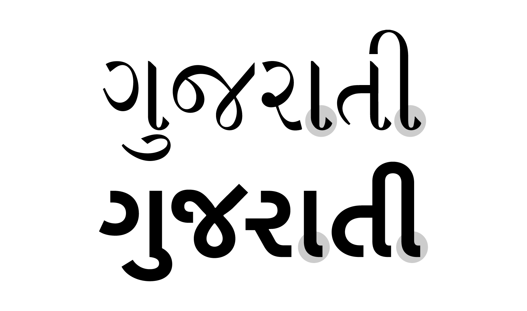
Each Indian script has its own peculiarities and unique features. Oli is a modern monolinear typeface that reduces details to the bare essence. We wanted Oli to bring the scripts together but also respect their individual characteristics. So each script’s uniqueness finds a way to define the design: In Gujarati it is most obvious. The script evolved from Devanagari but has a unique outstroke feature that doesn’t exist in the latter. We maintained this feature, in a modern reduced form, in Oli Gujarati.
Oli multiscript will be published in full by Typotheque. Peter Biľak the founder of Typotheque, is extending Oli to other world scripts with his team of collaborators to include Greek, Cyrillic, Armenian, Arabic, Thai, etc.
Oli is a slow process and we’d like for it to take its time. Latin took three years and was just released in October 2019. Oli Mono, the fixed-width variant of the Latin, will release next, followed by Devanagari. Then, as and when new scripts get ready they will be published.
SB
Could you share what are your favorite Indic letterforms to draw? Which are the toughest ones?
SN

Sketch of Tamil letterform ஜூ (juu)
The script I’m most familiar with is Tamil, and my favorite letterform to draw is the ஜூ (juu). Tamil is a single-stroke script, with most letters devised as a single stroke. A good practice in typeface design is to draw different strokes as individual shapes. So drawing Tamil is especially interesting in that respect, especially when drawing contrasted styles. ஜூ is an incredible shape, from starting point to end, and its matra (the loop part on the top right) is unique to this letter. I love the letter for obviously personal reasons as well.
SB
Who are some non-Latin type designers you encountered working in the type design realm?
NOVEMBER
Non-Latin covers a huge spectrum—basically the rest of the world. We prefer to just say “world scripts.” That covers everything.
In Indic design, our friends Arya Purohit, Hitesh “Rocky” Malaviya, and Ramakrishna Saiteja are incredible—each proficient in multi-script design and each with their own styles and tangents. We also love the work of Universal Thirst, which we’ve had the pleasure of collaborating with on more than one occasion. In Arabic we are huge fans of Kristiyan Sarkis and Bahman Eslami—both as incredible as people as they are type designers. If we design something half as beautiful as Harir or Greta Text Arabic, we would be very content in life.
SB
One of my strongest desire has been that world scripts get the same aesthetic regard, acknowledgement, and typographic perfume Latin gets. Why do you think there’s an absence?
NOVEMBER
Because when the future came, it wasn’t evenly distributed.
The first computers were designed with English and Latin script in mind, and the rest of the world’s scripts had to suddenly be force-fitted to this new machine. If the computer was invented in India, for example, it would’ve been a very different kind of machine, we think. See the difference between the Chinese typewriter and a Latin typewriter for instance.
Indic scripts, like many other world scripts, are extremely complex in their systems. Latin is a very straightforward system, but Devanagari has consonants and vowels, a system of half forms, conjuncts, matras, etc. Unlike in the West, where design/page-making programs could use the fonts available on the computer, for India, fonts came encoded with page-making software. And these programs weren’t really created with many options or design flexibility. This singularly brought down the level of quality and imaginative work that was prevalent in the Indian publishing world. The typefaces weren’t drawn or spaced really well either.
There was no type design education in India (and there are still none, except a few small college classes in a couple of design schools) and therefore no place to make or sell new fonts on a large scale. There was consistent work being done, for newspapers and public works by designers like RK Joshi and others but typeface design really jump started back in India only in 2009 with the release of Fedra Devanagari by Typotheque, the first unicode-compliant Indic typeface available for retail market.
Now is a good time to be a type designer in India because there are great tools like Robofont and Glyphs and a lot of support to make typefaces individually. There’s so much work to do and so many typefaces to design for basic use.
Colonialism guaranteed Latin script’s dominance in the world. Each world script has a market that defines the success and survival of a type industry. For example, a Latin typeface has the potential to be used all over the world. An Arabic typeface can be used in many countries in the world. Telugu script, for example, can be used in only a single state in one country. That doesn’t diminish its importance; in fact, it makes it even more imperative to design typefaces for these scripts so designers working in the state have more high quality tools and options to work with. More publishing and more reading and more content in a language not only helps it survive but also makes it thrive. Also, since the market dynamics for Indic scripts is so different from the market for Latin, the type industry and modes of selling typefaces here should also be different/contextual.
SB
I wanted to talk about Artists Unite. It’s a super interesting project, one that is in direct conversation with the current political temperature of India and typography.
NOVEMBER
Artists Unite was an anti-fascist movement that happened in Delhi and was a congregation of major artists and practitioners in the country to put up a united front against the politics of hate that has resurged in recent years. A good friend and frequent collaborator, curator Shaunak Mahbubani, was involved with it, and he got us on board to design the identity. It was a large-scale movement, with simultaneous events all over the country. The identity had to anticipate this scale and also be open enough to be interpreted by a wide variety of artists making posters and visual matter all over the country. It would’ve been contradictory to create a strict set of brand guidelines for something like this. Our solution was to create a typeface, that captured the essence of the movement that can then be used by everyone to make the material.
We designed Unite Stencil, inspired by the municipal lettering we see all around the country. These stencils are unique in that they feature way more cuts than necessary (a result of paint dabbing over spray painting). We wanted the typeface and identity to feel very familiar and very at home, as this was a people’s movement at the heart of it. We designed the logotype in all nine Indic scripts to signify the movement’s national reach. Once we submitted the typeface, it was sent to artists all over the country to design posters, social media posts, pamphlets, and so on.

A later update of the typeface Unite Stencil
We worked with our regular collaborators for the Indic variants—Rocky Malaviya (Bangla, Gujarati, Odia, Gurmukhi, Malayalam), Aarya Purohit (Devanagari and Marathi), and Ramakrishna Saiteja (Telugu and Kannada)—and the Urdu and Tamil were designed by us.
SB
Tell me about how November Library came to be. What is your relationship to archives?
NOVEMBER
November Library has always been a plan for us. When we started working together we thought we’d extend our studio practice to include a wing for the discovery and dissection of underrepresented and under-documented aspects of Indian visual culture.
JUHI VISHNANI (JV)
We find that this lack of knowledge about our own graphic pasts has deeply affected our ability to design genuine things. We cannot ignore our colonial past or the globalized world we live in, but it is imperative to bring a resonant, rooted voice to the melting pot, otherwise we would be lost in a neverending spiral of imitators. So November Library is our attempt to relearn our secular history and to provide an alternative for design students from the spiel they get at school. This re-education should happen at the student level.
The idea is to provide theory. November Library can easily be another Pinterest board of “exotic” design, but context for the works is very important.
“Most Muthuraman films are pastiche of things that were popular at the time: Charles Bronson, martial arts films, vigilante stories etc. This film combines all of that into one. The title graphics have aged far better than the film itself.
November suspects strongly that that the designer of all these titles are the same person and is currently working to find out their identity through sources and friends from the film industry. Hopefully we’ll know soon.”
SN
The works that really influenced me to take up design were old magazine annuals like ஆனந்த விகடன் (Ananda Vikatan) and கல்கி (Kalki) that I found in my ancestral home. The layouts defied any modernist conventions and the pages were rich with incredible illustrations, comics, lettering and typography. Then I scoured my relatives’ homes for other old books and magazine collections. I have no idea who designed them though. Why weren’t there any books published about these illustrators?
So we’ve always had this thought and we’d been collecting things. Then you invited me to curate South Asia Art, Som, and we saw it as an opportunity to test the waters before jumping into November Library. So I did the curation exactly like how we wanted to do NL: by discussing pieces of graphic design not purely about visual strategies but their historical contexts and backgrounds. What were the sociopolitical contexts that led to the design? Why the specific design choices? We were very clear not to fetishize these images or fall into the trap of nostalgia. The curation struck a real chord and we were confident to continue it on NL after.
SB
Can you elaborate more on the collection of designs you have gathered on specific sociopolitical movements and moments of urgency that compelled these graphics to take shape?
NOVEMBER
We haven’t really gathered them. Most of the images are from online archives or scans from books. We are not professional researchers, just curious people. India greatly suffers from a lack of documentation. We’ve been trying to find design work done on the political spectrum, especially work for various people’s movements in the country: posters and graphics of women’s movements, street theater, labor movements, freedom struggles, protests, etc.
We attended an exhibition at the Stedelijk Museum last year that showed the graphic output of radical movements, and we saw work by Emory Douglas (Minister of Culture for the Black Panther Party), Atelier Populair (May 1968 student protests), Provo, and various Marxist posters from Latin America. It was very moving. India has a rich history of fierce people’s movements from Chipko to Narmada Bachao. We’d like to think graphic material from all these times has survived and exists somewhere, waiting to be found. It would be a dream to make a web archive like the Palestine Poster Project Archives. Posters are the most urgent, visceral forms of self-expression, and it is important to bring them into the national conscience. We’d like to celebrate them both for artistic expression and for being markers of a people’s aspirations at the time of creation.
We’ve started small, by dissecting and telling the stories behind images and works already on the internet—Narmada Bachao Andolan logo, posters created for the revolutionary theater group JANAM by Orijit Sen, women’s movement posters by Sheba Chachhi and Jogi Panghaal, various logos, etc. We hope to grow the archive, hope to find actual pieces and bring them to light.
SB
Could both of you share five of your most favorite “Indian Designs,” and tell us what you like about them and what have they taught you. Kind of like your takeover of @southasia.art.
NOVEMBER
IN NO ORDER:
I.
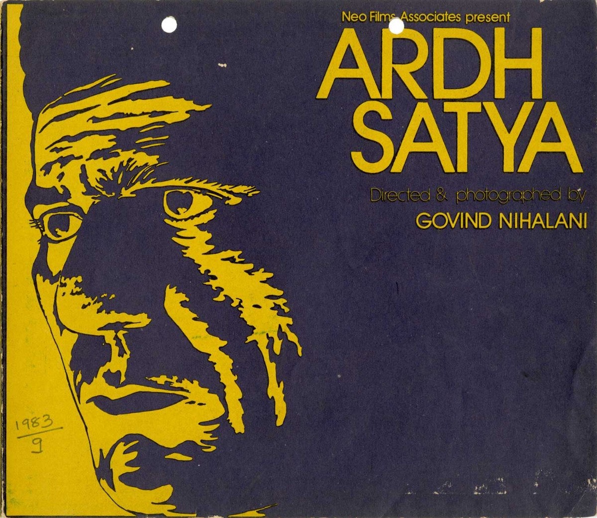
ARDH SATYA POSTER
Ardh Satya Poster (designed by Manjula Padmanaban): This is just a lesson in unforgettable image-making. Govind Nihalani’s legendary film about urban angst is captured so perfectly in this poster, which uses Om Puri’s iconic face as the symbol of anguish. This is an example of saying so much with so little: the poster doesn’t say anything about the plot of the film (it doesn’t even signify that Puri plays a police officer) but says so much about the ambience and content of the film. There’s an old saying: “There’s no good or bad design, just appropriate design.” Not a quote to live by, but this poster, we feel, is a great example of appropriate design.
II.
ROCK GARDEN
Nek Chand’s Rock Garden: Straying off the topic of graphic design here, but the Rock Garden in Chandigarh is a world that was designed nevertheless. Nek Chand’s sprawling fantasy land is the very definition of the perseverance of an artist and his work. Chand, a survivor of the Partition of India, created a utopian world of peace (slowly, piece by piece, in secret for 20 years). The garden is the most beautiful articulation of the Indian experience: from beauty in diversity to sustainability to magic realism. It is a true wonder.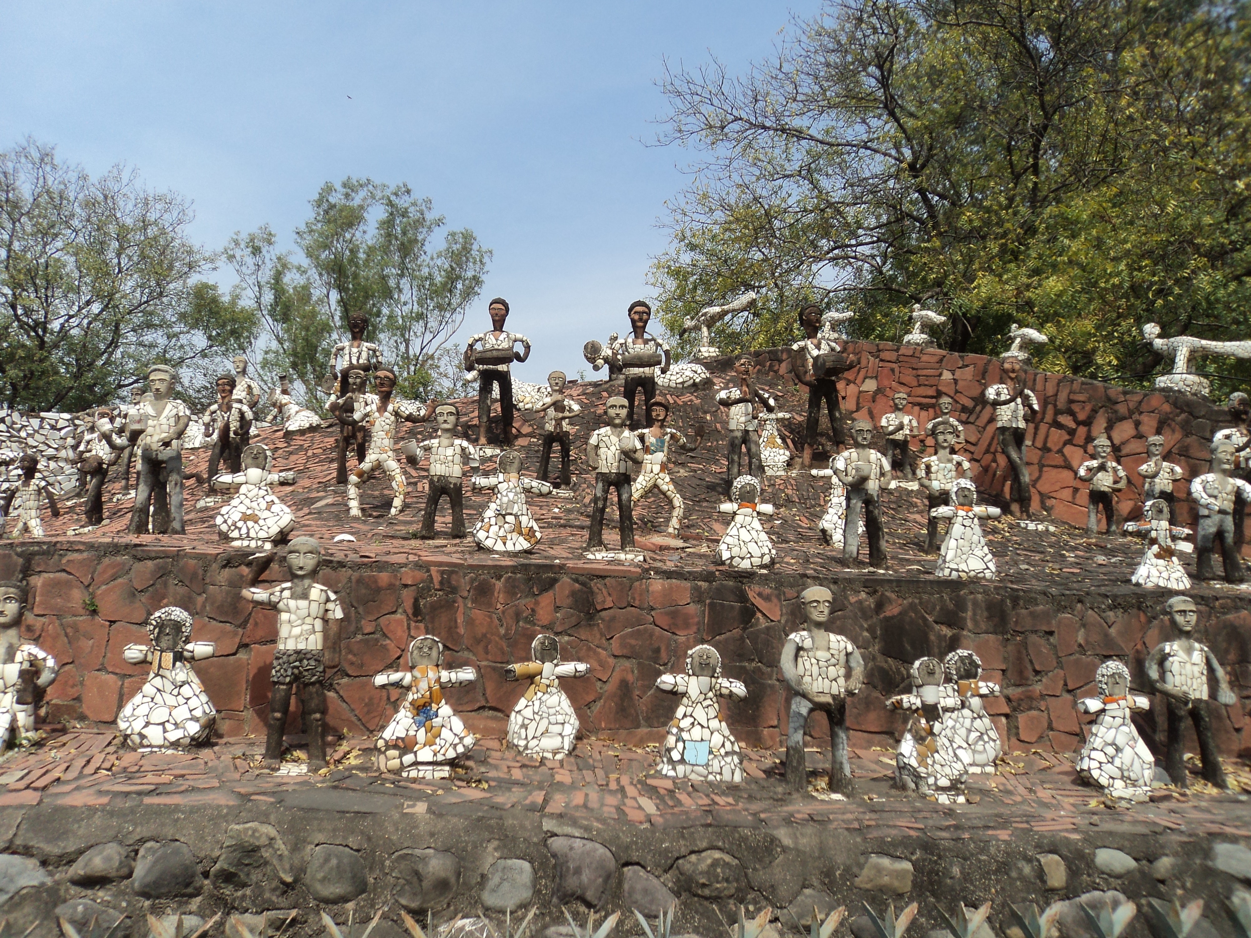
III.
CHILDREN’S BOOKS BY KG SUBRAMANYAN
KG is one of our favorite artists. His work and theory has had a great influence on us and our work. One of the most fascinating aspects of this prolific artist is his children’s books. Published by Seagull books, they are in one of his signature styles: the cut outs. Stark black and white with (maybe) one other color, the books are simple but profound stories relying heavily on the artwork. What’s striking is that the illustrations have not be simplified or made any less abstract than his well-known style in painting. Our absolute favorite book in the series is Some Chairs. Gorgeously screen-printed and typeset, the form of the book is as inviting as the contents inside. Super rare to find.
IV.
KUMAR MAGAZINE
1960s–1980s, designers no longer known
As we’ve mentioned, design in pre-digital publishing has a special place in our hearts. Kumar magazine, a little art and culture magazine in Gujarati, was truly revolutionary in content and design. Started by the well-known artist and intellectual Ravishankar Rawal, the magazine explored every facet of art, from poetry to prose, from comics to craft. The magazine broke every convention of modernist layouts and fully utilized the print medium. Every issue featured a new logo (in gorgeous and imaginative lettering) and iconic cover design (usually with a striking illustration). A truly plural design. Thanks to our good friend Rocky Malaviya for introducing us to it and letting us go through his old collection.
V.
RIVER OF STORIES
India’s pioneering graphic novel by Orijit Sen is a genuine and beautiful work of storytelling created with great skill and great empathy. The book’s central narrative is woven around the environmental, social, and political consequences of the Narmada Sarovar project. Orijin continues in the tradition of “people’s” artists like Chittoprosad and Zainul Abedin in his stark and empathetic depictions of the human condition. The work and style are very rooted in Indian figurative work but highly contemporary and original.
SB
In my experience, mainstream visual culture in South Asia can be very limited to class signaling. I wonder if you are able to find examples of “parallel” /”counter”/design culture? What brews in the underbelly?
NOVEMBER
With mainstream graphic design and publishing, a vibrant and brilliant parallel scene was created by the members of the Dalit Panther group with their “little magazines.” Headed by revolutionary poets like Namdeo Dhasal, Raja Dhale, Avinash Mahterkar, and Arjun Dangle, these magazines feature a visual language that is so very clearly “parallel” in the DIY-style layouts, stark illustrations, and revolutionary content that wouldn’t fit within the mainstream. Our own work with Kattiyakkari has been inspired by the little magazines. Parallel design can only exist in a parallel culture that challenges and corrects the powers of the mainstream.

Poster by November for Kattiyakkari, a theater group against Casteism, 2019
A great parallel scene in graphic design followed the vibrant parallel cinema movement in India in the late 1970s and 1980s. Posters and publicity work for the films of Mrinal Sen, Govind Nihalani, Shyam Benegal, John Abraham and others are so far from the accepted style of Bollywood image-making.
It is our opinion that some of the best graphic design in India happened in the pre-digital publishing world of local magazines. These designers weren’t even design-school educated—most probably art school graduates or simple layout artists working at the printing press—and designed from a natural, intuitive day-to-day point of view.
SB
I have always found the strict design rules, obsession with a clean aesthetic, and unquestioning attitude to power that designers carry to be low-key fascistic. How do you think designers can operate without tapping into or extending these fascistic tendencies, especially in the context of India.
NOVEMBER
We agree that the one-way-is-the-right-way approach to any subjective field is fascistic. We believe that pluralism and diversity are the greatest enemies and antidotes to fascism, of any kind. Different experiences, opinions, cultures, languages, genders and sexualities all co-existing in one melting pot is the forcefield against fascist ideas of one-ness, racial/ethnic/caste purity, homogeneity, fear of the other, etc. Every type of fascism shares the same ideals. The problem is that we often accept one kind of fascist as the solution for another kind of fascist.
Fascism only exists where there is a lack of empathy—empathy for other people and cultures and empathy for the environment. Design needs to be empathetic, plural, and diverse. It needs to be decolonized, especially here in India. Public and private design schools need to have reservations and economic scholarships, curricula dedicated to the social implications of design, and empathy-building courses and courses in history and cultural understanding. Only then can design as an industry change. The rules and definitions of what is acceptable and what is good (as set by those in positions of power and dominance) will be challenged and new, more exciting, inclusive design movements can take shape.
Whenever we talk about these things people often say, “That’s idealistic” or “That’s great but unrealistic.” But we believe that we can only achieve a 60 if we aim for a 100.
SB
“Pluralism” could be an appropriate antidote. How do you define a pluralistic design practice? Maybe these values also go hand-in-hand with democratic values?
NOVEMBER
We love the word “plural.” It’s a perfect word to explain the Indian experience. We find also that most designers we really admire have had a plural practice. We define this loosely as a practice that isn’t constrained by a field, style, medium, etc. A practice that looks at all opportunities and projects as an excuse to experiment and explore the widest possible angles. A pluralistic practice is not the same as being multi-talented or multi-disciplinary. It is also about multiple identities, realities and approaches. For example, the one-ness of a logo: can it be explored differently in a country like India where there are hundreds of languages and dialects? Can the modernist notions of branding and system design be designed not to make everything look the same but bring coherence in some other way?
SB
What are some examples of pluralistic design practice?
I.
DASHRATH PATEL
There’s no real definition yet, but the first time we felt that a different definition was required was when we discovered the work of Dasharath Patel, one of the early exponents of design in the country and founding secretary of the National Institute of Design, no tag could fit him quite accurately. Patel’s practice encompassed photography, illustration, graphic design, ceramics, sculpture—and all had an undeniable Dasharathness to them. Truly unconstrained and free, he used mediums and disciplines as tools, fully under his control, chosen contextually for each project/purpose. The man designed exhibitions, ceramics, large sculptural works, photography, and identities, and you would think he specialized in each of these fields with the level of finesse he brought.
II.
M.I.A

M.I.A breaking down her album artwork on twitter for Arular, 2005

Lyrics artwork for M.I.A’s song “Pull Up the People” from Arular
M.I.A (Mathangi Arulpragasam) is a great example of a pluralistic practice. She has one vision but interprets in a multitude of ways—in fashion, graphic design, film, and, of course, music. M.I.A’s songs and videos are laden with considered references of her Eelam refugee identity. We’re surprised her graphic design is not as highly lauded as her music. It is an example of a truly rooted, decolonized visual language. It would seem repulsive to modernist standards but speaks in a free and expressive voice. At the same time, her work is global and represents a positive globalization: asserting her identity as an equal contribution to the mix.
III.
TYPOTHEQUE
We love the practice of Johanna and Peter Biľak of Typotheque. We love that they not only innovate with the work itself but how the work is made to how it can reach people. For example, their innovative “social distribution” presented a new way for independent magazines to both thrive and reach people across the globe. Their Fontstand project looked at alternative modes of selling typefaces that was more inclusive. They’ve created two very beautiful and influential magazines (Dot Dot Dot and Works That Work), set up three groundbreaking type foundries and a company that innovates in modern dance, designed stamps and books, write prolifically and curate exhibitions—and create beautiful, meaningful and resonant body of work every time.
IV.
PETER SAVILLE
We also deeply admire the practice of Peter Saville. A personal huge influence on me. I was deeply influenced by post-punk music and culture as a teenager, and Factory Records was one of the most important players. I’ve been fascinated with Saville’s work not just because they were cool but because of how influential they were. His record covers defined an era, a movement, a youth culture… Saville has done exemplary work with other aspects of culture, too. His collaborations with Yohji Yamamoto and Raf Simons, his work for Manchester City, with brands: they were all unique, funny, original. Nothing conforming to any design movement or aesthetic. No rules. When was the last time a work of graphic design was as moving as the cover for True Faith? To create such enduring and meaningful images, that that a positive impact, is our ultimate goal.
Other pluralists we love are deeply influenced by are Alejandro Jodorowsky, Satyajit Ray, Rei Kawakubo, Karel Martens, Issey Miyake, and WA Dwiggins.
SB
What are the rewards and challenges of the bubbling, emerging design consciousness in India?
NOVEMBER
There is a larger consciousness, like you said, about the importance and impact of design. There are two facets to this consciousness: students and clients.
With the clients, we don’t (for the most part) have to convince them of the importance of design or why it’s something they should pay for. We find that this consciousness opens up more opportunities for design authorship and work that’s not in the regular client-designer vein.
The surge of start-ups and tech giants brings a popularity of design as a viable career option, leading to a shift in perception for the field. On the other hand, there aren’t enough systems of resources available to handle the popularity. For example, the number of students applying to design schools now is exponentially larger than what it was a decade ago. In 2009 there were five known design schools in the country, accepting 60 to 100 students a year (approximation). Now there are design schools popping up every day in every corner of the country. NID itself has opened three new campuses. But we wonder about the curricula: Are the courses geared toward exploring futuristic, sustainable, and ethical work? Is there a theoretical bend to the pedagogy that was lacking in our time? We are honestly not sure. But the rewards would be that many more kids interested in art and creative pursuits will be encouraged to look at design as an option. Many of our peers had to fight their families to study design.

Established in 1961 by Charles and Ray Eames, Gira and Gautam Sarabhai and Pupul Jayakar, the National Institute of Design served as an aid to small industries in India and pioneered design and visual thinking in the subcontinent. Designer and artist Dashrath Patel was its founding secretary. International designers like Armin Hofmann, Bob Gill, Adrian Frutiger, Ivan Chermayeff, and architect Louis Kahn have visited or taught at the campus. Photo: NID campus under construction, Paldi, Ahmedabad courtesy NID Archives

Adrian Frutiger with NID students c. 1964, NID Archives
With this consciousness comes a thriving community. There are more design conferences and events today than ever before. When we were students there was one annual design conference, but this year alone we attended four. And the quality of design conferences in India have been exceedingly good. Some of the events we’ve been to have been conscious and active about diversity in speaker line-ups and quality of the event itself. And we see an overwhelming turnout from students at the events, which is a great thing. We just hope that in the future, events and schools find a way to become as affordable as possible through plural pricing models or other schemes.
SB
How do you explain your work to your family, extended family, at Indian weddings? I find there is sometimes lack of acknowledgement in India for creative labor.
JV
You know, it’s gotten better these days! I think my extended family still believes I studied fashion design. Because that was the only stream they knew and understood as design!
SN
We are both blessed to have very supportive parents. But I think it’s easier to talk about design than it is to explain what a “business consultant” does, I guess. Everybody is touched by design everyday, they just don’t necessarily think about how these things were made or came about. It often sparks very interesting conversations and explaining design process to non-designers is an incredible exercise in articulation. Of course all such conversations end with, “Oh wow, someone actually sits and does that?!”
NOVEMBER
The point about the lack of acknowledgement is fair. It is a problem, but it’s interesting also that most people aren’t unaware of creative labor. For example, most people (who are not in the arts) know who M.F. Husain is. They all know that he is a painter and that he is a great figure but not necessarily why. In all our years of schooling we never learned about art. No school trips to art museums or galleries either. We learned most of what we know about art or art history in design school. So it’s very rare to get into art if your family isn’t into it. Generally, creative labor isn’t a very mainstream, understood concept for the masses. This, even with India’s rich history of craftspeople. Of course, the accompanying caste-class barriers also come into play in that case.
SB
It seems like November library was like a dream project. What is next for you? What is another dream project for November?
JV
I’ve always wanted to work on large-scale, public projects. We feel that a real difference can be made in such an arena in terms of the quality of work and the way of working. A dream project would be to design the branding and end-to-end design/art direction for an airline or a public project, like wayfinding for a city.
SN
I’ve had this very specific dream to design and art direct a book that chronicles the history of the struggle for Tamil Eelam. Designing books and book jackets/publishing has been a dream for me. It would be a dream to art direct the output of a radical publisher. I’m such a fan of what Rumours did with Verso.
NOVEMBER
We’ve also been very interested in design for publications. To design a forward thinking, original and uncompromising magazine/newspaper would be a dream. Design for great writing and ideas.
SB
Who are some of your contemporaries in India/South Asia whose work we should check out?
NOVEMBER
We love the practice(s) of Hanif Kureishi. We admire the scale and vision in his work and engagements!
Sameer Kulavoor quite simply revitalized illustration practice in the country.
Codesign consistently creates genuine and functional systems. Their work in documenting and writing about Indian design (their book Dekho) was hugely influential for us.
Vaz Rajan, a designer and creative director, has been a close friend and mentor figure who has had a deep influence on our work and aesthetic. Incredibly imaginative and visionary, his work for Rick Owens, as well as his own brands Adyar and Human Recreational Services, are exemplary. We also love the work of Bodice, Eka, Itoh, and Huemn.