Sovereign Typesetting: An Interview with Typefaces of the Temporary State
By Brian Huddleston
Roman Gornitsky is a type- and graphic designer originally from St. Petersburg, Russia, now based in Leipzig, Germany. He is the sole proprietor of the type foundry Typefaces of the Temporary State.
His typefaces reach beyond their essential function to serve as vehicles for ideological response and challenge long-held assumptions around the medium of type design. Through research and process, he asserts a critical stance on the tools of creative production, the complex web of technical knowledge, and the formal aspects of typography. His output demonstrates an alternate vision for what constitutes an independent type foundry in our contemporary age.
In part one of this interview, we talk about his early work as a student, the origins of his current foundry, and the concepts behind it. In part two, we discuss his recent collaboration with design studio Experimental Jetset designing a new typeface, Diagramatika, used for their visual identity of the V–A–C Foundation. This typeface was later modified and publicly released as Gramatika. In part three, we examine how a myriad of sources—teaching, writing, workshops, and research all serve to inform his work.
STATEMENT FROM ROMAN
Before we dive into our shamelessly long interview, I would like to quickly mention something completely unrelated to the topic of type design. There were more than 4,000 people arrested in Russia on 23rd of January, when people went to the streets demanding freedom for Alexey Navalny, a Russian opposition politician who was arrested immediately on his return to Russia from a German hospital, where he was recovering from an unsuccessful assasination attempt. There were almost 6,000 people arrested the following Sunday, 31st of January, when people went to the streets to demand justice again. On 2nd of February, when Navalny was sentenced to 2 years and 8 months of prison, there were more than 1,000 people arrested in Moscow alone.
A lot of people were beaten and tortured in the police departments those days. A lot of innocent people will be sentenced to years in jail. A lot of people were fired from their jobs or expelled from their universities for expressing their opinions on the current situation. In the neighboring Belarus hundreds of thousands of people are also protesting, for many months now, demanding freedom for their political leaders and fair elections. Similarly, all they’ve received so far was the same, if not harsher, treatment: intimidation, beatings, arrests, prison and torture. Observing unhesitating violence of such scale, one feels helpless and hopeless. But even if it looks like nothing can be done, I feel that at the very least I should utilize any publicity I receive to just once again broadcast a simple message:
Freedom to all the political prisoners. Justice for all the torture victims in Russian and Belarusian prisons.
Thank you for letting me say this and please let’s talk about something else now.

BRIAN HUDDLESTON (BH)
Was there a specific moment you can point to as the catalyst for wanting to become a type designer?
ROMAN GORNITSKY / TYPEFACES OF THE TEMPORARY STATE (RG)
When I was a student at the graphic design school, it was commonly considered that Cyrillic typography is far inferior to the Latin one. Our teachers would constantly complain about the Cyrillic alphabet: that all these ugly д and ж are impossible to deal with and don’t allow to set the type right. And that Peter the Great’s alphabet reform (300+ years ago) was a terrible mistake and because of it our typographic ecosystem is damaged beyond repair. And, most importantly, that we don’t have enough cool new Cyrillic typefaces and therefore just lack the tools to be modern. So, there was this idea that new fonts are the way to a better typography. And since there were almost no new Cyrillic typefaces at that time (I have a feeling that there would be only one or two releases a year—and not very exciting ones), I decided to start making my own fonts. Of course, I was quick to find out that new fonts don’t make your graphic design any better, but somehow continued making typefaces nevertheless.
BH
Your first type foundry was called Abstrkt. Can you talk about the origins of this foundry and why you established it?
RG
I never really thought of Abstrkt as a real foundry, it was just a name to publish my [student] work. On one hand, I didn’t want to look for a proper publisher at that time (mostly because I didn’t consider my fonts worthy). On the other hand, it was important to make ‘real’ retail typefaces and not just dump half-working junk to dafont.com. So I went to the free-for-all marketplace of MyFonts.com, where you can just create an account, upload the files, fill in your bank details and that’s it—you’ve got yourself a foundry running.
BH
Do you view Typefaces of The Temporary State as a continuation of Abstrkt or a separate project altogether?
RG
Separate. To certain degree I consider everything Abstrkt a student work—I was just learning how to make fonts. I never was too serious or considerate about what is published under that name (as long as it’s technically operational). Typefaces of The Temporary State is quite a different story, it’s a very curated library. I felt that now that I know how to make typefaces and can actually express some ideas through type design, it is natural to start a new endeavour. That’s also why no old fonts were taken into the new library.
BH
When first visiting your site, my initial thoughts were around the idea of the panopticon. Can you talk about the concepts and mission behind The Temporary State?
RG
I always wanted to have my own state, so why not? Establishing a corporation would be too commercial and a foundation would be too non-profit. Type foundry is too narrowly defined. Cooperatives and societies cannot be started alone. A state seemed like the most appropriate option. Furthermore, I was always fascinated by the idea of micronations, the comedic discrepancy of what they pretend to be and what the reality of their daily operations are. And finally, I think that the idea of a personal state can serve as a fertile ground for speculative design, and I’m a big fan of all sorts of speculations and conspiracy theories.
As for the name… I like, how ‘The Temporary State’ defies the idea of a national state. As every modern state tries to present itself as an ‘unbreakable union’ that was conceived at the dawn of mankind and will last for 10,000 years to come, ‘The Temporary State’, on the opposite, assumes a rather ephemeral entity. While national states are preoccupied with their identities and manifestations of their uniqueness, ‘The Temporary State’ is a rather abstract and unspecific name (might as well be ‘A Temporary State’). To certain extent, ‘The Temporary State’ is an attempt to explore alternative options for state-building, the ones that do not rely on national patriotism.


BH
Your ideas around alternatives to Statehood evoke the project Infinite Passports, by Giuitta Vendrame and Fiona Du Mesnildot, from our exhibition Designs for Different Futures. Are you familiar with this work?
RG
I’m afraid that I’m not familiar with this work. But when it comes to the questions of global migration, I think I’m more interested in the inner emigration, rather than physical relocation. Afterall, The Temporary State exists first and foremost behind the closed doors of my kitchen—and whether this kitchen is in Moscow or in Leipzig doesn’t matter so much.
BH
What does the concept of sovereign typesetting represent for you?
RG
I can think of several reasons for this choice of words:
1. When talking about cultural production, the word ‘independent’ is used too often and too lightly nowadays, to the extent that renders it meaningless. But since any state needs to constantly emphasize its independence, the word ‘sovereign’ comes as a convenient substitute.
2. Of course, ‘sovereign typesetting’ is a reference to Surkov’s sovereign democracy: if a certain political regime calls itself ‘sovereign democracy’, it claims that a) it is a democratic regime, and b) in its sovereignty it is entitled to decide for itself what democracy is and what it is not. Therefore, all claims that ‘sovereign democracy’ is not, in fact, a democracy are rebuffed as attacks on the state’s sovereignty instead. In a similar fashion, by declaring its sovereignty, the ‘sovereign typesetting’ refuses to comply with any conventions of the ‘normal’ typesetting and self-justifies all and any of its claims, however ridiculous they might be.
3. Sovereignty implies much more than a mere ‘independence’. Among other things it implies a certain degree of self-sufficiency and, therefore, the idea of production of its own tools. Can my graphic design be called ‘sovereign’ if it’s made with the tools provided by the foreign corporations who are completely unaware of my cultural context? Can a sovereign website be built on a WordPress template? Can sovereign design manifest itself through a regulated orifice of Facebook event cover picture or an Instagram post? Probably, not. Therefore, the quest for sovereignty becomes also the quest to reinvent the tools utilized in design production and distribution. Designing your own typefaces to be able to speak your own language seems like a natural first step.
I also like that ‘sovereignty’ assumes a certain stubborness. Stubborness that allows you to make your own decisions in disregard to the conditions of the outside world — and therefore often puts you in the position of power somehow.


BH
As a response to the monopoly on tools for creative production, many alternatives have launched in recent years. What type design tools do you currently use?
RG
Well, there are a lot of options available: FontLab, RoboFont (Mac only), FontForge (free under GNU license), DTL FontMaster, Fontographer, Glyphs (Mac only), etc. I’m only familiar with FontLab and Glyphs, and since I don’t work on Mac, Glyphs are not an option for me. But even if there was a PC version, I probably still wouldn’t use it. Just a matter of personal taste—I’m a big fan of FontLab 5. It has the beauty and finesse of a brick and it does exactly what you tell it to do (or crashes), without any attempts to ‘streamline’ your working process or ‘improve’ your experience. There’s only you and Bézier curves, and nothing inbetween. The problem is, FontLab 5 was released in 2005, so it slowly loses its grip on reality (for example, it doesn’t even know of the existence of woff format). And, unfortunately, FontLab 6 (2017) and 7 (2019) are nothing like their glorious predecessor—for me they are an absolute torture to use. I’ve spent at least a month trying to force myself to switch to FontLab 7, but just wasn’t able to: everything is laggy, copy-paste pastes ‘elements’ instead of simple outlines, selection is not considered an action (so ctrl-z is a mess), ctrl+click doesn’t always pick the nearest contour, a shift-dragged 450×450-units square turns out to be 450×449-units rectangle… aargh! So currently I’m stuck using TypeTool 3 (which is basically the same FontLab 5, but cheaper and with slightly limited functionality) for drawing and FontLab 7 for mastering.
BH
For you, what is the function of a typeface?
RG
To set text. I consider all my typefaces to be text typefaces and I don’t really know how to make or use display fonts. Whenever I would be asked to do some lettering job, I would always get stuck thinking: “Why can it not be set in Times New Roman? What’s wrong with just using a text typeface?” So, I am rather jealous of type designers to whom lettering comes naturally and easy and who seem to just enjoy drawing letters, but for me it doesn’t work. For me the lettershapes need to come from somewhere else.

BH
Currently, The Temporary State is just you. Would you consider growing the foundry if the opportunity presented itself?
RG
This omnipresent idea of inevitable growth seems really strange to me. That every year you are supposed to produce more and more. That you should employ people and aim to transition from productive labor into the managerial position (because laborers don’t make enough money, I guess?). I don’t think I would enjoy that—I like to make things much more than telling other people what to do. And yes, of course, the fact that I can be in full control of the outcome is crucial. I don’t really know what part of my work I could delegate. Can I ask somebody else to draw some characters? But in that case, I would probably spend more time revising, correcting and explaining how I want the characters to look like. Ask somebody else to do the kerning? But it’s such a crucial part of the typeface—for me it is inseparable from spacing and even drawing (and again, explaining to someone else how I want kerning to be and then checking and correcting the results would probably take much more time than just doing it myself).
BH
Do you work on custom or commissioned typefaces?
RG
Sure. It is important that the typeface is developed with some practical context in mind and having a commission is great because it provides such context. First version of Soyuz was made for a V–A–C Foundation exhibition. Steinbeck came from a typeface developed for Esquire magazine. Manege was initially planned for the anniversary of Moscow Manege.


That being said, I think it’s important that even if commissioned, the typeface still ends up available to public. I don’t like the idea of granting the exclusive rights for a typeface to just one user. Fonts are supposed to be versatile and they are supposed to work in all sorts of typographic environments, so seeing a corporate typeface—being used by only one company in only one way—is always a bit sad.

BH
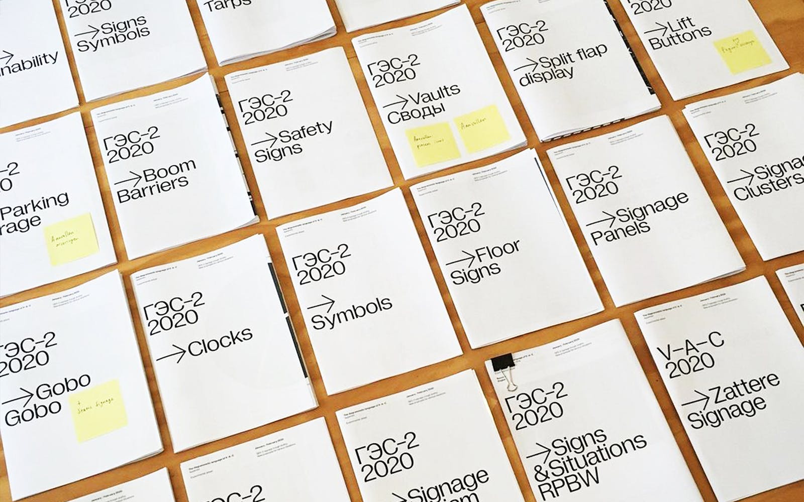
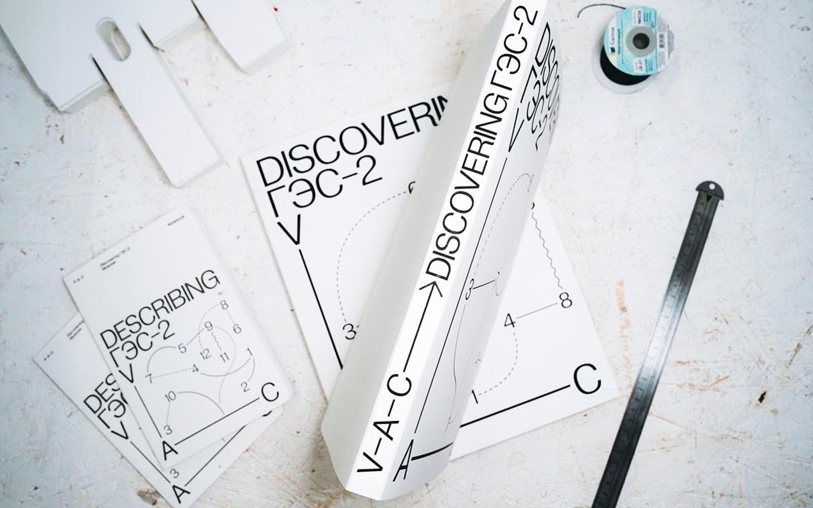
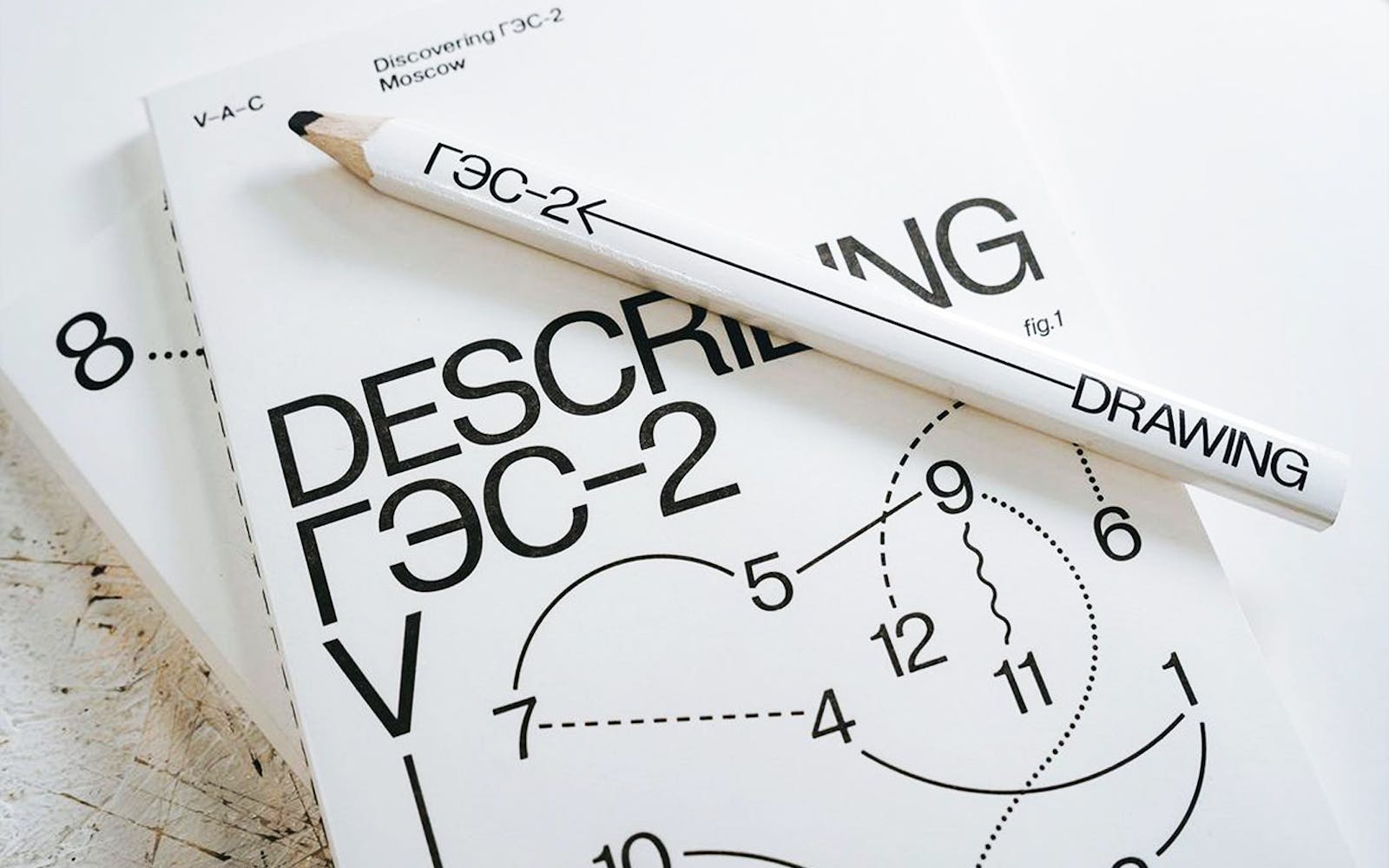
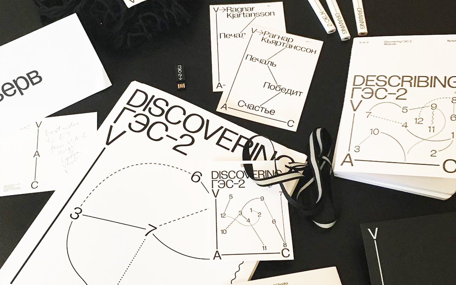
You recently finished work on developing the custom typeface Diagramatika for use by Experimental Jetset on the identity for V–A–C Foundation. Afterwards, Diagramatika was revised and released publicly as Gramatika. Can you talk about the origins of this project? Was there a clear goal from the outset?
RG
They’ve already had a complete identity proposal (set in Pragmatica) when we first met, so there was no real reason for me to suggest something completely new aesthetically. Rather, I thought, it will be interesting to preserve the overall image while completely reconsidering all the parameters of which it is made of. My first proposal to them was to make extremely short ascenders and descenders. They liked that idea and so from there it went further.

BH
What was the collaborative process like? How much did the development of Gramatika influence the visual identity of V–A–C Foundation, and vice versa?
RG
I’m not sure if there is much to tell (without getting into nerdy details). Which is a good thing—I guess, it means that it went rather smooth. For a long time, I’ve been working for the Moscow Museum of Modern Art, setting posters and invitations in Pragmatica on an almost daily basis, so I understand rather well how Pragmatica/Helvetica operates and what (numerous) issues it has. So I had quite a number of possible improvements in mind already and I think that mostly we did agree on what needs to be improved. To certain extent it was just about finding the right initial proportions, contrast and spacing—and the rest was technique. There was never a moment when we would think: “Oh, this is going completely the wrong way! We should reconsider the entire typeface from the very beginning.”
As for the impact of the typeface on the identity, I think it’s a question for EJ themselves—I’m not the right person to judge, really.


BH
Do you feel that some of these ideas around sovereignty could apply to Gramatika? Is this an attempt to take something as ubiquitous as Helvetica and remove it from the trappings of its’ Modernist legacy and the burden it carries?
RG
Well, now that I have Gramatika I don’t want to use any other fonts anymore and I certainly want to design more typefaces that would develop Gramatika’s ideas further and that would operate within the same framework. So, it’s a big step towards developing an arsenal of my own tools.
The second part of the question is not so easy to answer, though. I wanted to dedicate a part of Gramatika’s release text to the question of “Why would anyone want to use another Helvetica nowadays?”, but didn’t find the right words. There are just too many possible answers. It can serve as the typeface of Corporate Capitalism just as well as the typeface of Utopian Socialism. Someone can use it to challenge the International Style legacy, and someone can use it to follow up. And someone can use it in complete disregard to any legacy whatsoever. It can be used to paint Metahaven’s digital dystopia or to neatly typeset another Swiss furniture catalogue. And I personally don’t feel the presence of its corporate burden so much: since Helvetica was never a big part of Russian graphic landscape and I didn’t grow up in the helveticized world, it seems that I can treat it much more light-hearted than people from the West can. A blissful ignorance.


BH
Gramatika is critical of certain standards in type design—OpenType feature utilization, x-height measurements, hyphen and dash usage, etc. Can you talk about this? Were these ideas born out of this collaboration? Were they symptoms of your own frustration? Are type designers reverse-engineering their work to fit into paradigms dictated by commonly used tools of creative production?
RG
Well, the manual that I’ve written for Gramatika is already too technical and nerdy, so I’m afraid that if I elaborate further and start getting deeper into the details—like talking about the UPM dogma and such—we might lose our readership entirely. Generally speaking, I don’t think there are any dictated paradigms. Quite the opposite, I think what we have is a complete, utter mess. And I really wouldn’t mind complying to some existing standards, but most of them are either severely outdated, contradictory, or simply non-existent. Trying to avoid too much technical stuff, let me give you a random example: an underline. Every font file describes the preferred position and weight of the underline. There are two values: the thickness and the distance from the baseline to the top of the underlining stroke. Simple, reasonable and we might start to consider what ‘traditional’ underline should look like. But here comes practice: InDesign thinks that ‘distance to the top of the stroke’ means ‘distance to the middle of the stroke’ (due to the difference in PostScript and OpenType definitions—but I promised not to get too technical). So as a type designer you have a choice: either your underline renders correctly in InDesign, or it renders correctly everywhere else. Further, web: Firefox (as far as I know) is the only major browser that renders the underline correctly according to the font values. Chrome (and all the other Chromium-based browsers, I believe) just completely ignores* everything that a font file is trying to tell it. So, basically, on the web you have no control over how your underlined text will look like. Even though underlined text is probably the single most iconic attribute of web typography.
So, for me Gramatika was, among other things, about finally figuring out some rather technical questions: Why should the sum of ‘typoAscender’ and ‘typoDescender’ equal UPM and what happens if it doesn’t? How should the ‘case’ feature be written properly and should it be written at all? Is there a good reason for an emdash to actually have the length of one em? Is there ever a reason to set non-zero ‘lineGap’ value in the font’s vertical metrics? It was not so much about challenging rules or conventions—simply because the supposed rules are so messy and contradictory that they cannot be properly followed anyway—but just trying to establish a framework that I would be comfortable with.
*As things on the web are in constant flux, a small update is required: almost right as we speak, in November 2020, Google added the support of “text-underline-position: from-font;”, which will finally make their browser take the correct values from the font files. It is still not the default, though, and you need to write an extra line in your CSS for it to happen.


BH
With Gramatika, the conceptual intention and logic is embedded in the construction and measurements of the typeface. This outwardly effects the function—responsibility for correct typography falls to the user. It doesn’t pander, it treats the user as an equal. Do you see this as an ideological response to our current systems?
RG
Certainly. There is this dogma nowadays, that all the software needs to be ‘user-friendly’. And the ‘user’ in this ‘user-friendly’ is never the one who’ve spent years to master the craft, but an absolute beginner who’ve just opened the program for the first time. The interface should be inviting and not too complicated or intimidating. Everything needs to be self-explanatory. The mistakes should be automatically corrected and not punished. There cannot be any learning curve. Which are all reasonable assumptions if you design a ticket booking app, but in the case of professional software it’s a disgrace. It mocks professionalism. There is this common image of a ‘creative’ worker: take the first Adobe advertising that comes up in YouTube search, a video named “Never Settle”. It shows people doing all sorts of work—editing videos, drawing illustrations, retouching photos—all just by lazily moving a finger over a MacBook’s touchpad (or a tablet!), while sitting in the dark of what resembles mom’s basement more than any sort of real working space. To me, this is plain offensive. Because this is not what working on a font kerning table, or a book layout, or a video post-production, or a 3d render looks like. There are real knowledge, skills and labor involved in the design production. It’s a profession, not a hobby, and it requires professional, not hobby tools. It is not ‘my nephew has Photoshop, he can do it’. It is not generated with one click of a button. It is not done with a magic wand—so maybe it’s time to stop inventing magic wands that don’t work and rather cater to the real needs of the industry. This advertising enhances the very wrong image that ‘creative work’ is somehow not real work—it’s a play work. In which case, I guess, we should be paying play money for Adobe products—but that somehow is not the case.


BH
Gramatika features a large set of universal pictographic symbols. Can you speak to the development of these? Were they in dialogue with the diagrammatic language of the V–A–C Foundation identity?
RG
I have a feeling that I’m going to regret adding those. The list of additional symbols for the V–A–C identity typeface was quite modest and mostly included abstract geometric shapes, arrows and just a couple of interface/navigation icons. It was trim and fit. But when I started to work on the public release of the typeface, I decided to maybe expand this symbol set just a little bit—and opened the Pandora box. Now there are 300-something additional symbols and I think it’s just too much. But at the same time, I’m curious to see what will happen to all of those. Does it actually provide the sufficient set of tools for interface design, or will there always be the need to draw bespoke icons? Will some of these non-alphabetic non-punctuation symbols be ever used in a meaningful manner or will they always end up as a mere decoration? And how many of these symbols no one will ever use at all?
BH
Throughout the Gramatika manual, you speak to the poetry, charm, and warmth to be found at the heart of Modernism, in the ideals of universal design embedded within. Can you elaborate on this?
RG
I don’t find Modernism to be cold or impersonal. Maybe Swiss Modernism is. But if we speak of Soviet Modernism, isn’t it poetry:

It might be totalitarian or inhumane in its ultimate declaration of utopia, but it certainly isn’t boring, cold, or unpoetic.
This is the house in which I used to live in Moscow:

It’s an enormous humanhive of one thousand flats, a creation of monumental proportions designed to survive a nuclear blast. But if you ask me to describe my experience living there in just one adjective, I would say ‘cosy’.

BH
I read that you led a workshop at the British Higher School of Art and Design in Moscow. Do you teach type design regularly?
RG
It was a bit longer than a workshop—more like a short course. I did it twice—in 2018 and 2019. Here’s the assignment and some results from 2018. Important thing to note about this assignment is that it actually consists of two parts: in the first part the students make their typefaces and in the second part they are making layouts using the typefaces that they’ve made. I think it’s an important addition, because if you don’t use your fonts, you don’t really know what you’ve done.
Currently, though, I don’t teach anywhere.


BH
Why no pound signs?
RG
Let me start from afar. The Unicode character map is vast and it’s impossible to cover its entirety, so priorities have to be made. For example, all my fonts include Kazakh alphabet (which gets omitted sometimes, since Kazakh alphabet as well as the majority of other non-European Cyrillic alphabets—Tatar, Bashkir, Mongolian, etc.—is not part of Win-1251 codepage). That requires drawing a number of additional characters, namely: ӘҒҚҢӨҰҮҺәғқңөұүһ. While those characters are not particularly hard to draw, they are a real drag to kern (for example, Ұ alone has 129 pairs in the latest release of Gramatika Regular). So adding Kazakh language takes quite a lot of time and effort. Now, I don’t think that my fonts are particularly popular in Kazakhstan, and even worse, in 2017 Nazarbaev announced the plan to fully transition to Latin alphabet by 2025, so all of this work may turn out to be useless. But nevertheless, the Kazakh characters are still included, in naive hope that the more good Kazakh typefaces are produced, the higher are the chances for Kazakhstan to stay Cyrillic. At the same time, I decided to remove the support of Maltese (which is almost always included in the Western releases). Simply because I don’t think that anyone will ever set anything in Maltese using my fonts and not having to kern Ħ will save me a reasonable amount of time in production.

So when it comes to the currency symbols, there are just too many of them: Afghanistani Afghani, Azerbaijani Manat, Cambodian Riel, Chinese Yuan, Indian Rupee, Iranian Rial, Israeli Shekel, Japanese Yen, Korean Won, Lao Kip, Mongolian Tughrik, Nigerian Naira, Philippinian Peso, Thai Baht, Turkish Lira, Ukrainian Hryvna, and so on, and so forth. Including all of them would require too much effort—almost as much as drawing an entire new alphabet—and I would rather spend that effort adding directional arrows or something else useful. Therefore, the currency symbol set is kept to a bare minimum and if it was possible, I would get rid of all of these symbols altogether. After all, empires and currencies come and go, typefaces stay. Win-1252 codepage still encodes—and therefore most of the modern fonts still include—a symbol for the Dutch guilder. Hundreds of type designers keep drawing a symbol for a currency that doesn’t exist for almost 20 years now. On the ‘Currency Symbols’ Unicode block you can still find the characters for Brazilian cruzeiro (abandoned in 1994), Argentinian austral (abandoned in 1991), German pfennig (abandoned in 2002) and even such an obscure unit as spesmilo (abandoned in 1927?). Now, I understand why people consider the British pound to be a special case: it’s hard to get rid of the idea that the sun never sets on the British Empire and anywhere from Kingston to Wellington you can exchange bills with her majesty’s portraits for a pint. But even those days are over, I’m afraid, and nowadays the British pound is just another national currency—like a rupee or a shekel.
BH
So, for you, rather than viewing it from a practical or a business perspective, the final supported character set of a typeface can be a vehicle for ideological response on the part of the foundry?
RG
The character set of a typeface is certainly an important manifestation of ideas. I think it’s necessary to be considerate to which symbols you include in your fonts and not just blindly copy the Win/ISO/MacOS codepages. Not only because a lot of potentially useful characters are missing from those codepages (see ‘Expansion of the Alphabet’ in the Gramatika Typesetting Manual, p. 34), but also because there is a lot of junk in there, which is not worthy of wasting your time on (do we really need masculine/feminine ordinal indicators?).
BH
Do you need to go to school for type design? Is type design something that can be self-taught?
RG
I have no idea, because I never went to a type design school myself. I don’t really know what happens in type design schools.
BH
In addition to releasing typefaces, you also publish your research on Letters from the Temporary State. What role does research play for you in the process of designing a new typeface?
RG
It all started with Soyuz Grotesk. The Cyrillic part of Soyuz came quite easily, but then I was stuck with Latin for a very long time not knowing how to approach it. As I always felt rather comfortable writing and always wanted to write more, I decided to try to design the typeface and write about it at the same. Or rather, even let the narrative dictate my design decisions. And in the case of Soyuz I have a feeling that it worked quite well—I was able to find the solutions that I wouldn’t consider otherwise. So now writing is an essential part of my practice and I enjoy it quite a lot.


BH
What role do historical models play for you in modern type design? Are type designers too beholden to what came before?
RG
Well, I’m a Cyrillic type designer, so my source of historical models is not as vast as Latin. But even with that limited source material (which is still more than enough for a couple of lifetimes) there’s a lot of work to be done—I mean, we don’t even have a good digital version of Literaturnaya yet, how is that possible? So, when there is a gap like that, I don’t see any shame in revisiting the past (and even just copying something from an old specimen is still a creative process and can be done in many different ways). Also, if you know what you are doing and why—if you have, for example, a good reason to make another Garamond, you should make another Garamond despite the fact that there are hundreds of them already.
BH
Several of your typefaces offer alternatives around what constitutes an italic. I’m thinking specifically of Panama’s Iranic as well as Five Years Later’s Rotated. Do you feel that type designers have been too lax around challenging basic assumptions of the medium?
RG
I think there are obvious economical reasons for why the things are the way they are. It’s natural for a commercial type foundry to maximize the output and minimize the labor, nevermind the quality as long as it doesn’t affect the sales. Therefore, things are streamlined and normalized. Therefore, there are standard italics in every font (often not even made by the font’s author, but by some technical staff). Therefore, there are ten shades of bold in every type family (often auto-generated from just two masters). So it is obvious why does the commercial type look the way it looks. If I had a company with employees, investors and a board of directors, I also might have had to look into cutting some corners. Thankfully, I don’t need to do that. And thankfully there are still a lot of other smaller studios who are able to produce interesting work.


BH
How do you approach the design of new typefaces?
RG
I’m not sure. It’s just something that happens: some thoughts that eventually get developed as fonts.
Or, if the question was regarding the process: usually I work in some intervals—I quickly draw an entire character set, run some tests and then leave it alone until I forget how it looks like. Then I come back and redraw it. And so on and so forth until I’m happy with the result. And then comes the dread of kerning and mastering.
BH
So, they often stem from an urge or question on your part that you then explore further? Are these questions based on function, aesthetics, or both?
RG
I think usually it comes from the typographic practice. I do believe that the best tools are made by the ones who use them. So if you use Caslon all the time in your daily work, the chances are that sooner or later you will develop some ideas about how to improve it. And even if it’s just a seemingly small adjustment that you want to make, it can develop into a much bigger concept, once one little adjustment leads to the other and you start to dig deeper. Eventually, the whole Gutenberg Universe is upside down.
BH
Are you mindful of contemporary aesthetics when creating new typefaces?
RG
Not so much. Rarely a typeface comes as a reflection of some current situation—usually it is in the consideration of the past or imaginary future.

Related Articles

UNLICENSED: Experimental Jetset

