Talk Magazine Discusses the Politics of Style
By Ryan Gerald Nelson

Eric Hu and Harry Gassel, founders/editors/art directors of Talk Magazine, have described the origins of Talk Magazine and where it’s going:
Published biannually, each issue brings together a different group of artists, writers, and collaborators to push each other into making something new. The publication emerged from a desire to observe culture through the lens of graphic design and to critique graphic design through the lens of style. …It’s the start of a conversation, a space for dialogue, an arena for debate; mostly it is here to make a record of what’s happening now.
This text comes from Talk Magazine’s press release for Issue 2. Despite the matter-of-fact nature of a press release, what this text describes feels honest, ambitious, and confident. Talk Magazine expresses an attitude and a way of seeing that is integral to how they seek out and assemble the content of the magazine. At the same time, the text seems primed to morph into a new kind of manifesto, not only for the magazine itself, but for graphic designers and those who are visually/stylistically-aware, and that, for me, is what makes Talk Magazine particularly exciting.
On the heels of their recent release of Issue 2 of Talk Magazine, Eric and Harry have graciously shared their excellent opening essay from Issue 2, titled “Some Politics on Style,” for the readers of The Gradient. This opening essay kicks-off a vibrant Issue 2, which “gathers a hodgepodge of writers, artists, designers, (and in this particular issue, comedians) to examine style and its effects on larger cultural forces” and which “continues [the] discussion about the politics of style.”
Editor’s Note: To experience Some Politics on Style as intended, push play on audio while reading
Some Politics on Style
We’ve been thinking a lot about this one image. It’s a vertical diptych of stills from The Simpsons episode where both Bart and Martin are running for class president. Martin hangs a campaign poster that reads A Vote for Bart is a Vote for Anarchy. Bart pastes his own poster over Martin’s. His reads A Vote for Bart is a Vote for Anarchy. The only visible difference between the posters is their lettering style—Martin’s is neatly laid out in a presidential serif typeface and his message is seen as a warning, while Bart’s is rendered in an anarchic scrawl and his message is seen as an invitation.
A shift in style leads to a change in meaning.

As designers, it’s our job to think that the way something looks is important. Coming into 2016 and issue two of this magazine, we’ve been reflecting on the the past year—both globally and in relation to our own activities. Three things come to mind. The rebrand of Google and their new parent company Alphabet, the foregrounding of a lot of long-overdue social and political movements along with the almost successful and unsuccessful attempts artists have made to add to the conversation. Our interest is in trying to understand the codes of style traded back and forth between politics and images, and how, if at all, that understanding can lead to an effective contribution to the social good. We’re confused. So as always, we start by looking.
There’s this other image that’s been on our minds. Last August, Google rebranded and published a picture of their design department critiquing each other’s typographic sketches. The new logotype abandoned its familiar serif typeface and replaced it with a sans-serif designed in-house. The letterforms are geometric and charmingly clumsy. To the design world, the logo was hip and quirky, but to the broader public, the logo pointed towards more.
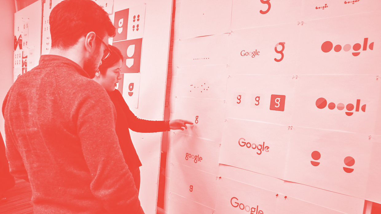
Scattered throughout the press during the rebrand announcement were invocations of the words friendliness, empathy, and most importantly, human. This is a wild contrast to a company who’s enterprises now range from home surveillance to armed AI—all as they amass personal data. It’s also the opposite of the logos of evil companies in fiction—like Skynet in The Terminator—or real companies like Halliburton who often utilize bold, engineered typefaces, minimal color pairings and stark symbolism.
![]()
Their uniformity and ubiquity convey both omnipresence and mystery. However, the companies with the most power and influence over our daily lives and political landscape are decorated in logos self-described as playful. Say what you will about Skynet, but its looks don’t deceive. These brutal sci-fi aesthetics have curiously found a new home in millennial music and fashion.
Perhaps this hipster retreat to the overtly evil branding from fiction is because the thought of a Boston Dynamics cheetah dressed in Google’s friendly brand assets hunting down dissidents is much more horrific.

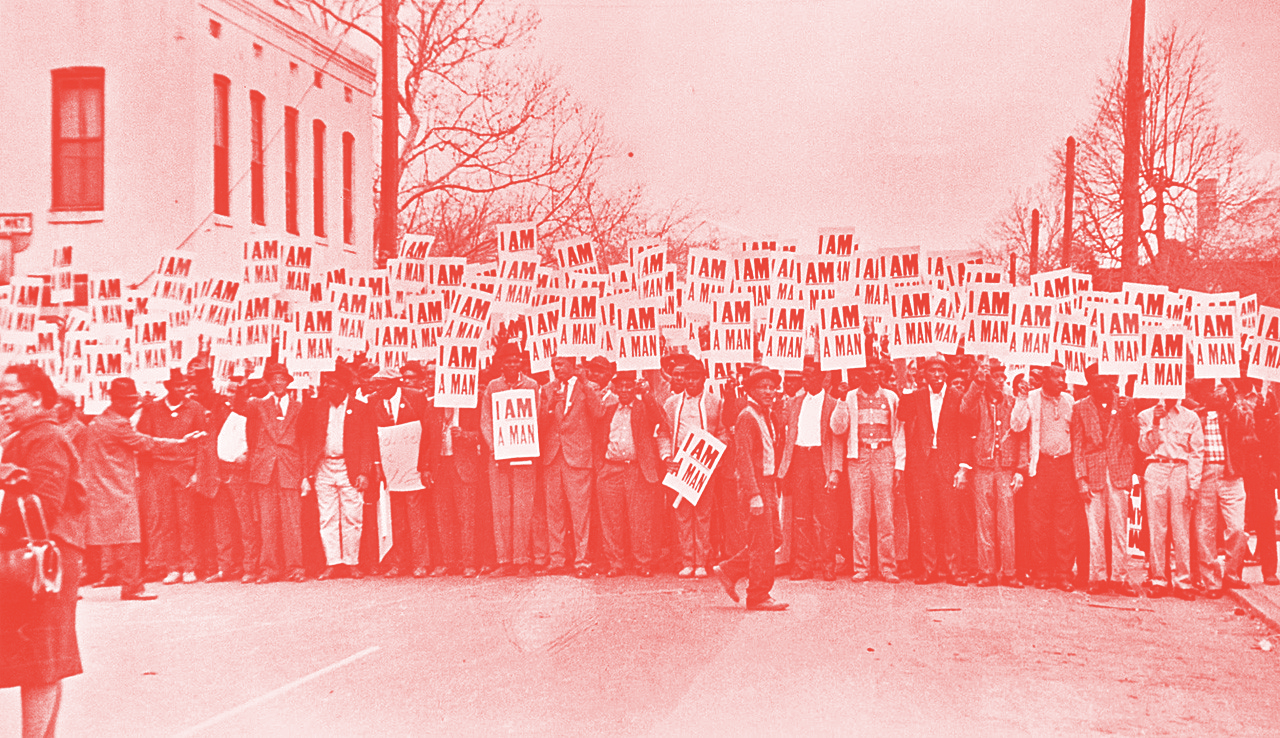
If Google’s new coded design language hides its status or intentions, how can we effectively use our skills to subvert power or protest injustice ? There are so many iconic images of protest in design history. Like the I AM A MAN protest sandwich board, or the raw silkscreen posters from the May 1968 student protests. Or the newspaper and ephemera designed for the Black Panther Party by Emory Douglas. Though certainly they had agency and intention, their now fetishized aesthetic was borne from the urgency and limitations of the moment. Also, these are cases where the often anonymous designers were directly inside the movement and their work was in service of its political messaging.


Situations where designers offer unsolicited proposals often lead to a result that is tone-deaf. For an Op-Ed in the New York Times, Seymour Chwast selected a few design studios to re-brand Occupy Wall Street. In all of these cases, the designers have engaged in the traditional client model, assuming the role of an outsider who came to either clean up or spice up. Despite good intentions, the blog post that usually follows these case studies isn’t so much about the issue as it is about the fact that a designer took interest in the issue, injecting self-promotional noise to the discourse rather than providing a signal-boost to the movement.
It’s a case of selfie over substance.

Protest art can just be kind of goofy. Joel Goby for Vice UK in “A Painfully In-Depth Analysis of the Worst Bit of Graffiti I’ve Ever Seen” savages post-Banksy soft-ball political stencil graffiti on their tendency to annihilate all notions of complexity for the sake of a banal slogan combined with facile imagery. It’s worth comparing this to the graffiti of the 70s and 80s which was less about how it looked—though it looked amazing—and more about what it meant as an action. It was kids with underrepresented voices, taking back space in their city. Graffiti works as a political statement until the statement becomes overtly political. Then it’s just dorky as fuck.
Maybe the cliché actions speak louder than words has been right all along, and that the simple act of writing on a wall to deface it is a louder statement than whatever is actually written. In thinking about all these things, we’ve also witnessed a group of artists who are keenly aware of the sociopolitical forces connected to their identities and at work in their communities. And who, by simply doing what they do, have responded in kind.
Which is all to say, Design Harder.
Talk Magazine Issue 2 features: Cole Escola, Kate Berlant, Matthew Tammaro, Marcus Cuffie, Seth Price, Emilie Friedlander, Geordie Wood, Devin Troy Strother & Yuri Ogita, Berton Hasebe, Christian Chico, Kristian Henson, Othelo Gervacio, Hassan Rahim, and Mike Devine.
Design contributors: Eric Hu, Harry Gassel, Maxime Harvey, Gabrielle Lamontagne, and Raf Rennie with his typeface, Anno.
Get familiar with Talk Magazine on their website or order Issue 2 (or Issue 1!) on their online shop.