


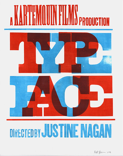
Please join us on Thursday, November 6, at 7 and 9 pm, for two screenings of Typeface. After the screening will be a conversation with its director, Justine Nagan; Bill Moran, St. Paul-based designer and letterpress guru who cowrote a book documenting Hamilton; and Greg Corrigan, designer and Hamilton technical director.
Typeface documents the Hamilton Wood Type and Printing Museum in Two Rivers, Wisconsin, the only such institution dedicated to the preservation, study, production, and printing of wood type. With 1.5 million pieces and more than 1,000 styles and sizes, the Hamilton’s is one of the premier wood-type collections in the world. The museum, however, is not just host to static holdings of preserved artifacts behind glass, but rather is an active educational center for letterpress workshops for designers and artists from across the Midwest and around the country, and a place where the last generation of skilled men and women who once created these intricate fonts—now in their seventies and eighties—can share their knowledge of this enduring craft.
In anticipation of this sneak preview, we interviewed Justine Nagan about the process of making Typeface.
—
WALKER: How did you get involved with this film? Was your entry point the museum, the craft, or the people?
JUSTINE NAGAN: I’ve always had an interest in design and preservation, but my introduction to the museum was fairly random, and serendipitous! My husband Matt and I were coming back from a wedding in Door County and saw the sign for Two Rivers’ Ice cream sundaes… We stopped and stumbled on the museum. Once inside we were just blown away by the collection and the space and I thought—this should be documented. After looking into it further, things clicked into place and it seemed the perfect collaboration for my first film.
W: Why make a film about an obsolete technology?
JN: I became fascinated with exploring the changing importance of analog technologies in our digital age. There is this theory that as we as a society sit at our computers all day, in the off hours, tactile and sensual experiences become all the more important. People are craving things with texture that they can hold in their hands—whether it’s knitting or playing guitar… Then there’s the whole nostalgia factor: LPs vs. ipod, film vs. video, letterpress vs. inkjet.
W: What kind of research did you do in preparation for the film?
JN: I reached out to people in the graphic design, letterpress, printing history and craft communities. I spent a lot of time on the internet. Paul Gehl at the Newberry was a wonderful resource.
W: Seeing as how you’re making a documentary about a museum which is already a very didactic source of information, how did you go about drawing the subtext out of the place?
JN: We use the museum as the locus and then follow several strands out from there. Through our cast of characters across the Midwest, all connected to the museum in some way, we are able to weave a thematic narrative that covers the various ideas we’re interested in. Among other things—how the value and purpose of older printing methods has changed as our society has transitioned into a digital age? How is contemporary graphic art influenced by the history of the artform itself? We try to raise questions about what to preserve, how to preserve it, and why it’s worth the effort.
W: Some obsolete technologies manage to take on a second life by addressing a different need or being adopted by a new (sub)culture in a different context. Do you think a revival or re-interpretation is inherent to any successful preservation movement?
N: I think evolution is key to preservation. Re-imagining and adapting technology, while maintaining the elements that made it interesting in the first place, ensures longevity of the medium. I think the new interest in letterpress and craft is sustainable. The current styles of letterpress may fade, only to be re-invented again by some future generation.
W: It’s hard to talk about your film’s potential impact in the design community without bringing up the immensely successful Helvetica — do you think Helvetica has opened any doors for your film, and how do you compare the two? Do you see them as complimentary films?
JN: I had been working on Typeface for years when Helvetica was released. At first, I was worried that they would compete, but then as soon as I saw Helvetica (and enjoyed it) I realized they were totally different works. I think Helvetica has shown what a voracious audience there is for films/discussions about type and design and that both films raise points about the prevalence and importance of type in society, but in the end they cover very different ground.
W: I was excited when I realized that Kartemquin Films, known for films such as Hoop Dreams and Stevie, was producing this. How is Kartemquin making this film differently than someone else would?
JN: Our films take a very long time to make—largely because we follow subjects over time and are invested in getting the story right. I think we worked to flesh out the documentary beyond just a film about type to be more of a discussion about the state of our culture in its current frenzied state. We try to show the opportunities and obstacles inherent in preserving a collection like Hamilton. I hope it resonates with audiences—both designers and laymen alike, and that it gets people thinking about how to take care of the things in their lives, jobs and communities that they value.
Get Walker Reader in your inbox. Sign up to receive first word about our original videos, commissioned essays, curatorial perspectives, and artist interviews.