
In 1938, Alex Steinweiss was hired as the art director for Columbia Records where he pioneered the idea of album artwork. Since then the format has moved from a simple piece of graphic design to an integral part of popular culture. Sadly, as the music industry has evolved, so has the sleeve. What was once a canvas for seminal LP artworks by Peter Saville and Hipgnosis has now been reduced to a small .jpg at the bottom left-hand corner of Spotify. Despite the change, album covers are still a dream project for many designers, and the field is rich with covers that are both beautiful and boundary pushing.
In the second installment of Uncovered, a regular series on The Gradient focused on the process and influences behind recent album artwork, we hear straight from the designers behind releases from Fever Ray, the label Country Music, and Mouse on Mars.
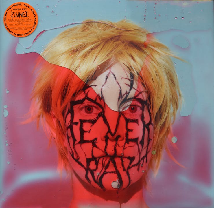
Artist: Fever Ray
Title: Plunge
Designer: Martin Falck
Ben Schwartz (BS)
How does a process like this begin with Karin Dreijer? Does she come to you with a clear idea of what the visuals should be, are you responding to particular elements of the music, or is it more of a conversation?
Martin Falck (MF)
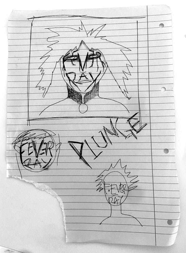
I’ve worked with Karin before on different projects for The Knife, so we had a good starting point. She told me she was working on a new project and wasn’t completely sure what it was. She allowed me to listen to some music early in the process, from which I began thinking about this new world. I understood this would be something completely different from the previous album, so it needed a completely different aesthetic. Karin is really great to work with and we have a lot of trust in each other so the process becomes very smooth, fun, and easy. I would say it works a little bit like a vikgubbe—not sure about the English name, maybe ”exquisite corpse”? I put some stuff together and then Karin reacts to it. I would call it a visual conversation.
-
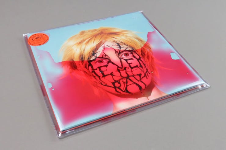
 CD cover for Plunge
-
 Back cover for Plunge
-
 Record sleeve for Plunge
-
 Vinyl label for Plunge
-
 Poster for Plunge included in album packaging
-
 Poster for Plunge included in album packaging
-
 Poster for Plunge included in album packaging
-
 Poster for Plunge included in album packaging
-
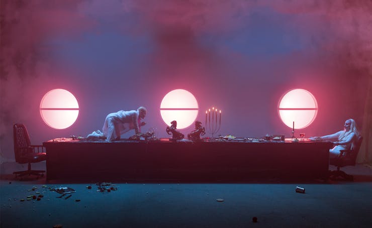
 Behind the scenes with Karin Dreijer (Fever Ray)
-
 Behind the scenes with Karin Dreijer (Fever Ray)
-
 Behind the scenes with Karin Dreijer (Fever Ray)
-
 Behind the scenes with Karin Dreijer (Fever Ray)
-
 Behind the scenes with Karin Dreijer (Fever Ray)
BS
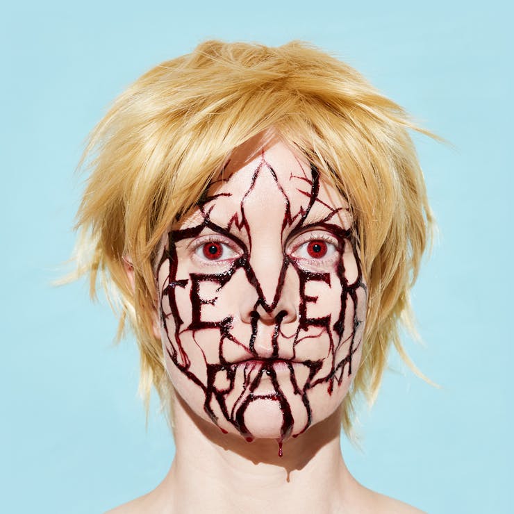
The visuals for Plunge create a new “Fever Ray universe.” There is a cast of characters, symbols, colors, and implied relationships that evolve over the elements of the packaging and videos. Some of the references are clear—black metal, occult symbolism, and BDSM, for example. Overall though, the world feels completely alien. I’m curious about the inspiration that shaped the visual language of Plunge?
MF
A lot of the things in this world are very intuitive. I wanted to create a fantasy world where everything would be possible and everything could coexist… You know when you’re really hungry and you want some fries, pizza, a burger, salad, ice cream, chocolate, candy, soda, and you have to make a decision but instead you just put everything together in one bowl and VOILA! Why do you need to chose one thing? Why can’t you be more then one thing and change and transform? I feel people are functioning on multiple levels, and by using complexity, diversity, and surprise you can build your own opinion and not just swallow a constructed image. Maybe that sounds pretentious; I’m not sure exactly how to put it into words. I’m trying to say that by not doing what’s expected of you you can truly meet yourself and others.
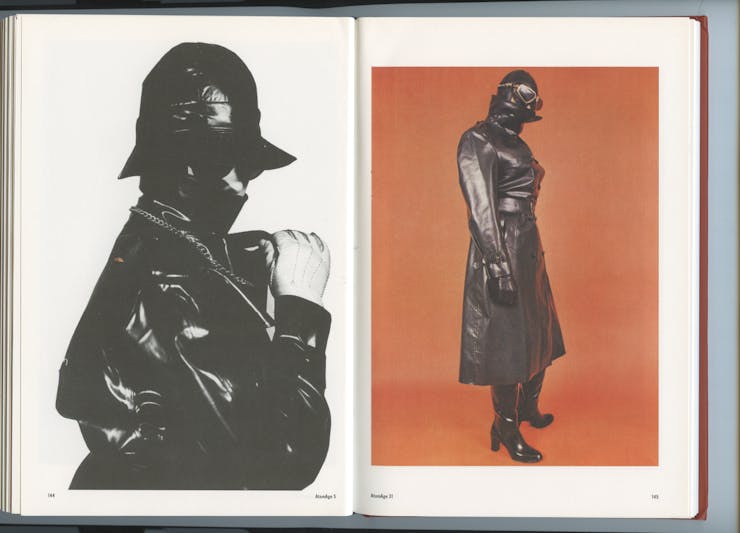
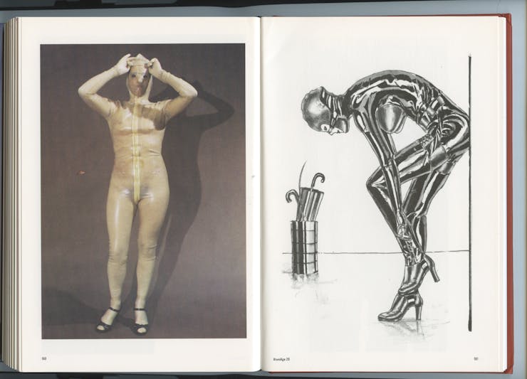
It was a way to let go of the idea of a “clean concept” and to just be free, play, and have fun. One of the main sources of inspiration is a magazine I came across doing an exhibition at a gallery in Glasgow called Atomic Age. It’s a magazine from the ’60s made by BDSM enthusiasts. Everything is very DIY but still amazing. It’s very playful and the creations they made are out of this world. They play with class, gender, status, titles very freely. This is also where I understood that BDSM aesthethics have become very conservative: it’s not all dark, leather, and chains. It’s more a space where you can be a cosmonaut, an office worker, a firefighter, a dog, a flower, and where you can meet. It’s a sort of hyperreality, a place where you can live out your fantasies safely by trusting each other and not being judged. This is also what the I hope the Plunge world represents.
BS
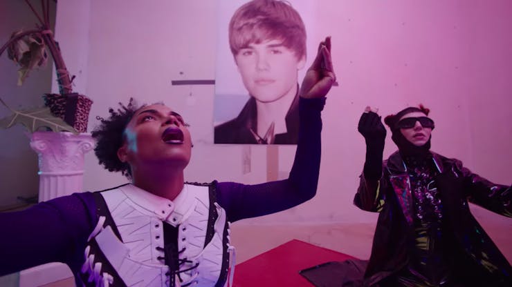
It seems like black metal is appearing more and more in pop culture but used with heavy irony (I was going to bring up Justin Bieber and his black metal merchandise, but hesitated until I noticed the Bieber poster in the video for “IDK About You”). On Plunge it feels different—not necessarily aligning with a black metal aesthetic or a sense of irony. Could you talk about its use?
MF
Oh, yes. I didn’t see Justin Bieber’s merchandise, so not sure about the reference there… There was this period in the ’90s where there was a lot of gothic and black metal influences in American hip hop. No? Anyway, the Justin Bieber poster in the video is more a reference to many of my lesbian friends liking him a lot. To be more specific, his hairdo. Sort of getting his haircut sort of taking on his style. It’s a very internal joke that we have. The ”Beaver-Fever.”
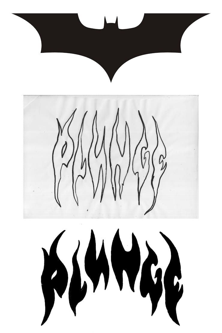
Being from Scandinavia, black metal is a really big thing here and has always been. It’s like a daily influence. I think some of the biggest bands are all black metal bands. Basically its hard to walk home from work without seeing someone who looks like the main singer from Slipknot. There is almost a kind of “drag” element to black metal music. Guys that put on their wigs and makeup and jewelry and have a ”fun night out with the rest of the girls” while serving us some hardcore masculinity. It’s a performance. It’s an outlet just as the music on Plunge is an outlet. For me there is an obvious connection between black metal music and Fever Ray’s music. It’s always been there. I’m not sure everyone agrees, but for me there is. And it’s really not meant to be ironic. The aesthetics for Plunge overall are a puzzle. There are a lot of anecdotes and references to things that explain the world as a whole. Some are obvious and some are not.
BS
You also directed the music videos for Plunge. Do you feel more comfortable working in print or motion? Do you develop the ideas for the packaging and videos in tandem, or is one an extension of the other?
MF
Basically, I’ve always been interested in creating ”new worlds” or alternate realities. That’s what I enjoy the most. To me it doesn’t really matter which medium; it’s more about the energy, the colors, and the collective vision. In a way it’s easier to sit in front of your computer screen working on a logo and then meet your clients, but that can also be a very lonely work. So the biggest difference for me when working with moving image is that you need a much bigger team and you need to be very synchronized, prepared, and get along. And I’m very lucky to have that and that makes me feel very comfortable with any medium.
BS
The special edition packaging is incredible. Could you talk about the process of putting that together?
MF
So, I knew from the beginning I wanted to demystify Fever Ray. I wanted Karin to be present on the cover and in the visuals without a mask. I wanted her to be closer to anyone who listens. I felt it was such a personal story and the album needed to be close and transparent. And then I had this idea what if we would take Karin’s blood and put it around the vinyl. And that’s how that idea came along.
Run and initiated by: Daniel Iinatti and Anna Sagström
Design: Per Törnberg, Anna Sagström, and Wei Huang
Typefaces by: Per Törnberg, Laurenz Brunner, and Wei Huang
Website concept: Julia Novitch and Anna Sagström
Website development: Julia Novitch
Photography by Viktor Fordell and Ari King
![]()
Ben Schwartz (BS)
What were some of the initial discussions around the design and concept for Country Music?
Anna Sagström (AS)
Before any of the album covers were designed, Per and I began by questioning the format itself. It’s interesting how the actual ratio from physical records live on when digital record covers could potentially look however. A long thin jpeg, why not!?
Per Törnberg (PT)
We chose the square format, though, mostly because of SoundCloud, but also the ratio is a clear symbol for a record cover. It’s something that signals music-related content before one even gets a chance to explore further.
BS
I’m curious about the connection between Country Music and the industrial aesthetic that seems to permeate most of the album artwork?
AS
The whole project is informed by a workshop aesthetics. I was working part-time in an actual wood workshop at the moment, and it was where I had the most time and space to listen to music. Per came up with the round, center screwhead design mostly to be able to work with a template and streamline our releases and make us seem more like a record label. It was an answer to a question I was thinking about: when a “record label: is just a bunch of digital releases, how does one signify coherence/curation?
PT
Our music is hard club music—how is “hardness” typically communicated commercially? We looked a lot at visual languages from drilling companies and tool manufacturers, and there’s a certain kind of class signaling that’s associated with black and yellow, for example. It is factory. It is work, and we wanted to take digital music into that too. Now we work with producers that are working within different kinds of peripheries—be it geographically, a marginalized gender, or sexuality. We thought of “hard aesthetics” or “work aesthetics” as generally associated with white straight men, and we wanted to see what we can do to change that, within that (because that’s not the reality we see in our digital spaces, workspaces, or spaces for music).


BS
As a fan of all things Peter Saville, I can’t help but ask if the aesthetic is at all inspired by Factory Records?
PT
The Factory Records and Peter Saville references are completely coincidental (such as the use of Rotis), although we definitely are inspired by some similar things and ideas.
AS
The sandpaper (Guy Debord referencing) Durutti Column record cover is my favorite record cover of all time. But whereas for Factory Records it seems almost purely conceptual, I think about the sensation of it: remembering and daydreaming about how sandpaper feels against the fingertips. We try to think about texture in our digital work, and it is something we want to continue to work on. How does one express the grit found in the music and desolate scrappy landscapes we’re inspired by in digital music covers when there’s no physical manifestation between visuals and the body? We have done some experiments into how one consumes the music by releasing sleep headphones and work headphones, but writing this text has made me inspired to think more about the digestion and representation of the digital album cover.

BS
Was the idea to combine the artwork and player something decided upon from the beginning?
AS
The first covers were designed before the players came to mind. When Julia Novitch and I started to conceptualize the project website we began thinking about introducing rotation (movement, tempo) into the page and quite quickly got excited about creating the custom players; the designs already had so much potential to be animated. For us, it was important that the audio stayed on SoundCloud (as it is where most people engage with the kind of alternative club music we release), and Julia was able to make players that stream the duration (time ticker on the left) and audio directly from SoundCloud. We talked a lot about whether to make the speed of the rotation mimic the tempo of the track but ultimately decided against it. There’s so much going on that the individuality of the music actually comes out better if the rotation is just the same slow and steady. All our producers get an 8-minute framework to work with as they choose for their releases—to offer a time constraint in the space of digital music has been really interesting.
BS
Rotis is an unusual typeface for the project. Was there any particular concept that inspired that choice?
PT
I’ve had Rotis on standby for a couple of years and came across a Nokia reference (using Rotis) when researching for our logotype. We had done one-off parties and released some texts before, so by the time we got around to actually putting the label together we had a lot of things figured out: a certain kind of sound/energy, producers lined up, a theoretical framework, and an ambition to present music and text in a more expanded way. I think with this determination and quite ambitious umbrella it made sense for us to think about corporation-inspired aesthetics. Rotis semi-sans extra bold became our first font choice. Wei Huang made a custom Rotis mono for us that we use for speed reader presentations of the texts we release during our club events and on our website—a corporate-looking oddity! I drew the horizontal title font (used on the first set of covers and in our logo) myself from old scans, somewhat in the same category as Eurostile but taken further. We have also been fortunate to get to use an unreleased font from Laurenz Brunner that’s also exploring industrial aesthetics but from another angle for the second set of covers.

AS
In conjunction with the ambition to consider music and tempo outside of the club, we also wanted to put text inside of the club, and alongside the music. For label nights we normally publish a paper text-pamphlet of essays we like, in collaboration with the writers, that we distribute for free. It’s actually a great opportunity to have people consider text, with lots of in-between time and moods. We also put up a speed reader of the text that people can dance to and take in as they wish. A lot of the time this brings out interesting temporal aspects in both the music and texts played!

BS
Outside of the album covers, I’m very interested in some of the products you have designed. How do you see them fitting in with the music? Many of them seem much more conceptual than typical label swag. For example, differentiating between work headphones and sleep headphones?
AS
The products are really integral to us. Any kind of branded wearable has aspects of connectivity: people pick up our music online, a quite solitary activity, but by also offering a physical embodiment—even if it’s just a shirt—we get to engage with our listeners in a more social and practical way. But the products are also part of a more conceptual exploration for us connected to the central belief that high intensity club music is not just for the club, but to be used at all times. Low-volume music to fall asleep to when you’re too wired up to relax to anything else, an injection to get you out of bed in the morning, to survive a day of work, or to balance the depression of being stuck in a state of regress (personal or structural), for example.
Some products come out of a personal, practical need: the noise-protecting work headphones and sleep headphones we use a lot. The screen saver came about from years of witnessing my coworkers use the work desktop image as a space for “jokes” and to express concealed frustrations.
Other products are more theoretically grounded. The 8-our work watch comes out from frustrations with the locked-in, punchcard-controlled workday and divides the day into three eight hour sections, UV-printed onto a saw blade—a workshop fixture. Another turned-around fixture is the workshop calendar, where instead of pictures of women in bikinis we made a piece contemplating the division of time and labor stretched over each month—not far from how we think of of time and tempo in our music releases.


BS
How do you see the aesthetic of Country Music developing in the future?
AS
Having had the fortune to work with Julia on the website and players changed our way of designing for the project completely. Now our starting point isn’t the fixed square, but a rotating surface opening up whole new typographical opportunities. We released the second season of covers: black, gray, and red metal blade–inspired designs at the start of the year.
Below—premiering!—is our latest release with artist GIL, and the fifth release with this cover style.
However, it’s been interesting for us to see a similar aesthetic to ours come out more and more recently, and in the last couple of weeks in support of a much more mainstream artist. I think we at this point want to broaden our visual output to highlight the larger aim with the project: to consider music and tempo from a contemporary periphery, rather than to get stuck in a signature style. We have also changed temp jobs, and I will go back to school in the fall, and the most important thing for us is that Country Music continues to reflect the landscapes, struggles and desires that surround us, our producers, and listeners.
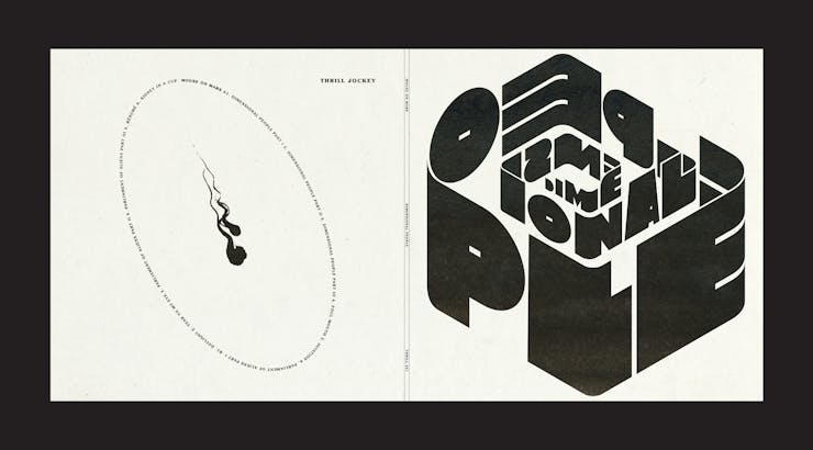
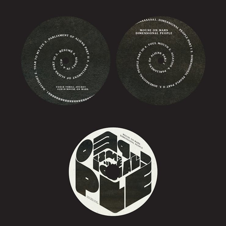
Artist: Mouse on Mars
Title: Dimensional People
Designer: Azar Kazimir
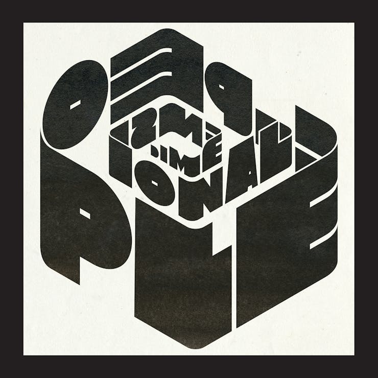
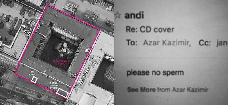
I knew right away that I wanted the typography to lead and that it should have a sculptural feel; the name of the record pointed me that way. At the time my office was a few doors down from Jan[St. Werner] and Andi [Toma]’s studio (they are the two halves of Mouse On Mars) up on the fourth floor of the Michelberger Hotel here in Berlin. Indeed many of the collaborations on this album came about through their participation (along with those collaborators) in the Michelberger Music festival in 2016, and they also did a lot of the work on the record in the hotel. So when I started thinking about the form of the typography, the building we were all sitting, working, and hanging out it in, unconsciously insinuated itself into the cover. And I think that’s perfectly appropriate.
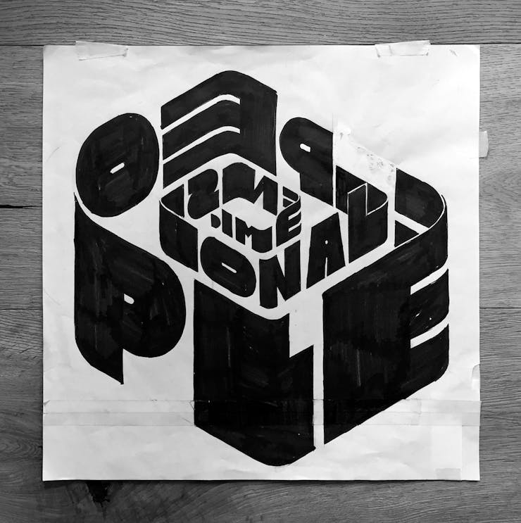
I did a rough drawing with marker at 100 percent and then a second more precise version in ink, and that was more or less the final artwork, apart from some little adjustments in the computer. I experimented with some additional drawn typography for “Mouse On Mars” on the front cover, but it always seems to weaken it. Jan told me that the label would want to put a sticker on the vinyl wrap with the collaborators names on so their name could go there too.
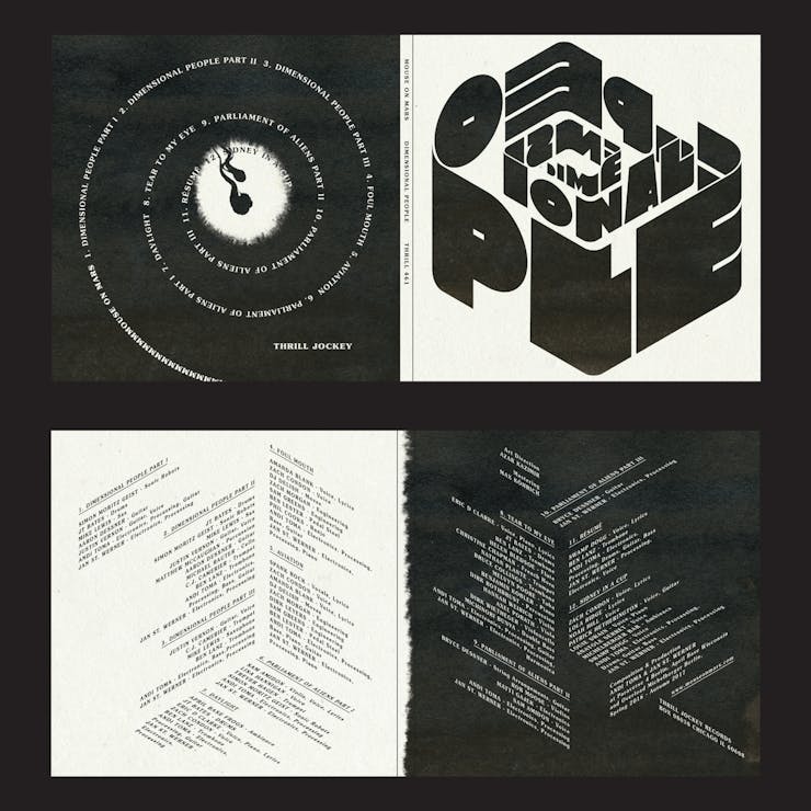
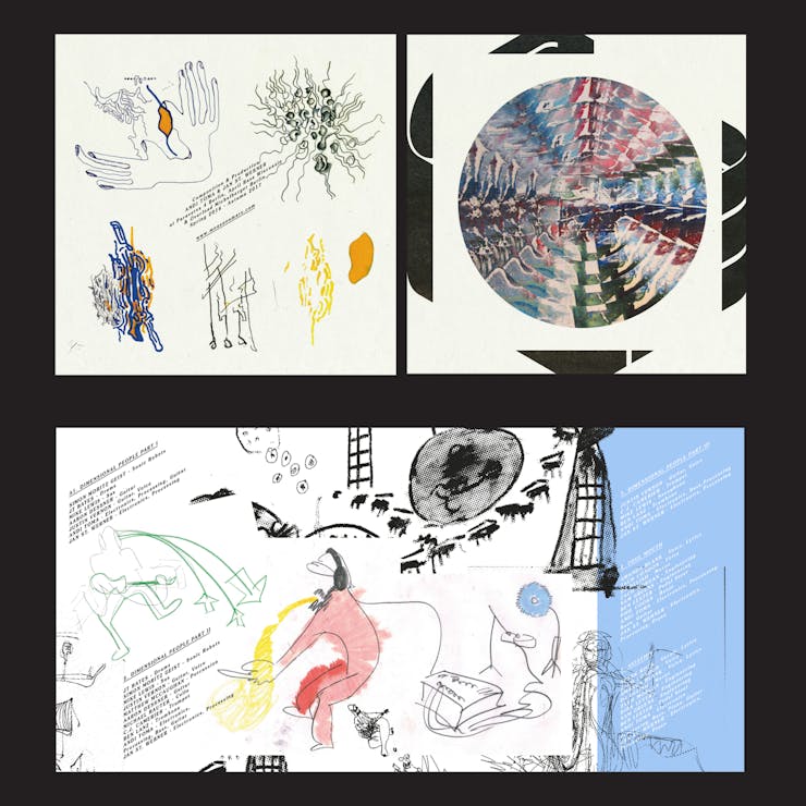
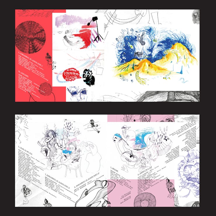
Jan is a professor at the Dynamische Akustik Akademie der Bildenden Künste in Nürnberg, and he wanted to gather drawings from his students made in response to listening to the record to use here. I tried integrating those drawings across the sleeve art, but they were so varied that it was impossible for me to get to some place that I felt was coherent overall. So we made a booklet insert that could feature all the students work with more space to breathe. There was a whole bunch of credits anyhow so they could go there too.
Andi is more the quiet, introverted one. I only got one piece of direction from him…. which I went on to ignore anyway.
Get Walker Reader in your inbox. Sign up to receive first word about our original videos, commissioned essays, curatorial perspectives, and artist interviews.
)
)
)