Uncovered 004: Perfume Genius and Kate Wallich’s The Sun Still Burns Here
By Ben Schwartz

How can design be a performative act? What insights can be gleaned from a production by approaching it from the perspective of its graphic identity? The Sun Still Burns Here is an upcoming performance at the Walker Art Center (copresented with Liquid Music) involving choreographer Kate Wallich, her company The YC, Mike Hadreas (better known as musician Perfume Genius), musician Alan Wyffels, and a host of other artists, including graphic designer Andrew J.S.. As part of the Uncovered series I spoke with Andrew J.S., the New York–based graphic designer on The Sun Still Burns Here, as well as Wallich and Hadreas about design, cross-disciplinary collaboration, and the creation of the bacchanalian aesthetic that has made us so excited about the upcoming piece. Due to a set of unique circumstances, J.S.. Wallich, and Hadreas found themselves working side by side as the production developed, allowing for responsive real-time process that could only be described as performative. With today’s launch of a performance trailer and new Perfume Genius single from the project, we discuss the unique nature of The Sun Still Burns Here, including a museum residency, a lost typeface, and a stunning and perverse piece of album art.
BS (Ben Schwartz)
You’ve been working as the in-house designer for Kate Wallich and her company, The YC. How did you first begin collaborating? Did you have any previous experience with performing arts?
AJS (Andrew J.S.)
Kate and I met under seemingly arbitrary circumstances: we ran into each other on the street while on a walk with friends. Kate was working on Splurge Land (2015), her first big commission for On The Boards. I was getting a crash course at my first agency job that I somehow landed with no design training or experience (a miracle in hindsight). At the time, Kate was also going through a branding process for herself as an artist and director with Shore, a fantastic design studio in Seattle. She asked me for some language around the conversation she was having, and I feel like that dialogue never stopped. Kate has since gone on to found Studio Kate Wallich, and together we’re starting to run things more and more like a design studio, with Kate as artistic director and me on project-based support.
My background is in music and performance first. I went to school on a saxophone scholarship, studying improvised music and contemporary composition, practicing ceaselessly, teaching lessons and touring in bands, playing a lot. My path in design and art direction was self-initiated when amid a post-college burnout I picked up a camera, pirated Illustrator, and started making album artwork for friends—just really bad posters and things. You know a lot of that work was really terrible, but some of it had a real vibe, so I just kept after it.
Over time I’ve found the interconnections between music and design to be very natural; once I recorded a single-layered piece of music in three separate sessions, each a year apart, with the aim of exploring the sound of time itself. I view that as an act of design, of intention. In every discipline, you encounter challenges or constraints and have to develop tools to work against them, but at the core, it’s all one great ocean of spiritual stuff we’re diving into. A note-for-note between performance and design is that there are audiences to engage, you know, art in conversation with the public. In this way, they feel very similar.
BS
The Sun Still Burns Here seems like an incredibly unique and multidisciplinary process. Could you talk about your experience developing the design system?
AJS
For me, the work began in earnest about a year into Kate and Mike’s development process. As part of the company, I participated in the artist residency at MASS MoCA, spending a week in the theater as production was underway. There I was interested in fielding energy, really paying attention to what people were saying and feeling, how the piece was taking shape. I spent a lot of time having side conversations with everyone between runs and shoots, witnessing Kate make choreography on the dancers’ bodies in real time, talking to Mike about weird movies, seeing the gorgeous set appear as it was constructed and deconstructed. It was so much to take in, so I photographed all of it. We also had private access to the galleries, and I became really fascinated with some of the pieces at the museum. I was gobsmacked by the Louise Bourgeois works on display, where she was playing with these incredible (and frankly hilarious) manipulations of human sex organs, all carved beautifully into 15 tons of marble; it all seemed especially relatable to Kate and Mike’s piece.
All that to say, I knew the visual identity needed to be encompassing of so much spiritual and thematic information from all involved, and this experience allowed me to see and feel it widescreen.

Spread from a book sketch for The Sun Still Burns Here book, design and photograph by Andrew J.S.

Spread from a book sketch for The Sun Still Burns Here book, design and photograph by Andrew J.S.

Spread from a book sketch for The Sun Still Burns Here book, design and photograph by Andrew J.S.

Spread from a book sketch for The Sun Still Burns Here book, design by Andrew J.S.
BS
Kate, Andrew mentioned you view choreography as design through time, that idea has really stuck with me since our conversation. Do you think about type and image when creating dance and music? Did working closely with a designer throughout this process change your relationship to design at all?
KW (Kate Wallich)
With my dances, I constantly ask myself, “Is this necessary?” I’m rarely interested in decoration if there is no function, and this is a principal of design that I have always been drawn to. When I was young I was obsessed with type and layouts of editorials in magazines. I had forever danced, and I think somehow that love for design manifested into the body and ultimately to lines in space in a time-based form. Getting dances to the people has been my life’s work. But as we know, dance can be challenging and hard to digest for many audiences. I’ve used design to help translate and contextualize my medium, and my work to the public. The pieces don’t feel complete without it.

Spread from a book sketch for The Sun Still Burns Here book, design and photograph by Andrew J.S.

Spread from a book sketch for The Sun Still Burns Here book, design and photograph by Andrew J.S.

Spread from a book sketch for The Sun Still Burns Here book, design and photograph by Andrew J.S.
BS
Andrew, it seems like such a rare circumstance to be involved in the design process so early on—I’m assuming much different than your usual way of working. How do you think seeing things in production affected the result?
AJS
We decided from the outset that we wanted space for all of the elements of the production to unfold in tandem. We knew that it was rare to have such circumstances, but we insisted on it so that by the end of the process all the choices we made would be intentional.
We still built these passages of trust into the process to generate huge moments of astonishment and emotion, though, to allow the piece to reveal itself. For instance, I didn’t hear a single second of the music until it was issuing forth at full volume in the theater at MASS MoCA, with the lights shining on an unfurled velvet curtain and several dancers warming up on new choreography. I cried, and it was literally just a test of the sound system while Amiya Brown was tuning the lights. Even so, that initial experience gave me a sort of surreal, psychic impression of what things could be. That emotional thing has found its way into the romance of all of it. Zia Anger, the video director for the piece, also shot the trailers on Super 16 film, so we didn’t see anything until she dropped a near-final edit of her work on us and it was just mind-bogglingly inspiring.
On a more practical tip, we discussed things like the color palette while in the early stages of wardrobing, something like five months before the residency. So by the time we were making moves in design, things were really jiving.

Poster from The Cook, The Thief, His Wife & Her Lover, a design reference for The Sun Still Burns Here campaign

Gang of Cosmos, Robert Longo book cover designed by Yeju Choi, a design reference for The Sun Still Burns Here campaign

Poster from Cruel Intentions, a design reference for The Sun Still Burns Here campaign
BS
Outside of being in the MASS MoCA space, were there any other references you were working from?
AJS
I worked very closely with Kate to source a collection of visual inspiration. Kate, Mike, Alan, and I were always throwing little bits out here and there, so I recorded them all in my mind for research purposes and ended up working from a pretty wild set of reference points. Offhandedly Mike mentioned this movie called The Cook, The Thief, His Wife & Her Lover. Googling around weeks later, the title resurfaced in my mind and I sort of laughed when I found the poster for it. The image is plainly shot in some sort of bad portrait studio with a cloth drop; there is all this wild stretched small type at the bottom, the colors are so deep and dramatic. It all helped to get my head in this role-playing mode, like, “What if I was the marketing design intern at Miramax or working from the basement of some community theater and had to make this poster? What choices would I make?”
Beyond that, it included everything from Robert Longo exhibition texts to Evangelion, classical music LP covers and Black Magic handbooks, goofy framed dance tour flyers and contemporary type labs in Europe. Mike was always wearing this Cruel Intentions shirt at rehearsals and I just felt that there was something to it. I wanted to see it all.
BS
The photos really set a particular tone for the piece. I read the phrase “Romantic Decay,” and I felt like that verbally landed on the mood of the images. Can you talk me through the photography?
AJS
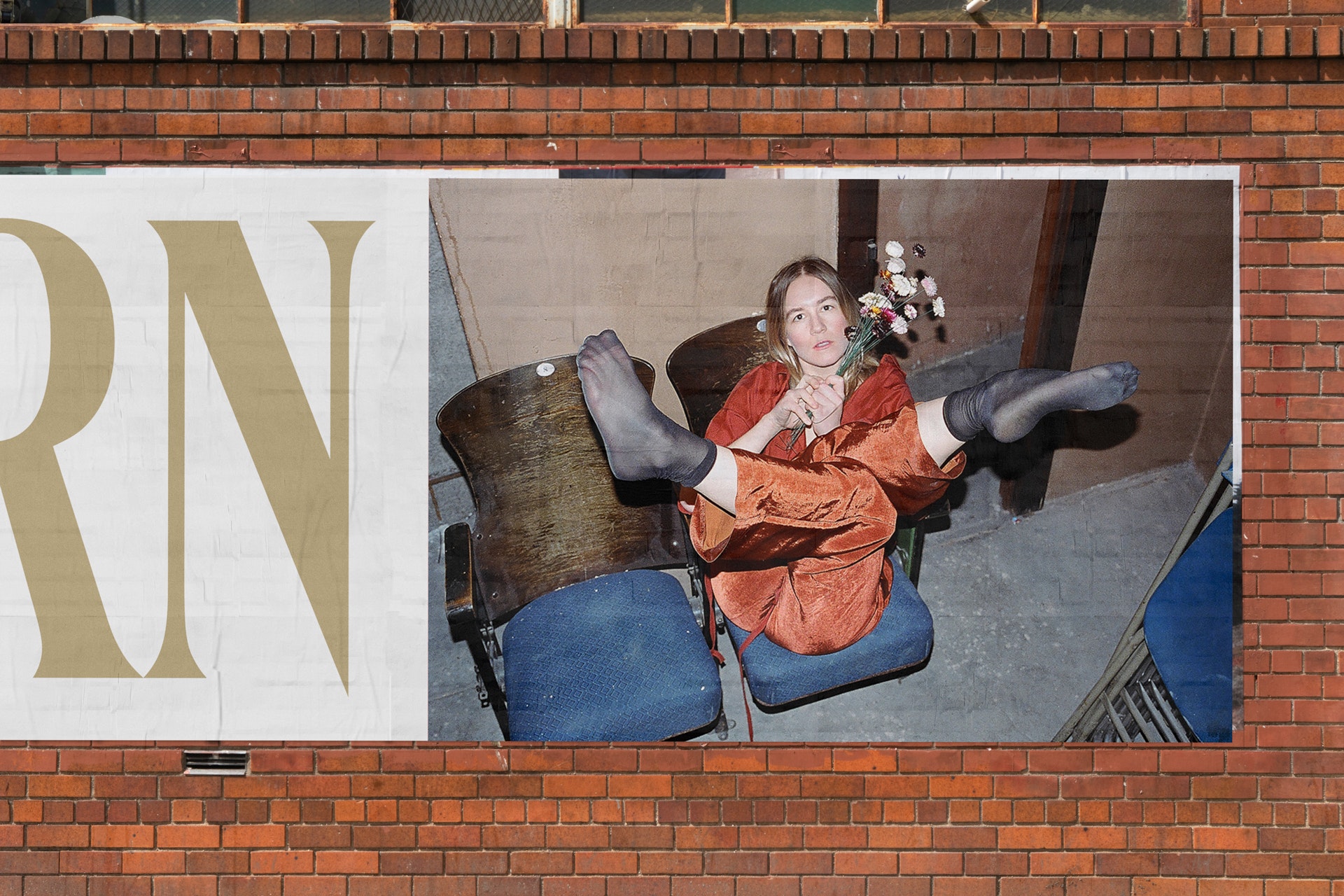
The first press photos were shot by Agustin Hernandez, who is absolutely brilliant. There’s a tenderness and romance beneath the unvarnished flash. The dancers are really performing in the frame, and they can own that space so well. In terms of art direction, really the only direction set forth in advance was to capture things in the theater space that embody that quality of romantic decay. The theater where the piece is premiering is over a hundred years old, but today it’s also used for rock shows. There is something compelling in capturing that juxtaposition, the mix of beautiful molding and archways and shitty cable snakes. I knew these things would add a whole other element to the design system, more than just press photos.

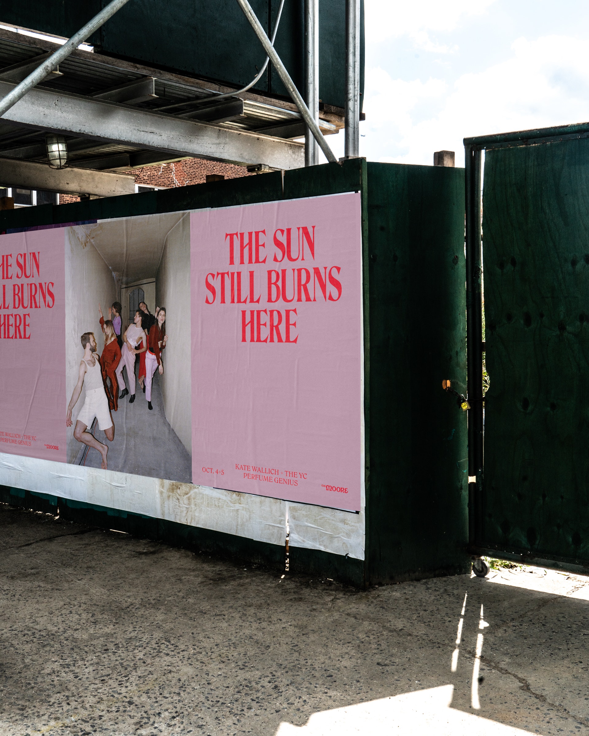
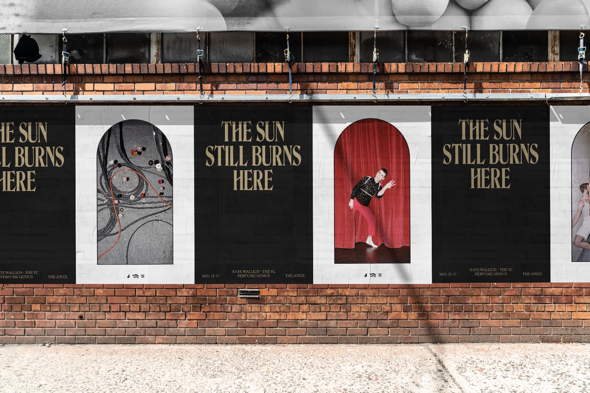
Posters from The Sun Still Burns Here campaign, design by Andrew J.S., photographs by Agustin Hernandez

Flyer for The Sun Still Burns Here, design by Andrew J.S.

Poster for The Sun Still Burns Here, design by Andrew J.S.

City-specific event posters for The Sun Still Burns Here, design by Andrew J.S.

Playbill for The Sun Still Burns Here, design by Andrew J.S.
BS
To continue to dissect the design, I’m curious about the type choice. My first instinct was Hawthorne, which I thought was an interesting decision, but it’s not. Is it a custom typeface?
AJS
I looked at Hawthorne early on, I’ve always wanted to use it for something, but it wasn’t quite right. I’ve been interested in these descendants of De Vinne, which of course had its own predecessors. There is also this renewed popularity of ’70s-feeling typefaces seen in families like GT Super by Grilli Type or Nazareth Roman by Benjamin Critton. This general style of type is fascinating to me conceptually in that it’s been reinvented over and over every so often—even the versions from the ’70s and ’80s were made to revive things from the ’20s, the 1890s, and so on.
Anyhow, through a protracted research and reference process that involved a lot of emailing, tracking down of physical transfer sheets, printing, and scaling, and some redrawing of characters by hand in vector and so forth, I finally got it to where I wanted. It’s semi-custom, let’s say that.
I love that it doesn’t take itself too seriously, feels just campy enough to hint at some of the humor in our library of references. At the same time, I think it’s just really beautiful.

Single cover for Eye In The Wall by Perfume Genius. Design and photograph by Andrew J.S.

Inner sleeve for Eye In The Wall by Perfume Genius. Design and photograph by Andrew J.S.

Original polaroids used for album packaging for Eye In The Wall by Perfume Genius. Photographs by Andrew J.S.
BS
The design system seems extremely robust with posters, T-shirts, ads, etc. When I started this Uncovered series it was with the intention to talk about album art, so I’m inclined to ask specifically about album covers for the project.
AJS
For the first album cover (out today) the label had called me on a Friday night asking when they were going to see the album artwork (we had no idea it was due that day); Kate, Mike, and I had just started texting about ideas the night before. The photograph we used was actually one of the Polaroids I took during the film shoot with Zia at MASS MoCA. I used a flash with a magenta gel, giving it this really provocative lighting. It was taken catch-as-catch-can between setups, during “The Orgy” scene, so it really has this voyeuristic immediacy. We like that about it. The type here takes much more of a back seat, in contrast to large display settings more central to the other pieces. We really wanted to take the image edge-to-edge and set the title right on top, as if working at an imagined low-budget ’70s Italian record label (more role-playing). It really matches the vibe of the song “Eye in the Wall,” which seems to have this sort of exotic Italian sexploitation thing going on.
I actually texted like 10 different versions of this artwork to Mike and Kate, a lot of which were more typographic or purely photographic, but we felt like this was a chance to just give an inflection of the universe for this single. I think we were all drawn to the perversion of the image, too. It’s just fun.
BS
Mike, the design of each of your albums seems an essential element to the “universe building” that happens musically on the record. I’m wondering about your relationship with design? Do you think about type and image when creating dance and music? Did working closely with a designer throughout this process change your relationship to design at all?
MH (Mike Hadreas)
My first album was all home recordings. I also made videos for each song directly after finishing them from found YouTube footage I would edit and arrange. I spent hours and hours playing my songs over muted fetish videos and strangers’ home movies until I found a cosmic match. It all felt like the same process to me; I could have started from either direction. Andrew has been part of the entire creation from the beginning, shifting and growing his ideas while all the other moving parts also took shape. It was very heartening to have these elements moving in tandem again. The whole experience has been so energetically circular that every element is completely braided together. You almost cannot separate the music from the dance or the design. It has made the world feel like a living thing that constantly exists, not just when the camera is on or the album is being played.

The Sun Still Burns Here long sleeve T-shirt designed by Andrew J.S.

The Sun Still Burns Here T-shirt designed by Andrew J.S.

The Sun Still Burns Here tote bag designed by Andrew J.S.
BS
I’m always interested in the relationship between performance and design. Being so intertwined with the performative aspects of this project I’m curious if you see any sort of correlation there. Do you think design can be performative?
AJS
I think really it comes down to having powerful ideas. I believe, truly, that certain ideas can just as easily become a song as they might a poster or a book or choreography. It all depends on who wields that idea. As a collaborative performing group, we create a central well of thought that’s drawn on by all of us. I think the relationship between artist and the public is a common thread here, too, and knowing that whether the concepts are translating as visuals or songs or movement they still need to be received by someone on the other side. Lest we forget: cool-looking shit gets people in seats, too. So there’s that.

Still from the trailer for The Sun Still Burns Here, filmed by Zia Anger, typography by Andrew J.S.

Still from the trailer for The Sun Still Burns Here, filmed by Zia Anger, typography by Andrew J.S.
BS
Multidisciplinary programming is really at the heart of the Walker ethos. This piece, in particular, seems particularly multidisciplinary and collaborative. Could the three of you talk about the effect of this collaboration on the final outcome?
AJS
None of this would exist without our collaboration; none of this work would be relevant without the dance and the music. As an AD, I was really aiming to glean and bottle even the tiniest bit of the creative energy around me. I think nothing was off limits, and the surface area we created together was ripe for generating this work.
I also need to shine a spotlight on the feedback process with Kate, Mike, and Alan. We all know they’re extraordinary artists within their respective fields, but they also give extremely well-articulated visual feedback (not surprising, but still amazing). I wouldn’t have gotten to this place without their ideas in mind.
As far as I’m concerned, the premiere of this piece is only the beginning: the visual language will continue to evolve as more venues present it, more collaborations happen, and more merch drops. I can’t wait to see where it goes.
KW
Historically, all my works have been collaborations in some form, but for this work we went next-level. I knew from the start that we wanted the piece to be a full integration of dance and music, and that Mike and I should co-direct. I also knew that it was going to be a big piece, three-dimensionally, so we brought every other element to the table from the beginning—production, costuming, art direction, and design. I think about creation as something that is beyond us—the supporting of the “thing.” Maybe we’re just lucky, but there was definitely a cosmic connection here. I think we all let ourselves push each other into the unknown, trusting the ball that we were collectively blowing on to keep afloat.
MH
I have always started my projects essentially in isolation. Collaborative conversations always come after work I did on my own—after my demos are fleshed out, after I have a rough visual map of references for a video, etc. This piece was different because the team was in place from the very beginning. Kate and I had sent paintings back and forth before I even began writing music, following initial rehearsals I had known bodies in my mind moving while singing the beginning ideas of songs, the stylists were sending mood boards while I was still in the studio recording. It created a lot of trust; I never second-guessed myself when following deeper and wilder instincts with the music because it was all born from a communal place. I knew it would be understood. I didn’t have to pitch or overly explain where I was coming from because everyone else was coming from there, too.

Polaroid by Andrew J.S.

Polaroid by Andrew J.S.
Related Events

Kate Wallich + The YC x Perfume Genius: The Sun Still Burns Here
Related Articles

Uncovered 003: The Photographs of Mr. iozo for A$AP Rocky’s Testing

Uncovered 002: Fever Ray, Country Music, Mouse on Mars
