Everything in Between: Brian Roettinger on 10 Years of Working with No Age (Plus, 5 Questions for No Age)
By Ben Schwartz

The power trio lineup is rock music in its most raw form—guitar, bass, and drums. It’s been a proven formula throughout history, from The Jimi Hendrix Experience to Hüsker Dü, Rush to the Yeah Yeah Yeahs. Recently, the concept has crossed over into design with an essay by Mark Owens in the Experimental Jetset monograph Statement And Counter-statement.
No Age, the LA-based punk band is a two-piece operating somewhere in the outskirts of the power trio landscape. On stage and on record, the group consists of Randy Randall (guitar) and Dean Spunt (drums). However, a quick glance at the band’s discography and one gets the sense that their creative process is inextricably linked to the work of their long-time collaborator Brian Roettinger. Brian, the LA-based graphic designer, has been working with No Age since their inception, and in many ways has become an honorary third member (thus forming their own unique version of the power trio). The latest No Age release, Snares Like A Haircut, marks over a decade of collaboration between Roettinger and the band. In the following interview, I chat with Brian, Randy, and Dean about the development of their collaboration from recording music in a motel parking lot to hand assembling an entire run of LPs.
Ben Schwartz (BS)
How did you meet Dean and Randy of No Age? At what point did you begin working together?
Brian Roettinger (BR)
Dean and I grew up in the same suburb outside of LA, so we got to know each other in high school, post–high school, and pre–No Age. We ended up reconnecting years later at The Smell when they were both in a band called Wives. It wasn’t until I was on tour in Europe with the band Liars, playing a show with Wives that Dean, Randy, and I began discussing design. We were looking at a lot of the design for Wives and I was explaining to them ways which I felt it could be better. When we returned from tour, Wives eventually broke up, and Dean and Randy formed No Age. That was the beginning of our collaboration.
BS
What was the first official No Age project you worked on together?
BR
The five EPs were the first projects we worked on together, which all happened simultaneously. We thought, rather than just putting out one record, we could release five EPs with five different record labels that all came out at the same time. To make things even more confusing, none of the covers really said No Age on them, with the exception of the gradient T-shirt. On the back of each record was a letter from the band’s name, so when you collected them all it spelled out “N-O-A-G-E.” The idea of multiple EPs really just came from the number of letters in the band’s name.
BS
You mentioned that shirt with the rainbow gradient on it. That shirt became a sort of icon in the LA DIY scene. Does it have a back story? Did you anticipate it having that sort of effect?
BR
No, it was just a photo we all really liked. It fit in nicely with the idea of not explicitly spelling out the band’s name on the cover. At one point I think the shirt became bigger than the band—more people had seen that design than had actually heard a song by No Age.
BS
And following the five EPs, was the full-length album Nouns?
BR
Right, and for that album, we were again on the road. Liars went on a month-long tour with No Age, and during that time we had to design the packaging for Nouns. Every night after the show we would collectively get together and talk about what the record could be. It was a fluid process of designing, conversing, and then responding.
Through the process came the idea to feature people, places, and things that had influenced the band. It was everything, from shows that the band played, pictures from The Smell, outside influences, other bands, even other record labels. The entire experience lead us to the record title Nouns, something I don’t think we would have come up with had we not been on tour together.

Nouns, 2008

Nouns, 2008
BS
Were you exploring any new ways of making at the time? I’d imagine being out of the studio and working on the road meant varying constraints.
BR
It was definitely a new set of constraints. Any element I wanted in the design I would have to photograph with my phone and email to myself. This was around the time of the first iPhone so you can imagine the photos were pretty crappy.
I remember one time in a hotel in Lawrence, Kansas, there were no notepads in the room, so we took down a painting and began drawing on the wall behind it. We ended up photographing the writing, which was then used for a 7-inch EP we did later. We liked the idea of someone eventually taking down the painting and finding the writing.
That night we also recorded a song in the hotel bathroom and in the parking lot. There is a photo of Dean playing drums outside and you can see it started to snow. The entire time Dean was playing someone had to hold an iPod for him so he could have a track to play along to.

Randy Randall writing on hotel wall in Lawrence, Kansas

No Age recording a track in a hotel parking lot
BS
The whole idea of making Nouns on the road, did that come out of necessity or were you thinking about it as a sort of design experiment?
BR
I wish it was more of an experiment, but it was definitely more of a timing issue. It was a really useful process though, the finished project was absolutely a product of being on the road. An example is the lettering on the album cover. When we would take a break at truck stops there were a bunch of those reflective letter stickers for radio codes or the back of big rig trucks. We bought ones that said No Age and put them on the bass drum. The sticker backing had this really nice hairline bleed of the letters, which created an interesting outline. Those outlines eventually formed the type on the cover.
BS
And that album art was nominated for a Grammy, which seems surprising given the type of artists they generally look at…
BR
Yeah, no one knew who they were at that point. It was pretty crazy.

Liars + No Age, 2008

Liars + No Age, 2008
BS
You also put out numerous city-specific 7-inch EPs on that tour. Could you talk about those?
BR
For every city the band stopped in, I would make a new cover for the split 7-inch (with Liars) that commemorated that particular tour date. I would design them digitally then find a local copy shop to print, cut, and assemble the sleeves. We would estimate how many records we would sell at each show and only make that set amount. If they sold out that night then that would be it, that was the only time and place you could get that 7-inch with that cover.
BS
So every record became a limited edition?
BR
Right. Once we left a particular city, all the leftover covers form that city were destroyed. If you had that record you would always remember where you got it from.

No Age and Liars city-specific EPs
BS
And coming out of this tour the band released the Eraser 7-inch?
BR
Right, it was on this album where the writing from the hotel wall appeared on the back. Quickly following Eraser we did the Losing Feeling EP. For that cover, we used a Riso which barely fit into my laundry room. We did the entire cover on the bed of the Riso in one night. Conceptually we were exploring the idea of growing up and struggling with how to hold on to, or let go of, past influences. The cover is a literal transition, or melting moment, where you don’t want to forget about the past, but want to continue to move forward. The record as well came with a limited-edition zine further exploring that concept.

Eraser, 2008

Losing Feeling, 2009

Losing Feeling, 2009

Losing Feeling zine, 2009

Losing Feeling zine, 2009
BS
At this point in your collaboration, how do you feel you were integrated into the band’s creative process?
BR
My role was always a bit more than just graphic design or art direction. With Nouns, for example, the record was almost done but there was no title. Coming up with that was a group effort. Because the band is a two-piece, having a third person involved is really beneficial. Any issues could be settled with a quick vote.
BS
After Losing Feeling came Everything In Between, the first full-length since Nouns. Did you approach this record any differently than past projects?
BR
There was a lot of pressure with Everything In Between following the Nouns Grammy nomination for CD packaging. As a result, we decided to do the opposite, put most of the focus on the vinyl. We turned the record sleeve into a zine where we really explored the theme of “in-between moments.” We had been thinking about how most memories are made up of beginnings or endings, but rarely anything else. Both the music and the design tried to really highlight these often forgotten experiences.
BS
Despite Everything In Between feeling like a larger label release, you are still working within a particular DIY aesthetic (the simplicity of materials on the cover, the making of a zine, etc.). Is this lo-fi approach a sort of self-imposed constraint?
BR
No, I think it’s more the product of immediacy that was such a big part of our backgrounds. That aesthetic is very much a part of their ethos: the way they think about and write music could definitely be called lo-fi. So to gloss it over or to give it some sort of elevated status never really made sense from a design perspective. I think the materials and the objects definitely became more elevated as time went on, but from a surface level it was definitely meant to feel low-tech.

Everything In Between, 2010
BS
I loved that zine. I bought the record without owning a record player just so I could own a copy.
BR
Thanks! Yeah, it was a sort of extended tracklist exploring the idea of in-between moments—in this case in between the start and end of the record. The photos in the zine represented moments during the process of making the record. Looking at it or talking about it now might feel a bit abstract but, for us, the whole thing felt very clear at the time.
BS
And there are definite graphic ways that the idea is played out. For example, the letter spacing which plays up the “in between” of the characters.
BR
Right, that’s where the concept becomes a bit more concrete. And it’s funny, the Glitter EP had a similar design move with the large spacing in between characters. On that the cover, we actually put 3 “Ts” in the title so it spaced out evenly, and I don’t think anyone has caught that.

Glitter 12″, 2010

Glitter 12″, 2010

Glitter 7″, 2010
BS
That same year you worked on the Artist Music Journals with No Age, where you actually wrote songs and played with the band.
BR
Yeah. Actually, come to think of it, Artist Music Journals came out before Everything In Between. If you look at the type on the inside of the Artist Music Journals and then at the type of Everything In Between you can see how they influenced each other. Like you said, though, this is the first time that I collaborated with No Age on the music side of things in addition to doing all of the visuals. In the past, the band is always entering my world when collaborating and working on the design. So this was a really nice chance for a role reversal where I was entering the recording studio to create. The process lasted about two days and we stayed in their studio just making tracks. I was playing everything from bass to synths to percussion. It sounds a little bit like No Age, but then again, not really.
BS
You guys finally became a literal power trio.
BR
Yes, exactly.

Artist Music Journals Volume I No. X , 2010

Artist Music Journals Volume I No. X , 2010

Artist Music Journals Volume I No. X , 2010
BS
Afterward, the band participated in another side project, which was Collage Culture—a book you did with Aaron Rose and Mandy Kahn.
BR
Right, so Collage Culture started off as a book, and eventually, I thought it would be great to have a soundtrack to a book. Dean and Randy read Collage Culture and got an understanding of what it was about, and then we talked about ideas for the soundtrack. The album works where the left channel is people reading the book and the right channel is the music. So if you put the record on you can pan and hear either version or you can hear this sort of audio collage by playing both channels at once.

Collage Culture, 2012

Collage Culture, 2012
BS
It’s great that as collaborators you are both willing to explore these side projects or odd scenarios and see how they play out. For example, doing a joint lecture at Cal Arts…
BR
Right, that talk was meant to be on the 30th anniversary of when Black Flag played at Cal Arts, on the same exact date in the same exact room. We didn’t get the same date, but we did get the same year. I talked about my design work and they talked about their process in the studio. The lecture ended with the band playing three or four songs in the same room that Black Flag played in.

No Age performing at CalArts

No Age performing at CalArts
BS
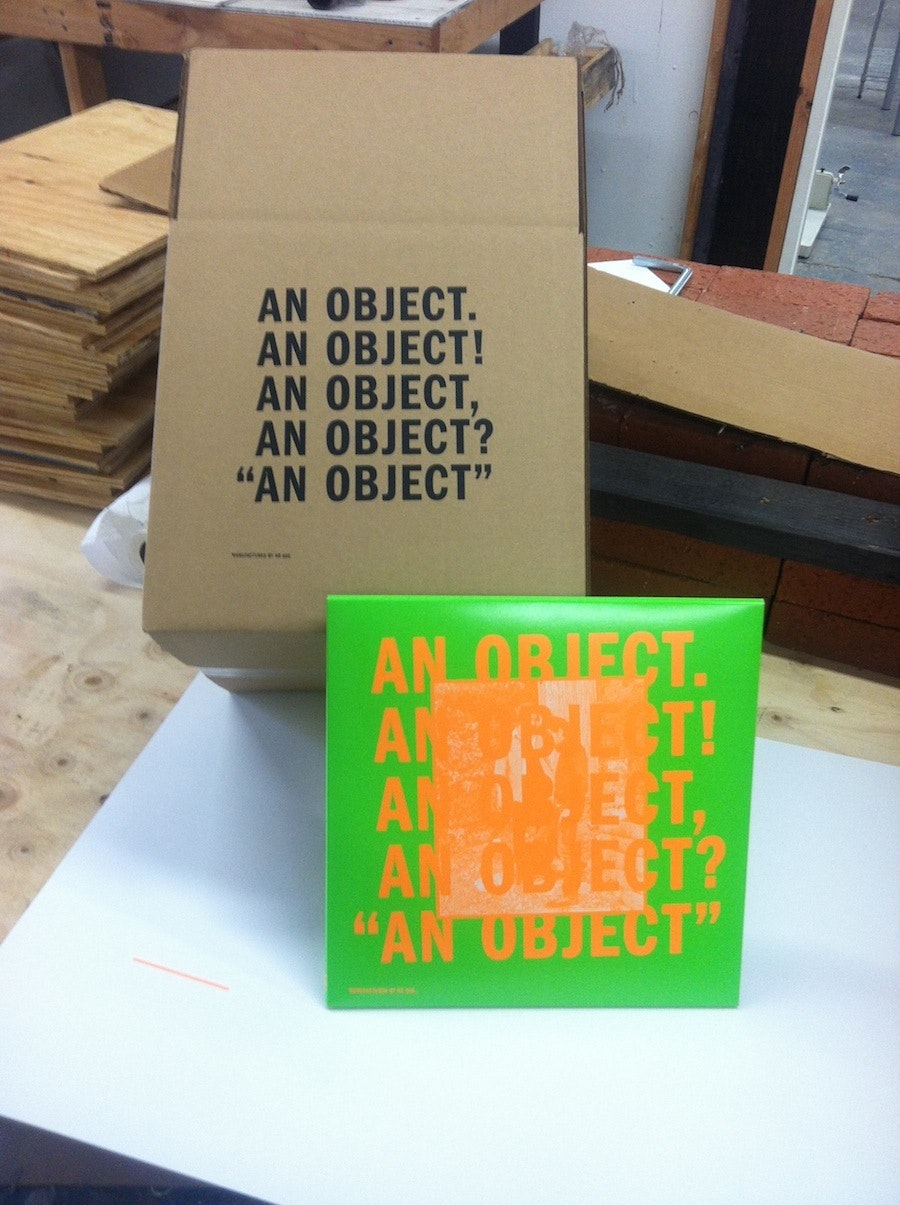
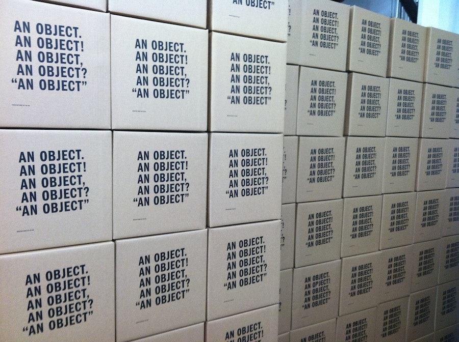
The next release from the band was An Object, which revolved around the band producing every aspect of the release themselves—from the music to the printing to the assembling.
BR
An Object was this idea where we wanted to take over the entire process of making an album. We were sick of the idea of making a record and then just sending it off to a label for it be finished. Our idea was to take over the entire production from printing to die-cutting, assembling to making custom boxes. We really created this sort of brand for the album.
BS
What made you want to rethink the standard music release process?
BR
I think it came out of wanting to know how things were made and wanting to know the cost of producing everything ourselves. We asked the label for the entirety of the budget and promised them a final delivered album. Initially they were reluctant, but they were up for trying it. And we did it; we took care of everything and delivered the album.
BS
I also see the project as a means of investigating or questioning the “object-ness” of music in today’s stream-based culture.
BR
Yeah, absolutely. It was a complete embrace of the physical. The cover treatment with multiple punctuations asks that question, “How do you define an object?” It is open-ended, and you can define the title how you want.

An Object, 2013

An Object, 2013

An Object, 2013
BS
And then you did a part B with The Thing Quarterly as a cassette?
BR
Right, the band played the songs live, changed them up a bit, and it was recorded live to cassette. If you were in the audience you got the finished project immediately after the performance.

Re-Imagined An Object, 2014

Re-Imagined An Object, 2014

Re-Imagined An Object, 2014

Re-Imagined An Object, 2014
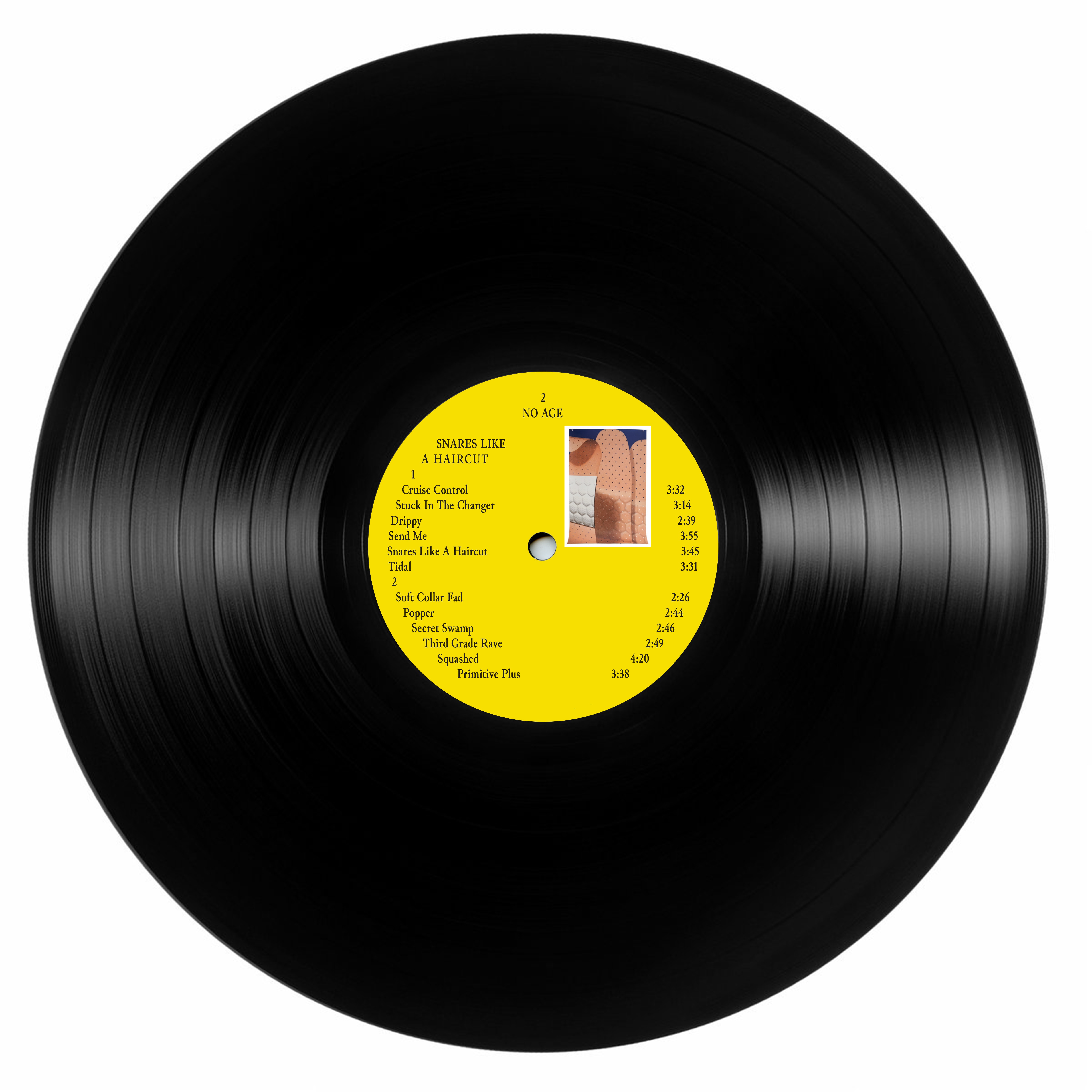
BS
And that takes us to today, to the most recent release, Snares Like A Haircut. For a band that was pretty prolific through most of their career, four years seems like quite a long time between releases.
BR
It was definitely the biggest gap between projects. Some of it had to do with the band growing up, having kids, and getting married. They were rethinking what it means to actually be in a band. A lot changed for what it means to make the type of music they are interested in. It’s not that people didn’t care anymore, but things were definitely different. Even elements of the design had changed. It was the first time, for example, that a cover featured someone else’s artwork. The idea was to try and make something anonymous and mysterious—something along the lines of Joseph Beuys’s readymade sculptures.
BS
Whose work is on the cover?
BR
The photo on the cover is an installation view of a work by Daphne Fitzpatrick. On the back are two images that are posters that she made, but I placed them at the size of thumbnails. Also on the front of the record is the price of the album in each region it is available, and on the back is the phone number of the record label.
BS
The real phone number?
BR
Hah, yes. You can actually call the label if you want.
BS
I also love how the CD has no backing card.
BR
There is no tray card. The CD is put into the package upside down and it just becomes the back cover. So it’s really just limiting the number of things that need to get printed.

Snares Like A Haircut, 2018

Snares Like A Haircut, 2018
Snares Like A Haircut, 2018

Snares Like A Haircut, 2018

Snares Like A Haircut, 2018

Snares Like A Haircut, 2018

Snares Like A Haircut T-shirt, 2018

Snares Like A Haircut T-shirt, 2018
BS
It’s really nice to sit down and look at all of this at once and really see how the two practices have developed hand in hand.
BR
Yeah, it’s been really nice to have this strong collaboration that has unfolded over a period of time—about a decade. Especially a band with two members. I think it speaks to that classic notion of the power trio in rock music, but in this case the third member isn’t really a member. I love looking at the relationship and seeing how, while each project is unique, there is a shared sensibility that permeates the work. It would have been easy to sort of “brand” the band and make it look the same across the board, but it just wouldn’t have been interesting. They are constantly exploring—new sounds, new ways of writing, new ways of recording. And with each record, we had to sort of redefine who we were without forgetting what we had done.
5 QUESTIONS FOR NO AGE
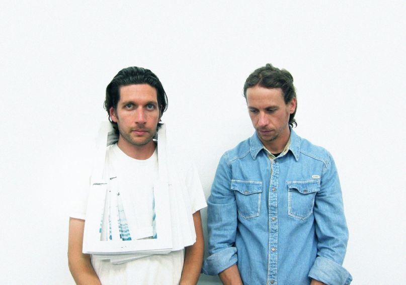
Dean Spunt and Randy Randall of No Age
BS
Could you talk about the process of working with Brian? At what point do you begin to engage with the visual side of an album, and what are some of those early conversations like?
No Age (NA)
I really don’t have an idea visually what the album is going to look like until we sit with Brian. Those are two different creative minds for me, writing music and designing. With the exception of An Object, which I was thinking about the packaging and music together, but the image never really gets there until we all sit around and start talking. I will usually send in my lyrics to Brian shortly after the first time we all meet up, which is the first time I have typed them and the first time Randy has read them as well. Then we start riffing, like an extension of the writing of the album, throwing ideas and words around until we all get excited. Usually we get a good laugh out of it.
An Object in production, 2013
An Object in production, 2013
BS
One typically thinks of album art as a byproduct of the music (and not the other way around). However, because of your strong creative relationship with Brian, do you feel that the visuals have had any influence on the writing and recording?
NA
Not usually. We have always had the entire album finished by the time we meet with Brian. But it is amazing how after we get the design done, the albums color stays with these songs. I think of that salmon color every time we play songs off Nouns, or green and orange when we play An Object songs. And again speaking of An Object, we had met up and talked about manufacturing the record ourselves before we started really writing for it, so that is probably the best case of the design and packaging influencing the music. Also the Eraser and Teen Creeps 7-inches we were coming up with the design at the same time we were recording the B-sides, so I think the design and the feel of the songs go together.

Eraser, 2008
BS
As you continue to work with Brian, how has his role evolved in your creative process?
NA
I think we continue to treat Brian as a member of the group in the sense that we have equal say in the design in that way. It is less like we hire Brian to design our album. We would never do that. It’s a place to get creative and have someone who has an extremely crafted practice engage with the silly ideas we have. And hopefully for Brian it’s a chance to collaborate in a way he doesn’t normally do. We are sitting together and working on it together, trying to push each other. At this point it’s just what we do: meet up and make something that feels special and twisted that holds our music.

Everything In Between CD booklet, 2010

Everything In Between CD booklet, 2010
BS
Looking back, do you have a particular project that the three of you have worked on that you feel most proud of?
NA
Nouns was particularly special looking back. We had no idea people would be into what we were making. The label was hesitant to spend the money on the CD book art; we were designing it on the road, and it was ambitious and hilarious. Also meeting up every night after the show and adding more text or images and ideas to the package was a really nice way to capture the vibe we were going for.

Spread from the Nouns CD booklet, 2008

Spread from the Nouns CD booklet, 2008

Spread from the Nouns CD booklet, 2008
BS
One last thing: so many people, when I mention No Age, bring up the shirt with the band name and rainbow gradient. What’s the story behind it?
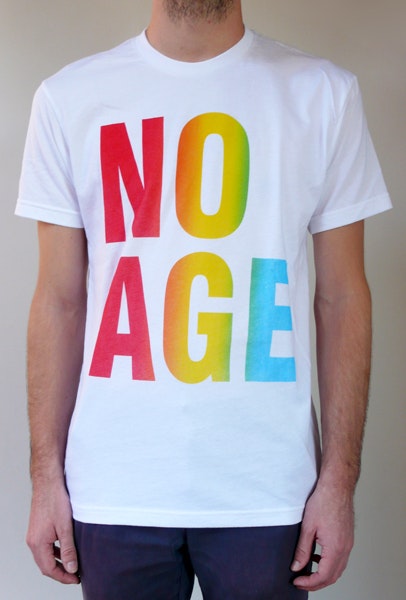
No Age rainbow gradient shirt
NA
The shirt was made at my mother’s silk screen shop. She started a shop with her sister when I was just finishing elementary school so I was always around silk screening and worked at the shop when I was younger. I remember vividly all the color blends she would do for local businesses in the late ’80s and early ’90s, it was a very hip thing to do back then. So when it came time to make a shirt, it was really simple to think what the design should be. Big type says, “Yes, I am buying a shirt because I want people to know I like and support this band.” I’m really glad the shirt made it onto the cover of the Get Hurt EP. The image was from a friend of ours who took some photos of his niece wearing it. I think the graphic eventually did get bigger than the band. People loved it and had no idea who we were.
*A publication will be forthcoming further documenting the collaboration between Brian Roettinger and No Age. Stay tuned!
Related Articles
